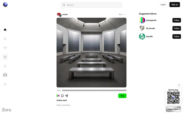
Preview image. Unlock full-res
Raw Concrete Gallery
Color palette
Primary success indicators, 'Buy' buttons, highlights — a jarring, vivid green.
Accent color used for icons and small interactive elements, creating extreme contrast.
Distinctive gradient for call-to-actions or special states.
Attention-grabbing highlights, often associated with positive status or interaction.
Page backgrounds, card surfaces, primary text on dark elements.
Primary UI elements, text on white backgrounds, button backgrounds for emphasis.
Secondary text, borders, icons, input text.
Placeholder text, minor labels, badges.
Subtle borders, button outlines.
Subtle background texture or separator, adding visual interest without distracting.
Typography
- Weights
- 410, 450, 500, 600
- Sizes
- 11px, 13px, 15px, 16px, 17px
- Line height
- 1.09, 1.23, 1.25, 1.33, 1.41
- Letter spacing
- -0.0150em
- Fallback
- Inter, Arial, sans-serif
Unified font for all text elements from body to headlines, contributing to a modern, slightly technical feel. The consistent negative letter-spacing across all sizes gives text a condensed, intentional presence.
Spacing & shape
Components
Background: transparent (rgba(0,0,0,0)). Text: Slate Gray (#4d4d4d). Color: #4d4d4d. No padding, no border radius, text only.
Background: transparent (rgba(0,0,0,0)). Text: Slate Gray (#4d4d4d). Border: 1px solid #4d4d4d. Radius: 8px. Padding: 12px 12px.
Background: Graphite Dark (#121212). Text/Icon: Canvas White (#ffffff). Radius: 50% (circular). No padding. The entire element is a clickable circle rather than containing text.
Background: Signal Green (#00df00). Text: Black (#000000). Radius: 8px. Padding: 4px 12px. Distinctively bright to stand out.
Background: transparent (rgba(0,0,0,0)). No border, no shadow. Radius: 0px. Padding bottom: 16px. Content flows directly.
Background: transparent (rgba(0,0,0,0)). No border, no shadow. Radius: 12px. No padding.
Background: transparent (rgba(0,0,0,0)). Text: Slate Gray (#4d4d4d). Border: 1px solid #4d4d4d. Radius: 0px. Padding: 12px 12px.
Background: #f5f5f5. Text: Ash Gray (#878787). Radius: 999px (pill shape). Padding: 0px 4px.
Guidelines
- Always use MonumentGrotesk with a negative letter-spacing of -0.0150em for all text elements to maintain a condensed aesthetic.
- Apply Graphite Dark (#121212) as the default text color on Canvas White (#ffffff) backgrounds for strong contrast.
- Utilize Signal Green (#00df00) exclusively for primary 'Buy' actions or positive affirmations, ensuring its high visibility.
- Employ rounded corners of 8px for most interactive elements like buttons, and 12px for card containers, creating a soft but not overly playful feel.
- Maintain a clear visual hierarchy by placing content directly on the Canvas White (#ffffff) page background with minimal framing unless a specific grouping is required.
- Integrate the Monochrome Stripe Gradient for subtle background texture on neutral blocks, avoiding solid gray fills where possible.
- Use 50% border-radius for circular icon buttons, making them immediately recognizable as interactive elements.
- Avoid using standard black text on light backgrounds; instead, opt for Graphite Dark (#121212) or Slate Gray (#4d4d4d).
- Do not introduce additional accent colors beyond Signal Green (#00df00) and Vivid Magenta (#ff00f0) to preserve the brand's distinct color palette.
- Refrain from adding explicit box-shadows to cards; elevation is mostly implied by content framing rather than visual depth cues.
- Do not use generic padding values; adhere to the established spacing scale based on 4px increments (4px, 8px, 12px, 16px).
- Avoid large, impactful headlines; all typography uses MonumentGrotesk with a consistent negative letter-spacing and relatively modest sizes.
- Do not use default browser form element styles; all inputs should be styled with transparent backgrounds, Slate Gray (#4d4d4d) text, and a border style matching the search input.
About this system
ShowHide
Zora's design evokes an 'underground market' feel, blending a stark monochromatic UI with unexpected, almost illicit, bursts of vivid color. The primary interaction zones are kept deliberately understated with muted grays and crisp whites, allowing product imagery and the occasional electric gradient to dominate. This tension between a neutral, almost unstyled frame and hyper-vivid accents creates an edgy, disruptive atmosphere.
The page adheres to a max-width contained layout, with a prominent left-hand fixed sidebar navigation that introduces asymmetry. The main content area is centrally aligned. The hero pattern appears to be absent in the provided screens, with the page immediately presenting a grid-like feed of content cards. Section rhythm is driven by the feed, presenting a consistent stream of items rather than distinct, block-separated sections. Content is arranged primarily in a single-column stack of cards within the main content area, with a right-hand sidebar for suggestions and QR code. Navigation consists of a left-hand fixed sidebar with minimalist icons and a top-right header with 'Log in' and 'Sign up' buttons. This creates a focused, content-heavy experience within clearly defined UI zones.
Imagery on Zora is product-focused or artistic, often full-bleed within card areas or as central page features. There's a mix of photography, abstract graphics, and some potentially illustrative elements. The treatment varies: images themselves appear to respect the content card's border-radius (0px or 12px) but are otherwise raw, without masks or heavy treatments. Photography tends towards detailed, sometimes artistic or conceptual works, with varied color palettes depending on the content. Illustrations, if present, lean towards flat or outlined graphic styles (like some icons). The density is high, with images being the primary focal points upon which the UI elements are overlaid or positioned, serving both decorative and explanatory roles for NFTs/digital assets.
Reminiscent of OpenSea, Rarible, Foundation, Are.na.
# Zora — Style Reference
> Raw Concrete Gallery

**Theme:** light

**Site:** https://zora.co

Zora's design evokes an 'underground market' feel, blending a stark monochromatic UI with unexpected, almost illicit, bursts of vivid color. The primary interaction zones are kept deliberately understated with muted grays and crisp whites, allowing product imagery and the occasional electric gradient to dominate. This tension between a neutral, almost unstyled frame and hyper-vivid accents creates an edgy, disruptive atmosphere.

## Tokens — Colors

| Name | Value | Token | Role |
|------|------|------|------|
| Signal Green | `#00df00` | `--color-signal-green` | Primary success indicators, 'Buy' buttons, highlights — a jarring, vivid green. |
| Vivid Magenta | `#ff00f0` | `--color-vivid-magenta` | Accent color used for icons and small interactive elements, creating extreme contrast. |
| Electro Pink Gradient | `#ff00d9` | `--color-electro-pink-gradient` | Distinctive gradient for call-to-actions or special states. |
| Luminous Green Gradient | `#62ff00` | `--color-luminous-green-gradient` | Attention-grabbing highlights, often associated with positive status or interaction. |
| Canvas White | `#ffffff` | `--color-canvas-white` | Page backgrounds, card surfaces, primary text on dark elements. |
| Graphite Dark | `#121212` | `--color-graphite-dark` | Primary UI elements, text on white backgrounds, button backgrounds for emphasis. |
| Slate Gray | `#4d4d4d` | `--color-slate-gray` | Secondary text, borders, icons, input text. |
| Ash Gray | `#878787` | `--color-ash-gray` | Placeholder text, minor labels, badges. |
| Fog Contrast | `#e6e6e6` | `--color-fog-contrast` | Subtle borders, button outlines. |
| Monochrome Stripe Gradient | `#d2d2d2` | `--color-monochrome-stripe-gradient` | Subtle background texture or separator, adding visual interest without distracting. |

## Tokens — Typography

### MonumentGrotesk
- **Substitute:** Inter, Arial, sans-serif
- **Weights:** 410, 450, 500, 600
- **Sizes:** 11px, 13px, 15px, 16px, 17px
- **Line height:** 1.09, 1.23, 1.25, 1.33, 1.41
- **Letter spacing:** -0.0150em
- **Role:** Unified font for all text elements from body to headlines, contributing to a modern, slightly technical feel. The consistent negative letter-spacing across all sizes gives text a condensed, intentional presence.

## Tokens — Type Scale

Major Second (1.125) from 15px base.

| Role | Size | Line height | Letter spacing |
|------|------|------|------|
| caption | 11px | 1.25 | — |
| body-sm | 13px | 1.25 | — |
| body | 15px | 1.25 | — |
| body-lg | 16px | 1.25 | — |
| heading-sm | 17px | 1.25 | — |

## Tokens — Spacing

- **Section gap:** 20px
- **Card padding:** 0px
- **Element gap:** 4px

## Tokens — Radius

- **Buttons:** 8px
- **Cards:** 12px
- **badges:** 999px
- **round-elements:** 50%

## Layout

The page adheres to a max-width contained layout, with a prominent left-hand fixed sidebar navigation that introduces asymmetry. The main content area is centrally aligned. The hero pattern appears to be absent in the provided screens, with the page immediately presenting a grid-like feed of content cards. Section rhythm is driven by the feed, presenting a consistent stream of items rather than distinct, block-separated sections. Content is arranged primarily in a single-column stack of cards within the main content area, with a right-hand sidebar for suggestions and QR code. Navigation consists of a left-hand fixed sidebar with minimalist icons and a top-right header with 'Log in' and 'Sign up' buttons. This creates a focused, content-heavy experience within clearly defined UI zones.

## Imagery

Imagery on Zora is product-focused or artistic, often full-bleed within card areas or as central page features. There's a mix of photography, abstract graphics, and some potentially illustrative elements. The treatment varies: images themselves appear to respect the content card's border-radius (0px or 12px) but are otherwise raw, without masks or heavy treatments. Photography tends towards detailed, sometimes artistic or conceptual works, with varied color palettes depending on the content. Illustrations, if present, lean towards flat or outlined graphic styles (like some icons). The density is high, with images being the primary focal points upon which the UI elements are overlaid or positioned, serving both decorative and explanatory roles for NFTs/digital assets.

## Components

### Suggested Follows Panel

### Content Card with Buy Action

### NFT Card with Price Bar

### Ghost Button
*Functional text buttons for navigation and secondary actions.*

Background: transparent (rgba(0,0,0,0)). Text: Slate Gray (#4d4d4d). Color: #4d4d4d. No padding, no border radius, text only.

### Rectangular Text Button
*Secondary action buttons, often inline.*

Background: transparent (rgba(0,0,0,0)). Text: Slate Gray (#4d4d4d). Border: 1px solid #4d4d4d. Radius: 8px. Padding: 12px 12px.

### Circular Icon Button
*Icon-only primary actions, usually on sidebars or within cards.*

Background: Graphite Dark (#121212). Text/Icon: Canvas White (#ffffff). Radius: 50% (circular). No padding. The entire element is a clickable circle rather than containing text.

### Vivid Buy Button
*Primary call-to-action for purchasing items.*

Background: Signal Green (#00df00). Text: Black (#000000). Radius: 8px. Padding: 4px 12px. Distinctively bright to stand out.

### Content Card - Minimal
*Default content container for displaying items.*

Background: transparent (rgba(0,0,0,0)). No border, no shadow. Radius: 0px. Padding bottom: 16px. Content flows directly.

### Content Card - Rounded
*Card variant for specific items or sections that need slight framing.*

Background: transparent (rgba(0,0,0,0)). No border, no shadow. Radius: 12px. No padding.

### Search Input Field
*Global search functionality.*

Background: transparent (rgba(0,0,0,0)). Text: Slate Gray (#4d4d4d). Border: 1px solid #4d4d4d. Radius: 0px. Padding: 12px 12px.

### Follow Badge
*Label for following users.*

Background: #f5f5f5. Text: Ash Gray (#878787). Radius: 999px (pill shape). Padding: 0px 4px.

## Guidelines

### Do

- Always use MonumentGrotesk with a negative letter-spacing of -0.0150em for all text elements to maintain a condensed aesthetic.
- Apply Graphite Dark (#121212) as the default text color on Canvas White (#ffffff) backgrounds for strong contrast.
- Utilize Signal Green (#00df00) exclusively for primary 'Buy' actions or positive affirmations, ensuring its high visibility.
- Employ rounded corners of 8px for most interactive elements like buttons, and 12px for card containers, creating a soft but not overly playful feel.
- Maintain a clear visual hierarchy by placing content directly on the Canvas White (#ffffff) page background with minimal framing unless a specific grouping is required.
- Integrate the Monochrome Stripe Gradient for subtle background texture on neutral blocks, avoiding solid gray fills where possible.
- Use 50% border-radius for circular icon buttons, making them immediately recognizable as interactive elements.

### Don't

- Avoid using standard black text on light backgrounds; instead, opt for Graphite Dark (#121212) or Slate Gray (#4d4d4d).
- Do not introduce additional accent colors beyond Signal Green (#00df00) and Vivid Magenta (#ff00f0) to preserve the brand's distinct color palette.
- Refrain from adding explicit box-shadows to cards; elevation is mostly implied by content framing rather than visual depth cues.
- Do not use generic padding values; adhere to the established spacing scale based on 4px increments (4px, 8px, 12px, 16px).
- Avoid large, impactful headlines; all typography uses MonumentGrotesk with a consistent negative letter-spacing and relatively modest sizes.
- Do not use default browser form element styles; all inputs should be styled with transparent backgrounds, Slate Gray (#4d4d4d) text, and a border style matching the search input.

## Agent Prompt Guide

### Quick Color Reference
- Text (primary): #121212
- Background (page): #ffffff
- CTA (buy): #00df00
- Border (general): #4d4d4d
- Accent (vivid): #ff00f0

### 3-5 Example Component Prompts
1. Create a primary 'Buy' button: background #00df00, text #000000, 8px border-radius, 4px 12px padding. Text: 'Buy' using MonumentGrotesk 13px, weight 450, letter-spacing -0.195px.
2. Design a minimalist content card: transparent background, 0px border-radius, 0px padding-top/right/left, 16px padding-bottom. Contains image and text.
3. Generate a circular icon button: background #121212, icon color #ffffff, 50% border-radius. No explicit padding, the icon should be centered.
4. Create a search input field: transparent background, text color #4d4d4d, 1px solid #4d4d4d border, 0px border-radius, 12px 12px padding. Placeholder text should be Ash Gray (#878787).
More like this








Keep what you find
A free account saves references to boards and can send you a weekly email of picks based on what you save.
To see every result, go Pro.