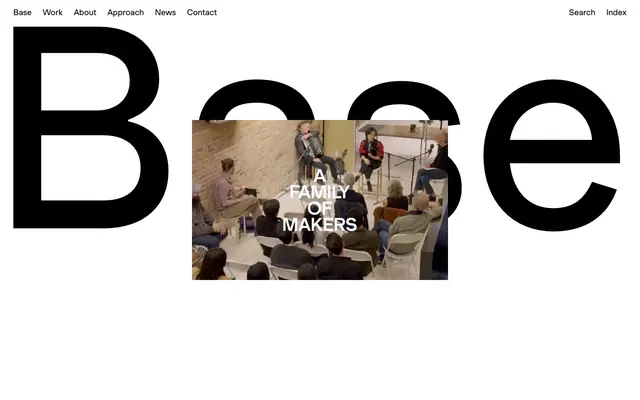
Preview image. Unlock full-res
Minimalist canvas, bold typography.
Color palette
Page backgrounds, large brand blocks, interactive element backgrounds
All primary text, borders, iconography, and large graphical elements
Muted helper text, secondary information, and subtle borders
Typography
- Weights
- 300, 400, 500, 700
- Sizes
- 12px, 16px, 18px, 25px, 30px, 32px, 50px, 60px, 65px
- Line height
- 1.15, 1.17, 1.2, 1.3, 1.33, 1.4
- Letter spacing
- 0.0100em
- Fallback
- Inter
The primary and sole typeface for all content, navigation, and branding. Its versatility across weights and generous letter-spacing contributes to the distinctively open and legible feel of the design. The subtle, slightly increased letter-spacing across all sizes prevents text from feeling dense and reinforces the minimalist aesthetic.
Spacing & shape
Components
Ghost button with rounded corners for secondary actions. Text is Midnight Ink (#000000) on Canvas White (#ffffff) background, with a 2px Midnight Ink border. Padding is 8px vertical, 22px horizontal, and a very high 54px border-radius creates the pill shape.
Solid Canvas White (#ffffff) background with Midnight Ink (#000000) text. No border, square corners. Generous 20px padding on all sides. Used for prominent calls to action within content areas.
Pure text link with Midnight Ink (#000000) text on a transparent background. No padding or border defined, relying on typography alone. Appears as a simple, clickable text string.
Guidelines
- Prioritize Canvas White (#ffffff) for all main backgrounds and Midnight Ink (#000000) for all text and borders.
- Use BaseGrotesk across all typographic elements, leveraging its consistent letter-spacing of 0.0100em.
- Apply a 54px border-radius to pill-shaped buttons to maintain a soft, distinct interaction style.
- Maintain generous negative space around content blocks and sections to emphasize clarity and scale.
- Ensure all interactive elements, particularly text links, are distinctly underlined on hover if not already by default.
- Use Ash Gray (#ababab) sparingly for subordinate text or subtle dividing lines, never for primary content.
- All navigation and primary branding elements should feature BaseGrotesk, respecting the established type scale.
- Avoid using multiple typefaces; BaseGrotesk is the only sanctioned font.
- Do not introduce new color hues; strictly adhere to the monochromatic palette of Canvas White, Midnight Ink, and Ash Gray.
- Refrain from using sharp, square corners on interactive elements where a rounded alternative exists.
- Do not overcrowd sections; maintain a spacious layout with a section gap of 40px.
- Avoid decorative elements or excessive imagery that could detract from the bold, minimal aesthetic.
- Do not use subtle elevation; the design system relies on stark color contrast and white space for hierarchy.
- Never deviate from the specified padding for interactive elements; for example, pill buttons must have 8px vertical and 22px horizontal padding.
About this system
ShowHide
Base Design uses a high-contrast, minimalist aesthetic that champions clarity and boldness. The visual style is dominated by stark black-on-white typography with generous negative space, creating a sense of understated authority. Large-scale branding elements are interspersed with functional text and navigation, all rendered with a consistent, precise typographic hierarchy. The overall impression is one of directness and sophisticated simplicity.
The page primarily uses a full-bleed layout, where content elements stretch across the full width of the viewport, particularly for large brand statements and hero sections. There is no explicit `pageMaxWidth` constraint. Sections are visually distinct through large blocks of content often featuring oversized typography or video embeds. Vertical rhythm is established through significant white space, with a section gap of 40px. The hero section often features oversized, bold typography that integrates with or overlays background motion imagery. Content arrangement tends towards simple, centered stacks or large single elements dominating the screen, reinforcing the minimalist and direct communication style. Navigation is a persistent top bar, minimalistic and unobtrusive against the predominantly white canvas.
Imagery follows a clean, often raw and authentic style, featuring documentary-like video stills, unpolished photography, or bold, large-scale black and white typographic elements. No ornamental graphics or heavy illustrations are present. When photography is used, it often shows people in natural, creative work environments, implying a focus on process and real-world impact rather than aspirational perfection. Imagery is either full-bleed or contained within large, unadorned blocks, maintaining a high-contrast relationship with the surrounding whitespace or black backgrounds.
Reminiscent of Huge Inc., Anagrama, Chermayeff & Geismar & Haviv, Pentagram.
# Base Design — Style Reference
> Minimalist canvas, bold typography.

**Theme:** light

**Site:** https://www.basedesign.com

Base Design uses a high-contrast, minimalist aesthetic that champions clarity and boldness. The visual style is dominated by stark black-on-white typography with generous negative space, creating a sense of understated authority. Large-scale branding elements are interspersed with functional text and navigation, all rendered with a consistent, precise typographic hierarchy. The overall impression is one of directness and sophisticated simplicity.

## Tokens — Colors

| Name | Value | Token | Role |
|------|------|------|------|
| Canvas White | `#ffffff` | `--color-canvas-white` | Page backgrounds, large brand blocks, interactive element backgrounds |
| Midnight Ink | `#000000` | `--color-midnight-ink` | All primary text, borders, iconography, and large graphical elements |
| Ash Gray | `#ababab` | `--color-ash-gray` | Muted helper text, secondary information, and subtle borders |

## Tokens — Typography

### BaseGrotesk
- **Substitute:** Inter
- **Weights:** 300, 400, 500, 700
- **Sizes:** 12px, 16px, 18px, 25px, 30px, 32px, 50px, 60px, 65px
- **Line height:** 1.15, 1.17, 1.2, 1.3, 1.33, 1.4
- **Letter spacing:** 0.0100em
- **Role:** The primary and sole typeface for all content, navigation, and branding. Its versatility across weights and generous letter-spacing contributes to the distinctively open and legible feel of the design. The subtle, slightly increased letter-spacing across all sizes prevents text from feeling dense and reinforces the minimalist aesthetic.

## Tokens — Type Scale

Major Third (1.25) from 18px base.

| Role | Size | Line height | Letter spacing |
|------|------|------|------|
| caption | 12px | 1.4 | — |
| body-sm | 16px | 1.4 | — |
| body | 18px | 1.4 | — |
| subheading | 25px | 1.33 | — |
| heading-sm | 30px | 1.3 | — |
| heading | 32px | 1.3 | — |
| heading-lg | 50px | 1.2 | — |
| display | 65px | 1.15 | — |

## Tokens — Spacing

- **Section gap:** 40px
- **Card padding:** 20px
- **Element gap:** 7px

## Tokens — Radius

- **Buttons:** 54px

## Layout

The page primarily uses a full-bleed layout, where content elements stretch across the full width of the viewport, particularly for large brand statements and hero sections. There is no explicit `pageMaxWidth` constraint. Sections are visually distinct through large blocks of content often featuring oversized typography or video embeds. Vertical rhythm is established through significant white space, with a section gap of 40px. The hero section often features oversized, bold typography that integrates with or overlays background motion imagery. Content arrangement tends towards simple, centered stacks or large single elements dominating the screen, reinforcing the minimalist and direct communication style. Navigation is a persistent top bar, minimalistic and unobtrusive against the predominantly white canvas.

## Imagery

Imagery follows a clean, often raw and authentic style, featuring documentary-like video stills, unpolished photography, or bold, large-scale black and white typographic elements. No ornamental graphics or heavy illustrations are present. When photography is used, it often shows people in natural, creative work environments, implying a focus on process and real-world impact rather than aspirational perfection. Imagery is either full-bleed or contained within large, unadorned blocks, maintaining a high-contrast relationship with the surrounding whitespace or black backgrounds.

## Components

### Pill Ghost Button
*Secondary action button*

Ghost button with rounded corners for secondary actions. Text is Midnight Ink (#000000) on Canvas White (#ffffff) background, with a 2px Midnight Ink border. Padding is 8px vertical, 22px horizontal, and a very high 54px border-radius creates the pill shape.

### Contrast Fill Button
*Primary action button, often for content blocks*

Solid Canvas White (#ffffff) background with Midnight Ink (#000000) text. No border, square corners. Generous 20px padding on all sides. Used for prominent calls to action within content areas.

### Text Link Button
*Minimal interactive element, typically for navigation or inline actions*

Pure text link with Midnight Ink (#000000) text on a transparent background. No padding or border defined, relying on typography alone. Appears as a simple, clickable text string.

## Guidelines

### Do

- Prioritize Canvas White (#ffffff) for all main backgrounds and Midnight Ink (#000000) for all text and borders.
- Use BaseGrotesk across all typographic elements, leveraging its consistent letter-spacing of 0.0100em.
- Apply a 54px border-radius to pill-shaped buttons to maintain a soft, distinct interaction style.
- Maintain generous negative space around content blocks and sections to emphasize clarity and scale.
- Ensure all interactive elements, particularly text links, are distinctly underlined on hover if not already by default.
- Use Ash Gray (#ababab) sparingly for subordinate text or subtle dividing lines, never for primary content.
- All navigation and primary branding elements should feature BaseGrotesk, respecting the established type scale.

### Don't

- Avoid using multiple typefaces; BaseGrotesk is the only sanctioned font.
- Do not introduce new color hues; strictly adhere to the monochromatic palette of Canvas White, Midnight Ink, and Ash Gray.
- Refrain from using sharp, square corners on interactive elements where a rounded alternative exists.
- Do not overcrowd sections; maintain a spacious layout with a section gap of 40px.
- Avoid decorative elements or excessive imagery that could detract from the bold, minimal aesthetic.
- Do not use subtle elevation; the design system relies on stark color contrast and white space for hierarchy.
- Never deviate from the specified padding for interactive elements; for example, pill buttons must have 8px vertical and 22px horizontal padding.

## Agent Prompt Guide

Quick Color Reference:
- text: #000000
- background: #ffffff
- border: #000000
- accent: no distinct accent color
- primary action: no distinct CTA color

Example Component Prompts:
- Create a navigation link: BaseGrotesk, 16px, weight 400, #000000, 0.0100em letter-spacing. Use 25px right margin between links.
- Create a pill ghost button: BaseGrotesk, 16px, weight 400, #000000 text, transparent background, #000000 2px border, 54px border-radius, 8px vertical padding, 22px horizontal padding.
- Create a large primary heading: BaseGrotesk, 65px, weight 700, #000000, 0.0100em letter-spacing, centered.
More like this









Keep what you find
A free account saves references to boards and can send you a weekly email of picks based on what you save.
To see every result, go Pro.