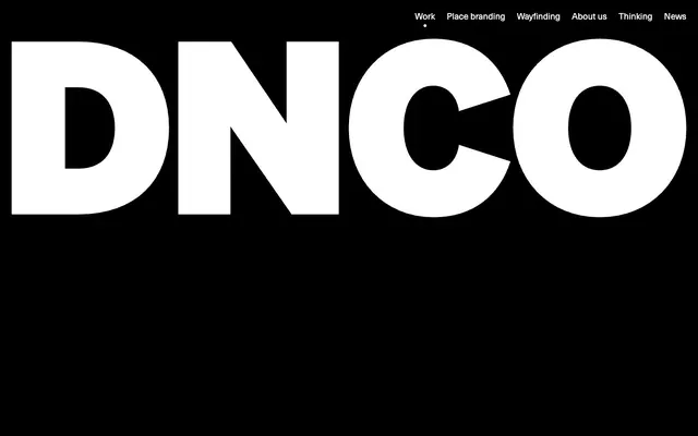
Preview image. Unlock full-res
Graphic exhibition space.
Color palette
Primary text, heading text, background for hero sections and footer, structural elements
Secondary background, general page background for most content sections, navigation text, icon fills
Hairline borders, dividers, input outlines, and card edges on light surfaces. Do not promote it to the primary CTA color
Muted body text, helper text, secondary links for lower hierarchy information
Typography
- Weights
- 400
- Sizes
- 16px, 18px, 22px, 72px
- Line height
- 1, 1.25, 1.33, 1.5, 1.56
- Letter spacing
- -0.0250em
- Fallback
- Helvetica Neue
The primary typeface for all text content, from headings to body copy, maintaining a consistent minimalist yet impactful tone. The tight letter-spacing enforces a sense of precision and graphic density.
Spacing & shape
Components
Displays as Canvas White text on a Midnight Ink background or Midnight Ink text on a Canvas White background. An underline interaction is implied by transitions but not a static style.
Text-only button with no background or border in its default state. Text color is Midnight Ink. Interaction is implied visually but no explicit styling is provided for the default state from the data. Used for 'All', 'Sector', 'Location', 'Expertise' filters, etc.
A ghost button, typically Midnight Ink text on a transparent background, but defined by a 1px solid Concrete Gray border. Radius is 0px as per the component variant data. Padding around text is variable based on context but minimal.
Midnight Ink text by default, often appearing in close proximity to a Concrete Gray border for visual separation or structuring elements. Muted Ash for lower hierarchy links.
Presented in Neue Haas Unica Pro, 72px, weight 400, Midnight Ink color, with a tight letter-spacing of -0.0250em. Often against a stark white or black background, commanding immediate attention through size and contrast.
A 1px solid border using Concrete Gray, creating subtle but clear divisions on the Canvas White background. Often found at the base of sections.
Guidelines
- Prioritize Neue Haas Unica Pro typography at 72px with -0.0250em letter-spacing for large headlines, utilizing Midnight Ink on Canvas White or vice versa for maximum impact.
- Use a purely achromatic palette of Midnight Ink (#000000), Canvas White (#ffffff), and Concrete Gray (#e5e7eb) for all UI elements to maintain a stark, graphic aesthetic.
- Employ Concrete Gray (#e5e7eb) for all subtle borders and dividers, typically at 1px thickness, to define boundaries without adding visual weight.
- Ensure interactive elements like buttons and navigation links transition with a duration of 0.3s and an `ease` timing function.
- Maintain minimal padding on interactive text elements (e.g., 0px for text-only buttons in the component variant example) to keep them lightweight.
- Use Muted Ash (#a3a3a3) exclusively for secondary or informational text, never for primary actions or main headings.
- Apply 9999px border-radius for all small, interactive elements like tags and navigation items, creating a 'pill' shape.
- Do not introduce additional colors beyond Midnight Ink, Canvas White, Concrete Gray, and Muted Ash for functional UI elements.
- Avoid using drop shadows or complex gradients; the design relies on flat surfaces and high contrast.
- Do not deviate from the Neue Haas Unica Pro font family or its specified letter-spacing for any text content.
- Do not add heavy backgrounds or large fills to interactive elements; maintain a lightweight, often border-only or text-only approach.
- Do not vary font weights; consistency with 400 weight across all text is key to the system's character.
- Avoid excessive spacing between UI elements or sections; aim for a 'comfortable' density as defined by the elementGap and sectionGap.
- Do not use generic system default link colors; ensure all link text uses either Midnight Ink, Canvas White, or Muted Ash.
About this system
ShowHide
DNCO uses a bold, high-contrast visual language reminiscent of abstract expressionism. Large-scale typography on stark backgrounds defines a significant portion of the primary messaging. The palette is intentionally minimal, relying on black, white, and a single light gray for structure, with interactivity indicated subtly through borders and hover states. Components are lightweight and direct, ensuring that content, especially large text, remains the focal point.
The page model alternates between full-bleed sections and max-width contained sections, with a generally centered content approach. The hero uses a text-dominant, large-scale headline against a black background. Section rhythm is established by alternating Midnight Ink and Canvas White backgrounds, with concrete gray borders often serving as subtler dividers. Content is frequently arranged in a stacked, centered manner for headlines and subtext, and then transitions to a multi-column grid for project showcases where images are primary. Navigation is a minimal top-right bar on a white background, becoming white text on black in the hero.
The site uses product photography that is contained within rectangular frames, often full-bleed against sections of the page. The images are high-quality, often featuring people interacting with 'place brands' or architectural contexts, emphasizing lifestyle and experience. There's a mix of candid and staged photography, treated with natural colors, avoiding filters or heavy stylization. Imagery serves to showcase project examples and add visual richness without overwhelming the stark UI.
Reminiscent of Huge Inc., Pentagram, Wolff Olins.
# DNCO — Style Reference
> Graphic exhibition space.

**Theme:** light

**Site:** https://dnco.com

DNCO uses a bold, high-contrast visual language reminiscent of abstract expressionism. Large-scale typography on stark backgrounds defines a significant portion of the primary messaging. The palette is intentionally minimal, relying on black, white, and a single light gray for structure, with interactivity indicated subtly through borders and hover states. Components are lightweight and direct, ensuring that content, especially large text, remains the focal point.

## Tokens — Colors

| Name | Value | Token | Role |
|------|------|------|------|
| Midnight Ink | `#000000` | `--color-midnight-ink` | Primary text, heading text, background for hero sections and footer, structural elements |
| Canvas White | `#ffffff` | `--color-canvas-white` | Secondary background, general page background for most content sections, navigation text, icon fills |
| Concrete Gray | `#e5e7eb` | `--color-concrete-gray` | Hairline borders, dividers, input outlines, and card edges on light surfaces. Do not promote it to the primary CTA color |
| Muted Ash | `#a3a3a3` | `--color-muted-ash` | Muted body text, helper text, secondary links for lower hierarchy information |

## Tokens — Typography

### Neue Haas Unica Pro
- **Substitute:** Helvetica Neue
- **Weights:** 400
- **Sizes:** 16px, 18px, 22px, 72px
- **Line height:** 1, 1.25, 1.33, 1.5, 1.56
- **Letter spacing:** -0.0250em
- **Role:** The primary typeface for all text content, from headings to body copy, maintaining a consistent minimalist yet impactful tone. The tight letter-spacing enforces a sense of precision and graphic density.

## Tokens — Type Scale

Golden Ratio (1.618) from 16px base.

| Role | Size | Line height | Letter spacing |
|------|------|------|------|
| body | 16px | 1.56 | -0.4px |
| subheading | 18px | 1.5 | -0.45px |
| heading-sm | 22px | 1.33 | -0.55px |
| display | 72px | 1 | -1.8px |

## Tokens — Spacing

- **Section gap:** 24px
- **Element gap:** 24px

## Tokens — Radius

- **Buttons:** 9999px
- **interactiveElements:** 9999px
- **tags:** 9999px

## Layout

The page model alternates between full-bleed sections and max-width contained sections, with a generally centered content approach. The hero uses a text-dominant, large-scale headline against a black background. Section rhythm is established by alternating Midnight Ink and Canvas White backgrounds, with concrete gray borders often serving as subtler dividers. Content is frequently arranged in a stacked, centered manner for headlines and subtext, and then transitions to a multi-column grid for project showcases where images are primary. Navigation is a minimal top-right bar on a white background, becoming white text on black in the hero.

## Imagery

The site uses product photography that is contained within rectangular frames, often full-bleed against sections of the page. The images are high-quality, often featuring people interacting with 'place brands' or architectural contexts, emphasizing lifestyle and experience. There's a mix of candid and staged photography, treated with natural colors, avoiding filters or heavy stylization. Imagery serves to showcase project examples and add visual richness without overwhelming the stark UI.

## Components

### Navigation Link
*Main navigation and footer links*

Displays as Canvas White text on a Midnight Ink background or Midnight Ink text on a Canvas White background. An underline interaction is implied by transitions but not a static style.

### Filter Button (Text Only)
*Category/filter selection*

Text-only button with no background or border in its default state. Text color is Midnight Ink. Interaction is implied visually but no explicit styling is provided for the default state from the data. Used for 'All', 'Sector', 'Location', 'Expertise' filters, etc.

### Outlined Filter Button
*Categorization or filtering, visually separating options*

A ghost button, typically Midnight Ink text on a transparent background, but defined by a 1px solid Concrete Gray border. Radius is 0px as per the component variant data. Padding around text is variable based on context but minimal.

### Body Text Link
*Contextual navigation or references within body content*

Midnight Ink text by default, often appearing in close proximity to a Concrete Gray border for visual separation or structuring elements. Muted Ash for lower hierarchy links.

### Hero Headline
*Page-level and major section headlines*

Presented in Neue Haas Unica Pro, 72px, weight 400, Midnight Ink color, with a tight letter-spacing of -0.0250em. Often against a stark white or black background, commanding immediate attention through size and contrast.

### Section Divider
*Visual separation of content blocks*

A 1px solid border using Concrete Gray, creating subtle but clear divisions on the Canvas White background. Often found at the base of sections.

## Guidelines

### Do

- Prioritize Neue Haas Unica Pro typography at 72px with -0.0250em letter-spacing for large headlines, utilizing Midnight Ink on Canvas White or vice versa for maximum impact.
- Use a purely achromatic palette of Midnight Ink (#000000), Canvas White (#ffffff), and Concrete Gray (#e5e7eb) for all UI elements to maintain a stark, graphic aesthetic.
- Employ Concrete Gray (#e5e7eb) for all subtle borders and dividers, typically at 1px thickness, to define boundaries without adding visual weight.
- Ensure interactive elements like buttons and navigation links transition with a duration of 0.3s and an `ease` timing function.
- Maintain minimal padding on interactive text elements (e.g., 0px for text-only buttons in the component variant example) to keep them lightweight.
- Use Muted Ash (#a3a3a3) exclusively for secondary or informational text, never for primary actions or main headings.
- Apply 9999px border-radius for all small, interactive elements like tags and navigation items, creating a 'pill' shape.

### Don't

- Do not introduce additional colors beyond Midnight Ink, Canvas White, Concrete Gray, and Muted Ash for functional UI elements.
- Avoid using drop shadows or complex gradients; the design relies on flat surfaces and high contrast.
- Do not deviate from the Neue Haas Unica Pro font family or its specified letter-spacing for any text content.
- Do not add heavy backgrounds or large fills to interactive elements; maintain a lightweight, often border-only or text-only approach.
- Do not vary font weights; consistency with 400 weight across all text is key to the system's character.
- Avoid excessive spacing between UI elements or sections; aim for a 'comfortable' density as defined by the elementGap and sectionGap.
- Do not use generic system default link colors; ensure all link text uses either Midnight Ink, Canvas White, or Muted Ash.

## Agent Prompt Guide

**Quick Color Reference**
- text: #000000
- background: #ffffff
- border: #e5e7eb
- accent: no distinct accent color
- primary action: no distinct CTA color

**3-5 Example Component Prompts**
- Create a section divider: 1px solid border, color #e5e7eb.
- Create a hero headline: "We create place brands that move your world", Neue Haas Unica Pro, 72px, weight 400, color #000000, letter-spacing -0.0250em.
- Create a navigation link: "Work", Neue Haas Unica Pro, 16px, weight 400, color #000000.
- Create a text-only filter button: "All", Neue Haas Unica Pro, 16px, weight 400, color #000000, no background, 0px border-radius, 0px padding.
- Create an outlined filter button: "Sector", Neue Haas Unica Pro, 16px, weight 400, color #000000, 1px solid border #e5e7eb, 0px border-radius, 12px 14px padding.
More like this









Keep what you find
A free account saves references to boards and can send you a weekly email of picks based on what you save.
To see every result, go Pro.