Preview image. Unlock full-res
Black & White Manifesto
Color palette
Page backgrounds, primary card surfaces, inverse text on dark elements
Primary text, heading text, navigation elements, dark background accents, button backgrounds. Defines the core contrast
Hairline borders, dividers, input outlines, and card edges on light surfaces. Do not promote it to the primary CTA color
Muted text, secondary navigation items, and hairline borders for less prominent elements
Text color for default, non-filled buttons, chosen for readability against white
Typography
- Weights
- 400, 700
- Sizes
- 14px, 16px, 24px, 30px
- Line height
- 1.25, 1.33, 1.6, 1.71
- Fallback
- Open Sans
Body text, smaller headings, navigation links, and footer content. Its legibility balances the bolder display font.
- Weights
- 400, 500
- Sizes
- 14px, 22px, 23px, 25px, 48px, 60px
- Line height
- 1, 1.1, 1.6, 1.71
- Fallback
- Montserrat
Dominant display font for large headings, hero text, and key brand statements. Its geometric structure and varying weights create a commanding presence.
- Weights
- 400, 700
- Sizes
- 12px
- Line height
- 1
- Fallback
- Inter
Used specifically for button text at a small size, maintaining crispness and efficiency.
Spacing & shape
Components
Text in Button Text Gray (#4e4a4a), no background, 1px Ghost Border (#d8d8d8). Padding is 5px top, 20px right, 6px bottom, 20px left. Zero border-radius for sharp, decisive edges.
Solid Midnight Black (#000000) background with Canvas White (#ffffff) text. Padding is 8px top, 13px right, 10px bottom, 13px left. Zero border-radius for a strong, unyielding presence.
Transparent background with no box shadow and 0px border-radius. Padding is 0px on all sides, allowing content to dictate visual spacing. Borders are applied semantically to elements within the card, not the card itself.
Transparent background with Midnight Black (#000000) text. Padding is 1px top, 0px right, 0px bottom, 1px left. Zero border-radius, often with 15px top margin for separation.
Guidelines
- Prioritize text with Midnight Black (#000000) on Canvas White (#ffffff) for all primary content and actions, ensuring AAA contrast.
- Use Telegraf for all headline-level text (sizes 22px-60px) and Quattrocento Sans for body text (sizes 14px-30px, always with letterSpacing normal).
- Maintain a strict '0px' border-radius for all component corners, reinforcing a sharp and angular aesthetic.
- Implement Ghost Action Buttons with 1px Ghost Border (#d8d8d8) and text color Button Text Gray (#4e4a4a) for secondary interactions.
- Implement Primary Action Buttons with solid Midnight Black (#000000) backgrounds and Canvas White (#ffffff) text for critical interactions.
- Employ consistent 20px padding for element and card spacing, allowing content to breathe without excessive white space.
- Avoid using saturated or bright colors; the system relies almost exclusively on achromatic tones.
- Do not introduce rounded corners or soft edges; all visual elements should adhere to a strict 0px border-radius.
- Refrain from adding UI shadows or significant elevation; surfaces should remain flat and compositional.
- Do not use generic system fonts when custom fonts Telegraf and Quattrocento Sans are specified; their distinctiveness is key to the brand.
- Avoid decorative gradients or background imagery on UI elements; maintain a clean, text-first presentation.
- Do not deviate from the specified spacing units; consistent element and card spacing is crucial for structure.
About this system
ShowHide
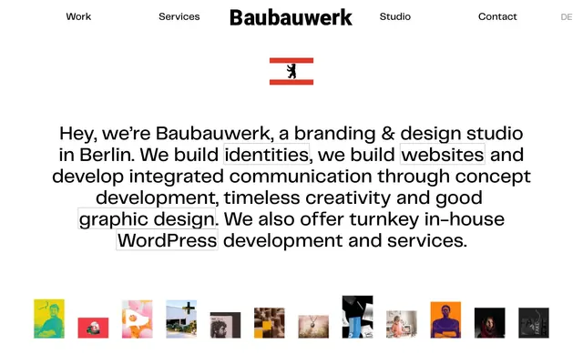
Baubauwerk presents a stark, high-contrast visual system built on uncompromising black and white. Typography carries the primary visual weight, feeling both academic and modern, with minimal use of color beyond functional roles. Surfaces are flat and unadorned, relying on crisp text and strong compositional lines rather than elevation or gradients. The overall atmosphere is direct, confident, and text-focused, allowing content to take precedence without visual interruption.
The page structure is a contained layout, with content centered within a maximum width that supports a clear columned approach. The hero section features a prominent, centered headline with a minimal visual accent (the Berlin bear graphic). Sections often alternate between content blocks and image galleries. A consistent vertical rhythm is maintained with specific section and element gaps. Navigation is a simple top bar with left-aligned links and a right-aligned language toggle. Content often uses 2 or 3-column grids for feature cards or blog posts, creating a structured, information-dense display.
This system primarily uses embedded functional imagery: product screenshots, tightly cropped visual examples of work, and small profile pictures. Photography is typically high-contrast, often with a stark, journalistic quality and a focus on the subject. Illustrations, if present, are minimal and flat. Icons are generally filled and monochromatic. Imagery serves as explanatory content or showcases product/portfolio, rather than decorative atmosphere, and is often presented in small, contained squares.
Reminiscent of AIGA, Pentagram, Manual (design studio).
# Baubauwerk — Style Reference
> Black & White Manifesto

**Theme:** light

**Site:** https://baubauwerk.com

Baubauwerk presents a stark, high-contrast visual system built on uncompromising black and white. Typography carries the primary visual weight, feeling both academic and modern, with minimal use of color beyond functional roles. Surfaces are flat and unadorned, relying on crisp text and strong compositional lines rather than elevation or gradients. The overall atmosphere is direct, confident, and text-focused, allowing content to take precedence without visual interruption.

## Tokens — Colors

| Name | Value | Token | Role |
|------|------|------|------|
| Canvas White | `#ffffff` | `--color-canvas-white` | Page backgrounds, primary card surfaces, inverse text on dark elements |
| Midnight Black | `#000000` | `--color-midnight-black` | Primary text, heading text, navigation elements, dark background accents, button backgrounds. Defines the core contrast |
| Ghost Border | `#d8d8d8` | `--color-ghost-border` | Hairline borders, dividers, input outlines, and card edges on light surfaces. Do not promote it to the primary CTA color |
| Subtle Gray | `#9b9b9b` | `--color-subtle-gray` | Muted text, secondary navigation items, and hairline borders for less prominent elements |
| Button Text Gray | `#4e4a4a` | `--color-button-text-gray` | Text color for default, non-filled buttons, chosen for readability against white |

## Tokens — Typography

### Quattrocento Sans
- **Substitute:** Open Sans
- **Weights:** 400, 700
- **Sizes:** 14px, 16px, 24px, 30px
- **Line height:** 1.25, 1.33, 1.6, 1.71
- **Role:** Body text, smaller headings, navigation links, and footer content. Its legibility balances the bolder display font.

### Telegraf
- **Substitute:** Montserrat
- **Weights:** 400, 500
- **Sizes:** 14px, 22px, 23px, 25px, 48px, 60px
- **Line height:** 1, 1.1, 1.6, 1.71
- **Role:** Dominant display font for large headings, hero text, and key brand statements. Its geometric structure and varying weights create a commanding presence.

### Roboto
- **Substitute:** Inter
- **Weights:** 400, 700
- **Sizes:** 12px
- **Line height:** 1
- **Role:** Used specifically for button text at a small size, maintaining crispness and efficiency.

## Tokens — Type Scale

Major Third (1.25) from 16px base.

| Role | Size | Line height | Letter spacing |
|------|------|------|------|
| caption | 12px | 1 | — |
| body-sm | 14px | 1.25 | — |
| body | 16px | 1.33 | — |
| subheading | 22px | 1.1 | — |
| heading | 24px | 1.25 | — |
| heading-lg | 30px | 1.25 | — |
| display | 48px | 1 | — |

## Tokens — Spacing

- **Section gap:** 40px
- **Card padding:** 20px
- **Element gap:** 20px

## Tokens — Radius

- **none:** 0px

## Layout

The page structure is a contained layout, with content centered within a maximum width that supports a clear columned approach. The hero section features a prominent, centered headline with a minimal visual accent (the Berlin bear graphic). Sections often alternate between content blocks and image galleries. A consistent vertical rhythm is maintained with specific section and element gaps. Navigation is a simple top bar with left-aligned links and a right-aligned language toggle. Content often uses 2 or 3-column grids for feature cards or blog posts, creating a structured, information-dense display.

## Imagery

This system primarily uses embedded functional imagery: product screenshots, tightly cropped visual examples of work, and small profile pictures. Photography is typically high-contrast, often with a stark, journalistic quality and a focus on the subject. Illustrations, if present, are minimal and flat. Icons are generally filled and monochromatic. Imagery serves as explanatory content or showcases product/portfolio, rather than decorative atmosphere, and is often presented in small, contained squares.

## Components

### Ghost Action Button
*Secondary action button for filtering and navigation.*

Text in Button Text Gray (#4e4a4a), no background, 1px Ghost Border (#d8d8d8). Padding is 5px top, 20px right, 6px bottom, 20px left. Zero border-radius for sharp, decisive edges.

### Primary Action Button
*Prominent calls to action.*

Solid Midnight Black (#000000) background with Canvas White (#ffffff) text. Padding is 8px top, 13px right, 10px bottom, 13px left. Zero border-radius for a strong, unyielding presence.

### Feature Card
*Content container for articles or project showcases.*

Transparent background with no box shadow and 0px border-radius. Padding is 0px on all sides, allowing content to dictate visual spacing. Borders are applied semantically to elements within the card, not the card itself.

### Category Badge
*Small, descriptive labels for content.*

Transparent background with Midnight Black (#000000) text. Padding is 1px top, 0px right, 0px bottom, 1px left. Zero border-radius, often with 15px top margin for separation.

## Guidelines

### Do

- Prioritize text with Midnight Black (#000000) on Canvas White (#ffffff) for all primary content and actions, ensuring AAA contrast.
- Use Telegraf for all headline-level text (sizes 22px-60px) and Quattrocento Sans for body text (sizes 14px-30px, always with letterSpacing normal).
- Maintain a strict '0px' border-radius for all component corners, reinforcing a sharp and angular aesthetic.
- Implement Ghost Action Buttons with 1px Ghost Border (#d8d8d8) and text color Button Text Gray (#4e4a4a) for secondary interactions.
- Implement Primary Action Buttons with solid Midnight Black (#000000) backgrounds and Canvas White (#ffffff) text for critical interactions.
- Employ consistent 20px padding for element and card spacing, allowing content to breathe without excessive white space.

### Don't

- Avoid using saturated or bright colors; the system relies almost exclusively on achromatic tones.
- Do not introduce rounded corners or soft edges; all visual elements should adhere to a strict 0px border-radius.
- Refrain from adding UI shadows or significant elevation; surfaces should remain flat and compositional.
- Do not use generic system fonts when custom fonts Telegraf and Quattrocento Sans are specified; their distinctiveness is key to the brand.
- Avoid decorative gradients or background imagery on UI elements; maintain a clean, text-first presentation.
- Do not deviate from the specified spacing units; consistent element and card spacing is crucial for structure.

## Agent Prompt Guide

Quick Color Reference: text: #000000, background: #ffffff, border: #d8d8d8, primary action: no distinct CTA color

Example Component Prompts:
Create a hero section: Canvas White background. Headline 'Hey, we’re Baubauwerk' at 48px Telegraf, weight 400, Midnight Black. Subtext 'a branding & design studio in Berlin.' at 24px Quattrocento Sans, weight 400, Midnight Black.
Create a Ghost Action Button: text 'Corporate Design' in Button Text Gray (#4e4a4a), 1px Ghost Border (#d8d8d8), 0px radius, 5px top, 20px right, 6px bottom, 20px left padding.
No distinct primary action color was observed; use the extracted neutral button treatments instead of inventing a filled CTA color.
Create a Blog Post Card: Transparent background, no shadow, 0px radius. Headline 'Baubauwerk's design selected' at 24px Telegraf, weight 400, Midnight Black. Category badge 'News' in Midnight Black text, transparent background, 1px top, 0px right, 0px bottom, 1px left padding, 0px radius.
More like this









Keep what you find
A free account saves references to boards and can send you a weekly email of picks based on what you save.
To see every result, go Pro.