Preview image. Unlock full-res
monochromatic gallery, bold typography
Color palette
Page backgrounds, card surfaces, ghost button backgrounds, default text colors for inverted elements
Dark borders and separators for elevated surfaces and inverted UI. Do not promote it to the primary CTA color
Muted secondary text, subtle borders, and background accents for minor text elements
Dark borders and separators for elevated surfaces and inverted UI. Do not promote it to the primary CTA color
Typography
- Weights
- 400
- Sizes
- 13px, 14px, 15px, 16px, 18px, 20px, 30px, 35px, 180px
- Line height
- 0.72, 0.75, 1.1, 1.25, 1.38, 1.5
- Letter spacing
- normal
- Fallback
- Inter
The sole typeface, spanning all text elements from body copy to oversized headlines. Its consistent application at varying sizes and line heights defines the site's typographic hierarchy and bold, modern yet classic feel.
Spacing & shape
Components
Ghost button with `Canvas White` background, `Slate Text` for text and border, padding `4px` vertical, `20px` horizontal for left, `8px` horizontal for right. Features a `3px` border-radius and a subtle inner shadow `rgba(0, 0, 0, 0.15) 0px 0px 0px 1px inset, rgba(0, 0, 0, 0.15) 0px 1px 1px -1px`.
Navigation links and primary calls to action are rendered in `Midnight Ink` with Aeonik 400. They have a `40px` border-radius at the corners to imply an oval shape, and padding of `7px` vertical and `8px` horizontal.
A `Canvas White` card with a `100%` border-radius, creating a circular shape. No shadow or padding, designed for contained visual elements or icons.
Body text blocks with a primary `Midnight Ink` color, typically uses Aeonik 400 at sizes around `16px` to `20px`. Generous line heights are `1.25` to `1.5` for readability and ample `15px` left and right horizontal padding, and `135px` top padding for section breaks.
A `Canvas White` button with `Midnight Ink` text and borders. It features a `3px` radius, `4px` vertical padding, and `20px` left / `8px` right horizontal padding. Similar styling to the primary ghost button, serving a secondary interactive function.
Guidelines
- Use `Midnight Ink` (`#000000`) for all primary text and headings to establish strong contrast against `Canvas White` (`#ffffff`).
- Apply Aeonik 400 exclusively for all typeface requirements, adjusting size and line height to create hierarchy, not weight changes.
- Maintain generous vertical spacing, using `30px` as a standard `sectionGap` between distinct content blocks for a spacious feel.
- Employ the `3px` border-radius for interactive buttons and the `40px` border-radius for distinct oval-shaped links to differentiate interaction types.
- Center all content blocks horizontally with a `900px` `pageMaxWidth` to maintain a contained and focused layout.
- Use `Ash Gray` (`#9d9d9d`) for subtle borders or secondary information where `Midnight Ink` would be too dominant.
- Implement the subtle button shadow `rgba(0, 0, 0, 0.15) 0px 0px 0px 1px inset, rgba(0, 0, 0, 0.15) 0px 1px 1px -1px` for all button hover/active states or subtle elevation.
- Do not introduce additional font families or weights beyond Aeonik 400.
- Avoid using saturated colors; the palette is strictly achromatic with black and white as dominant tones.
- Do not break the `900px` `pageMaxWidth` for primary content sections; hero elements can extend full-bleed visually but the content within should adhere to the max-width.
- Do not use heavy, filled button styles; all primary interactive elements should leverage ghost or outlined button aesthetics.
- Avoid decorative gradients or drop shadows; elevation is minimal and subtle, primarily through outlines or inset shadows.
- Do not use small, cramped spacing; aim for comfortable `15px` `elementGap` and `20px` `cardPadding` to enhance readability and visual breathing room.
- Do not introduce border radii other than `3px`, `40px`, or `80px` (for circular elements) to maintain shape consistency.
About this system
ShowHide
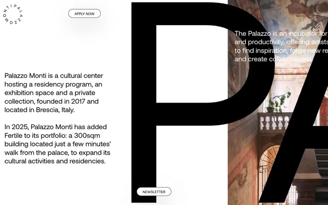
Palazzo Monti employs a stark, high-contrast aesthetic with a minimalist footprint. Black text on white canvas dominates, with generous negative space emphasizing content. The design features a single, custom sans-serif typeface used across all elements, creating a cohesive typographic voice. Components are lightweight and often outlined, playing into a 'ghost' or 'inverted' button style, and circular elements appear as an unexpected geometric motif.
The page adheres to a `900px` fixed-width centered container for most content, creating a strong sense of structure. The hero section often features oversized typography (`display` role) laid over a full-bleed atmospheric image, contrasting with the contained sections below. Content is arranged in a classic stacked format, with `30px` `sectionGap` providing distinct visual separation. There are no explicit grid layouts for features; instead, content like team members or partners seems to be handled with simple lists or sequential blocks. Navigation consists of a left-aligned, rotated brand name and a clear 'Apply Now' button, implying a minimal, focused approach to site navigation.
The site uses photography primarily as background elements, often large-scale and subtly integrated, such as the historical palazzo interior serving as a backdrop to text. Imagery is not presented front-and-center but acts as atmospheric context. There are no outlined or filled icons visible, suggesting an aesthetic that relies on typography and whitespace. The limited imagery suggests a text-dominant design where visuals provide mood rather than direct information.
Reminiscent of AIGA Journal, The Paris Review, Moleskine, The New York Times (archive).
# PALAZZO MONTI — Style Reference
> monochromatic gallery, bold typography

**Theme:** light

**Site:** https://palazzomonti.org

Palazzo Monti employs a stark, high-contrast aesthetic with a minimalist footprint. Black text on white canvas dominates, with generous negative space emphasizing content. The design features a single, custom sans-serif typeface used across all elements, creating a cohesive typographic voice. Components are lightweight and often outlined, playing into a 'ghost' or 'inverted' button style, and circular elements appear as an unexpected geometric motif.

## Tokens — Colors

| Name | Value | Token | Role |
|------|------|------|------|
| Canvas White | `#ffffff` | `--color-canvas-white` | Page backgrounds, card surfaces, ghost button backgrounds, default text colors for inverted elements |
| Midnight Ink | `#000000` | `--color-midnight-ink` | Dark borders and separators for elevated surfaces and inverted UI. Do not promote it to the primary CTA color |
| Ash Gray | `#9d9d9d` | `--color-ash-gray` | Muted secondary text, subtle borders, and background accents for minor text elements |
| Slate Text | `#595959` | `--color-slate-text` | Dark borders and separators for elevated surfaces and inverted UI. Do not promote it to the primary CTA color |

## Tokens — Typography

### Aeonik
- **Substitute:** Inter
- **Weights:** 400
- **Sizes:** 13px, 14px, 15px, 16px, 18px, 20px, 30px, 35px, 180px
- **Line height:** 0.72, 0.75, 1.1, 1.25, 1.38, 1.5
- **Letter spacing:** normal
- **Role:** The sole typeface, spanning all text elements from body copy to oversized headlines. Its consistent application at varying sizes and line heights defines the site's typographic hierarchy and bold, modern yet classic feel.

## Tokens — Type Scale

| Role | Size | Line height | Letter spacing |
|------|------|------|------|
| caption | 13px | 1.5 | — |
| heading-sm | 18px | 1.5 | — |
| heading | 20px | 1.38 | — |
| heading-lg | 30px | 1.25 | — |
| display | 180px | 0.72 | — |

## Tokens — Spacing

- **Max width:** 900px
- **Section gap:** 30px
- **Card padding:** 20px
- **Element gap:** 15px

## Tokens — Radius

- **button:** 3px
- **circular:** 80px
- **link:** 40px

## Layout

The page adheres to a `900px` fixed-width centered container for most content, creating a strong sense of structure. The hero section often features oversized typography (`display` role) laid over a full-bleed atmospheric image, contrasting with the contained sections below. Content is arranged in a classic stacked format, with `30px` `sectionGap` providing distinct visual separation. There are no explicit grid layouts for features; instead, content like team members or partners seems to be handled with simple lists or sequential blocks. Navigation consists of a left-aligned, rotated brand name and a clear 'Apply Now' button, implying a minimal, focused approach to site navigation.

## Imagery

The site uses photography primarily as background elements, often large-scale and subtly integrated, such as the historical palazzo interior serving as a backdrop to text. Imagery is not presented front-and-center but acts as atmospheric context. There are no outlined or filled icons visible, suggesting an aesthetic that relies on typography and whitespace. The limited imagery suggests a text-dominant design where visuals provide mood rather than direct information.

## Components

### Ghost Button
*Interactive action button*

Ghost button with `Canvas White` background, `Slate Text` for text and border, padding `4px` vertical, `20px` horizontal for left, `8px` horizontal for right. Features a `3px` border-radius and a subtle inner shadow `rgba(0, 0, 0, 0.15) 0px 0px 0px 1px inset, rgba(0, 0, 0, 0.15) 0px 1px 1px -1px`.

### Primary Link
*Navigation and key action links*

Navigation links and primary calls to action are rendered in `Midnight Ink` with Aeonik 400. They have a `40px` border-radius at the corners to imply an oval shape, and padding of `7px` vertical and `8px` horizontal.

### Circular Card
*Decorative or content containers with a distinct shape*

A `Canvas White` card with a `100%` border-radius, creating a circular shape. No shadow or padding, designed for contained visual elements or icons.

### Callout Text Block
*Prominent textual content sections*

Body text blocks with a primary `Midnight Ink` color, typically uses Aeonik 400 at sizes around `16px` to `20px`. Generous line heights are `1.25` to `1.5` for readability and ample `15px` left and right horizontal padding, and `135px` top padding for section breaks.

### Newsletter Button
*Secondary action button for subscriptions*

A `Canvas White` button with `Midnight Ink` text and borders. It features a `3px` radius, `4px` vertical padding, and `20px` left / `8px` right horizontal padding. Similar styling to the primary ghost button, serving a secondary interactive function.

## Guidelines

### Do

- Use `Midnight Ink` (`#000000`) for all primary text and headings to establish strong contrast against `Canvas White` (`#ffffff`).
- Apply Aeonik 400 exclusively for all typeface requirements, adjusting size and line height to create hierarchy, not weight changes.
- Maintain generous vertical spacing, using `30px` as a standard `sectionGap` between distinct content blocks for a spacious feel.
- Employ the `3px` border-radius for interactive buttons and the `40px` border-radius for distinct oval-shaped links to differentiate interaction types.
- Center all content blocks horizontally with a `900px` `pageMaxWidth` to maintain a contained and focused layout.
- Use `Ash Gray` (`#9d9d9d`) for subtle borders or secondary information where `Midnight Ink` would be too dominant.
- Implement the subtle button shadow `rgba(0, 0, 0, 0.15) 0px 0px 0px 1px inset, rgba(0, 0, 0, 0.15) 0px 1px 1px -1px` for all button hover/active states or subtle elevation.

### Don't

- Do not introduce additional font families or weights beyond Aeonik 400.
- Avoid using saturated colors; the palette is strictly achromatic with black and white as dominant tones.
- Do not break the `900px` `pageMaxWidth` for primary content sections; hero elements can extend full-bleed visually but the content within should adhere to the max-width.
- Do not use heavy, filled button styles; all primary interactive elements should leverage ghost or outlined button aesthetics.
- Avoid decorative gradients or drop shadows; elevation is minimal and subtle, primarily through outlines or inset shadows.
- Do not use small, cramped spacing; aim for comfortable `15px` `elementGap` and `20px` `cardPadding` to enhance readability and visual breathing room.
- Do not introduce border radii other than `3px`, `40px`, or `80px` (for circular elements) to maintain shape consistency.

## Agent Prompt Guide

Quick Color Reference:
text: #000000
background: #ffffff
border: #000000
accent: no distinct accent color
primary action: no distinct CTA color

Example Component Prompts:
1. Create a Primary Link: Text 'Learn More' in Aeonik 400 at 16px, color `#000000`. Apply `40px` border-radius to the entire element, with `7px` vertical and `8px` horizontal padding.
2. Create a Ghost Button: Text 'Subscribe' in Aeonik 400 at 14px, color `#595959`. Background color `#ffffff`, border color `#595959`. Apply `3px` border-radius, `4px` vertical padding, `20px` left padding, `8px` right padding, and the shadow `rgba(0, 0, 0, 0.15) 0px 0px 0px 1px inset, rgba(0, 0, 0, 0.15) 0px 1px 1px -1px`.
3. Create a Callout Text Block: Headline 'Our Vision' in Aeonik 400 at 30px, color `#000000`, lineHeight 1.25. Body text (3-4 sentences dummy text) in Aeonik 400 at 16px, color `#000000`, lineHeight 1.5. Apply `15px` horizontal padding to the text block and `135px` top padding to the overall section.
More like this









Keep what you find
A free account saves references to boards and can send you a weekly email of picks based on what you save.
To see every result, go Pro.