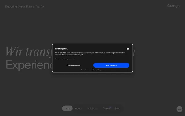
Preview image. Unlock full-res
Inky canvas, stark white lines
Color palette
Supporting palette color for small decorative accents when the core palette needs contrast. Do not promote it to the primary CTA color
Primary page background, card base. This deep black serves as the foundational surface for the dark theme
Primary text, interactive elements (links, buttons) against dark backgrounds, borders, and some light-themed card surfaces. Establishes high contrast
Secondary card surfaces, providing subtle elevation and differentiation from the main background
Muted text, subtle borders, and contextual information, suggesting secondary importance without losing visibility
Typography
- Weights
- 400
- Sizes
- 12px, 20px, 22px, 36px, 42px, 68px, 92px
- Line height
- 1, 1.05, 1.15, 1.2
- Letter spacing
- -0.0590em at 92px, -0.0430em at 68px, -0.0250em at 42px, -0.0240em at 36px, -0.0230em at 22px, -0.0140em at 20px, auto at 12px
- Fallback
- Inter
Primary content typeface for most headings, body text, and interactive elements. Its modern, geometric feel provides a sharp and contemporary voice.
- Weights
- 400
- Sizes
- 22px, 68px, 92px
- Line height
- 1, 1.15
- Letter spacing
- -0.0550em at 92px, -0.0180em at 68px, -0.0130em at 22px
- Fallback
- Playfair Display
Decorative serif typeface used sparingly for impactful headlines and large display text, providing an elegant and authoritative counterpoint to the dominant sans-serif.
Spacing & shape
Components
Text in Ghost White on a Midnight Ink background, no explicit padding, no specific border-radius. Relies on negative letter-spacing for large text.
Text in Midnight Ink on a Ghost White background, no explicit padding, no specific border-radius. Used for light-themed footer links.
Ghost White text on a Ghost White background with a 100px border-radius, creating a circular shape. No padding defined, implying content fills the circle.
Background Charcoal Gray (#3b3b3b), with 10px border-radius. No explicit padding mentioned, suggesting content handles its own spacing internally.
Background Midnight Ink (#1a1a1a), with 20px border-radius and 20px top padding. Used for more prominent or larger content blocks.
This appears as a Charcoal Gray (#3b3b3b) card with a 10px border-radius. It likely uses 20px padding for its content, ensuring comfortable spacing.
A filled button with the Spectrum Burst gradient (linear-gradient(200deg, rgb(0, 78, 255) 0%, rgb(113, 9, 102) 75%, rgb(142, 46, 69) 100%)) as its background. Text color is Ghost White. It uses a 10px border-radius and has a generous padding appropriate for interaction.
Guidelines
- Prioritize a dark aesthetic with a Midnight Ink (#1a1a1a) background for most surfaces and Ghost White (#ffffff) for primary text and interactive elements.
- Use UniversalSans for all body text, UI elements, and most headlines, primarily at weight 400 for clarity and a modern feel.
- Reserve Cambon for high-impact display headlines (68px or 92px) to add a touch of classic elegance against the modern sans-serif majority.
- Apply negative letter-spacing aggressively on larger text sizes (e.g., -0.0590em at 92px) to ensure titles feel tight and impactful.
- Employ Charcoal Gray (#3b3b3b) as a subtle background for elevated cards or secondary content blocks, providing minimal surface differentiation.
- Use 100px border-radius for all button-like interactive elements to create a distinct pill or circular shape.
- Introduce the Spectrum Burst gradient (linear-gradient(...) #004eff) as a deliberate accent for primary calls-to-action or critical highlights against the dark monochrome. Use it sparingly.
- Avoid using bright, saturated colors universally; restrict them to the Spectrum Burst gradient for accent.
- Do not use generic box-shadows or heavy elevation; surfaces should primarily differentiate through background color shifts.
- Avoid mixed-case headings unless Cambon is specifically used for a decorative effect; otherwise, maintain clear typographic hierarchy with UniversalSans.
- Do not deviate from the established letter-spacing values, especially for headlines, as it defines a key part of the typographic personality.
- Avoid complex border styles or heavy strokes; the design favors minimal borders (if any) or very thin outlines in Ghost White.
- Do not use Ghost White as a background color unless for specific, small, and contained elements like the footer on some pages, where it acts as a rare inversion of the dominant dark theme.
- Do not apply large, standard padding to interactive ghost buttons; they are designed to be visually lightweight and contextually driven by text.
About this system
ShowHide
Becklyn employs a deep, inky canvas with stark white text, establishing a high-contrast foundation for a digital agency. Typography blends assertive, almost brutalist sans-serifs with classic serifs for accent, creating a mood of modern authority with a nod to traditional craft. Components are defined by sharp edges or subtle curves and ghost-like interactions, prioritizing functionality without heavy ornamentation. The visual system is rooted in a dark mode aesthetic, allowing a single vivid gradient accent to provide energetic punctuation against an otherwise monochrome backdrop.
The page uses a contained layout within a maximum width of 503px, centered within the full viewport. The hero section often features a large, dark background with centered, prominent Cambon typography. Sections flow vertically with comfortable spacing (40px section gap), and content is primarily displayed in stacked, clear blocks, often anchored by large headings. There are instances of 2-column card grids for features. Navigation is primarily a minimal top-bar and a bottom-fixed navigation bar, both using ghost-style links.
Imagery is minimal, primarily focusing on abstract graphics or subtle, full-bleed backgrounds where visible. When present, product or concept visuals are handled with a dark aesthetic, often blending into the background. Icons, when visible, appear as simple outlines in Ghost White. The density is text-dominant, with ample breathing room, pushing imagery to a supporting, atmospheric role rather than a direct content showcase. There is no evidence of photography, illustrations, or 3D renders. The aesthetic is pure UI and typography driven.
Reminiscent of Linear, Supabase, Vercel, Figma (dark mode).
# Becklyn — Style Reference
> Inky canvas, stark white lines

**Theme:** dark

**Site:** https://becklyn.com

Becklyn employs a deep, inky canvas with stark white text, establishing a high-contrast foundation for a digital agency. Typography blends assertive, almost brutalist sans-serifs with classic serifs for accent, creating a mood of modern authority with a nod to traditional craft. Components are defined by sharp edges or subtle curves and ghost-like interactions, prioritizing functionality without heavy ornamentation. The visual system is rooted in a dark mode aesthetic, allowing a single vivid gradient accent to provide energetic punctuation against an otherwise monochrome backdrop.

## Tokens — Colors

| Name | Value | Token | Role |
|------|------|------|------|
| Spectrum Burst | `#004eff` | `--color-spectrum-burst` | Supporting palette color for small decorative accents when the core palette needs contrast. Do not promote it to the primary CTA color |
| Midnight Ink | `#1a1a1a` | `--color-midnight-ink` | Primary page background, card base. This deep black serves as the foundational surface for the dark theme |
| Ghost White | `#ffffff` | `--color-ghost-white` | Primary text, interactive elements (links, buttons) against dark backgrounds, borders, and some light-themed card surfaces. Establishes high contrast |
| Charcoal Gray | `#3b3b3b` | `--color-charcoal-gray` | Secondary card surfaces, providing subtle elevation and differentiation from the main background |
| Steel Gray | `#606060` | `--color-steel-gray` | Muted text, subtle borders, and contextual information, suggesting secondary importance without losing visibility |

## Tokens — Typography

### UniversalSans
- **Substitute:** Inter
- **Weights:** 400
- **Sizes:** 12px, 20px, 22px, 36px, 42px, 68px, 92px
- **Line height:** 1, 1.05, 1.15, 1.2
- **Letter spacing:** -0.0590em at 92px, -0.0430em at 68px, -0.0250em at 42px, -0.0240em at 36px, -0.0230em at 22px, -0.0140em at 20px, auto at 12px
- **Role:** Primary content typeface for most headings, body text, and interactive elements. Its modern, geometric feel provides a sharp and contemporary voice.

### Cambon
- **Substitute:** Playfair Display
- **Weights:** 400
- **Sizes:** 22px, 68px, 92px
- **Line height:** 1, 1.15
- **Letter spacing:** -0.0550em at 92px, -0.0180em at 68px, -0.0130em at 22px
- **Role:** Decorative serif typeface used sparingly for impactful headlines and large display text, providing an elegant and authoritative counterpoint to the dominant sans-serif.

## Tokens — Type Scale

Augmented Fourth (1.414) from 20px base.

| Role | Size | Line height | Letter spacing |
|------|------|------|------|
| caption | 12px | 1.15 | — |
| body | 20px | 1.2 | -0.28px |
| subheading | 22px | 1.2 | -0.506px |
| heading-sm | 36px | 1.2 | -0.9px |
| heading | 42px | 1.2 | -1.008px |
| heading-lg | 68px | 1.05 | -2.924px |
| display | 92px | 1 | -5.428px |

## Tokens — Spacing

- **Max width:** 503px
- **Section gap:** 40px
- **Card padding:** 20px
- **Element gap:** 20px

## Tokens — Radius

- **Buttons:** 100px
- **Cards:** 10px, 20px
- **subtle:** 23px, 31px

## Layout

The page uses a contained layout within a maximum width of 503px, centered within the full viewport. The hero section often features a large, dark background with centered, prominent Cambon typography. Sections flow vertically with comfortable spacing (40px section gap), and content is primarily displayed in stacked, clear blocks, often anchored by large headings. There are instances of 2-column card grids for features. Navigation is primarily a minimal top-bar and a bottom-fixed navigation bar, both using ghost-style links.

## Imagery

Imagery is minimal, primarily focusing on abstract graphics or subtle, full-bleed backgrounds where visible. When present, product or concept visuals are handled with a dark aesthetic, often blending into the background. Icons, when visible, appear as simple outlines in Ghost White. The density is text-dominant, with ample breathing room, pushing imagery to a supporting, atmospheric role rather than a direct content showcase. There is no evidence of photography, illustrations, or 3D renders. The aesthetic is pure UI and typography driven.

## Components

### Ghost Navigation Link (Dark)
*Global navigation item*

Text in Ghost White on a Midnight Ink background, no explicit padding, no specific border-radius. Relies on negative letter-spacing for large text.

### Ghost Navigation Link (Light)
*Footer navigation item*

Text in Midnight Ink on a Ghost White background, no explicit padding, no specific border-radius. Used for light-themed footer links.

### Circular Toggle Button
*Interactive control or status indicator*

Ghost White text on a Ghost White background with a 100px border-radius, creating a circular shape. No padding defined, implying content fills the circle.

### Information Card (Charcoal)
*Content container, feature display*

Background Charcoal Gray (#3b3b3b), with 10px border-radius. No explicit padding mentioned, suggesting content handles its own spacing internally.

### Information Card (Midnight)
*Prominent content container*

Background Midnight Ink (#1a1a1a), with 20px border-radius and 20px top padding. Used for more prominent or larger content blocks.

### System Notification Popup
*Temporary information or cookie consent*

This appears as a Charcoal Gray (#3b3b3b) card with a 10px border-radius. It likely uses 20px padding for its content, ensuring comfortable spacing.

### Primary Action Button (Gradient)
*Main call to action, interactive button*

A filled button with the Spectrum Burst gradient (linear-gradient(200deg, rgb(0, 78, 255) 0%, rgb(113, 9, 102) 75%, rgb(142, 46, 69) 100%)) as its background. Text color is Ghost White. It uses a 10px border-radius and has a generous padding appropriate for interaction.

## Guidelines

### Do

- Prioritize a dark aesthetic with a Midnight Ink (#1a1a1a) background for most surfaces and Ghost White (#ffffff) for primary text and interactive elements.
- Use UniversalSans for all body text, UI elements, and most headlines, primarily at weight 400 for clarity and a modern feel.
- Reserve Cambon for high-impact display headlines (68px or 92px) to add a touch of classic elegance against the modern sans-serif majority.
- Apply negative letter-spacing aggressively on larger text sizes (e.g., -0.0590em at 92px) to ensure titles feel tight and impactful.
- Employ Charcoal Gray (#3b3b3b) as a subtle background for elevated cards or secondary content blocks, providing minimal surface differentiation.
- Use 100px border-radius for all button-like interactive elements to create a distinct pill or circular shape.
- Introduce the Spectrum Burst gradient (linear-gradient(...) #004eff) as a deliberate accent for primary calls-to-action or critical highlights against the dark monochrome. Use it sparingly.

### Don't

- Avoid using bright, saturated colors universally; restrict them to the Spectrum Burst gradient for accent.
- Do not use generic box-shadows or heavy elevation; surfaces should primarily differentiate through background color shifts.
- Avoid mixed-case headings unless Cambon is specifically used for a decorative effect; otherwise, maintain clear typographic hierarchy with UniversalSans.
- Do not deviate from the established letter-spacing values, especially for headlines, as it defines a key part of the typographic personality.
- Avoid complex border styles or heavy strokes; the design favors minimal borders (if any) or very thin outlines in Ghost White.
- Do not use Ghost White as a background color unless for specific, small, and contained elements like the footer on some pages, where it acts as a rare inversion of the dominant dark theme.
- Do not apply large, standard padding to interactive ghost buttons; they are designed to be visually lightweight and contextually driven by text.

## Agent Prompt Guide

### Quick Color Reference
text: #ffffff
background: #1a1a1a
border: #ffffff
accent: #004eff
primary action: no distinct CTA color

### 3-5 Example Component Prompts
1. Create a Hero Section: Background Midnight Ink (#1a1a1a). Centered headline 'Wir transformieren Ideen in Experiences.' using Cambon 92px, Ghost White (#ffffff), letter-spacing -5.428px.
2. Design an Information Card: Charcoal Gray (#3b3b3b) background, 10px border-radius, with 20px padding. Inside, use UniversalSans 20px (#ffffff) for a title and UniversalSans 12px (#606060) for a caption, separated by 10px vertical space.
No distinct primary action color was observed; use the extracted neutral button treatments instead of inventing a filled CTA color.
4. Create a Ghost Navigation Link: Ghost White (#ffffff) text using UniversalSans 22px, no background, no borders, with letter-spacing -0.506px.
5. Design a prominent content block: Midnight Ink (#1a1a1a) background, 20px border-radius, with 20px top padding. Use UniversalSans 42px (#ffffff) for main text, -1.008px letter-spacing.
More like this







Keep what you find
A free account saves references to boards and can send you a weekly email of picks based on what you save.
To see every result, go Pro.