Preview image. Unlock full-res
monochrome digital canvas, precisely framed
Color palette
Informational badges, occasional accents. A single, distinct vibrant color for highlights.
Alternative accent for badges. Slightly lighter shade of Sky Blue, used for variety.
Page backgrounds, card surfaces, button backgrounds, text on dark backgrounds. Gives a clean, expansive feeling.
Primary heading text, button backgrounds for prominent actions. Provides strong visual impact and contrast.
Body text, link text, icons. Ensures high readability on light backgrounds.
Text for secondary information, button text on white backgrounds. Provides a softer contrast than Graphite.
Button borders, subtle dividers. Defines boundaries without harshness.
Support text, secondary body copy. Slightly lighter than Stone Gray for less emphasis.
Typography
- Weights
- 400, 500, 600
- Sizes
- 10px, 11px, 12px, 13px, 14px, 16px, 18px, 38px
- Line height
- 1, 1.11, 1.2, 1.4, 1.43, 1.6
- Letter spacing
- 0.02em
- Fallback
- Inter
Primary typeface for all UI elements, headings, and body text. The consistent letter-spacing across weights and sizes provides a tight, structured feel characteristic of digital interfaces.
Spacing & shape
Components
Carbon Black (#202020) background, Canvas White (#ffffff) text, 100px border radius, 12px vertical padding, 26px horizontal padding. Prominent and high contrast.
Transparent background, Stone Gray (#555555) text and border, 100px border radius, 14px vertical padding, 24px horizontal padding. Subtle but clearly interactive.
Canvas White (#ffffff) background, Graphite (#3b3b3b) text, Silver Lining (#e6e6e6) border, 100px border radius, 8px padding. Used for group selection with clear active state.
Sky Blue (#4177ff) background, Graphite (#333333) text, 100px border radius, 0px padding. Provides a clear, non-intrusive label.
Canvas White (#ffffff) background, Graphite (#333333) text, 100px border radius, 0px padding. A neutral option for less emphasis.
Guidelines
- Prioritize Graphite (#333333) for body text on Canvas White (#ffffff) backgrounds to maintain AAA contrast.
- Use 100px border radius for all interactive elements like buttons and badges to signal affordance and approachability.
- Reserve Carbon Black (#202020) for dominant headlines and primary call-to-action button backgrounds.
- Apply Spacings of 8px, 10px, 12px, 14px, 18px to maintain a compact, structured layout, particularly around interactive elements.
- Utilize Ppneuemontreal at 0.02em letter-spacing consistently across all sizes and weights to maintain a crisp, digital aesthetic.
- Avoid using multiple chromatic colors; Sky Blue (#4177ff) and Ocean Blue (#41a9ff) are the only allowed accents.
- Do not introduce sharp corners on interactive buttons or badges; maintain '100px' radius for these elements.
- Do not use dark backgrounds for large text blocks, as the system favors a light base with dark text.
- Avoid excessive line heights; the tight line height values (e.g., 1.0, 1.11, 1.2) should be maintained for a dense, composed feel.
- Refrain from using strong box shadows on general UI elements; the system relies on flat design with subtle borders for separation.
About this system
ShowHide
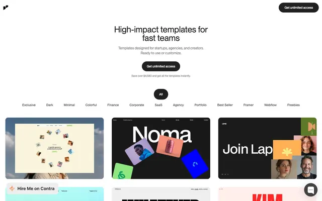
This system conveys a precise and product-focused atmosphere, grounded in a stark achromatic palette. The interplay of near-white backgrounds with dark grayscale text and interactive elements creates a clean, high-contrast visual hierarchy. Rounded corners on interactive elements (100px) soften the otherwise sharp 12px corners of content areas, suggesting approachability within a structured framework. Vivid blue accents are reserved for badges, acting as rare, focused indicators.
The page uses a `max-width` contained model for its primary content, centered on a Canvas White background. The hero section features a centered headline and subtext, followed by a centrally aligned action button. Below the hero, a prominent filter bar with segmented toggle buttons suggests content organization. The main content area is a dense, responsive grid of template preview cards, which appear to use a 3-column layout at desktop sizes. Sections are clearly delineated by the content within, rather than strong visual separators or alternating background colors. The layout is compact, prioritizing information density without feeling cramped, with consistent vertical spacing between sections and elements.
The site heavily features product screenshots (template previews) presented within Canvas White (#ffffff) frames with 12px rounded corners. These previews are tightly cropped and often showcase digital interfaces or abstract graphic compositions. There is no lifestyle photography; the focus is entirely on the digital product itself, treated as an object of design. Illustrations, if present, are minimal and likely integrated within the templates themselves, not as separate decorative elements of the site. Icons are outlined, simple, and monochrome, complementing the clean UI. The overall density of imagery is high, with a large grid of template cards dominating the layout, making it visually rich despite the lack of complex decorative graphics.
Reminiscent of Framer, Superlist, Linear, Raycast.
# Jp — Style Reference
> monochrome digital canvas, precisely framed

**Theme:** light

**Site:** https://jp.works

This system conveys a precise and product-focused atmosphere, grounded in a stark achromatic palette. The interplay of near-white backgrounds with dark grayscale text and interactive elements creates a clean, high-contrast visual hierarchy. Rounded corners on interactive elements (100px) soften the otherwise sharp 12px corners of content areas, suggesting approachability within a structured framework. Vivid blue accents are reserved for badges, acting as rare, focused indicators.

## Tokens — Colors

| Name | Value | Token | Role |
|------|------|------|------|
| Sky Blue | `#4177ff` | `--color-sky-blue` | Informational badges, occasional accents. A single, distinct vibrant color for highlights. |
| Ocean Blue | `#41a9ff` | `--color-ocean-blue` | Alternative accent for badges. Slightly lighter shade of Sky Blue, used for variety. |
| Canvas White | `#ffffff` | `--color-canvas-white` | Page backgrounds, card surfaces, button backgrounds, text on dark backgrounds. Gives a clean, expansive feeling. |
| Carbon Black | `#202020` | `--color-carbon-black` | Primary heading text, button backgrounds for prominent actions. Provides strong visual impact and contrast. |
| Graphite | `#333333` | `--color-graphite` | Body text, link text, icons. Ensures high readability on light backgrounds. |
| Stone Gray | `#555555` | `--color-stone-gray` | Text for secondary information, button text on white backgrounds. Provides a softer contrast than Graphite. |
| Silver Lining | `#e6e6e6` | `--color-silver-lining` | Button borders, subtle dividers. Defines boundaries without harshness. |
| Zinc | `#838383` | `--color-zinc` | Support text, secondary body copy. Slightly lighter than Stone Gray for less emphasis. |

## Tokens — Typography

### Ppneuemontreal
- **Substitute:** Inter
- **Weights:** 400, 500, 600
- **Sizes:** 10px, 11px, 12px, 13px, 14px, 16px, 18px, 38px
- **Line height:** 1, 1.11, 1.2, 1.4, 1.43, 1.6
- **Letter spacing:** 0.02em
- **Role:** Primary typeface for all UI elements, headings, and body text. The consistent letter-spacing across weights and sizes provides a tight, structured feel characteristic of digital interfaces.

## Tokens — Spacing

- **Section gap:** 48-80px
- **Card padding:** 0px
- **Element gap:** 4-18px

## Tokens — Radius

- **Buttons:** 100px
- **Cards:** 12px
- **badges:** 100px

## Layout

The page uses a `max-width` contained model for its primary content, centered on a Canvas White background. The hero section features a centered headline and subtext, followed by a centrally aligned action button. Below the hero, a prominent filter bar with segmented toggle buttons suggests content organization. The main content area is a dense, responsive grid of template preview cards, which appear to use a 3-column layout at desktop sizes. Sections are clearly delineated by the content within, rather than strong visual separators or alternating background colors. The layout is compact, prioritizing information density without feeling cramped, with consistent vertical spacing between sections and elements.

## Imagery

The site heavily features product screenshots (template previews) presented within Canvas White (#ffffff) frames with 12px rounded corners. These previews are tightly cropped and often showcase digital interfaces or abstract graphic compositions. There is no lifestyle photography; the focus is entirely on the digital product itself, treated as an object of design. Illustrations, if present, are minimal and likely integrated within the templates themselves, not as separate decorative elements of the site. Icons are outlined, simple, and monochrome, complementing the clean UI. The overall density of imagery is high, with a large grid of template cards dominating the layout, making it visually rich despite the lack of complex decorative graphics.

## Components

### CTA Button Group

### Category Filter Tab Bar

### Template Preview Cards Grid

### Primary Action Button
*Main call to action*

Carbon Black (#202020) background, Canvas White (#ffffff) text, 100px border radius, 12px vertical padding, 26px horizontal padding. Prominent and high contrast.

### Secondary Outline Button
*Navigation, filtering*

Transparent background, Stone Gray (#555555) text and border, 100px border radius, 14px vertical padding, 24px horizontal padding. Subtle but clearly interactive.

### Selection Toggle Button
*Category selection (e.g., 'All', 'Exclusive')*

Canvas White (#ffffff) background, Graphite (#3b3b3b) text, Silver Lining (#e6e6e6) border, 100px border radius, 8px padding. Used for group selection with clear active state.

### Informational Badge - Sky Blue
*Categorization, status indicators*

Sky Blue (#4177ff) background, Graphite (#333333) text, 100px border radius, 0px padding. Provides a clear, non-intrusive label.

### Informational Badge - Canvas White
*Categorization, status indicators*

Canvas White (#ffffff) background, Graphite (#333333) text, 100px border radius, 0px padding. A neutral option for less emphasis.

## Guidelines

### Do

- Prioritize Graphite (#333333) for body text on Canvas White (#ffffff) backgrounds to maintain AAA contrast.
- Use 100px border radius for all interactive elements like buttons and badges to signal affordance and approachability.
- Reserve Carbon Black (#202020) for dominant headlines and primary call-to-action button backgrounds.
- Apply Spacings of 8px, 10px, 12px, 14px, 18px to maintain a compact, structured layout, particularly around interactive elements.
- Utilize Ppneuemontreal at 0.02em letter-spacing consistently across all sizes and weights to maintain a crisp, digital aesthetic.

### Don't

- Avoid using multiple chromatic colors; Sky Blue (#4177ff) and Ocean Blue (#41a9ff) are the only allowed accents.
- Do not introduce sharp corners on interactive buttons or badges; maintain '100px' radius for these elements.
- Do not use dark backgrounds for large text blocks, as the system favors a light base with dark text.
- Avoid excessive line heights; the tight line height values (e.g., 1.0, 1.11, 1.2) should be maintained for a dense, composed feel.
- Refrain from using strong box shadows on general UI elements; the system relies on flat design with subtle borders for separation.

## Type Scale

**role:** caption
**size:** 10
**lineHeight:** 1.4
**letterSpacing:** 0.02

**role:** body-sm
**size:** 11
**lineHeight:** 1.4
**letterSpacing:** 0.02

**role:** body
**size:** 12
**lineHeight:** 1.4
**letterSpacing:** 0.02

**role:** subheading
**size:** 14
**lineHeight:** 1.4
**letterSpacing:** 0.02

**role:** heading
**size:** 18
**lineHeight:** 1.11
**letterSpacing:** 0.02

**role:** display
**size:** 38
**lineHeight:** 1
**letterSpacing:** 0.02

## Agent Prompt Guide

**Quick Color Reference:** Text: #333333, Background: #ffffff, CTA: #202020, Border: #e6e6e6, Accent: #4177ff

**Example Component Prompt 1: Primary Action Button**
Create a button: background #202020, text #ffffff, border-radius 100px, padding 12px 26px, font 'Ppneuemontreal' weight 500, letter-spacing 0.02em.

**Example Component Prompt 2: Secondary Outline Button**
Create a button: background transparent, text #555555, border 1px solid #555555, border-radius 100px, padding 14px 24px, font 'Ppneuemontreal' weight 400, letter-spacing 0.02em.

**Example Component Prompt 3: Template Preview Card**
Create a card: background #ffffff, border-radius 12px, box-shadow none, padding 0px. Inside, place an image that fills the card, maintaining the 12px corner radius.

**Example Component Prompt 4: Informational Badge - Sky Blue**
Create a badge: background #4177ff, text #333333, border-radius 100px, font 'Ppneuemontreal' weight 400, letter-spacing 0.02em, 0px padding around content (text content such as 'Exclusive').
More like this










Keep what you find
A free account saves references to boards and can send you a weekly email of picks based on what you save.
To see every result, go Pro.