Preview image. Unlock full-res
natural blueprint, organic craft
Color palette
Primary text, headings, button borders, navigation accents — a deep, muted charcoal that provides strong contrast against lighter surfaces
Secondary text, ghost button outlines, navigation borders, card backgrounds in content areas. Serves as a less stark alternative to pure white, contributing to the organic feel
Card backgrounds, overall page background in some sections, providing a clean working surface
Subtle card backgrounds, creating a slight visual distinction from Canvas Cream without introducing strong color
Typography
- Weights
- 400
- Sizes
- 14px, 16px, 17px, 28px, 32px
- Line height
- 1.3
- Fallback
- Helvetica Neue
All textual elements from body copy to headings. Its singular weight and consistent line height contribute to a unified, approachable voice across the interface. The custom font choice avoids generic system fonts.
Spacing & shape
Components
Ghost button with Inkwell Black text and a 2px stroke border of Inkwell Black. Rounded with a 38px radius, providing a tactile, pill-like shape. Padding: 6px top, 9px bottom, 20px horizontal.
Ghost button with Canvas Cream text and a 2px stroke border of Canvas Cream. Rounded with a 38px radius for a soft, pill-like appearance. Padding: 6px top, 9px bottom, 20px horizontal.
Ghost button with Inkwell Black text and a 2px stroke border of Inkwell Black, but with a 0px radius, essentially creating an underlined text link. Padding: 0px top/bottom, 30px horizontal.
Card with Linen White background and no shadow, featuring a top border-radius of 22px and bottom squared (0px). No internal padding specified for primary content.
Card with Canvas Cream background and no shadow, featuring a top border-radius of 22px and bottom squared (0px). No internal padding specified for primary content.
Card with Stone Gray background and no shadow, featuring a top border-radius of 22px and bottom squared (0px). No internal padding specified for primary content.
Guidelines
- Use Neue Haas Unica W1G weight 400 for all text, maintaining a consistent brand voice without font variation.
- Prioritize Canvas Cream (#e9e9e1) and Inkwell Black (#2a2920) for ghost button borders and primary text to highlight interactive elements.
- Apply a 38px border-radius to all interactive buttons and navigation items for a distinct pill shape.
- Use 22px border-radius for cards, applied only to the top corners, to create a consistent grounded element.
- Employ a 2px solid border for all strokes, borders, and outlined elements to maintain the handcrafted aesthetic.
- Maintain a compact spacing rhythm, with element gaps typically around 6px and card padding at 20px.
- Utilize Inkwell Black for primary text and headings, providing strong legibility against cream and white backgrounds.
- Avoid using box-shadows or significant elevation; maintain a flat, natural surface aesthetic.
- Do not introduce additional font weights or families; Neue Haas Unica W1G 400 is the only typographic choice.
- Steer clear of vivid or vibrant colors; the palette is strictly monochrome with muted, natural tones.
- Do not use sharp 0px radii for cards or buttons, unless it explicitly represents an underlined text link.
- Avoid large empty spaces; maintain a compact information density across layouts.
- Do not add gradients or complex background fills; surfaces should be solid, single colors.
About this system
ShowHide
Bee Home's design system evokes a handcrafted blueprint aesthetic, combining structured layouts with an organic, tactile feel. Predominantly monochrome with subtle creams and charcoal grays, the visual system suggests natural materials and understated functionality. Typography uses a single confident, yet friendly, sans-serif, often in outlined states for interactive elements. Components prioritize soft edges and a light touch, focusing on content over heavy decoration.
The page primarily uses a max-width contained layout, though the hero section is full-bleed. The hero features a centered headline over a background image of the product. Subsequent sections alternate between full-width typographic elements and a grid-based content consumption. A common pattern is a 2-column layout for text and image; images are often treated as cards with specific radii. Vertical spacing is consistent but compact, creating a flowing, unified experience. Navigation is a top-bar sticky header with ghost buttons, converting to a hamburger menu on smaller screens or specific interactions. A consistent feature is the use of large, stylized typographic elements acting as visual dividers or section headlines.
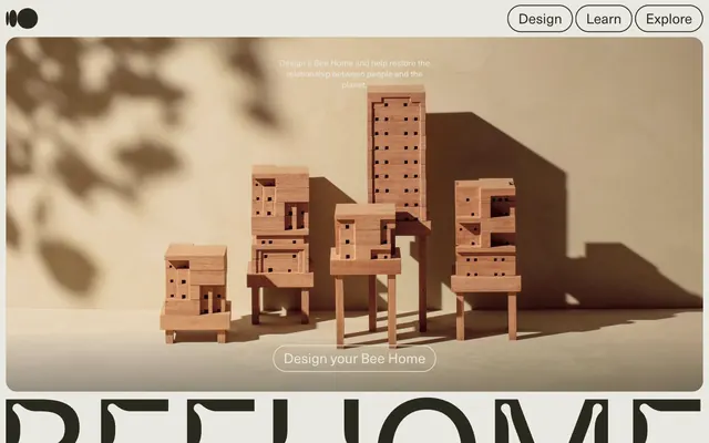
The imagery is split between stylized product photography and lifestyle photography. Product shots feature the bee home modules as wooden architectural models, precisely lit against a warm, neutral background, emphasizing craftsmanship and material. Lifestyle photography features people engaged in creative or natural activities. All images are contained within rounded (22px) card frames, or integrated seamlessly as background textures for hero sections. Icons are minimal, outlined, and monochromatic, matching the overall subdued aesthetic. Imagery serves both decorative atmosphere and explanatory content, often pairing human activity with the product ethos.
Reminiscent of Oura Ring, Sense by Headspace, B&O (Bang & Olufsen), Linear (before dark mode).
# Bee Home — Style Reference
> natural blueprint, organic craft

**Theme:** light

**Site:** https://www.beehome.design

Bee Home's design system evokes a handcrafted blueprint aesthetic, combining structured layouts with an organic, tactile feel. Predominantly monochrome with subtle creams and charcoal grays, the visual system suggests natural materials and understated functionality. Typography uses a single confident, yet friendly, sans-serif, often in outlined states for interactive elements. Components prioritize soft edges and a light touch, focusing on content over heavy decoration.

## Tokens — Colors

| Name | Value | Token | Role |
|------|------|------|------|
| Inkwell Black | `#2a2920` | `--color-inkwell-black` | Primary text, headings, button borders, navigation accents — a deep, muted charcoal that provides strong contrast against lighter surfaces |
| Canvas Cream | `#e9e9e1` | `--color-canvas-cream` | Secondary text, ghost button outlines, navigation borders, card backgrounds in content areas. Serves as a less stark alternative to pure white, contributing to the organic feel |
| Linen White | `#ffffff` | `--color-linen-white` | Card backgrounds, overall page background in some sections, providing a clean working surface |
| Stone Gray | `#d3d3ce` | `--color-stone-gray` | Subtle card backgrounds, creating a slight visual distinction from Canvas Cream without introducing strong color |

## Tokens — Typography

### Neue Haas Unica W1G
- **Substitute:** Helvetica Neue
- **Weights:** 400
- **Sizes:** 14px, 16px, 17px, 28px, 32px
- **Line height:** 1.3
- **Role:** All textual elements from body copy to headings. Its singular weight and consistent line height contribute to a unified, approachable voice across the interface. The custom font choice avoids generic system fonts.

## Tokens — Type Scale

Perfect Fifth (1.5) from 14px base.

| Role | Size | Line height | Letter spacing |
|------|------|------|------|
| body-sm | 14px | 1.3 | — |
| heading | 28px | 1.3 | — |
| heading-lg | 32px | 1.3 | — |

## Tokens — Spacing

- **Section gap:** 40px
- **Card padding:** 20px
- **Element gap:** 6px

## Tokens — Radius

- **Buttons:** 38px
- **Cards:** 22px
- **navItems:** 38px

## Layout

The page primarily uses a max-width contained layout, though the hero section is full-bleed. The hero features a centered headline over a background image of the product. Subsequent sections alternate between full-width typographic elements and a grid-based content consumption. A common pattern is a 2-column layout for text and image; images are often treated as cards with specific radii. Vertical spacing is consistent but compact, creating a flowing, unified experience. Navigation is a top-bar sticky header with ghost buttons, converting to a hamburger menu on smaller screens or specific interactions. A consistent feature is the use of large, stylized typographic elements acting as visual dividers or section headlines.

## Imagery

The imagery is split between stylized product photography and lifestyle photography. Product shots feature the bee home modules as wooden architectural models, precisely lit against a warm, neutral background, emphasizing craftsmanship and material. Lifestyle photography features people engaged in creative or natural activities. All images are contained within rounded (22px) card frames, or integrated seamlessly as background textures for hero sections. Icons are minimal, outlined, and monochromatic, matching the overall subdued aesthetic. Imagery serves both decorative atmosphere and explanatory content, often pairing human activity with the product ethos.

## Components

### Pill Ghost Button (Inkwell Text)
*Primary Call to Action*

Ghost button with Inkwell Black text and a 2px stroke border of Inkwell Black. Rounded with a 38px radius, providing a tactile, pill-like shape. Padding: 6px top, 9px bottom, 20px horizontal.

### Pill Ghost Button (Canvas Text)
*Secondary Call to Action, Navigation*

Ghost button with Canvas Cream text and a 2px stroke border of Canvas Cream. Rounded with a 38px radius for a soft, pill-like appearance. Padding: 6px top, 9px bottom, 20px horizontal.

### Underlined Text Button
*Tertiary Action, Inline Navigation*

Ghost button with Inkwell Black text and a 2px stroke border of Inkwell Black, but with a 0px radius, essentially creating an underlined text link. Padding: 0px top/bottom, 30px horizontal.

### Content Card (Linen White)
*Categorized Content Display*

Card with Linen White background and no shadow, featuring a top border-radius of 22px and bottom squared (0px). No internal padding specified for primary content.

### Content Card (Canvas Cream)
*Categorized Content Display*

Card with Canvas Cream background and no shadow, featuring a top border-radius of 22px and bottom squared (0px). No internal padding specified for primary content.

### Content Card (Stone Gray)
*Categorized Content Display*

Card with Stone Gray background and no shadow, featuring a top border-radius of 22px and bottom squared (0px). No internal padding specified for primary content.

## Guidelines

### Do

- Use Neue Haas Unica W1G weight 400 for all text, maintaining a consistent brand voice without font variation.
- Prioritize Canvas Cream (#e9e9e1) and Inkwell Black (#2a2920) for ghost button borders and primary text to highlight interactive elements.
- Apply a 38px border-radius to all interactive buttons and navigation items for a distinct pill shape.
- Use 22px border-radius for cards, applied only to the top corners, to create a consistent grounded element.
- Employ a 2px solid border for all strokes, borders, and outlined elements to maintain the handcrafted aesthetic.
- Maintain a compact spacing rhythm, with element gaps typically around 6px and card padding at 20px.
- Utilize Inkwell Black for primary text and headings, providing strong legibility against cream and white backgrounds.

### Don't

- Avoid using box-shadows or significant elevation; maintain a flat, natural surface aesthetic.
- Do not introduce additional font weights or families; Neue Haas Unica W1G 400 is the only typographic choice.
- Steer clear of vivid or vibrant colors; the palette is strictly monochrome with muted, natural tones.
- Do not use sharp 0px radii for cards or buttons, unless it explicitly represents an underlined text link.
- Avoid large empty spaces; maintain a compact information density across layouts.
- Do not add gradients or complex background fills; surfaces should be solid, single colors.

## Agent Prompt Guide

Quick Color Reference:
text: #2a2920
background: #ffffff
border: #2a2920
accent: no distinct accent color
primary action: no distinct CTA color

Example Component Prompts:
1. Create a primary navigation item: "Design" using Neue Haas Unica W1G 400, Canvas Cream (#e9e9e1) text, with a 2px Canvas Cream (#e9e9e1) border, 38px radius, and 6px top, 9px bottom, 20px horizontal padding.
2. Create a content card: using Linen White (#ffffff) background, 22px top-left/top-right radius, 0px bottom-left/bottom-right radius, no shadow or border.
3. Create a section heading: "BEEHOME" using Neue Haas Unica W1G 400, Inkwell Black (#2a2920) text, size 32px, 1.3 line height, centered on a Canvas Cream (#e9e9e1) background. Followed by a body paragraph at 16px size of the same font, Inkwell Black text, with 40px of vertical spacing above.

## Motion Philosophy

Motion is subtle and purposeful, favoring `ease` timing functions over linear, preventing abrupt changes. Durations are generally short (0.2s, 0.3s) for common interactions like color and opacity changes, making UI feel responsive. The presence of a `slideFadeIn` animation hint suggests gentle introductions of content, contributing to a fluid, unobtrusive user experience. Large transitions may use slightly longer durations (0.75s, 2s) for a more deliberate reveal without feeling slow.
More like this









Keep what you find
A free account saves references to boards and can send you a weekly email of picks based on what you save.
To see every result, go Pro.