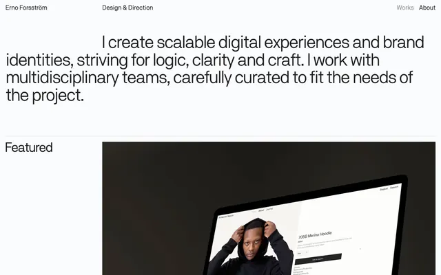
Preview image. Unlock full-res
Gallery exhibition, typographic precision
Color palette
Primary text, headings, link hover states, and structural borders, providing a high-contrast anchor against light backgrounds for a crisp, authoritative feel
Primary page background
Subtle UI borders and dividers, indicating structure without visual dominance
Typography
- Weights
- 400
- Sizes
- 21px, 43px, 58px
- Line height
- 0.93, 1, 1.1, 1.33
- Letter spacing
- -0.75px at 21px, -1.16px at 43px, -2.9px at 58px
- Fallback
- Inter
Primary typeface for all text elements. The 'tnum' feature ensures tabular figures for consistent number alignment, supporting the system's precise and structured aesthetic.
Spacing & shape
Components
Text in Lead Graphite (#202020), no special styling. Hover state implies a subtle interaction, borders suggest clickable areas for the Works and About links, using Lead Graphite (#202020).
Comprises a large image (video capable), project title in Lead Graphite (#202020) at body size (21px), and a subtitle in Whisper Gray (#cdcecf) also at body size. No explicit padding mentioned but content is typically followed by a small element gap.
Lead Graphite (#202020) text with size inferred from data points such as 'Featured' at 43px, or '2018—2020' at 21px. Followed by a marginBottom of 31px.
Guidelines
- Use Lead Graphite (#202020) for all primary text, headings, and interactive elements for consistent contrast.
- Maintain a tight letter spacing for all typography, with larger headings receiving more negative tracking: -2.9px at 58px, -1.16px at 43px, and -0.75px at 21px.
- Adhere to 'tnum' font feature settings for all numeric data when using Nb akademie pro book to ensure consistent tabular alignment.
- Apply 18px as the default element spacing between components and within horizontal layouts.
- Utilize Whisper Gray (#cdcecf) only for subtle borders or low-emphasis dividers, such as separating links or minor UI elements.
- Ensure all interactive text elements (links) visually change state on hover, using Lead Graphite (#202020) text and a subtle border for visual feedback.
- Avoid using multiple font families or excessive font weights; stick to Nb akademie pro book book webfont at 400 weight exclusively.
- Do not introduce strong accent colors; the palette is strictly achromatic with the only distinct color being for structural borders.
- Refrain from using shadows or gradients; the design relies on flat surfaces and high contrast typography.
- Do not use small body text sizes; the smallest text observed for body is 21px, ensuring legibility and presence.
- Avoid decorative imagery or illustrations; focus on high-fidelity product shots or screenshots for visual content.
About this system
ShowHide
Erno Forsström's visual system evokes a gallery exhibition laid out in a stark, minimalist environment. Typography takes center stage, creating hierarchy and visual interest through precise sizes and tracking on a primarily achromatic canvas. The interface is text-heavy but feels spacious, punctuated by large, photographic case studies that break the rhythm with high-fidelity product imagery. The overall impression is one of restrained confidence and cerebral focus.
The page uses a full-bleed layout without a fixed max-width, allowing content to extend to the viewport edges, which is particularly evident in the large project showcases. The hero section prominently features a large, horizontally centered heading text. Section rhythm is managed through consistent vertical spacing (31px section gap) and the alternating presentation of large imagery blocks and text. Content is primarily arranged in centered stacks for headings and text, with project showcases presenting a large visual followed by text. Navigation is minimal, consisting of a top bar with aligned text links on the left and right.
The imagery primarily consists of high-fidelity product screenshots or tightly cropped product photography, often showcasing digital interfaces on devices. The treatment is full-bleed or contained within a black or dark background, suggesting a focus on the product itself rather than lifestyle or environmental context. There are no apparent rounded corners; images maintain sharp, raw edges. Icons are typically not used to convey meaning; visual weight comes from larger product images.
Reminiscent of Awwwards Nominees, Figma, Blinkist, Linear.
# Erno Forsström — Style Reference
> Gallery exhibition, typographic precision

**Theme:** light

**Site:** https://erno.works

Erno Forsström's visual system evokes a gallery exhibition laid out in a stark, minimalist environment. Typography takes center stage, creating hierarchy and visual interest through precise sizes and tracking on a primarily achromatic canvas. The interface is text-heavy but feels spacious, punctuated by large, photographic case studies that break the rhythm with high-fidelity product imagery. The overall impression is one of restrained confidence and cerebral focus.

## Tokens — Colors

| Name | Value | Token | Role |
|------|------|------|------|
| Lead Graphite | `#202020` | `--color-lead-graphite` | Primary text, headings, link hover states, and structural borders, providing a high-contrast anchor against light backgrounds for a crisp, authoritative feel |
| Canvas White | `#ffffff` | `--color-canvas-white` | Primary page background |
| Whisper Gray | `#cdcecf` | `--color-whisper-gray` | Subtle UI borders and dividers, indicating structure without visual dominance |

## Tokens — Typography

### Nb akademie pro book webfont
- **Substitute:** Inter
- **Weights:** 400
- **Sizes:** 21px, 43px, 58px
- **Line height:** 0.93, 1, 1.1, 1.33
- **Letter spacing:** -0.75px at 21px, -1.16px at 43px, -2.9px at 58px
- **Role:** Primary typeface for all text elements. The 'tnum' feature ensures tabular figures for consistent number alignment, supporting the system's precise and structured aesthetic.

## Tokens — Type Scale

| Role | Size | Line height | Letter spacing |
|------|------|------|------|
| body | 21px | 1.33 | -0.75px |
| heading-md | 43px | 1.1 | -1.16px |
| heading-lg | 58px | 0.93 | -2.9px |

## Tokens — Spacing

- **Section gap:** 31px
- **Card padding:** 18px
- **Element gap:** 18px

## Tokens — Radius

- **none:** 0px

## Layout

The page uses a full-bleed layout without a fixed max-width, allowing content to extend to the viewport edges, which is particularly evident in the large project showcases. The hero section prominently features a large, horizontally centered heading text. Section rhythm is managed through consistent vertical spacing (31px section gap) and the alternating presentation of large imagery blocks and text. Content is primarily arranged in centered stacks for headings and text, with project showcases presenting a large visual followed by text. Navigation is minimal, consisting of a top bar with aligned text links on the left and right.

## Imagery

The imagery primarily consists of high-fidelity product screenshots or tightly cropped product photography, often showcasing digital interfaces on devices. The treatment is full-bleed or contained within a black or dark background, suggesting a focus on the product itself rather than lifestyle or environmental context. There are no apparent rounded corners; images maintain sharp, raw edges. Icons are typically not used to convey meaning; visual weight comes from larger product images.

## Components

### Minimal Navigation Link
*Text link for primary navigation (header, footers)*

Text in Lead Graphite (#202020), no special styling. Hover state implies a subtle interaction, borders suggest clickable areas for the Works and About links, using Lead Graphite (#202020).

### Featured Project Card
*Showcase individual portfolio projects with a large image and descriptive text.*

Comprises a large image (video capable), project title in Lead Graphite (#202020) at body size (21px), and a subtitle in Whisper Gray (#cdcecf) also at body size. No explicit padding mentioned but content is typically followed by a small element gap.

### Category Heading
*Divides content sections*

Lead Graphite (#202020) text with size inferred from data points such as 'Featured' at 43px, or '2018—2020' at 21px. Followed by a marginBottom of 31px.

## Guidelines

### Do

- Use Lead Graphite (#202020) for all primary text, headings, and interactive elements for consistent contrast.
- Maintain a tight letter spacing for all typography, with larger headings receiving more negative tracking: -2.9px at 58px, -1.16px at 43px, and -0.75px at 21px.
- Adhere to 'tnum' font feature settings for all numeric data when using Nb akademie pro book to ensure consistent tabular alignment.
- Apply 18px as the default element spacing between components and within horizontal layouts.
- Utilize Whisper Gray (#cdcecf) only for subtle borders or low-emphasis dividers, such as separating links or minor UI elements.
- Ensure all interactive text elements (links) visually change state on hover, using Lead Graphite (#202020) text and a subtle border for visual feedback.

### Don't

- Avoid using multiple font families or excessive font weights; stick to Nb akademie pro book book webfont at 400 weight exclusively.
- Do not introduce strong accent colors; the palette is strictly achromatic with the only distinct color being for structural borders.
- Refrain from using shadows or gradients; the design relies on flat surfaces and high contrast typography.
- Do not use small body text sizes; the smallest text observed for body is 21px, ensuring legibility and presence.
- Avoid decorative imagery or illustrations; focus on high-fidelity product shots or screenshots for visual content.

## Agent Prompt Guide

Quick Color Reference: text: #202020, background: #ffffff, border: #cdcecf, accent: no distinct accent color, primary action: no distinct CTA color

Example Component Prompts:
1. Create a primary navigation section: Left-aligned 'Erno Forsström' (text color #202020, font size 21px, line height 1.33) and 'Design & Direction' (text color #202020, font size 21px, line height 1.33). Right-aligned 'Works' and 'About' (text color #202020, font size 21px, line height 1.33), with a 1px solid #202020 border visible on hover for 'Works' and 'About'.
2. Design a hero text block: "I create scalable digital experiences and brand identities, striving for logic, clarity and craft. I work with multidisciplinary teams, carefully curated to fit the needs of the project." using Nb akademie pro book, weight 400, size 58px, letter-spacing -2.9px, line-height 0.93, color #202020.
3. Create a section heading: 'Featured' using Nb akademie pro book, weight 400, size 43px, letter-spacing -1.16px, line-height 1.10, color #202020, followed by a 31px bottom margin.
More like this









Keep what you find
A free account saves references to boards and can send you a weekly email of picks based on what you save.
To see every result, go Pro.