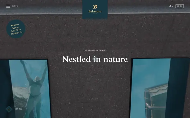
Preview image. Unlock full-res
Alpine Chalet Refinement: warm, textural, and quietly luxurious.
Color palette
Primary text, darkened background sections, button borders, subtle UI accents — establishes a sophisticated, grounding depth
Gray accent for outlined action borders, linked labels, and lightweight interactive emphasis. Do not promote it to the primary CTA color
Decorative icons, seasonal highlights, subtle branding elements — provides a touch of warmth and luxury against the cool neutrals
Page backgrounds, default text in dark sections, borders for light sections, icon fills — functions as the primary canvas
Secondary background surfaces, card backgrounds in light contexts — a soft, off-white that adds warmth without starkness
Subtle borders, secondary text, inactive states, ghost button borders in a light context — a cool-toned gray for quiet details
Input borders, decorative fills, some icon fills — used for high-contrast details against lighter backgrounds
Typography
- Weights
- 700
- Sizes
- 16px, 18px, 28px, 48px, 64px
- Line height
- 1.1, 1.2, 1.3, 1.4
- Fallback
- Georgia, Playfair Display
Display headings and prominent section titles — its seriffed elegance and bold weight establishes a traditional, luxurious tone.
- Weights
- 400
- Sizes
- 12px, 14px, 16px, 20px, 24px, 28px, 40px
- Line height
- 1, 1.2, 1.25, 1.4, 1.43, 1.5, 1.71
- Letter spacing
- 0.1250em, 0.1670em
- Fallback
- Open Sans, Lato
Body copy, navigation, functional elements, and subheadings — its clean, open forms ensure readability while supporting the sophisticated aesthetic.
Spacing & shape
Components
Ghost-style button with a border of Chalet Teal (#193741) or Paper White (#ffffff) and matching text color. Padding is 20px vertical, 32px horizontal. Full pill shape with an 80px border-radius, emphasizing natural and soft forms.
Simple text link, either Chalet Teal (#193741) or Paper White (#ffffff), with no background or padding. Avenir LT Pro, weight 400. Letter spacing of 0.125em at smaller sizes and 0.167em at larger.
Small circular card with Chalet Teal (#193741) background, 100% border-radius, and 16px of horizontal padding to contain content without explicit vertical padding.
Input fields have a Chalet Teal (#193741) background with Paper White (#ffffff) text. A 1px Rich Black (#000000) bottom border for definition. Padding is 8px vertical, 0px horizontal.
Guidelines
- Prioritize ITC Giovanni Std 700 for all display and major section headings to maintain a sense of traditional luxury.
- Use Avenir LT Pro 400 for all body text, navigation, and subordinate UI elements, ensuring consistency and readability.
- Apply Chalet Teal (#193741) as the primary accent color for outlines and text, reserving Alpine Gold (#eac486) for subtle highlights only.
- Employ the 80px border-radius for all primary buttons to achieve a soft, pill-shaped aesthetic.
- Maintain comfortable spacing with 24px as a standard `elementGap` between UI elements and `sectionGap` between major content blocks.
- Use Paper White (#ffffff) as the primary page canvas for light sections and Warm Linen (#ebe7e1) for secondary interactive surfaces.
- Establish interactive elements with an outlined or ghost style using Chalet Teal (#193741) or Deep Teal (#1d414d) borders, avoiding solid filled buttons for primary calls to action.
- Avoid using solid filled buttons for primary calls to action; always prefer the outlined or ghost styles.
- Do not introduce new saturated primary colors; limit the accent palette to Alpine Gold (#eac486).
- Avoid using drop shadows or heavy box-shadows that would detract from the site's flat, natural aesthetic.
- Do not deviate from the specified letter-spacing for Avenir LT Pro; its subtle tracking is part of the brand's typographic signature.
- Do not use hard-edged, 0px border-radius for buttons; always apply the 80px radius for a consistent soft feel.
- Do not assume color #0000ee is a brand color; this is a browser default that must be overridden with brand-approved values.
About this system
ShowHide
BelArosa Chalet evokes a bespoke alpine luxury aesthetic, blending raw natural textures with refined details. A palette of deep, muted teal and warm off-white creates an understated elegance, punctuated by a delicate golden accent. Typography combines the classic formality of ITC Giovanni Std with the modern versatility of Avenir LT Pro, applied at a comfortable density. Components are minimal, often outlined or ghosted, prioritizing content and image presentation over heavy UI elements.
Reminiscent of Airelles, The Chedi Andermatt, Virgin Limited Edition.
# BelArosa Chalet — Style Reference
> Alpine Chalet Refinement: warm, textural, and quietly luxurious.

**Theme:** light

**Site:** https://www.belarosa-chalet.ch

BelArosa Chalet evokes a bespoke alpine luxury aesthetic, blending raw natural textures with refined details. A palette of deep, muted teal and warm off-white creates an understated elegance, punctuated by a delicate golden accent. Typography combines the classic formality of ITC Giovanni Std with the modern versatility of Avenir LT Pro, applied at a comfortable density. Components are minimal, often outlined or ghosted, prioritizing content and image presentation over heavy UI elements.

## Tokens — Colors

| Name | Value | Token | Role |
|------|------|------|------|
| Chalet Teal | `#193741` | `--color-chalet-teal` | Primary text, darkened background sections, button borders, subtle UI accents — establishes a sophisticated, grounding depth |
| Deep Teal | `#1d414d` | `--color-deep-teal` | Gray accent for outlined action borders, linked labels, and lightweight interactive emphasis. Do not promote it to the primary CTA color |
| Alpine Gold | `#eac486` | `--color-alpine-gold` | Decorative icons, seasonal highlights, subtle branding elements — provides a touch of warmth and luxury against the cool neutrals |
| Paper White | `#ffffff` | `--color-paper-white` | Page backgrounds, default text in dark sections, borders for light sections, icon fills — functions as the primary canvas |
| Warm Linen | `#ebe7e1` | `--color-warm-linen` | Secondary background surfaces, card backgrounds in light contexts — a soft, off-white that adds warmth without starkness |
| Muted Stone | `#8c9ba0` | `--color-muted-stone` | Subtle borders, secondary text, inactive states, ghost button borders in a light context — a cool-toned gray for quiet details |
| Rich Black | `#000000` | `--color-rich-black` | Input borders, decorative fills, some icon fills — used for high-contrast details against lighter backgrounds |

## Tokens — Typography

### ITC Giovanni Std
- **Substitute:** Georgia, Playfair Display
- **Weights:** 700
- **Sizes:** 16px, 18px, 28px, 48px, 64px
- **Line height:** 1.1, 1.2, 1.3, 1.4
- **Role:** Display headings and prominent section titles — its seriffed elegance and bold weight establishes a traditional, luxurious tone.

### Avenir LT Pro
- **Substitute:** Open Sans, Lato
- **Weights:** 400
- **Sizes:** 12px, 14px, 16px, 20px, 24px, 28px, 40px
- **Line height:** 1, 1.2, 1.25, 1.4, 1.43, 1.5, 1.71
- **Letter spacing:** 0.1250em, 0.1670em
- **Role:** Body copy, navigation, functional elements, and subheadings — its clean, open forms ensure readability while supporting the sophisticated aesthetic.

## Tokens — Type Scale

Perfect Fourth (1.333) from 16px base.

| Role | Size | Line height | Letter spacing |
|------|------|------|------|
| caption | 12px | 1.71 | 1.5px |
| body-sm | 14px | 1.5 | 1.5px |
| body | 16px | 1.43 | 1.5px |
| subheading | 20px | 1.25 | 1.5px |
| heading | 28px | 1.2 | — |
| heading-lg | 40px | 1 | 1.25px |
| display | 64px | 1.1 | — |

## Tokens — Spacing

- **Section gap:** 48px
- **Card padding:** 16px
- **Element gap:** 24px

## Tokens — Radius

- **Buttons:** 80px
- **links:** 12px

## Components

### Outlined Button
*Primary action button with a luxury aesthetic*

Ghost-style button with a border of Chalet Teal (#193741) or Paper White (#ffffff) and matching text color. Padding is 20px vertical, 32px horizontal. Full pill shape with an 80px border-radius, emphasizing natural and soft forms.

### Text Link
*Navigation and secondary calls to action*

Simple text link, either Chalet Teal (#193741) or Paper White (#ffffff), with no background or padding. Avenir LT Pro, weight 400. Letter spacing of 0.125em at smaller sizes and 0.167em at larger.

### Circular Card Accent
*Decorative card element for emphasis*

Small circular card with Chalet Teal (#193741) background, 100% border-radius, and 16px of horizontal padding to contain content without explicit vertical padding.

### Input Field (Text)
*Form input elements*

Input fields have a Chalet Teal (#193741) background with Paper White (#ffffff) text. A 1px Rich Black (#000000) bottom border for definition. Padding is 8px vertical, 0px horizontal.

## Guidelines

### Do

- Prioritize ITC Giovanni Std 700 for all display and major section headings to maintain a sense of traditional luxury.
- Use Avenir LT Pro 400 for all body text, navigation, and subordinate UI elements, ensuring consistency and readability.
- Apply Chalet Teal (#193741) as the primary accent color for outlines and text, reserving Alpine Gold (#eac486) for subtle highlights only.
- Employ the 80px border-radius for all primary buttons to achieve a soft, pill-shaped aesthetic.
- Maintain comfortable spacing with 24px as a standard `elementGap` between UI elements and `sectionGap` between major content blocks.
- Use Paper White (#ffffff) as the primary page canvas for light sections and Warm Linen (#ebe7e1) for secondary interactive surfaces.
- Establish interactive elements with an outlined or ghost style using Chalet Teal (#193741) or Deep Teal (#1d414d) borders, avoiding solid filled buttons for primary calls to action.

### Don't

- Avoid using solid filled buttons for primary calls to action; always prefer the outlined or ghost styles.
- Do not introduce new saturated primary colors; limit the accent palette to Alpine Gold (#eac486).
- Avoid using drop shadows or heavy box-shadows that would detract from the site's flat, natural aesthetic.
- Do not deviate from the specified letter-spacing for Avenir LT Pro; its subtle tracking is part of the brand's typographic signature.
- Do not use hard-edged, 0px border-radius for buttons; always apply the 80px radius for a consistent soft feel.
- Do not assume color #0000ee is a brand color; this is a browser default that must be overridden with brand-approved values.

## Agent Prompt Guide

Quick Color Reference:
text: #193741
background: #ffffff
border: #193741
accent: #eac486
primary action: #1d414d (outlined action border)

Example Component Prompts:
1. Create a Hero Section: full-bleed background image. Headline 'We’re rethinking luxury.' at 64px ITC Giovanni Std 700, #ffffff. Subtext 'Your alpine nest offering freedom, space and indulgence.' at 20px Avenir LT Pro 400, #ffffff, letter-spacing 1.5px. Add a 'Book your stay' outlined button (border: 1px solid #ffffff, text: #ffffff, 80px radius, 20px 32px padding).
2. Create a Feature Card: on a Warm Linen (#ebe7e1) background. Headline 'Skypool Chalet' at 28px ITC Giovanni Std 700, #193741. Body text at 16px Avenir LT Pro 400, #193741. Add a 'Discover now' ghost button (border: 1px solid transparent, text: #193741) aligned to the Chalet Teal (#193741) border color found in outlines and accents.
3. Create a Navigation Link: 'Cuisine' in Avenir LT Pro 400, 16px, #193741, letter-spacing 1.5px, no background, no border, 12px radius on hover. Below it, a thin underline of Chalet Teal (#193741) on hover.
More like this









Keep what you find
A free account saves references to boards and can send you a weekly email of picks based on what you save.
To see every result, go Pro.