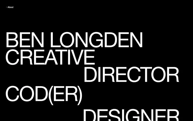
Preview image. Unlock full-res
monochromatic typographic power
Color palette
Page backgrounds, primary text, section dividers, decorative borders for images and lists — sets a high-contrast, bold tone
Primary page background for content sections, elevated card surfaces — provides a neutral canvas for high-contrast text
Text color against black backgrounds, borders around content blocks and list items — creates maximum contrast for readability and definition
Dark borders and separators for elevated surfaces and inverted UI. Do not promote it to the primary CTA color
Typography
- Weights
- 200
- Sizes
- 16px, 20px, 50px
- Line height
- 1.2, 1.6
- Letter spacing
- normal
- Fallback
- Helvetica Neue Light, Arial Light
The sole typeface, used for all content from headings to body text. Its very light weight (200), even at large sizes, creates an unusual sense of modern elegance and restraint, contrasting with its inherent geometric boldness. This choice avoids loudness, projecting authority through understated scale.
Spacing & shape
Components
Uses swis721_btroman at 50px line-height 1.2, in Element White (#ffffff) against an Absolute Black (#000000) background. Characterized by large, broken-line text blocks that create a typographic composition rather than a traditional heading.
Text uses swis721_btroman at 20px line-height 1.6, in Element White (#ffffff) for light themes or Absolute Black (#000000) for dark themes. Paired with a more descriptive text at 16px.
Uses swis721_btroman at 16px line-height 1.6, in Element White (#ffffff) or Absolute Black (#000000) depending on background. Typically left-aligned with 20px bottom margin for paragraph separation.
Text is swis721_btroman at 16px, Absolute Black (#000000). Features a subtle 1px solid border in Email Border Dark (#121212) on hover or focus, indicating interactivity without changing color.
Text uses swis721_btroman at 16px, Element White (#ffffff) on Absolute Black (#000000) background. Features a small bullet point to its left, indicating a minimal navigation style.
Text uses swis721_btroman at 16px, Element White (#ffffff) or Absolute Black (#000000), depending on context. Often presented in a two-line format, right-aligned relative to a preceding larger headline, using 20px bottom margin.
Guidelines
- Prioritize typography as the primary visual element, using swis721_btroman across all text roles.
- Maintain extreme contrast using only Absolute Black (#000000) and Element White (#ffffff) for text and backgrounds.
- Utilize Element White (#ffffff) for text on Absolute Black (#000000) backgrounds to ensure maximum readability and impact.
- Apply Absolute Black (#000000) as default for page backgrounds and thick content separation where a stark division is desired.
- Use letter-spacing 'normal' for all text, avoiding custom tracking to preserve the intrinsic character spacing of swis721_btroman.
- Separate content blocks and paragraphs with vertical margins of 20px using the base font size as a visual guide.
- Introduce elements like email links with a 1px solid border in Email Border Dark (#121212) to subtly indicate interactivity.
- Do not introduce any chromatic colors into the UI; strictly adhere to the black-and-white palette.
- Avoid using multiple font families or varying font weights beyond the available 200 for swis721_btroman.
- Do not add shadows or gradients to any UI elements; design is flat and relies on color contrast and spatial arrangement.
- Do not add decorative rounded corners to any component; maintain sharp, geometric edges throughout the design.
- Avoid excessive padding or large element gaps that soften the compact density; stick to 5px for elements and 20px for internal card padding.
- Do not use subtle neutral shifts for surface differentiation; rely on stark black/white changes for distinct sections.
About this system
ShowHide
Benlongdendesign employs a stark, high-contrast visual language reminiscent of brutalist typography. The system is built on a foundation of absolute black and white, achieving visual power through scale and geometric precision rather than color. Typography is the primary visual element, commanding attention with large, condensed forms, while UI elements are minimal and primarily functional. The overall atmosphere is direct, bold, and unapologetic, using negative space to emphasize strong textual statements.
The page employs a full-bleed layout alternating between Absolute Black (#000000) and Canvas White (#f6f6f6) sections, creating a strong vertical rhythm of monochromatic blocks. The hero section is full-bleed black with oversized white typographic compositions. Content is primarily arranged in single columns with occasional textual elements right-aligned beside larger headings, or project examples appearing in a waterfall-like list. There are no explicit grid systems for features or cards, rather a fluid stacking of content. Vertical spacing between logical sections is managed by the stark color changes and sectionGap of 43px. Navigation is minimal, consisting of a single 'About' link and email contact in the header/footer.
Imagery is functional, primarily comprising tightly cropped product screenshots or promotional artwork integrated directly into the layout. These visuals are typically contained within rectangular bounds, often bordered by Absolute Black or Element White depending on context, and serve to showcase work examples rather than provide decorative atmosphere. There is a complete absence of photography or abstract graphics; the visual language is all about direct presentation and bold typography interacting with sharp-edged imagery. Icons are minimal, represented only by a white bullet point in navigation, suggesting a content-dominant approach.
# Benlongdendesign — Style Reference
> monochromatic typographic power

**Theme:** light

**Site:** https://benlongdendesign.co.uk

Benlongdendesign employs a stark, high-contrast visual language reminiscent of brutalist typography. The system is built on a foundation of absolute black and white, achieving visual power through scale and geometric precision rather than color. Typography is the primary visual element, commanding attention with large, condensed forms, while UI elements are minimal and primarily functional. The overall atmosphere is direct, bold, and unapologetic, using negative space to emphasize strong textual statements.

## Tokens — Colors

| Name | Value | Token | Role |
|------|------|------|------|
| Absolute Black | `#000000` | `--color-absolute-black` | Page backgrounds, primary text, section dividers, decorative borders for images and lists — sets a high-contrast, bold tone |
| Canvas White | `#f6f6f6` | `--color-canvas-white` | Primary page background for content sections, elevated card surfaces — provides a neutral canvas for high-contrast text |
| Element White | `#ffffff` | `--color-element-white` | Text color against black backgrounds, borders around content blocks and list items — creates maximum contrast for readability and definition |
| Email Border Dark | `#121212` | `--color-email-border-dark` | Dark borders and separators for elevated surfaces and inverted UI. Do not promote it to the primary CTA color |

## Tokens — Typography

### swis721_btroman
- **Substitute:** Helvetica Neue Light, Arial Light
- **Weights:** 200
- **Sizes:** 16px, 20px, 50px
- **Line height:** 1.2, 1.6
- **Letter spacing:** normal
- **Role:** The sole typeface, used for all content from headings to body text. Its very light weight (200), even at large sizes, creates an unusual sense of modern elegance and restraint, contrasting with its inherent geometric boldness. This choice avoids loudness, projecting authority through understated scale.

## Tokens — Type Scale

| Role | Size | Line height | Letter spacing |
|------|------|------|------|
| body | 16px | 1.6 | — |
| subheading | 20px | 1.6 | — |
| display | 50px | 1.2 | — |

## Tokens — Spacing

- **Section gap:** 43px
- **Card padding:** 20px
- **Element gap:** 5px

## Tokens — Radius

- **Default:** 0px

## Layout

The page employs a full-bleed layout alternating between Absolute Black (#000000) and Canvas White (#f6f6f6) sections, creating a strong vertical rhythm of monochromatic blocks. The hero section is full-bleed black with oversized white typographic compositions. Content is primarily arranged in single columns with occasional textual elements right-aligned beside larger headings, or project examples appearing in a waterfall-like list. There are no explicit grid systems for features or cards, rather a fluid stacking of content. Vertical spacing between logical sections is managed by the stark color changes and sectionGap of 43px. Navigation is minimal, consisting of a single 'About' link and email contact in the header/footer.

## Imagery

Imagery is functional, primarily comprising tightly cropped product screenshots or promotional artwork integrated directly into the layout. These visuals are typically contained within rectangular bounds, often bordered by Absolute Black or Element White depending on context, and serve to showcase work examples rather than provide decorative atmosphere. There is a complete absence of photography or abstract graphics; the visual language is all about direct presentation and bold typography interacting with sharp-edged imagery. Icons are minimal, represented only by a white bullet point in navigation, suggesting a content-dominant approach.

## Components

### Hero Headline
*Statement typography for primary page headings.*

Uses swis721_btroman at 50px line-height 1.2, in Element White (#ffffff) against an Absolute Black (#000000) background. Characterized by large, broken-line text blocks that create a typographic composition rather than a traditional heading.

### Section Subtitle
*Secondary headings for project titles or thematic sections.*

Text uses swis721_btroman at 20px line-height 1.6, in Element White (#ffffff) for light themes or Absolute Black (#000000) for dark themes. Paired with a more descriptive text at 16px.

### Body Text Block
*Standard text content for paragraphs and descriptive information.*

Uses swis721_btroman at 16px line-height 1.6, in Element White (#ffffff) or Absolute Black (#000000) depending on background. Typically left-aligned with 20px bottom margin for paragraph separation.

### Link with Border
*Interactive text links, like email addresses.*

Text is swis721_btroman at 16px, Absolute Black (#000000). Features a subtle 1px solid border in Email Border Dark (#121212) on hover or focus, indicating interactivity without changing color.

### About Navigation Item
*Top-level navigation item.*

Text uses swis721_btroman at 16px, Element White (#ffffff) on Absolute Black (#000000) background. Features a small bullet point to its left, indicating a minimal navigation style.

### Project Metadata
*Descriptive tags associated with project entries.*

Text uses swis721_btroman at 16px, Element White (#ffffff) or Absolute Black (#000000), depending on context. Often presented in a two-line format, right-aligned relative to a preceding larger headline, using 20px bottom margin.

## Guidelines

### Do

- Prioritize typography as the primary visual element, using swis721_btroman across all text roles.
- Maintain extreme contrast using only Absolute Black (#000000) and Element White (#ffffff) for text and backgrounds.
- Utilize Element White (#ffffff) for text on Absolute Black (#000000) backgrounds to ensure maximum readability and impact.
- Apply Absolute Black (#000000) as default for page backgrounds and thick content separation where a stark division is desired.
- Use letter-spacing 'normal' for all text, avoiding custom tracking to preserve the intrinsic character spacing of swis721_btroman.
- Separate content blocks and paragraphs with vertical margins of 20px using the base font size as a visual guide.
- Introduce elements like email links with a 1px solid border in Email Border Dark (#121212) to subtly indicate interactivity.

### Don't

- Do not introduce any chromatic colors into the UI; strictly adhere to the black-and-white palette.
- Avoid using multiple font families or varying font weights beyond the available 200 for swis721_btroman.
- Do not add shadows or gradients to any UI elements; design is flat and relies on color contrast and spatial arrangement.
- Do not add decorative rounded corners to any component; maintain sharp, geometric edges throughout the design.
- Avoid excessive padding or large element gaps that soften the compact density; stick to 5px for elements and 20px for internal card padding.
- Do not use subtle neutral shifts for surface differentiation; rely on stark black/white changes for distinct sections.

## Agent Prompt Guide

primary action: no distinct CTA color
More like this









Keep what you find
A free account saves references to boards and can send you a weekly email of picks based on what you save.
To see every result, go Pro.