Preview image. Unlock full-res
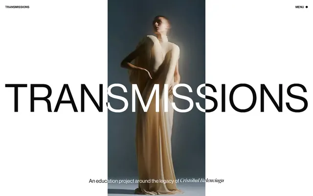
Monochromatic editorial canvas
Color palette
Page backgrounds, large content blocks, default text for dark modes — forms the expansive white canvas
Primary text, borders, high-contrast accents, link states
Secondary text, subtle borders, often used with Canvas White for maximal contrast
Subtle background surfaces, border accents for text links
Typography
- Weights
- 400, 500
- Sizes
- 14px, 18px, 24px, 64px
- Line height
- 0.95, 1, 1.2
- Letter spacing
- normal
- Fallback
- Inter
Headlines, navigation elements, and textual content. The high proportion of large sizes and a tightly-wound lineHeight (0.95) makes it feel impactful and modern. Substitute: Inter.
- Weights
- 500
- Sizes
- 24px, 64px
- Line height
- 0.95, 1.2
- Letter spacing
- normal
- Fallback
- Playfair Display
Decorative headlines and specific callouts. Its distinct character provides a visual counterpoint to the sans-serif, used sparingly for emphasis. Substitute: Playfair Display.
Spacing & shape
Components
Text in Neue Haas Grotesk Display, 14px size, Ink Black, no specific letter spacing. Interacts with a subtle border effect on hover or active states. The brand name 'TRANSMISSIONS' acts as a prominent static header item.
Small text 'MENU' in Neue Haas Grotesk Display, 14px, Ink Black, followed by a small, solid Ink Black circular indicator. Minimal padding.
Large text using either Neue Haas Grotesk Display or Saol Display, 64px, Ink Black (or Canvas White if overlapping a dark image). Line height is very tight at 0.95 for an impactful, stacked appearance, often overlapping background visuals.
Text in Neue Haas Grotesk Display, 18px, Phantom Black, with a standard line height of 1.20 for readability in smaller blocks.
Guidelines
- Prioritize Canvas White (#ffffff) and Ink Black (#000000) for high-contrast primary content and backgrounds.
- Use Neue Haas Grotesk Display 64px, lineHeight 0.95, for primary headlines, allowing it to overlap imagery.
- Implement small, minimal textual navigation links (14px Neue Haas Grotesk Display) rather than large buttons or icons.
- Maintain generous vertical spacing between content blocks, with section gaps often at 134px.
- Use Ghost Gray (#f5f5f5) sparingly for subtle background changes or very minimal borders on interactive elements.
- Apply all text in uppercase for headlines and navigation to maintain a stark, editorial tone.
- Avoid using saturated or chromatic colors; stick strictly to the achromatic palette beyond imagery.
- Do not introduce complex components with multiple styles, shadows, or gradients.
- Refrain from using bold typefaces or heavy weights; 400 and 500 are the heaviest allowed.
- Do not deviate from the tight line heights (0.95-1.00) specified for headlines and 1.20 for body text.
- Do not add any explicit border radii to UI elements; all corners should remain sharp.
- Avoid large primary action buttons; all interactive elements should remain text-based and understated.
About this system
ShowHide
Transmissions employs a stark, high-fashion editorial aesthetic, characterized by extreme typographic scale shifts and a monochromatic palette. Visual emphasis is achieved through oversized headlines that dominate the canvas, often overlapping imagery, while interactive elements like navigation remain small and subtle. The design relies on high contrast and minimal ornamentation, creating a sense of sophisticated restraint and focus.
Reminiscent of Balenciaga, Vogue, Calvin Klein (archival site), Acne Studios.
# Transmissions — Style Reference
> Monochromatic editorial canvas

**Theme:** light

**Site:** https://transmissions.cristobalbalenciagamuseoa.com

Transmissions employs a stark, high-fashion editorial aesthetic, characterized by extreme typographic scale shifts and a monochromatic palette. Visual emphasis is achieved through oversized headlines that dominate the canvas, often overlapping imagery, while interactive elements like navigation remain small and subtle. The design relies on high contrast and minimal ornamentation, creating a sense of sophisticated restraint and focus.

## Tokens — Colors

| Name | Value | Token | Role |
|------|------|------|------|
| Canvas White | `#ffffff` | `--color-canvas-white` | Page backgrounds, large content blocks, default text for dark modes — forms the expansive white canvas |
| Ink Black | `#000000` | `--color-ink-black` | Primary text, borders, high-contrast accents, link states |
| Phantom Black | `#010101` | `--color-phantom-black` | Secondary text, subtle borders, often used with Canvas White for maximal contrast |
| Ghost Gray | `#f5f5f5` | `--color-ghost-gray` | Subtle background surfaces, border accents for text links |

## Tokens — Typography

### Neue Haas Grotesk Display
- **Substitute:** Inter
- **Weights:** 400, 500
- **Sizes:** 14px, 18px, 24px, 64px
- **Line height:** 0.95, 1, 1.2
- **Letter spacing:** normal
- **Role:** Headlines, navigation elements, and textual content. The high proportion of large sizes and a tightly-wound lineHeight (0.95) makes it feel impactful and modern. Substitute: Inter.

### Saol Display
- **Substitute:** Playfair Display
- **Weights:** 500
- **Sizes:** 24px, 64px
- **Line height:** 0.95, 1.2
- **Letter spacing:** normal
- **Role:** Decorative headlines and specific callouts. Its distinct character provides a visual counterpoint to the sans-serif, used sparingly for emphasis. Substitute: Playfair Display.

## Tokens — Type Scale

| Role | Size | Line height | Letter spacing |
|------|------|------|------|
| caption | 14px | 1.2 | — |
| body | 18px | 1.2 | — |
| heading | 24px | 1.2 | — |
| display | 64px | 0.95 | — |

## Tokens — Spacing

- **Section gap:** 134px
- **Card padding:** 24px
- **Element gap:** 12px

## Components

### Header Navigation Link
*Top-level navigation items and brand identifier.*

Text in Neue Haas Grotesk Display, 14px size, Ink Black, no specific letter spacing. Interacts with a subtle border effect on hover or active states. The brand name 'TRANSMISSIONS' acts as a prominent static header item.

### Menu Trigger
*Opens the main site navigation.*

Small text 'MENU' in Neue Haas Grotesk Display, 14px, Ink Black, followed by a small, solid Ink Black circular indicator. Minimal padding.

### Hero Headline
*Dominant, attention-grabbing titles for key sections.*

Large text using either Neue Haas Grotesk Display or Saol Display, 64px, Ink Black (or Canvas White if overlapping a dark image). Line height is very tight at 0.95 for an impactful, stacked appearance, often overlapping background visuals.

### Subtle Helper Text
*Captions and secondary information.*

Text in Neue Haas Grotesk Display, 18px, Phantom Black, with a standard line height of 1.20 for readability in smaller blocks.

## Guidelines

### Do

- Prioritize Canvas White (#ffffff) and Ink Black (#000000) for high-contrast primary content and backgrounds.
- Use Neue Haas Grotesk Display 64px, lineHeight 0.95, for primary headlines, allowing it to overlap imagery.
- Implement small, minimal textual navigation links (14px Neue Haas Grotesk Display) rather than large buttons or icons.
- Maintain generous vertical spacing between content blocks, with section gaps often at 134px.
- Use Ghost Gray (#f5f5f5) sparingly for subtle background changes or very minimal borders on interactive elements.
- Apply all text in uppercase for headlines and navigation to maintain a stark, editorial tone.

### Don't

- Avoid using saturated or chromatic colors; stick strictly to the achromatic palette beyond imagery.
- Do not introduce complex components with multiple styles, shadows, or gradients.
- Refrain from using bold typefaces or heavy weights; 400 and 500 are the heaviest allowed.
- Do not deviate from the tight line heights (0.95-1.00) specified for headlines and 1.20 for body text.
- Do not add any explicit border radii to UI elements; all corners should remain sharp.
- Avoid large primary action buttons; all interactive elements should remain text-based and understated.

## Agent Prompt Guide

Quick Color Reference:
- text: #000000 (Ink Black)
- background: #ffffff (Canvas White)
- border: #000000 (Ink Black)
- accent: no distinct accent color
- primary action: no distinct CTA color

Example Component Prompts:
- Create a top navigation bar: Canvas White background, brand name 'TRANSMISSIONS' in Neue Haas Grotesk Display 14px Ink Black (weight 400), and a 'MENU •' link in Neue Haas Grotesk Display 14px Ink Black (weight 400) aligned right.
- Generate a hero section: Canvas White background, a central image, with an overlaid headline 'FASHION NOW' in Neue Haas Grotesk Display 64px Ink Black (weight 500, lineHeight 0.95). Below the headline, a caption 'Exploring visual narratives' in Neue Haas Grotesk Display 18px Phantom Black (weight 400, lineHeight 1.20).
- Design a text link: '← Back' in Neue Haas Grotesk Display 14px (weight 400) Ink Black, with a hover state that changes text to Ghost Gray (#f5f5f5) while retaining an Ink Black border for effect, if applicable.
More like this









Keep what you find
A free account saves references to boards and can send you a weekly email of picks based on what you save.
To see every result, go Pro.