Preview image. Unlock full-res
Earthy minimalist canvas
Color palette
Interactive element borders (links, navigation items, ghost buttons), decorative accents, badge text — this warm, earthy red provides a natural accent against the neutral palette
Page backgrounds, card surfaces, ghost button text (when on dark backgrounds)
Primary text color, content borders
Typography
- Weights
- 400, 700
- Sizes
- 14px, 16px, 40px
- Line height
- 1.5
- Letter spacing
- normal
- Fallback
- Inter
Primary typeface for all content, navigation, and interactive elements. Its clean, geometric forms maintain clarity.
Spacing & shape
Components
Transparent background, Terracotta Accent text and border. Radius 0px, no padding for a sleek, minimal link look.
Transparent background, White Canvas text, no defined border. Radii are set to 640px for a distinctive pill shape. Padding is implicit from content, but observed example data suggests 40px left/right padding for text-based badges.
Transparent background, Terracotta Accent text. No explicit padding or border radius on its own, usually adapting to its content and placement. Observed example data suggests zero padding for text-based badges.
Guidelines
- Use White Canvas (#ffffff) for page backgrounds and primary content surfaces.
- Apply Ink Black (#000000) for all primary body text and most headers to ensure high contrast.
- Accent interactive elements with Terracotta Accent (#8b3b2f) for borders and text where a subtle brand highlight is needed, particularly for outlined links and navigation.
- Ensure all buttons and interactive elements maintain a generous 640px border-radius for a consistent pill-shaped aesthetic.
- Prioritize Satoshi for all text, using weights 400 for body and 700 for distinct emphasis where necessary. Use normal letter-spacing.
- Maintain comfortable density by using 40px for vertical section gaps and 20px within cards.
- Keep overall layouts within a 1360px max-width, centrally aligned, to maintain content focus.
- Avoid strong shadows or heavy gradients; the design relies on flat surfaces and natural light.
- Do not introduce highly saturated or vibrant colors outside the established earthy palette; maintain the muted tone.
- Refrain from using varied border-radii across buttons and navigation; consistency in the 640px radius is key.
- Do not deviate from Satoshi; refrain from introducing additional font families.
- Do not use small, tight spacing between sections; allow ample breathing room with a minimum of 40px vertical section gaps.
- Avoid busy background patterns or textures that would distract from the content's natural feel.
- Do not create filled primary buttons; prioritize ghost or text-based buttons, accented with Terracotta Accent for borders.
About this system
ShowHide
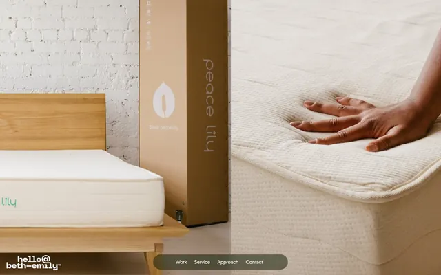
Beth-Emily employs a 'peaceful minimalist' style, characterized by a muted, earthy color palette and a soft, understated typographic approach. The design emphasizes natural textures and subtle visual cues, allowing brand imagery and content to take precedence. Surfaces are generally light, with interaction points highlighted by gentle washes of color and a distinct lack of heavy shadows, conveying an organic and approachable feel.
The page structure is based on a predominantly max-width contained layout (1360px), ensuring content is centered and readable. The hero section leverages full-bleed imagery as a backdrop for minimal text, setting an immersive tone. Sections appear to flow seamlessly with consistent vertical spacing, creating an airy feel. While a clear grid isn't explicitly defined, elements within sections suggest a balanced, possibly two-column, content arrangement. Navigation is discreetly placed, likely a minimalist footer or hidden off-canvas, minimizing visual clutter.
The visual language features authentic photography focusing on product details and natural textures rather than abstract concepts. Imagery is often tightly cropped, allowing the product or material to be the hero, with a soft, natural lighting that reinforces the peaceful and organic aesthetic. The absence of specific icon styles implies a content-forward approach where visual communication is primarily conveyed through photography and typography.
Reminiscent of Etsy, Allbirds, Away (luggage), Arket.
# Beth-Emily — Style Reference
> Earthy minimalist canvas

**Theme:** light

**Site:** https://beth-emily.com

Beth-Emily employs a 'peaceful minimalist' style, characterized by a muted, earthy color palette and a soft, understated typographic approach. The design emphasizes natural textures and subtle visual cues, allowing brand imagery and content to take precedence. Surfaces are generally light, with interaction points highlighted by gentle washes of color and a distinct lack of heavy shadows, conveying an organic and approachable feel.

## Tokens — Colors

| Name | Value | Token | Role |
|------|------|------|------|
| Terracotta Accent | `#8b3b2f` | `--color-terracotta-accent` | Interactive element borders (links, navigation items, ghost buttons), decorative accents, badge text — this warm, earthy red provides a natural accent against the neutral palette |
| White Canvas | `#ffffff` | `--color-white-canvas` | Page backgrounds, card surfaces, ghost button text (when on dark backgrounds) |
| Ink Black | `#000000` | `--color-ink-black` | Primary text color, content borders |

## Tokens — Typography

### Satoshi
- **Substitute:** Inter
- **Weights:** 400, 700
- **Sizes:** 14px, 16px, 40px
- **Line height:** 1.5
- **Letter spacing:** normal
- **Role:** Primary typeface for all content, navigation, and interactive elements. Its clean, geometric forms maintain clarity.

## Tokens — Type Scale

| Role | Size | Line height | Letter spacing |
|------|------|------|------|
| caption | 14px | 1.5 | — |
| body-sm | 16px | 1.5 | — |
| body | 40px | 1.3 | — |

## Tokens — Spacing

- **Max width:** 1360px
- **Section gap:** 40px
- **Card padding:** 20px
- **Element gap:** 8px

## Tokens — Radius

- **Buttons:** 640px
- **navigationItems:** 640px

## Layout

The page structure is based on a predominantly max-width contained layout (1360px), ensuring content is centered and readable. The hero section leverages full-bleed imagery as a backdrop for minimal text, setting an immersive tone. Sections appear to flow seamlessly with consistent vertical spacing, creating an airy feel. While a clear grid isn't explicitly defined, elements within sections suggest a balanced, possibly two-column, content arrangement. Navigation is discreetly placed, likely a minimalist footer or hidden off-canvas, minimizing visual clutter.

## Imagery

The visual language features authentic photography focusing on product details and natural textures rather than abstract concepts. Imagery is often tightly cropped, allowing the product or material to be the hero, with a soft, natural lighting that reinforces the peaceful and organic aesthetic. The absence of specific icon styles implies a content-forward approach where visual communication is primarily conveyed through photography and typography.

## Components

### Ghost Navigation Link
*Navigation item and basic link styling.*

Transparent background, Terracotta Accent text and border. Radius 0px, no padding for a sleek, minimal link look.

### Pill Ghost Button
*Primary interactive element for calls to action.*

Transparent background, White Canvas text, no defined border. Radii are set to 640px for a distinctive pill shape. Padding is implicit from content, but observed example data suggests 40px left/right padding for text-based badges.

### Inline Text Badge
*Small, contextual labels or tags.*

Transparent background, Terracotta Accent text. No explicit padding or border radius on its own, usually adapting to its content and placement. Observed example data suggests zero padding for text-based badges.

## Guidelines

### Do

- Use White Canvas (#ffffff) for page backgrounds and primary content surfaces.
- Apply Ink Black (#000000) for all primary body text and most headers to ensure high contrast.
- Accent interactive elements with Terracotta Accent (#8b3b2f) for borders and text where a subtle brand highlight is needed, particularly for outlined links and navigation.
- Ensure all buttons and interactive elements maintain a generous 640px border-radius for a consistent pill-shaped aesthetic.
- Prioritize Satoshi for all text, using weights 400 for body and 700 for distinct emphasis where necessary. Use normal letter-spacing.
- Maintain comfortable density by using 40px for vertical section gaps and 20px within cards.
- Keep overall layouts within a 1360px max-width, centrally aligned, to maintain content focus.

### Don't

- Avoid strong shadows or heavy gradients; the design relies on flat surfaces and natural light.
- Do not introduce highly saturated or vibrant colors outside the established earthy palette; maintain the muted tone.
- Refrain from using varied border-radii across buttons and navigation; consistency in the 640px radius is key.
- Do not deviate from Satoshi; refrain from introducing additional font families.
- Do not use small, tight spacing between sections; allow ample breathing room with a minimum of 40px vertical section gaps.
- Avoid busy background patterns or textures that would distract from the content's natural feel.
- Do not create filled primary buttons; prioritize ghost or text-based buttons, accented with Terracotta Accent for borders.

## Agent Prompt Guide

**Quick Color Reference:**
text: #000000
background: #ffffff
border: #8b3b2f (for interactive elements)
accent: #8b3b2f
primary action: #8b3b2f (outlined action border)

**3-5 Example Component Prompts:**
1. Create a navigation ghost link: text 'Work' in Satoshi, weight 400, size 16px, color #8b3b2f, normal letter-spacing, with a 0px border-radius.
2. Create an Outlined Primary Action: Transparent background, #8b3b2f border and text, 9999px radius, compact pill padding. Use it for the main CTA instead of a filled button.
3. Create an inline text badge: text 'New' in Satoshi, weight 400, size 14px, color #8b3b2f, normal letter-spacing, with a transparent background and no padding.
More like this









Keep what you find
A free account saves references to boards and can send you a weekly email of picks based on what you save.
To see every result, go Pro.