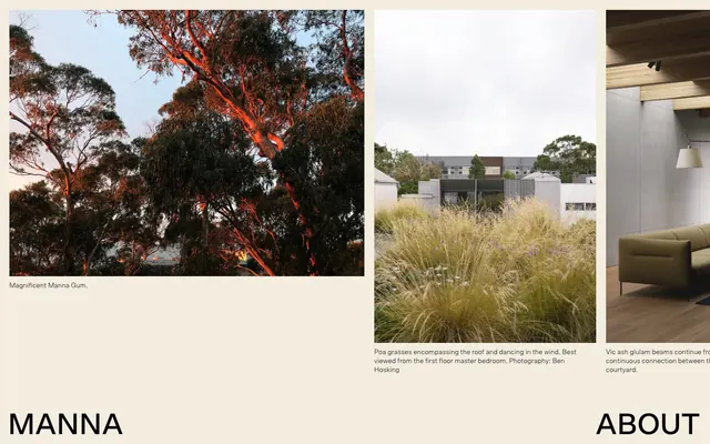
Preview image. Unlock full-res
Earthy Gallery Canvas
Color palette
Dominant background for visual sections and footers, creating a warm canvas for large imagery
Secondary background for footer elements or subtle surface variations, providing a softer contrast to text
Primary text color for all content, headings, and links. Also used for hairline borders and content dividers
Typography
- Weights
- 300, 500
- Sizes
- 14px, 60px
- Line height
- 1.29
- Letter spacing
- normal
- Fallback
- Inter
Headlines and prominent display text (60px, 500 weight) for brand impact, body text (14px, 300 weight) for spacious readability. The light 300 weight for body text gives a delicate, refined feel.
- Weights
- 400
- Sizes
- 16px, 26px
- Line height
- 1.23, 1.5
- Letter spacing
- normal
- Fallback
- Georgia
Body copy and informational text, particularly for image captions and detailed descriptions. The consistent 400 weight maintains a straightforward, unobtrusive presence.
Spacing & shape
Components
Images are presented without rounded corners, relying on the 'Earthy Ochre' background as their implied container. A 'Merlo' 16px caption in 'Charcoal Ink' with 1.5 lineHeight is set with 10px `marginBottom` below the image. Padding around the image and caption is 20px, framing the visual content.
The footer uses a 'Pale Linen' background with 20px padding on all sides. Text links like 'About' and 'info@mannaarchitects.com' are in 'Charcoal Ink' using 'Scto Grotesk A' at 14px, 300 weight.
Utilizes 'Scto Grotesk A' at 60px, weight 500, in 'Charcoal Ink'. This large, bold typography anchors content sections despite the overall light touch of the design.
Guidelines
- Prioritize large, uncropped imagery as primary content, allowing them to fill available width and define sections.
- Use 'Earthy Ochre' (#af6446) as the primary background for content blocks and distinct page sections.
- Render all text, including headings, body, and links, in 'Charcoal Ink' (#000000).
- Apply 'Scto Grotesk A' (60px, 500 weight) for dominant headings and 'Merlo' (16px, 400 weight) for detailed captions and informational text.
- Maintain minimal spacing around images by using 10px `marginBottom` for captions, creating a tight visual grouping.
- Structure layouts with ample clear space, using 20px padding for content blocks to prevent visual clutter.
- Avoid using highly saturated, vivid colors; stick to the muted, earthy palette provided.
- Do not introduce rounded corners for images or cards; maintain sharp, crisp edges for visual elements.
- Refrain from using strong drop shadows or complex elevation; the design relies on flat presentation and color contrast.
- Do not deviate from the specified font families or weights, as the typographic precision is a core brand element.
- Avoid excessive interactive elements or buttons; interaction should be secondary to content display.
- Do not use letter-spacing other than 'normal' for any text elements.
About this system
ShowHide
Manna Architects employs a subdued, earthy aesthetic that evokes natural materials and warm, muted tones. Text is primarily black against subtly tinted, soft backgrounds, giving a feeling of quiet elegance. Typography is precise and airy, favoring lighter weights and generous readability. The design system prioritizes large, impactful imagery and minimal, deliberate UI elements, suggesting a focus on visual content over interactive complexity.
The page primarily uses a full-bleed layout for imagery, with content sections appearing as large blocks or canvases. Text is typically centered or left-aligned beneath images. There is a strong vertical rhythm, with sections clearly delineated by shifts in background color (often 'Earthy Ochre'). The overall layout feels spacious and unconstrained, allowing visual content to breathe. Navigation is minimal, likely a simple header or footer with key links.
This system relies heavily on high-quality, full-bleed architectural photography and natural landscape imagery. Images are presented without borders or significant contained treatment, creating an immersive, gallery-like experience. The focus is on the object or scene, often with descriptive captions below. There are no apparent abstract graphics, illustrations, or complex icon systems; simplicity and realism dominate the visual language.
Reminiscent of Norm Architects, Studio McGee, The Future Kept, Artless.
# MANNA — Style Reference
> Earthy Gallery Canvas

**Theme:** light

**Site:** https://www.mannaarchitects.com

Manna Architects employs a subdued, earthy aesthetic that evokes natural materials and warm, muted tones. Text is primarily black against subtly tinted, soft backgrounds, giving a feeling of quiet elegance. Typography is precise and airy, favoring lighter weights and generous readability. The design system prioritizes large, impactful imagery and minimal, deliberate UI elements, suggesting a focus on visual content over interactive complexity.

## Tokens — Colors

| Name | Value | Token | Role |
|------|------|------|------|
| Earthy Ochre | `#af6446` | `--color-earthy-ochre` | Dominant background for visual sections and footers, creating a warm canvas for large imagery |
| Pale Linen | `#f2edde` | `--color-pale-linen` | Secondary background for footer elements or subtle surface variations, providing a softer contrast to text |
| Charcoal Ink | `#000000` | `--color-charcoal-ink` | Primary text color for all content, headings, and links. Also used for hairline borders and content dividers |

## Tokens — Typography

### Scto Grotesk A
- **Substitute:** Inter
- **Weights:** 300, 500
- **Sizes:** 14px, 60px
- **Line height:** 1.29
- **Letter spacing:** normal
- **Role:** Headlines and prominent display text (60px, 500 weight) for brand impact, body text (14px, 300 weight) for spacious readability. The light 300 weight for body text gives a delicate, refined feel.

### Merlo
- **Substitute:** Georgia
- **Weights:** 400
- **Sizes:** 16px, 26px
- **Line height:** 1.23, 1.5
- **Letter spacing:** normal
- **Role:** Body copy and informational text, particularly for image captions and detailed descriptions. The consistent 400 weight maintains a straightforward, unobtrusive presence.

## Tokens — Spacing

- **Section gap:** 40px
- **Card padding:** 20px
- **Element gap:** 10-20px

## Tokens — Radius

- **Images:** 0px

## Layout

The page primarily uses a full-bleed layout for imagery, with content sections appearing as large blocks or canvases. Text is typically centered or left-aligned beneath images. There is a strong vertical rhythm, with sections clearly delineated by shifts in background color (often 'Earthy Ochre'). The overall layout feels spacious and unconstrained, allowing visual content to breathe. Navigation is minimal, likely a simple header or footer with key links.

## Imagery

This system relies heavily on high-quality, full-bleed architectural photography and natural landscape imagery. Images are presented without borders or significant contained treatment, creating an immersive, gallery-like experience. The focus is on the object or scene, often with descriptive captions below. There are no apparent abstract graphics, illustrations, or complex icon systems; simplicity and realism dominate the visual language.

## Components

### Image Card with Caption
*Primary content display for portfolio pieces or architectural photography.*

Images are presented without rounded corners, relying on the 'Earthy Ochre' background as their implied container. A 'Merlo' 16px caption in 'Charcoal Ink' with 1.5 lineHeight is set with 10px `marginBottom` below the image. Padding around the image and caption is 20px, framing the visual content.

### Footer Section
*Global brand and contact information.*

The footer uses a 'Pale Linen' background with 20px padding on all sides. Text links like 'About' and 'info@mannaarchitects.com' are in 'Charcoal Ink' using 'Scto Grotesk A' at 14px, 300 weight.

### Prominent Brand Heading
*Major section titles and brand identity.*

Utilizes 'Scto Grotesk A' at 60px, weight 500, in 'Charcoal Ink'. This large, bold typography anchors content sections despite the overall light touch of the design.

## Guidelines

### Do

- Prioritize large, uncropped imagery as primary content, allowing them to fill available width and define sections.
- Use 'Earthy Ochre' (#af6446) as the primary background for content blocks and distinct page sections.
- Render all text, including headings, body, and links, in 'Charcoal Ink' (#000000).
- Apply 'Scto Grotesk A' (60px, 500 weight) for dominant headings and 'Merlo' (16px, 400 weight) for detailed captions and informational text.
- Maintain minimal spacing around images by using 10px `marginBottom` for captions, creating a tight visual grouping.
- Structure layouts with ample clear space, using 20px padding for content blocks to prevent visual clutter.

### Don't

- Avoid using highly saturated, vivid colors; stick to the muted, earthy palette provided.
- Do not introduce rounded corners for images or cards; maintain sharp, crisp edges for visual elements.
- Refrain from using strong drop shadows or complex elevation; the design relies on flat presentation and color contrast.
- Do not deviate from the specified font families or weights, as the typographic precision is a core brand element.
- Avoid excessive interactive elements or buttons; interaction should be secondary to content display.
- Do not use letter-spacing other than 'normal' for any text elements.

## Agent Prompt Guide

Quick Color Reference:
text: #000000
background: #af6446
border: #000000
accent: no distinct accent color
primary action: no distinct CTA color

Example Component Prompts:
1. Create an image display: an image with 0px radius, 10px `marginBottom`. Below it, add a caption: 'Merlo', 16px, 400 weight, #000000, 1.5 lineHeight.
2. Design a footer section: background is #f2edde, with 20px padding on all sides. It contains 'Scto Grotesk A', 14px, 300 weight, #000000 links separated by 20px `elementGap`.
3. Implement a page heading: 'Scto Grotesk A', 60px, 500 weight, #000000.
More like this









Keep what you find
A free account saves references to boards and can send you a weekly email of picks based on what you save.
To see every result, go Pro.