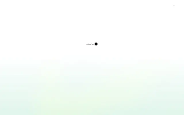
Preview image. Unlock full-res
Crisp canvas, pill buttons.
Color palette
Hero background tint, creating a unique visual atmosphere without strong saturation
Primary text, dark surface backgrounds, button backgrounds for primary actions, subtle borders for interactive elements
Page backgrounds, card surfaces, text on dark backgrounds, active navigation item borders
Slightly off-white backgrounds for secondary sections, creating subtle visual separation from the main canvas
Muted navigation text, subtle border accents in navigation
Secondary body text, supporting information with reduced visual hierarchy
Typography
- Weights
- 300, 400, 500, 600
- Sizes
- 10px, 12px, 14px, 15px, 16px, 17px, 18px, 30px, 42px
- Line height
- 1, 1.1, 1.2, 1.3, 1.4, 1.5
- Letter spacing
- 0.06
mainFont — detected in extracted data but not described by AI
- Letter spacing
- 0.0600em
- Fallback
- Inter, Arial, sans-serif
The primary typeface for all text elements. The range of weights and sizes supports a clear typographic hierarchy, from detailed captions to prominent headings. Consistent letter-spacing across the board provides a uniform and refined feel.
Spacing & shape
Components
Background: Obsidian (#0a0a0a), Text: Canvas (#ffffff), Border: Obsidian (#0a0a0a), Radius: 1497.6px (effectively pill-shaped). Padding: 9.7344px vertical, 16.4736px horizontal.
Background: Transparent, Text: Canvas (#ffffff), Border: Canvas (#ffffff) 1px, Radius: 0px. No padding, designed for inline text.
Background: rgba(255, 255, 255, 0.25), Text: Canvas (#ffffff), Border: Canvas (#ffffff), Radius: 100px. Padding: 4px vertical, 14px horizontal.
Background: Transparent, Text: Obsidian (#0a0a0a), Border: rgba(10, 10, 10, 0.15), Radius: 1497.6px (pill-shaped). Padding: 9.7344px vertical, 16.4736px horizontal.
Background: Canvas (#ffffff), Border: none, Radius: 4px. Padding around content is 14px.
Guidelines
- Use Obsidian (#0a0a0a) for primary text and interactions, ensuring AAA contrast against light backgrounds.
- Apply Canvas (#ffffff) for all main page and card backgrounds to maintain a bright, expansive canvas.
- Implement a 1497.6px border-radius for all primary action buttons, rendering them as distinct pill shapes.
- Introduce Mist (#ebebeb) as a background for secondary content blocks to create subtle visual breaking points.
- Prioritize the Custom Font at weight 400 for body text, ensuring legibility with a line-height of 1.5.
- Use 0.0600em letter-spacing consistently across all text to maintain a refined, airy feel.
- Employ the Soft Jade Wash gradient for hero sections or atmospheric backgrounds to introduce subtle, ethereal color.
- Avoid arbitrary uses of color; reserve saturated hues for specific brand-aligned visual moments like the Soft Jade Wash.
- Do not deviate from the established pill and 4px radii; circularity and soft corners are key brand identifiers.
- Never use heavy shadows or gradients on interactive elements beyond what's specified, as the system favors lightness.
- Refrain from tight spacing; maintain a comfortable element gap of 8px and generous section gaps of 60px.
- Do not introduce additional font families or weights outside of the 'Custom Font' weights 300-600.
- Avoid bolding words unnecessarily; visual hierarchy is primarily managed through size and a restrained palette of weights.
- Do not use highly saturated color for text; stick to Obsidian (#0a0a0a) and Faded Steel (#858585) for optimal contrast on white/light backgrounds.
About this system
ShowHide
Bou employs a crisp, airy aesthetic with clean typography and a strong emphasis on monochrome surfaces. Interactive elements are softened by extreme radii, creating a comfortable, approachable feel despite the stark black and white palette. Subtle background color shifts break up sections, while a singular light-green wash provides a moment of visual pause. The system prioritizes content legibility through high contrast and generous spacing.
The page adheres to a max-width contained layout, though the exact width is not explicitly defined, it maintains generous horizontal padding. The hero section often features a soft, background gradient (Soft Jade Wash) with centered headlines and minimal navigation hints. Section rhythm is managed through alternating background colors, primarily Canvas (#ffffff) and Mist (#ebebeb), with consistent vertical spacing provided by a 60px section gap. Content arrangement frequently uses a centered stack, and for showcasing work, a multi-column card-like grid with images and text overlays. Navigation is a sticky top bar with minimal links.
The site predominantly uses product screenshots or minimal abstract graphics, often presented without heavy adornment. Imagery is contained, rather than full-bleed, usually with either sharp 0px or soft 4px border radii, fitting neatly into the UI. There's a notable absence of lifestyle photography. Icons, when present, are simple, outlined, and monochrome, integrating seamlessly with the clean aesthetic. Imagery serves primarily to showcase client work or provide clear functional cues rather than creating atmospheric decoration.
Reminiscent of Framer, Linear, Stripe, Vercel.
# Bou — Style Reference
> Crisp canvas, pill buttons.

**Theme:** light

**Site:** https://bou.co

Bou employs a crisp, airy aesthetic with clean typography and a strong emphasis on monochrome surfaces. Interactive elements are softened by extreme radii, creating a comfortable, approachable feel despite the stark black and white palette. Subtle background color shifts break up sections, while a singular light-green wash provides a moment of visual pause. The system prioritizes content legibility through high contrast and generous spacing.

## Tokens — Colors

| Name | Value | Token | Role |
|------|------|------|------|
| Soft Jade Wash | `#cbecec` | `--color-soft-jade-wash` | Hero background tint, creating a unique visual atmosphere without strong saturation |
| Obsidian | `#0a0a0a` | `--color-obsidian` | Primary text, dark surface backgrounds, button backgrounds for primary actions, subtle borders for interactive elements |
| Canvas | `#ffffff` | `--color-canvas` | Page backgrounds, card surfaces, text on dark backgrounds, active navigation item borders |
| Mist | `#ebebeb` | `--color-mist` | Slightly off-white backgrounds for secondary sections, creating subtle visual separation from the main canvas |
| Pewter | `#dbd9dc` | `--color-pewter` | Muted navigation text, subtle border accents in navigation |
| Faded Steel | `#858585` | `--color-faded-steel` | Secondary body text, supporting information with reduced visual hierarchy |

## Tokens — Typography

### mainFont
- **Weights:** 300, 400, 500, 600
- **Sizes:** 10px, 12px, 14px, 15px, 16px, 17px, 18px, 30px, 42px
- **Line height:** 1, 1.1, 1.2, 1.3, 1.4, 1.5
- **Letter spacing:** 0.06
- **Role:** mainFont — detected in extracted data but not described by AI

### Custom Font
- **Substitute:** Inter, Arial, sans-serif
- **Letter spacing:** 0.0600em
- **Role:** The primary typeface for all text elements. The range of weights and sizes supports a clear typographic hierarchy, from detailed captions to prominent headings. Consistent letter-spacing across the board provides a uniform and refined feel.

## Tokens — Type Scale

Perfect Fourth (1.333) from 14px base.

| Role | Size | Line height | Letter spacing |
|------|------|------|------|
| caption | 10px | 1.5 | — |
| body | 14px | 1.5 | — |
| body-lg | 16px | 1.5 | — |
| subheading | 18px | 1.4 | — |
| heading | 30px | 1.2 | — |
| display | 42px | 1.1 | — |

## Tokens — Spacing

- **Section gap:** 60px
- **Card padding:** 14px
- **Element gap:** 8px

## Tokens — Radius

- **Buttons:** 1497.6px
- **Cards:** 4px
- **Images:** 4px
- **navigation:** 1400px
- **tags:** 100px

## Layout

The page adheres to a max-width contained layout, though the exact width is not explicitly defined, it maintains generous horizontal padding. The hero section often features a soft, background gradient (Soft Jade Wash) with centered headlines and minimal navigation hints. Section rhythm is managed through alternating background colors, primarily Canvas (#ffffff) and Mist (#ebebeb), with consistent vertical spacing provided by a 60px section gap. Content arrangement frequently uses a centered stack, and for showcasing work, a multi-column card-like grid with images and text overlays. Navigation is a sticky top bar with minimal links.

## Imagery

The site predominantly uses product screenshots or minimal abstract graphics, often presented without heavy adornment. Imagery is contained, rather than full-bleed, usually with either sharp 0px or soft 4px border radii, fitting neatly into the UI. There's a notable absence of lifestyle photography. Icons, when present, are simple, outlined, and monochrome, integrating seamlessly with the clean aesthetic. Imagery serves primarily to showcase client work or provide clear functional cues rather than creating atmospheric decoration.

## Components

### Filled Primary Button
*Calls to action, emphasized links.*

Background: Obsidian (#0a0a0a), Text: Canvas (#ffffff), Border: Obsidian (#0a0a0a), Radius: 1497.6px (effectively pill-shaped). Padding: 9.7344px vertical, 16.4736px horizontal.

### Ghost Navigation Link
*Navigation items, secondary actions within dark sections.*

Background: Transparent, Text: Canvas (#ffffff), Border: Canvas (#ffffff) 1px, Radius: 0px. No padding, designed for inline text.

### Ghost Accent Button
*Secondary actions, subtle interactive elements on textured backgrounds.*

Background: rgba(255, 255, 255, 0.25), Text: Canvas (#ffffff), Border: Canvas (#ffffff), Radius: 100px. Padding: 4px vertical, 14px horizontal.

### Text Only Button (Dark)
*Subtle actions or links within light sections.*

Background: Transparent, Text: Obsidian (#0a0a0a), Border: rgba(10, 10, 10, 0.15), Radius: 1497.6px (pill-shaped). Padding: 9.7344px vertical, 16.4736px horizontal.

### Content Card
*Grouping related content or feature highlights.*

Background: Canvas (#ffffff), Border: none, Radius: 4px. Padding around content is 14px.

## Guidelines

### Do

- Use Obsidian (#0a0a0a) for primary text and interactions, ensuring AAA contrast against light backgrounds.
- Apply Canvas (#ffffff) for all main page and card backgrounds to maintain a bright, expansive canvas.
- Implement a 1497.6px border-radius for all primary action buttons, rendering them as distinct pill shapes.
- Introduce Mist (#ebebeb) as a background for secondary content blocks to create subtle visual breaking points.
- Prioritize the Custom Font at weight 400 for body text, ensuring legibility with a line-height of 1.5.
- Use 0.0600em letter-spacing consistently across all text to maintain a refined, airy feel.
- Employ the Soft Jade Wash gradient for hero sections or atmospheric backgrounds to introduce subtle, ethereal color.

### Don't

- Avoid arbitrary uses of color; reserve saturated hues for specific brand-aligned visual moments like the Soft Jade Wash.
- Do not deviate from the established pill and 4px radii; circularity and soft corners are key brand identifiers.
- Never use heavy shadows or gradients on interactive elements beyond what's specified, as the system favors lightness.
- Refrain from tight spacing; maintain a comfortable element gap of 8px and generous section gaps of 60px.
- Do not introduce additional font families or weights outside of the 'Custom Font' weights 300-600.
- Avoid bolding words unnecessarily; visual hierarchy is primarily managed through size and a restrained palette of weights.
- Do not use highly saturated color for text; stick to Obsidian (#0a0a0a) and Faded Steel (#858585) for optimal contrast on white/light backgrounds.

## Agent Prompt Guide

Quick Color Reference:
text: #0a0a0a
background: #ffffff
border: #dbd9dc
accent: no distinct accent color
primary action: #0a0a0a (filled action)

Example Component Prompts:
1. Create a primary action button: Background #0a0a0a, text #ffffff, radius 1497.6px, padding 9.7344px vertical, 16.4736px horizontal.
2. Design a navigation link on a dark background: Background transparent, text #ffffff, 1px border #ffffff, radius 0px.
3. Implement a secondary action button with a frosted appearance: Background rgba(255, 255, 255, 0.25), text #ffffff, border #ffffff, radius 100px, padding 4px vertical, 14px horizontal.
4. Build a content card: Background #ffffff, radius 4px, internal padding of 14px surrounding content. Title text #0a0a0a at Custom Font 18px, weight 500. Body text #0a0a0a at Custom Font 14px, weight 400, line-height 1.5.
5. Create a section header: Text #0a0a0a at Custom Font 30px, weight 600, line-height 1.2, section gap above/below 60px.
More like this









Keep what you find
A free account saves references to boards and can send you a weekly email of picks based on what you save.
To see every result, go Pro.