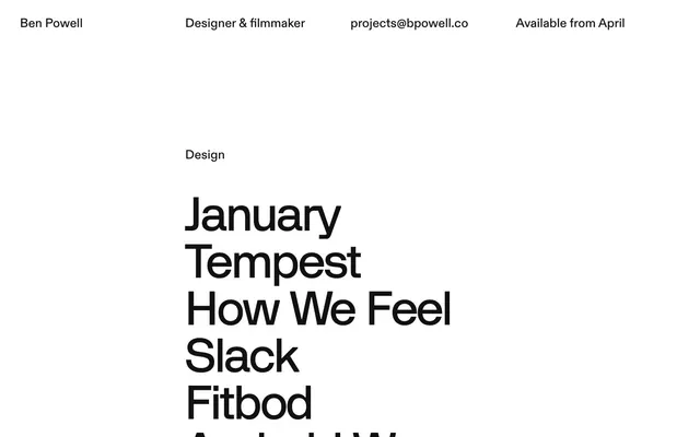
Preview image. Unlock full-res
gallery wall typography
Color palette
Primary page background, text on dark surfaces
Primary text, surface backgrounds, active outlines
Secondary text, subtle surface backgrounds, borders
Subtle border lines for subtle divisions
Typography
- Weights
- 500, 700
- Sizes
- 26px, 58px
- Line height
- 1.04, 1.05, 1.15
- Letter spacing
- -0.0170em
- Fallback
- Inter
Primary body text links, project titles in light sections. Weight 500 for general text, 700 for emphasis.
- Weights
- 500, 600
- Sizes
- 26px
- Line height
- 1.15
- Letter spacing
- normal
- Fallback
- PP Editorial New
Descriptive text, secondary titles. Its normal letter spacing provides a counterpoint to the more tracked typefaces.
- Weights
- 500, 600
- Sizes
- 58px, 86px
- Line height
- 1.04, 1.05
- Letter spacing
- 58px: -0.0170em, 86px: -0.0330em
- Fallback
- Monument Grotesk
Highly tracked, large-scale headlines, creating a distinct visual signature for prominent titles, especially in dark sections.
- Weights
- 500
- Sizes
- 26px
- Line height
- 1.15
- Letter spacing
- normal
- Fallback
- PP Editorial New
Small, descriptive sub-headings. Used sparingly to differentiate content categories.
- Weights
- 600
- Sizes
- 58px, 60px
- Line height
- 1, 1.04
- Letter spacing
- 0.0690em
- Fallback
- Space Mono
Uppercase emphasized headlines, with wide tracking creating an airy, refined feel for section titles.
Spacing & shape
Components
Text link in Diatype weight 500, 26px, Ink Black on Canvas White or Canvas White on Ink Black. Underlined on hover or active state using a 1px Ink Black border.
Large text link in Teg font, 58px or 86px, Ink Black on Canvas White or Canvas White on Ink Black. Letter spacing is either -0.0170em (58px) or -0.0330em (86px). Underlined with a 2px Ink Black border from the link's bottom edge upon interaction.
Uppercase text in New Grotesk font, weights 600, 58px or 60px, with wide letter spacing of 0.0690em. Rendered in Ink Black text.
Small text in Beatrice font, weight 500, 26px, normal letter spacing. Rendered in Ink Black.
Guidelines
- Prioritize typography as the primary visual element, using extreme contrast (Ink Black on Canvas White and vice versa).
- Maintain a clear visual hierarchy through font family, weight, and letter spacing — particularly the distinct tracking of Teg and New Grotesk.
- Use 1px or 2px solid Ink Black borders sparingly for subtle interaction cues on links and occasionally as a divider.
- Ensure generous vertical spacing, using 56px and 104px for section gaps to create comfortable density.
- Employ the 0px border-radius system-wide; avoid rounded corners for a sharp, precise look.
- Utilize a base unit of 4px for all spacing measurements, with element gaps typically at 16px.
- Alternate between Canvas White and Ink Black backgrounds for distinct page sections, using text colors that ensure AAA contrast.
- Avoid using any chromatic colors; stick to the achromatic palette of extreme blacks and whites.
- Do not add drop shadows or complex elevation effects; rely on high contrast and typographic size for hierarchy.
- Refrain from using any imagery or photographic elements; the UI is purely typographic and text-driven.
- Do not introduce decorative borders or complex graphical elements; keep UI minimal and functional.
- Avoid mixed letter-spacing within a single typographic element; stick to the defined tracking for each font and size.
- Do not use subtle gray shades for primary text or backgrounds; the system leans into high-contrast black and white.
- Do not use generic buttons; interactive elements are styled as underlines or text transformations without distinct backgrounds.
About this system
ShowHide
The Bpowell design system embodies a stark, high-contrast aesthetic reminiscent of a gallery space. It leverages a predominantly monochrome palette, where extreme black and white create a dramatic backdrop for textual content. Typography is the hero, featuring bold, custom sans-serif fonts with distinct letter spacing used to define visual hierarchy and create a sense of impactful directness. Components are minimalistic, relying on negative space and precise typography to convey interaction rather than traditional buttons or elaborate graphic elements.
The page primarily uses a full-bleed layout for both light and dark sections, with content centered horizontally but often stretching to near-full width. The hero consists of simple text. Section rhythm is driven by alternating Canvas White and Ink Black backgrounds, creating strong visual breaks. Content is arranged in prominent vertical stacks of large text links, often with smaller descriptive text above. There is no grid usage for content and no visible card structures. Navigation is a minimal, top-bar text-based menu that appears to be sticky or fixed.
The site uses no imagery, photography, or illustrations. The visual language is entirely text-based, relying on the composition, sizing, and contrast of typography to create visual interest and structure.
Reminiscent of AIGA Design Archives, Manythings by Pentagram, Casey Reas, Constructed.cc.
# Bpowell — Style Reference
> gallery wall typography

**Theme:** mixed

**Site:** https://www.bpowell.co

The Bpowell design system embodies a stark, high-contrast aesthetic reminiscent of a gallery space. It leverages a predominantly monochrome palette, where extreme black and white create a dramatic backdrop for textual content. Typography is the hero, featuring bold, custom sans-serif fonts with distinct letter spacing used to define visual hierarchy and create a sense of impactful directness. Components are minimalistic, relying on negative space and precise typography to convey interaction rather than traditional buttons or elaborate graphic elements.

## Tokens — Colors

| Name | Value | Token | Role |
|------|------|------|------|
| Canvas White | `#ffffff` | `--color-canvas-white` | Primary page background, text on dark surfaces |
| Ink Black | `#000000` | `--color-ink-black` | Primary text, surface backgrounds, active outlines |
| Charcoal Black | `#111111` | `--color-charcoal-black` | Secondary text, subtle surface backgrounds, borders |
| Deep Gray | `#2b2b2b` | `--color-deep-gray` | Subtle border lines for subtle divisions |

## Tokens — Typography

### Diatype
- **Substitute:** Inter
- **Weights:** 500, 700
- **Sizes:** 26px, 58px
- **Line height:** 1.04, 1.05, 1.15
- **Letter spacing:** -0.0170em
- **Role:** Primary body text links, project titles in light sections. Weight 500 for general text, 700 for emphasis.

### Beatricedisplay
- **Substitute:** PP Editorial New
- **Weights:** 500, 600
- **Sizes:** 26px
- **Line height:** 1.15
- **Letter spacing:** normal
- **Role:** Descriptive text, secondary titles. Its normal letter spacing provides a counterpoint to the more tracked typefaces.

### Teg
- **Substitute:** Monument Grotesk
- **Weights:** 500, 600
- **Sizes:** 58px, 86px
- **Line height:** 1.04, 1.05
- **Letter spacing:** 58px: -0.0170em, 86px: -0.0330em
- **Role:** Highly tracked, large-scale headlines, creating a distinct visual signature for prominent titles, especially in dark sections.

### Beatrice
- **Substitute:** PP Editorial New
- **Weights:** 500
- **Sizes:** 26px
- **Line height:** 1.15
- **Letter spacing:** normal
- **Role:** Small, descriptive sub-headings. Used sparingly to differentiate content categories.

### New Grotesk
- **Substitute:** Space Mono
- **Weights:** 600
- **Sizes:** 58px, 60px
- **Line height:** 1, 1.04
- **Letter spacing:** 0.0690em
- **Role:** Uppercase emphasized headlines, with wide tracking creating an airy, refined feel for section titles.

## Tokens — Spacing

- **Section gap:** 104px
- **Card padding:** 24px
- **Element gap:** 16px

## Tokens — Radius

- **none:** 0px

## Layout

The page primarily uses a full-bleed layout for both light and dark sections, with content centered horizontally but often stretching to near-full width. The hero consists of simple text. Section rhythm is driven by alternating Canvas White and Ink Black backgrounds, creating strong visual breaks. Content is arranged in prominent vertical stacks of large text links, often with smaller descriptive text above. There is no grid usage for content and no visible card structures. Navigation is a minimal, top-bar text-based menu that appears to be sticky or fixed.

## Imagery

The site uses no imagery, photography, or illustrations. The visual language is entirely text-based, relying on the composition, sizing, and contrast of typography to create visual interest and structure.

## Components

### Navigation Bar Item
*Header and footer navigation (text links)*

Text link in Diatype weight 500, 26px, Ink Black on Canvas White or Canvas White on Ink Black. Underlined on hover or active state using a 1px Ink Black border.

### Project Title Link
*Interactive project list items*

Large text link in Teg font, 58px or 86px, Ink Black on Canvas White or Canvas White on Ink Black. Letter spacing is either -0.0170em (58px) or -0.0330em (86px). Underlined with a 2px Ink Black border from the link's bottom edge upon interaction.

### Section Heading (Uppercase)
*Categorical section headers*

Uppercase text in New Grotesk font, weights 600, 58px or 60px, with wide letter spacing of 0.0690em. Rendered in Ink Black text.

### Subsection Label
*Subtle visual separators for content blocks*

Small text in Beatrice font, weight 500, 26px, normal letter spacing. Rendered in Ink Black.

## Guidelines

### Do

- Prioritize typography as the primary visual element, using extreme contrast (Ink Black on Canvas White and vice versa).
- Maintain a clear visual hierarchy through font family, weight, and letter spacing — particularly the distinct tracking of Teg and New Grotesk.
- Use 1px or 2px solid Ink Black borders sparingly for subtle interaction cues on links and occasionally as a divider.
- Ensure generous vertical spacing, using 56px and 104px for section gaps to create comfortable density.
- Employ the 0px border-radius system-wide; avoid rounded corners for a sharp, precise look.
- Utilize a base unit of 4px for all spacing measurements, with element gaps typically at 16px.
- Alternate between Canvas White and Ink Black backgrounds for distinct page sections, using text colors that ensure AAA contrast.

### Don't

- Avoid using any chromatic colors; stick to the achromatic palette of extreme blacks and whites.
- Do not add drop shadows or complex elevation effects; rely on high contrast and typographic size for hierarchy.
- Refrain from using any imagery or photographic elements; the UI is purely typographic and text-driven.
- Do not introduce decorative borders or complex graphical elements; keep UI minimal and functional.
- Avoid mixed letter-spacing within a single typographic element; stick to the defined tracking for each font and size.
- Do not use subtle gray shades for primary text or backgrounds; the system leans into high-contrast black and white.
- Do not use generic buttons; interactive elements are styled as underlines or text transformations without distinct backgrounds.

## Agent Prompt Guide

Quick Color Reference:
text: #000000
background: #ffffff
border: #000000
accent: no distinct accent color
primary action: no distinct CTA color

Example Component Prompts:
1. Create a primary navigation item: text 'About' in Diatype weight 500, 26px, Ink Black text on Canvas White background. Underline active state with 1px Ink Black border.
2. Create a project list entry: text 'Monument Valley' in Teg weight 500, 86px, letter-spacing -0.0330em, Canvas White text on Ink Black background. On hover, apply a 2px Ink Black underline.
3. Create a section heading: text 'DESIGN' uppercase in New Grotesk weight 600, 58px, letter-spacing 0.0690em, Ink Black text on Canvas White background.
4. Create a descriptive sub-heading: text 'Designer & filmmaker' in Beatrice weight 500, 26px, normal letter spacing, Ink Black text on Canvas White background, 16px elementGap below.
More like this







Keep what you find
A free account saves references to boards and can send you a weekly email of picks based on what you save.
To see every result, go Pro.