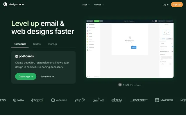
Preview image. Unlock full-res
Forest clearing at dawn — dark canopy above, open light below, a single green glow marking the path forward.
Color palette
Primary CTA buttons, active badges, success states — the one green that appears in both dark and light zones, making every interactive element identifiable at a glance
Accent text within dark hero section — used on word-level highlights inside headlines (e.g. 'Level up' in a contrasting tone), gives the dark hero warmth without switching to orange or gold
Light product card background (the Postcards feature card), a near-white tinted with the same green family as the primary brand
Accent word highlights in light-section headings ('beautiful' in 'Simple products for beautiful designs') — appears word-level only, never as a background
Inline links and secondary interactive elements in list contexts
Article category badges — vivid orange tags on blog/article cards for visual taxonomy
Sign Up button in the navigation bar — the only warm-hued button; its contrast against the dark nav makes it pop without using the primary green
Icon fill and secondary action states — appears in product UI screenshots and icon illustrations
Light violet background tint on select feature sections
Hero section background, dark nav background — the deepest surface in the system; white text reads at 16.5:1 against it
Secondary dark surface, used as an elevated dark card or section band within the dark-mode hero zone
Subtle dividers within dark sections — barely distinct from the background, read more as inset lines than separators
Default body text, icons, borders on light sections — the near-black that does almost all the work in the light zone
Secondary body text, captions, subdued labels on light backgrounds
Tertiary text, placeholder text, decorative borders
Subdued body copy and metadata within dark sections
Page background, section alternates — a barely-warm white that keeps the canvas from feeling sterile
Card borders, image frames, soft dividers on light surfaces
Typography
- Weights
- 400, 500, 600, 700
- Sizes
- 11px, 14px, 15px, 16px, 18px, 19px, 20px, 21px, 24px, 28px, 32px, 40px, 41px, 48px, 56px, 57px
- Line height
- 1.1
- Letter spacing
- -2.8px at 100px scale equivalent; concretely: -0.028em at 57px (~-1.6px), -0.022em at 48px (~-1.06px), -0.020em at 40px (~-0.8px), -0.015em at 28px (~-0.42px), -0.010em at 21px (~-0.21px), normal at 14-16px, +0.118em at 11px (uppercase labels only)
- Fallback
- Inter (Google Fonts) with feature-settings applied
The sole typeface for the entire system. Display sizes (48–57px) use weight 700 with tight negative tracking (-0.028em to -0.022em), creating dense, confident headlines. Body text (14–16px) uses weight 400 at 1.5–1.6 leading. Weight 600 handles subheadings and UI labels. The five OpenType features (cv03, cv04, cv06, cv09, ss03) distinguish this from stock Inter — alternate letterforms on 'a', 'g', and 'l' give the text a slightly more geometric feel than default Inter.
Spacing & shape
Components
Background #27ae60, white text, 999px radius (full pill), 13px top/bottom padding, 28px left/right padding. Weight 600, 16px. The same shape and color appears on both dark and light backgrounds — the green reads clearly on either surface. Arrow glyph appended inline (→).
Transparent background, #27ae60 text and border, 999px radius, 0px top/bottom padding (height set by line-height), 30px left/right padding. Appears paired with the filled green button to create a primary/secondary hierarchy without introducing a second color.
White background, #313942 text and border, 17px radius (not a pill — distinct from CTAs), 7px top/bottom padding, 19px left/right padding. The non-pill radius on this variant signals a different interaction tier from the rounded CTAs.
Transparent background, white text and border, 999px radius (pill), 0px vertical padding, 40px horizontal padding. Used in dark-hero contexts where the green primary isn't needed.
#f49a40 background (amber-orange), white text, 999px radius, matching padding to ghost white button. The amber color is unique to this one button site-wide — it's not part of the standard CTA system, deliberately distinguishing account creation from feature CTAs.
Background #edf9f2 (Mint Card), 32px border radius, no box-shadow, 50px padding all sides. Contains product logo, headline at 32px weight 700, body text at 16px #313942, and a ghost green button. The mint tint ties the card visually to the green brand without using the full #27ae60.
White or #f4f7f2 background, 20px radius, 32-40px padding. Display numeral at 57px weight 700, tracking -1.6px, line-height 1.0. Descriptor text at 14-16px weight 400 #313942. Three cards in a 3-column grid, separated by subtle #e4ebe2 borders.
Background #ff5722 (orange), white text, 6px radius, 4px vertical padding, 8px horizontal padding, 11px font size weight 500. The orange reads vividly against both the dark article section background and the card thumbnail images.
Background #27ae60, white text, 6px radius, 0px vertical padding, 6px horizontal padding. The same green as the CTA button, keeping semantic and brand signals unified.
Transparent background tabs with 16px text, active tab underlined with #27ae60 2px border-bottom, inactive tabs in #879b93 (Fog). Set on the dark hero, tabs provide product switching without a separate page load. Active label in white, inactive in Fog.
12–32px border radius on the image container. Drop shadow: rgba(17, 50, 38, 0.14) 14px 17px 40px 0px — a green-tinted shadow that stays on-brand even for elevation. Screenshots are displayed at full card width, never cropped to icons.
Full-width horizontal strip on #0e231c dark background, white SVG logos at reduced opacity. No borders or separators between logos. Functions as a pure social proof divider between the hero and the stats section.
Guidelines
- Use #27ae60 for all primary interactive elements — CTA buttons, active states, success badges — in both dark and light sections. This is the only green allowed as a button fill.
- Apply 999px border-radius to all CTA pill buttons; reserve 17px radius for outlined secondary actions and nav chips; use 32px for large product cards.
- Set display headlines (48–57px) at weight 700 with letter-spacing -0.022em to -0.028em and InterVariable feature-settings '"cv03" on, "cv04" on, "cv06" on, "cv09" on, "ss03" on'.
- Use #f49a40 exclusively for the navigation Sign Up button — no other element in the system uses amber. Do not repurpose this color for section CTAs.
- Apply the green-tinted shadow (rgba(17, 50, 38, 0.14) 14px 17px 40px 0px) only to product screenshot images — never to cards, modals, or buttons.
- Alternate hero and footer between #0e231c dark and light #f4f7f2/#ffffff to bookend page content with the same palette, closing the visual loop.
- Use #5c51e0 (Iris) and #defaca (Sage Whisper) only as inline word-level accents inside headlines — never as button fills or background swatches.
- Do not mix the amber nav button (#f49a40) into body CTAs or feature sections — it belongs only in the top navigation, where it uniquely signals account creation.
- Do not apply the green-tinted drop shadow to cards or panels — card boundaries are defined by background-color contrast alone (mint vs white vs page gray).
- Do not use Inter without the OpenType feature-settings — 'cv03', 'cv04', 'cv06', 'cv09', 'ss03' are required to match the on-brand letterform variants.
- Do not use positive letter-spacing (tracking) on any text larger than 12px — the +0.118em value is reserved for uppercase micro-labels at 11px only.
- Do not introduce additional font weights beyond 400, 500, 600, 700 — the four-weight scale is sufficient and adding 300 or 800 breaks the typographic register.
- Do not place article category badges in any color other than #ff5722 — violet, green, or blue badges would conflict with the accent-color hierarchy where those hues carry semantic meaning.
- Do not use card shadows or borders on Feature Product Cards — the #edf9f2 mint background against a white or gray page is the only containment mechanism.
About this system
ShowHide
Designmodo splits its personality across two distinct registers: a deep forest-green dark hero (#0e231c) that anchors authority, then opens into a bright white content canvas — the visual equivalent of stepping through a dark doorway into a sunlit studio. The dark sections use white and the muted sage #defaca for type, while the light sections flip to near-black #313942, creating a two-room color system where context always signals mode. A single electric green (#27ae60) is the sole interactive color in both worlds — CTA buttons, badges, and active states all share one hue, making every clickable element feel like it belongs to the same family regardless of which room it lives in. InterVariable at negative letter-spacing (down to -0.028em at display sizes) does the typographic heavy lifting, with ligature-aware feature flags 'cv03', 'cv04', 'cv06', 'cv09', 'ss03' making standard Inter feel proprietary. The 32px card radius and 999px pill buttons create the only soft geometry in an otherwise rectangular system.
Max-width approximately 1200px, centered on a white or near-white (#f4f7f2) canvas. The hero is full-bleed dark (#0e231c), spanning the full viewport width and roughly 90vh, with a two-column split: left column holds the headline + tab switcher + CTA cluster, right column holds the product screenshot frame. Below the hero, a full-bleed logo strip acts as a visual break before the light content zone begins. The light zone uses alternating white and #f4f7f2 section bands with no dividing lines — background shift alone creates rhythm. Feature product cards appear as large single cards (one per section) in a centered single-column layout with 50px internal padding. The stats section is a 3-column equal-width grid. The integrations and 'built for you' sections return to 2-column text-plus-visual layouts. The article carousel is a 4-column card grid with left/right arrow navigation. Footer is a dark #0e231c band returning to the hero palette, closing the visual loop.
Three types coexist without visual conflict. Product screenshots are the dominant imagery type — captured as realistic app UI at standard screen proportions, placed in rounded frames with the brand-green shadow, never cropped or iconified. These are explanatory, not decorative. Photography appears in blog/article cards: lifestyle-editorial — laptops on desks, phones in hands, overhead phone mockups — treated with natural color, high-key, not desaturated or duotoned. A third tier of small brand logos (partner/client strip) appears as flat white SVGs. Icons within the product UI (drag-and-drop icons, integration logos) are outlined, 1.5px stroke weight, monochromatic. The overall image density is moderate — screenshots anchor feature sections, photos appear only in the article carousel.
Reminiscent of Webflow, Mailchimp, Unbounce, Beefree, Framer.
# Designmodo — Style Reference
> Forest clearing at dawn — dark canopy above, open light below, a single green glow marking the path forward.

**Theme:** mixed

**Site:** https://designmodo.com

Designmodo splits its personality across two distinct registers: a deep forest-green dark hero (#0e231c) that anchors authority, then opens into a bright white content canvas — the visual equivalent of stepping through a dark doorway into a sunlit studio. The dark sections use white and the muted sage #defaca for type, while the light sections flip to near-black #313942, creating a two-room color system where context always signals mode. A single electric green (#27ae60) is the sole interactive color in both worlds — CTA buttons, badges, and active states all share one hue, making every clickable element feel like it belongs to the same family regardless of which room it lives in. InterVariable at negative letter-spacing (down to -0.028em at display sizes) does the typographic heavy lifting, with ligature-aware feature flags 'cv03', 'cv04', 'cv06', 'cv09', 'ss03' making standard Inter feel proprietary. The 32px card radius and 999px pill buttons create the only soft geometry in an otherwise rectangular system.

## Tokens — Colors

| Name | Value | Token | Role |
|------|------|------|------|
| Sprout | `#27ae60` | `--color-sprout` | Primary CTA buttons, active badges, success states — the one green that appears in both dark and light zones, making every interactive element identifiable at a glance |
| Sage Whisper | `#defaca` | `--color-sage-whisper` | Accent text within dark hero section — used on word-level highlights inside headlines (e.g. 'Level up' in a contrasting tone), gives the dark hero warmth without switching to orange or gold |
| Mint Card | `#edf9f2` | `--color-mint-card` | Light product card background (the Postcards feature card), a near-white tinted with the same green family as the primary brand |
| Iris | `#5c51e0` | `--color-iris` | Accent word highlights in light-section headings ('beautiful' in 'Simple products for beautiful designs') — appears word-level only, never as a background |
| Sky Link | `#186bff` | `--color-sky-link` | Inline links and secondary interactive elements in list contexts |
| Tangerine CTA | `#ff5722` | `--color-tangerine-cta` | Article category badges — vivid orange tags on blog/article cards for visual taxonomy |
| Amber Nav | `#f49a40` | `--color-amber-nav` | Sign Up button in the navigation bar — the only warm-hued button; its contrast against the dark nav makes it pop without using the primary green |
| Azure Action | `#2f80ed` | `--color-azure-action` | Icon fill and secondary action states — appears in product UI screenshots and icon illustrations |
| Lavender Tint | `#f1ebff` | `--color-lavender-tint` | Light violet background tint on select feature sections |
| Forest Floor | `#0e231c` | `--color-forest-floor` | Hero section background, dark nav background — the deepest surface in the system; white text reads at 16.5:1 against it |
| Canopy Shadow | `#1a3029` | `--color-canopy-shadow` | Secondary dark surface, used as an elevated dark card or section band within the dark-mode hero zone |
| Pine Border | `#233630` | `--color-pine-border` | Subtle dividers within dark sections — barely distinct from the background, read more as inset lines than separators |
| Slate Ink | `#313942` | `--color-slate-ink` | Default body text, icons, borders on light sections — the near-black that does almost all the work in the light zone |
| Ash | `#656a75` | `--color-ash` | Secondary body text, captions, subdued labels on light backgrounds |
| Mist | `#c3cecb` | `--color-mist` | Tertiary text, placeholder text, decorative borders |
| Fog | `#879b93` | `--color-fog` | Subdued body copy and metadata within dark sections |
| Parchment | `#f4f7f2` | `--color-parchment` | Page background, section alternates — a barely-warm white that keeps the canvas from feeling sterile |
| Dew | `#e4ebe2` | `--color-dew` | Card borders, image frames, soft dividers on light surfaces |

## Tokens — Typography

### InterVariable
- **Substitute:** Inter (Google Fonts) with feature-settings applied
- **Weights:** 400, 500, 600, 700
- **Sizes:** 11px, 14px, 15px, 16px, 18px, 19px, 20px, 21px, 24px, 28px, 32px, 40px, 41px, 48px, 56px, 57px
- **Line height:** 1.1
- **Letter spacing:** -2.8px at 100px scale equivalent; concretely: -0.028em at 57px (~-1.6px), -0.022em at 48px (~-1.06px), -0.020em at 40px (~-0.8px), -0.015em at 28px (~-0.42px), -0.010em at 21px (~-0.21px), normal at 14-16px, +0.118em at 11px (uppercase labels only)
- **Role:** The sole typeface for the entire system. Display sizes (48–57px) use weight 700 with tight negative tracking (-0.028em to -0.022em), creating dense, confident headlines. Body text (14–16px) uses weight 400 at 1.5–1.6 leading. Weight 600 handles subheadings and UI labels. The five OpenType features (cv03, cv04, cv06, cv09, ss03) distinguish this from stock Inter — alternate letterforms on 'a', 'g', and 'l' give the text a slightly more geometric feel than default Inter.

## Tokens — Type Scale

Major Third (1.25) from 16px base.

| Role | Size | Line height | Letter spacing |
|------|------|------|------|
| caption | 11px | 2.29 | 1.3px |
| body-sm | 14px | 1.5 | — |
| body | 16px | 1.6 | — |
| subheading | 18px | 1.5 | — |
| heading-sm | 24px | 1.35 | -0.24px |
| heading | 32px | 1.3 | -0.48px |
| heading-lg | 48px | 1.1 | -1.06px |
| display | 57px | 1 | -1.6px |

## Tokens — Spacing

- **Max width:** 1200px
- **Section gap:** 80-120px
- **Card padding:** 50px
- **Element gap:** 8-16px

## Tokens — Radius

- **Buttons:** 999px
- **Cards:** 32px
- **Images:** 12px
- **badges:** 6px
- **chips:** 17px
- **tags:** 5px

## Layout

Max-width approximately 1200px, centered on a white or near-white (#f4f7f2) canvas. The hero is full-bleed dark (#0e231c), spanning the full viewport width and roughly 90vh, with a two-column split: left column holds the headline + tab switcher + CTA cluster, right column holds the product screenshot frame. Below the hero, a full-bleed logo strip acts as a visual break before the light content zone begins. The light zone uses alternating white and #f4f7f2 section bands with no dividing lines — background shift alone creates rhythm. Feature product cards appear as large single cards (one per section) in a centered single-column layout with 50px internal padding. The stats section is a 3-column equal-width grid. The integrations and 'built for you' sections return to 2-column text-plus-visual layouts. The article carousel is a 4-column card grid with left/right arrow navigation. Footer is a dark #0e231c band returning to the hero palette, closing the visual loop.

## Imagery

Three types coexist without visual conflict. Product screenshots are the dominant imagery type — captured as realistic app UI at standard screen proportions, placed in rounded frames with the brand-green shadow, never cropped or iconified. These are explanatory, not decorative. Photography appears in blog/article cards: lifestyle-editorial — laptops on desks, phones in hands, overhead phone mockups — treated with natural color, high-key, not desaturated or duotoned. A third tier of small brand logos (partner/client strip) appears as flat white SVGs. Icons within the product UI (drag-and-drop icons, integration logos) are outlined, 1.5px stroke weight, monochromatic. The overall image density is moderate — screenshots anchor feature sections, photos appear only in the article carousel.

## Components

### Stats Counter Cards

### Product Feature Card (Postcards)

### Article Cards with Category Badges

### Primary CTA Button
*Main call-to-action, most prominent interactive element*

Background #27ae60, white text, 999px radius (full pill), 13px top/bottom padding, 28px left/right padding. Weight 600, 16px. The same shape and color appears on both dark and light backgrounds — the green reads clearly on either surface. Arrow glyph appended inline (→).

### Ghost Green Button
*Secondary CTA beside primary button, typically 'See more' or 'Learn more'*

Transparent background, #27ae60 text and border, 999px radius, 0px top/bottom padding (height set by line-height), 30px left/right padding. Appears paired with the filled green button to create a primary/secondary hierarchy without introducing a second color.

### Outlined Dark Button
*Tertiary action on light sections, e.g. 'Browse articles'*

White background, #313942 text and border, 17px radius (not a pill — distinct from CTAs), 7px top/bottom padding, 19px left/right padding. The non-pill radius on this variant signals a different interaction tier from the rounded CTAs.

### Ghost White Button
*Navigation-level or overlay actions on dark sections*

Transparent background, white text and border, 999px radius (pill), 0px vertical padding, 40px horizontal padding. Used in dark-hero contexts where the green primary isn't needed.

### Navigation Sign Up Button
*Primary conversion entry point in sticky nav bar*

#f49a40 background (amber-orange), white text, 999px radius, matching padding to ghost white button. The amber color is unique to this one button site-wide — it's not part of the standard CTA system, deliberately distinguishing account creation from feature CTAs.

### Feature Product Card
*Large showcase card for a named product (Postcards, Slides, Startup)*

Background #edf9f2 (Mint Card), 32px border radius, no box-shadow, 50px padding all sides. Contains product logo, headline at 32px weight 700, body text at 16px #313942, and a ghost green button. The mint tint ties the card visually to the green brand without using the full #27ae60.

### Stats Counter Card
*Metric callout block (97%, 7.2 hours, 500 hours)*

White or #f4f7f2 background, 20px radius, 32-40px padding. Display numeral at 57px weight 700, tracking -1.6px, line-height 1.0. Descriptor text at 14-16px weight 400 #313942. Three cards in a 3-column grid, separated by subtle #e4ebe2 borders.

### Category Badge
*Article taxonomy tag on blog cards*

Background #ff5722 (orange), white text, 6px radius, 4px vertical padding, 8px horizontal padding, 11px font size weight 500. The orange reads vividly against both the dark article section background and the card thumbnail images.

### Success/Status Badge
*Status indicator, success label*

Background #27ae60, white text, 6px radius, 0px vertical padding, 6px horizontal padding. The same green as the CTA button, keeping semantic and brand signals unified.

### Tab Navigation
*Product switcher (Postcards / Slides / Startup)*

Transparent background tabs with 16px text, active tab underlined with #27ae60 2px border-bottom, inactive tabs in #879b93 (Fog). Set on the dark hero, tabs provide product switching without a separate page load. Active label in white, inactive in Fog.

### Product Screenshot Frame
*App UI screenshot within hero or feature sections*

12–32px border radius on the image container. Drop shadow: rgba(17, 50, 38, 0.14) 14px 17px 40px 0px — a green-tinted shadow that stays on-brand even for elevation. Screenshots are displayed at full card width, never cropped to icons.

### Logo Bar (Social Proof Strip)
*Trust logos row — Twilio, Toptal, Vodafone, Yelp, etc.*

Full-width horizontal strip on #0e231c dark background, white SVG logos at reduced opacity. No borders or separators between logos. Functions as a pure social proof divider between the hero and the stats section.

## Guidelines

### Do

- Use #27ae60 for all primary interactive elements — CTA buttons, active states, success badges — in both dark and light sections. This is the only green allowed as a button fill.
- Apply 999px border-radius to all CTA pill buttons; reserve 17px radius for outlined secondary actions and nav chips; use 32px for large product cards.
- Set display headlines (48–57px) at weight 700 with letter-spacing -0.022em to -0.028em and InterVariable feature-settings '"cv03" on, "cv04" on, "cv06" on, "cv09" on, "ss03" on'.
- Use #f49a40 exclusively for the navigation Sign Up button — no other element in the system uses amber. Do not repurpose this color for section CTAs.
- Apply the green-tinted shadow (rgba(17, 50, 38, 0.14) 14px 17px 40px 0px) only to product screenshot images — never to cards, modals, or buttons.
- Alternate hero and footer between #0e231c dark and light #f4f7f2/#ffffff to bookend page content with the same palette, closing the visual loop.
- Use #5c51e0 (Iris) and #defaca (Sage Whisper) only as inline word-level accents inside headlines — never as button fills or background swatches.

### Don't

- Do not mix the amber nav button (#f49a40) into body CTAs or feature sections — it belongs only in the top navigation, where it uniquely signals account creation.
- Do not apply the green-tinted drop shadow to cards or panels — card boundaries are defined by background-color contrast alone (mint vs white vs page gray).
- Do not use Inter without the OpenType feature-settings — 'cv03', 'cv04', 'cv06', 'cv09', 'ss03' are required to match the on-brand letterform variants.
- Do not use positive letter-spacing (tracking) on any text larger than 12px — the +0.118em value is reserved for uppercase micro-labels at 11px only.
- Do not introduce additional font weights beyond 400, 500, 600, 700 — the four-weight scale is sufficient and adding 300 or 800 breaks the typographic register.
- Do not place article category badges in any color other than #ff5722 — violet, green, or blue badges would conflict with the accent-color hierarchy where those hues carry semantic meaning.
- Do not use card shadows or borders on Feature Product Cards — the #edf9f2 mint background against a white or gray page is the only containment mechanism.

## Agent Prompt Guide

**Quick Color Reference**
- Page background (light): #f4f7f2
- Page background (dark sections): #0e231c
- Primary text: #313942
- Primary CTA: #27ae60 (green, pill shape, 999px radius)
- Nav Sign Up button: #f49a40 (amber, pill)
- Accent headline word: #5c51e0 (violet, inline only)
- Border / divider: #e4ebe2

**Example Component Prompts**

1. **Dark Hero Section**: Full-bleed #0e231c background. Left column: headline at 57px InterVariable weight 700 white, letter-spacing -1.6px, line-height 1.0. The word 'Level up' in #defaca. Subtext 16px weight 400 #879b93. Tab row (Postcards, Slides, Startup) at 16px, active tab white with #27ae60 2px underline, inactive in #879b93. Green pill CTA: #27ae60 fill, white text, 999px radius, 13px/28px padding. Ghost secondary: transparent, #27ae60 border+text, 999px radius, 30px horizontal padding. Right column: app screenshot in 32px rounded container with shadow rgba(17,50,38,0.14) 14px 17px 40px 0px.

2. **Mint Feature Card**: Background #edf9f2, 32px radius, no shadow, 50px padding all sides. Product logo SVG top-left. Headline 32px weight 700 #313942, letter-spacing -0.48px. Body text 16px weight 400 #313942 line-height 1.6. Ghost green button below body text: transparent, #27ae60 border+text, 999px radius, 30px horizontal padding.

3. **Stats Counter Card**: White background, 20px radius, ~32px padding. Numeral at 57px weight 700 #313942, letter-spacing -1.6px, line-height 1.0. Descriptor text 14px weight 400 #313942. Three cards in a 3-column grid. Light #e4ebe2 border on each card.

4. **Article Blog Card**: White card, 12px image radius. Above image: full-width photo. Below: orange badge (#ff5722, 6px radius, white text 11px weight 500, 4px/8px padding). Author row: 24px avatar + name at 14px #313942. Headline 18px weight 600 #313942. 'Read more →' link 14px #313942 weight 400.

5. **Navigation Bar**: #0e231c background, full-width. Left: Designmodo wordmark + icon. Center: 'Apps' and 'Articles' dropdowns at 15px weight 500 white. Right: 'Log In' ghost text #ffffff 15px, then Sign Up pill button #f49a40 fill white text 999px radius 7px/19px padding.

## Color Accent System

The system uses a deliberate 3-tier accent approach to avoid accent color fatigue. Tier 1 (Interactive): #27ae60 green — the only color on buttons, active states, and success indicators. Tier 2 (Editorial): #5c51e0 violet appears only as inline headline word accents on light backgrounds; #defaca sage appears only as inline word accents on dark backgrounds. Neither accent tier is ever used as a button or a background. Tier 3 (Taxonomy): #ff5722 orange is strictly for article category badges. The amber #f49a40 is locked to the nav Sign Up button. This prevents any single non-green color from competing with the primary brand signal.
More like this



Keep what you find
A free account saves references to boards and can send you a weekly email of picks based on what you save.
To see every result, go Pro.