Preview image. Unlock full-res
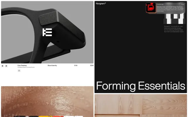
monochromatic architectural blueprint
Color palette
Primary text, critical borders, main canvas backgrounds in dark sections, player controls
Page backgrounds, subtle card surfaces, primary text on dark backgrounds
Card backgrounds, secondary dark surface elements
Subtle background accents, muted borders, placeholder text
Muted helper text, secondary information text, subtle decorative strokes
Subordinate body text, descriptive labels
Ghost button backgrounds and default link backgrounds, indicating non-primary actions
Supporting palette color for small decorative accents when the core palette needs contrast. Do not promote it to the primary CTA color
Typography
- Weights
- 400, 500
- Sizes
- 10px, 12px, 36px, 87px
- Line height
- 1, 1.1, 1.17, 1.67
- Letter spacing
- -0.0200em at 87px, -0.0080em at 36px, -0.0050em at 12px
- Fallback
- Inter
Primary display text, headlines, main body content, and navigation elements. Its precise tracking at larger sizes maintains clarity and strong visual presence.
- Weights
- 400
- Sizes
- 14px, 16px
- Line height
- 1.43, 1.5
- Letter spacing
- normal
- Fallback
- Times New Roman
Long-form editorial body text, detailed descriptions, and footer content. The serif choice adds a touch of classic sophistication against the clean sans-serif displays.
- Letter spacing
- -0.0060em
- Fallback
- Inter
Interactive link text, small labels, and button text when a slightly bolder or more compact presentation is needed than the regular weight.
Spacing & shape
Components
Transparent background with Obsidian text and border. Radius 0px. No padding, focusing purely on the icon or minimal text label. Uses 'Helvetica Now Display - Regular' at 10px.
Background is 'Smoked Glass' (rgba(63, 63, 63, 0.4)) with 'Canvas White' text. Has 7px border-radius and 5px vertical / 7px horizontal padding. Uses 'Helvetica Now Display - Medium' at 12px.
Background is 'Deep Graphite' (#141414) with a minimal border-radius of 4.0678px. No explicit padding, content is flush to edges. Font is 'Helvetica Now Display - Regular'.
Background is 'Whisper Gray' (#999999) with 10px border-radius. Padding is 3px for all sides. Text is 'Canvas White' using 'Helvetica Now Display - Medium' at 12px.
Uses 'Obsidian' for active states against light backgrounds. Icons and text appear with 0px padding and 0px radius.
Body text using 'Ash Mist' (#777777) or 'Soft Stone' (#cecece), typically 12px 'Helvetica Now Display - Regular'.
Guidelines
- Maintain a stark, high-contrast palette using 'Obsidian' (#000000) for text and 'Canvas White' (#ffffff) for backgrounds, and 'Deep Graphite' (#141414) for dark surfaces.
- Apply 'Helvetica Now Display - Regular' for headlines and main content, utilizing aggressive negative letter-spacing for large titles (-0.0200em at 87px).
- Use geometric, minimal border radii: 4.0678px for cards and larger containers, and 7px for interactive elements like buttons.
- Space elements using a compact rhythm, leveraging 8px for most element gaps and 68px for section separation.
- Convey interaction through subtle background fills like 'Smoked Glass' (rgba(63, 63, 63, 0.4)) or 'Whisper Gray' (#b2b2b2) rather than strongly chromatic accents.
- Prioritize functional clarity over decorative elements; every visual choice must serve to organize or highlight content precisely.
- Avoid decorative shadows or complex elevation schemes; surfaces should remain flat or subtly transparent.
- Do not introduce vibrant accent colors; the system relies on a strictly achromatic palette with functional gray tints.
- Refrain from using organic or hand-drawn graphic elements; visuals should be precise, geometric, and structured.
- Avoid excessive padding within containers; content often sits flush with card edges or uses minimal, proportional spacing.
- Do not use generic system fonts for display text; 'Helvetica Now Display' is critical for maintaining the brand's sharp, modern edge.
- Do not apply large, soft rounded corners unless explicitly denoted; default radii are small and precise.
About this system
ShowHide
Norgram operates with a stark, high-contrast aesthetic, juxtaposing deep black and pristine white with minimal interruption. The system leans on precise typography and a grid-based rhythm, creating a sense of quiet authority rather than overt design flourishes. Color is used sparingly, primarily for functional accents, ensuring that content and structure remain the focal point. Components emphasize lightweight clarity: flat surfaces, crisp text, and subtle interactions.
The layout is primarily a max-width contained grid, but projects and hero sections can expand to full-bleed. The hero pattern prominently features a full-bleed dark background with stark white, centered headlines. Content sections often alternate between light and dark thematic bands, utilizing consistent vertical spacing of 68px between major sections. Within sections, content is arranged in two-column text+image layouts or stacked centered blocks for more focused messages. There's an underlying compact density, with minimal internal padding on elements like cards, allowing imagery and text to command space. Navigation is a minimal top-bar, often ghosted or subtly present.
This design system uses a blend of high-fidelity product photography, often showcasing technological devices or industrial designs in controlled, studio-like lighting against monochromatic backgrounds. These are integrated full-bleed or as large content blocks, serving as primary visual content rather than decorative elements. Abstract, minimalist graphics featuring clean lines and geometric structures are also present, often used subtly as background textures or brand elements. Icons are typically monochrome, outlined or filled, with a very fine stroke weight or solid, reflecting the system's overall precision.
Reminiscent of Stripe, Linear, Apple (Product Pages), AIGA (Brand Identity Guidelines).
# Norgram — Style Reference
> monochromatic architectural blueprint

**Theme:** mixed

**Site:** https://www.norgram.co

Norgram operates with a stark, high-contrast aesthetic, juxtaposing deep black and pristine white with minimal interruption. The system leans on precise typography and a grid-based rhythm, creating a sense of quiet authority rather than overt design flourishes. Color is used sparingly, primarily for functional accents, ensuring that content and structure remain the focal point. Components emphasize lightweight clarity: flat surfaces, crisp text, and subtle interactions.

## Tokens — Colors

| Name | Value | Token | Role |
|------|------|------|------|
| Obsidian | `#000000` | `--color-obsidian` | Primary text, critical borders, main canvas backgrounds in dark sections, player controls |
| Canvas White | `#ffffff` | `--color-canvas-white` | Page backgrounds, subtle card surfaces, primary text on dark backgrounds |
| Deep Graphite | `#141414` | `--color-deep-graphite` | Card backgrounds, secondary dark surface elements |
| Powder Gray | `#efefef` | `--color-powder-gray` | Subtle background accents, muted borders, placeholder text |
| Ash Mist | `#777777` | `--color-ash-mist` | Muted helper text, secondary information text, subtle decorative strokes |
| Soft Stone | `#cecece` | `--color-soft-stone` | Subordinate body text, descriptive labels |
| Whisper Gray | `#b2b2b2` | `--color-whisper-gray` | Ghost button backgrounds and default link backgrounds, indicating non-primary actions |
| Smoked Glass | `#3f3f3f` | `--color-smoked-glass` | Supporting palette color for small decorative accents when the core palette needs contrast. Do not promote it to the primary CTA color |

## Tokens — Typography

### Helvetica Now Display
- **Substitute:** Inter
- **Weights:** 400, 500
- **Sizes:** 10px, 12px, 36px, 87px
- **Line height:** 1, 1.1, 1.17, 1.67
- **Letter spacing:** -0.0200em at 87px, -0.0080em at 36px, -0.0050em at 12px
- **Role:** Primary display text, headlines, main body content, and navigation elements. Its precise tracking at larger sizes maintains clarity and strong visual presence.

### Times
- **Substitute:** Times New Roman
- **Weights:** 400
- **Sizes:** 14px, 16px
- **Line height:** 1.43, 1.5
- **Letter spacing:** normal
- **Role:** Long-form editorial body text, detailed descriptions, and footer content. The serif choice adds a touch of classic sophistication against the clean sans-serif displays.

### Helvetica Now Display
- **Substitute:** Inter
- **Letter spacing:** -0.0060em
- **Role:** Interactive link text, small labels, and button text when a slightly bolder or more compact presentation is needed than the regular weight.

## Tokens — Type Scale

| Role | Size | Line height | Letter spacing |
|------|------|------|------|
| caption | 10px | 1.17 | — |
| body-sm | 12px | 1.17 | — |
| body | 36px | 1.17 | — |
| body-lg | 87px | 1.17 | — |

## Tokens — Spacing

- **Section gap:** 68px
- **Card padding:** 0px
- **Element gap:** 8px

## Tokens — Radius

- **Buttons:** 7px
- **Cards:** 4.0678px
- **forms:** 10px
- **links:** 26px

## Layout

The layout is primarily a max-width contained grid, but projects and hero sections can expand to full-bleed. The hero pattern prominently features a full-bleed dark background with stark white, centered headlines. Content sections often alternate between light and dark thematic bands, utilizing consistent vertical spacing of 68px between major sections. Within sections, content is arranged in two-column text+image layouts or stacked centered blocks for more focused messages. There's an underlying compact density, with minimal internal padding on elements like cards, allowing imagery and text to command space. Navigation is a minimal top-bar, often ghosted or subtly present.

## Imagery

This design system uses a blend of high-fidelity product photography, often showcasing technological devices or industrial designs in controlled, studio-like lighting against monochromatic backgrounds. These are integrated full-bleed or as large content blocks, serving as primary visual content rather than decorative elements. Abstract, minimalist graphics featuring clean lines and geometric structures are also present, often used subtly as background textures or brand elements. Icons are typically monochrome, outlined or filled, with a very fine stroke weight or solid, reflecting the system's overall precision.

## Components

### Ghost Player Button
*Interactive control for media playback or navigation within content blocks.*

Transparent background with Obsidian text and border. Radius 0px. No padding, focusing purely on the icon or minimal text label. Uses 'Helvetica Now Display - Regular' at 10px.

### Toast Notification Button
*Close button for ephemeral notifications or alerts.*

Background is 'Smoked Glass' (rgba(63, 63, 63, 0.4)) with 'Canvas White' text. Has 7px border-radius and 5px vertical / 7px horizontal padding. Uses 'Helvetica Now Display - Medium' at 12px.

### Basic Content Card
*Container for showcasing work, images, or small content snippets.*

Background is 'Deep Graphite' (#141414) with a minimal border-radius of 4.0678px. No explicit padding, content is flush to edges. Font is 'Helvetica Now Display - Regular'.

### Interactive Link Button
*Actionable text links in notifications or informational areas.*

Background is 'Whisper Gray' (#999999) with 10px border-radius. Padding is 3px for all sides. Text is 'Canvas White' using 'Helvetica Now Display - Medium' at 12px.

### Image Player Controls
*Controls for navigating through image galleries or project details.*

Uses 'Obsidian' for active states against light backgrounds. Icons and text appear with 0px padding and 0px radius.

### Meta Information Text
*Small, secondary textual information like dates or categories.*

Body text using 'Ash Mist' (#777777) or 'Soft Stone' (#cecece), typically 12px 'Helvetica Now Display - Regular'.

## Guidelines

### Do

- Maintain a stark, high-contrast palette using 'Obsidian' (#000000) for text and 'Canvas White' (#ffffff) for backgrounds, and 'Deep Graphite' (#141414) for dark surfaces.
- Apply 'Helvetica Now Display - Regular' for headlines and main content, utilizing aggressive negative letter-spacing for large titles (-0.0200em at 87px).
- Use geometric, minimal border radii: 4.0678px for cards and larger containers, and 7px for interactive elements like buttons.
- Space elements using a compact rhythm, leveraging 8px for most element gaps and 68px for section separation.
- Convey interaction through subtle background fills like 'Smoked Glass' (rgba(63, 63, 63, 0.4)) or 'Whisper Gray' (#b2b2b2) rather than strongly chromatic accents.
- Prioritize functional clarity over decorative elements; every visual choice must serve to organize or highlight content precisely.

### Don't

- Avoid decorative shadows or complex elevation schemes; surfaces should remain flat or subtly transparent.
- Do not introduce vibrant accent colors; the system relies on a strictly achromatic palette with functional gray tints.
- Refrain from using organic or hand-drawn graphic elements; visuals should be precise, geometric, and structured.
- Avoid excessive padding within containers; content often sits flush with card edges or uses minimal, proportional spacing.
- Do not use generic system fonts for display text; 'Helvetica Now Display' is critical for maintaining the brand's sharp, modern edge.
- Do not apply large, soft rounded corners unless explicitly denoted; default radii are small and precise.

## Agent Prompt Guide

### Quick Color Reference
text: #000000
background: #ffffff
border: #000000
accent: #777777
primary action: no distinct CTA color

### 3-5 Example Component Prompts
1. Create a dark hero section: 'Obsidian' (#000000) background. Headline 'Forming Essentials' in 'Canvas White' (#ffffff) at 87px 'Helvetica Now Display - Regular', letter-spacing -0.0200em. Subtext 'We collaborate closely...' in 'Soft Stone' (#cecece) at 16px 'Times - Regular', normal letter-spacing.
2. Create a notification toast: 'Smoked Glass' (rgba(63, 63, 63, 0.4)) background, 7px border-radius. Text '2 weeks ago...' in 'Canvas White' (#ffffff) at 12px 'Helvetica Now Display - Medium', letter-spacing -0.0060em. 'Close' button with 'Whisper Gray' (#b2b2b2) background, 7px border-radius, 5px vertical / 7px horizontal padding, 'Canvas White' text at 12px 'Helvetica Now Display - Medium'.
3. Create a content card: 'Deep Graphite' (#141414) background, 4.0678px border-radius, 0px padding. Content title 'Even Realities' in 'Obsidian' (#000000) at 12px 'Helvetica Now Display - Regular', letter-spacing -0.0050em. Subtitle 'Undisturbed Connections' in 'Ash Mist' (#777777) at 10px 'Helvetica Now Display - Regular'.
More like this







Keep what you find
A free account saves references to boards and can send you a weekly email of picks based on what you save.
To see every result, go Pro.