Preview image. Unlock full-res
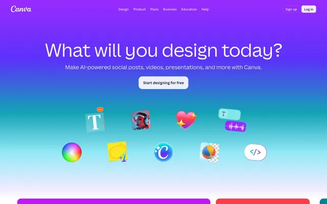
Vibrant digital toolkit — a painter's palette on a dark canvas, each tool glowing with possibility.
Color palette
Interactive elements, links, and primary brand accent color. A recurring vivid violet.
Lighter shade of violet for secondary accents, hover states on interactive elements, and illustrative touches.
Specific illustrative and icon accents, adding depth to the purple palette.
Highlighting key sections, hero backgrounds, and illustrative elements. Creates a dynamic and modern feel.
Vivid, energetic backgrounds for call-to-action sections or celebratory elements.
Complex background for hero sections or unique promotional areas, showcasing range and creativity.
Atmospheric background for sections emphasizing depth, technology, or creative tools.
Accent gradient for dramatic flair or to highlight specific product features.
Illustrative accents and occasional highlights, adding a pop of magenta.
Eye-catching accents, status indicators, and illustrative elements. A vibrant, warm pop.
Highlighting elements, icons, and occasional accents for warmth and vibrancy.
Primary background for dark sections, text, and primary surface containers. Provides high contrast for vibrant accents.
Dominant page background for light sections, primary text on dark backgrounds, and interactive element fills.
Primary text color on light backgrounds, strong borders, and most icon fills. Used for maximum contrast.
Secondary text, subtle icon fills, and borders for less prominent elements. A softer alternative to black.
Subtle borders, very light backgrounds for hover states, and divider lines. A near-white neutral.
Used for 'success' or 'growth' themed sections, adding a lush, positive tone.
Typography
- Weights
- 400, 500, 600
- Sizes
- 14px, 16px, 18px, 24px, 28px, 32px, 36px, 56px, 64px, 80px
- Line height
- 1.1, 1.25, 1.33, 1.38, 1.4, 1.5, 1.57
- Letter spacing
- -0.0100em
- Fallback
- Inter, Arial, sans-serif
Primary brand typeface used across all UI elements from body text to display headlines. Its weights and feature settings ('ss02', 'ss03') contribute to a modern, friendly yet precise feel.
- Weights
- 400
- Sizes
- 10px
- Line height
- 1.2
- Letter spacing
- normal
- Fallback
- serif
Legacy font with sparse usage, appearing in specific minor contexts.
- Weights
- 400
- Sizes
- 13px
- Line height
- 1.2
- Letter spacing
- normal
- Fallback
- sans-serif
Fallback font used in specific button and body contexts, for broad compatibility.
Spacing & shape
Elevation
Components
White text on transparent background, with 8px border-radius and 4px vertical, 8px horizontal padding. Border highlights on hover.
White background with 'Deepest Shadow' text. Border radius 8px, padding 0px vertical, 12px horizontal. Subtle top and bottom borders from the same color.
Transparent background with 'Deepest Shadow' text. 9999px border radius for a full pill shape. Generous 16px vertical, 24px horizontal padding.
Transparent background with 'Deepest Shadow' text. No padding or border. Used for lightweight navigation.
Background color 'Midnight Ink' with 8px border radius. No internal padding or shadow (content fills card).
Utilizes one of the vivid thematic gradients (e.g., Turquoise Dream Gradient, Sunset Fire Gradient) as background. Features prominent imagery and concise text.
Consists of multiple 'Navigation Link' components. Occupies 0-80px height of the header area. Links are 'Deepest Shadow' on `Canvas White` context.
White text on transparent background, 8px radius, 7px vertical and 12px horizontal padding. The text is 'Canvas White'.
Guidelines
- Prioritize 'Canva Sans' across all typographic elements, leveraging its 400, 500, and 600 weights.
- Use 8px border radius for all card and button components to ensure a consistent friendly softness, with 9999px reserved for pill shapes.
- Implement 'Midnight Ink' (#0f1015) as the primary background for dark themed content blocks to maximize vibrancy of super-imposed elements.
- Pair 'Deepest Shadow' (#000000) for text on 'Canvas White' (#ffffff) for maximum readability and AAA contrast.
- Utilize the brand gradients (e.g., Turquoise Dream Gradient, Sunset Fire Gradient) for main hero sections and feature highlights.
- Apply 'Rich Plum' (#8b3dff) as the primary accent for interactive elements and links.
- Avoid using Times or Arial for primary brand content; reserve them for legacy or specific minor contexts as detected.
- Do not introduce new border radii beyond 8px and 9999px.
- Do not overuse 'Deepest Shadow' for backgrounds; it is primarily intended for text and sharp UI elements.
- Avoid using a flat color for hero sections; leverage a brand gradient to convey dynamism.
- Do not introduce new color hues; work within the established vivid brand and accent palettes.
- Do not apply shadows without purpose; use the defined shadows for subtle elevation or interactive states only.
About this system
ShowHide
Canva's design language evokes a vibrant, creative toolkit, powered by a dynamic and playful color spectrum. The foundation is a cool, dark canvas illuminated by a kaleidoscope of vivid gradients and accent colors, signaling a platform built for imagination. A consistent softness is achieved through prevalent 8px and 9999px border radii, contrasting with the sharpness of sans-serif typography. This creates an accessible but powerful experience, where creativity feels both boundless and precisely guided.
The page primarily uses a max-width contained layout pattern but features full-bleed hero sections for dramatic effect. The overall rhythm combines expansive, gradient-filled introductory areas with alternating light and dark bands for content sections, providing visual segmentation and interest. Content is frequently arranged in two or three-column grids for features and templates, often with text-left/image-right or image-top/text-bottom compositions within cards. Spaces between sections are comfortable (sectionGap of roughly 44px). The header is a sticky top bar, providing global navigation and calls to action.
The visual language is a blend of conceptual, playful product illustrations and tightly cropped, brand-aligned photography or 3D renders. Illustrations are colorful, dimensional, and often feature floating UI elements or abstract shapes, designed to convey dynamism and creativity. Photography, when used, tends to be product-focused or lifestyle, but always integrated with graphic overlays or bold color treatments. Icons are filled, colorful, and often use the accent and brand gradients, reinforcing the vibrant palette. Imagery serves both decorative atmosphere and explanatory content, often layered to demonstrate product capabilities in a vibrant, engaging way. Density is moderate, balancing textual information with impactful visual storytelling.
# Canva — Style Reference
> Vibrant digital toolkit — a painter's palette on a dark canvas, each tool glowing with possibility.

**Theme:** mixed

**Site:** https://canva.com

Canva's design language evokes a vibrant, creative toolkit, powered by a dynamic and playful color spectrum. The foundation is a cool, dark canvas illuminated by a kaleidoscope of vivid gradients and accent colors, signaling a platform built for imagination. A consistent softness is achieved through prevalent 8px and 9999px border radii, contrasting with the sharpness of sans-serif typography. This creates an accessible but powerful experience, where creativity feels both boundless and precisely guided.

## Tokens — Colors

| Name | Value | Token | Role |
|------|------|------|------|
| Rich Plum | `#8b3dff` | `--color-rich-plum` | Interactive elements, links, and primary brand accent color. A recurring vivid violet. |
| Electric Lavender | `#a370fc` | `--color-electric-lavender` | Lighter shade of violet for secondary accents, hover states on interactive elements, and illustrative touches. |
| Vivid Violet | `#9729ff` | `--color-vivid-violet` | Specific illustrative and icon accents, adding depth to the purple palette. |
| Turquoise Dream Gradient | `#00C4CC` | `--color-turquoise-dream-gradient` | Highlighting key sections, hero backgrounds, and illustrative elements. Creates a dynamic and modern feel. |
| Sunset Fire Gradient | `#FF3B4C` | `--color-sunset-fire-gradient` | Vivid, energetic backgrounds for call-to-action sections or celebratory elements. |
| Digital Spectrum Gradient | `#992BFF` | `--color-digital-spectrum-gradient` | Complex background for hero sections or unique promotional areas, showcasing range and creativity. |
| Ocean Twilight Gradient | `#00C4CC` | `--color-ocean-twilight-gradient` | Atmospheric background for sections emphasizing depth, technology, or creative tools. |
| Magenta Bloom Gradient | `#BD19FF` | `--color-magenta-bloom-gradient` | Accent gradient for dramatic flair or to highlight specific product features. |
| Fuchsia Burst | `#e950f7` | `--color-fuchsia-burst` | Illustrative accents and occasional highlights, adding a pop of magenta. |
| Scarlet Glow | `#ff3d4d` | `--color-scarlet-glow` | Eye-catching accents, status indicators, and illustrative elements. A vibrant, warm pop. |
| Tangerine Pop | `#ff6105` | `--color-tangerine-pop` | Highlighting elements, icons, and occasional accents for warmth and vibrancy. |
| Midnight Ink | `#0f1015` | `--color-midnight-ink` | Primary background for dark sections, text, and primary surface containers. Provides high contrast for vibrant accents. |
| Canvas White | `#ffffff` | `--color-canvas-white` | Dominant page background for light sections, primary text on dark backgrounds, and interactive element fills. |
| Deepest Shadow | `#000000` | `--color-deepest-shadow` | Primary text color on light backgrounds, strong borders, and most icon fills. Used for maximum contrast. |
| Ash Grey | `#575a5f` | `--color-ash-grey` | Secondary text, subtle icon fills, and borders for less prominent elements. A softer alternative to black. |
| Silver Mist | `#d7d9de` | `--color-silver-mist` | Subtle borders, very light backgrounds for hover states, and divider lines. A near-white neutral. |
| Emerald Growth Gradient | `#007D26` | `--color-emerald-growth-gradient` | Used for 'success' or 'growth' themed sections, adding a lush, positive tone. |

## Tokens — Typography

### Canva Sans
- **Substitute:** Inter, Arial, sans-serif
- **Weights:** 400, 500, 600
- **Sizes:** 14px, 16px, 18px, 24px, 28px, 32px, 36px, 56px, 64px, 80px
- **Line height:** 1.1, 1.25, 1.33, 1.38, 1.4, 1.5, 1.57
- **Letter spacing:** -0.0100em
- **Role:** Primary brand typeface used across all UI elements from body text to display headlines. Its weights and feature settings ('ss02', 'ss03') contribute to a modern, friendly yet precise feel.

### Times
- **Substitute:** serif
- **Weights:** 400
- **Sizes:** 10px
- **Line height:** 1.2
- **Letter spacing:** normal
- **Role:** Legacy font with sparse usage, appearing in specific minor contexts.

### Arial
- **Substitute:** sans-serif
- **Weights:** 400
- **Sizes:** 13px
- **Line height:** 1.2
- **Letter spacing:** normal
- **Role:** Fallback font used in specific button and body contexts, for broad compatibility.

## Tokens — Type Scale

Major Third (1.25) from 10px base.

| Role | Size | Line height | Letter spacing |
|------|------|------|------|
| caption | 10px | 1.2 | — |
| body-lg | 16px | 1.38 | -0.16px |
| subheading | 18px | 1.33 | -0.18px |
| heading-sm | 24px | 1.25 | -0.24px |
| heading | 28px | 1.25 | -0.28px |
| heading-lg | 32px | 1.25 | -0.32px |
| display-sm | 36px | 1.25 | -0.36px |
| display | 56px | 1.1 | -0.56px |
| display-lg | 64px | 1.1 | -0.64px |
| display-xl | 80px | 1.1 | -0.8px |

## Tokens — Spacing

- **Section gap:** 44px
- **Card padding:** 12px
- **Element gap:** 4px

## Tokens — Radius

- **Default:** 8px
- **Buttons:** 8px
- **Cards:** 8px
- **pills:** 9999px

## Tokens — Elevation

- **Card Interaction:** `rgba(64, 79, 109, 0.06) 0px 0px 0px 0.5px, rgba(24, 44, 89, 0.137) 0px 2px 4px 0px, rgba(24, 44, 89, 0.07) 0px 6px 12px 0px`
- **Inset Button (Dark):** `rgba(53, 65, 90, 0.2) 0px 0px 0px 1px inset`
- **Inset Button (Light):** `rgba(255, 255, 255, 0.2) 0px 0px 0px 1px inset`

## Layout

The page primarily uses a max-width contained layout pattern but features full-bleed hero sections for dramatic effect. The overall rhythm combines expansive, gradient-filled introductory areas with alternating light and dark bands for content sections, providing visual segmentation and interest. Content is frequently arranged in two or three-column grids for features and templates, often with text-left/image-right or image-top/text-bottom compositions within cards. Spaces between sections are comfortable (sectionGap of roughly 44px). The header is a sticky top bar, providing global navigation and calls to action.

## Imagery

The visual language is a blend of conceptual, playful product illustrations and tightly cropped, brand-aligned photography or 3D renders. Illustrations are colorful, dimensional, and often feature floating UI elements or abstract shapes, designed to convey dynamism and creativity. Photography, when used, tends to be product-focused or lifestyle, but always integrated with graphic overlays or bold color treatments. Icons are filled, colorful, and often use the accent and brand gradients, reinforcing the vibrant palette. Imagery serves both decorative atmosphere and explanatory content, often layered to demonstrate product capabilities in a vibrant, engaging way. Density is moderate, balancing textual information with impactful visual storytelling.

## Components

### Primary Ghost Button
*Main call to action on vibrant backgrounds*

White text on transparent background, with 8px border-radius and 4px vertical, 8px horizontal padding. Border highlights on hover.

### Primary Filled Button
*Default interactive button*

White background with 'Deepest Shadow' text. Border radius 8px, padding 0px vertical, 12px horizontal. Subtle top and bottom borders from the same color.

### Pill Button
*Category filters, tags, or secondary actions*

Transparent background with 'Deepest Shadow' text. 9999px border radius for a full pill shape. Generous 16px vertical, 24px horizontal padding.

### Navigation Link
*Top-level navigation items*

Transparent background with 'Deepest Shadow' text. No padding or border. Used for lightweight navigation.

### Feature Card (Dark)
*Content container for features or product sections on dark backgrounds*

Background color 'Midnight Ink' with 8px border radius. No internal padding or shadow (content fills card).

### Gradient Section Card
*Highlighting distinct product features with a strong visual identity*

Utilizes one of the vivid thematic gradients (e.g., Turquoise Dream Gradient, Sunset Fire Gradient) as background. Features prominent imagery and concise text.

### Header Navigation
*Global site navigation*

Consists of multiple 'Navigation Link' components. Occupies 0-80px height of the header area. Links are 'Deepest Shadow' on `Canvas White` context.

### Hero CTA Button
*Prominent call to action in hero sections.*

White text on transparent background, 8px radius, 7px vertical and 12px horizontal padding. The text is 'Canvas White'.

## Guidelines

### Do

- Prioritize 'Canva Sans' across all typographic elements, leveraging its 400, 500, and 600 weights.
- Use 8px border radius for all card and button components to ensure a consistent friendly softness, with 9999px reserved for pill shapes.
- Implement 'Midnight Ink' (#0f1015) as the primary background for dark themed content blocks to maximize vibrancy of super-imposed elements.
- Pair 'Deepest Shadow' (#000000) for text on 'Canvas White' (#ffffff) for maximum readability and AAA contrast.
- Utilize the brand gradients (e.g., Turquoise Dream Gradient, Sunset Fire Gradient) for main hero sections and feature highlights.
- Apply 'Rich Plum' (#8b3dff) as the primary accent for interactive elements and links.

### Don't

- Avoid using Times or Arial for primary brand content; reserve them for legacy or specific minor contexts as detected.
- Do not introduce new border radii beyond 8px and 9999px.
- Do not overuse 'Deepest Shadow' for backgrounds; it is primarily intended for text and sharp UI elements.
- Avoid using a flat color for hero sections; leverage a brand gradient to convey dynamism.
- Do not introduce new color hues; work within the established vivid brand and accent palettes.
- Do not apply shadows without purpose; use the defined shadows for subtle elevation or interactive states only.

## Agent Prompt Guide

Quick Color Reference: Text: #000000, Background: #ffffff, CTA: #8b3dff, Border: #d7d9de, Accent: #e950f7.

Example Component Prompts:
1. Create a hero section with 'Turquoise Dream Gradient' (#00C4CC) as the background. Headline text 'What will you design today?' at 80px Canva Sans weight 600, color #ffffff, letter-spacing -0.8px, line-height 1.1. Subheading 'Make AI-powered social posts, videos, presentations, and more with Canva.' at 24px Canva Sans weight 400, color #ffffff, line-height 1.25. Include a 'Primary Ghost Button' centered below the text: 'Start designing for free', with white text and 8px border-radius.
2. Design a feature card section. Use a 'Midnight Ink' (#0f1015) background. Incorporate three 'Feature Card (Dark)' components horizontally, each with a 'Digital Spectrum Gradient' (#992BFF) background for a contained visual. Each card should have 8px border-radius and include a heading at 28px Canva Sans weight 500, color #ffffff, letter-spacing -0.28px, and body text at 16px Canva Sans weight 400, color #d7d9de.
3. Implement a primary navigation bar. Use 'Canvas White' (#ffffff) as the background. Include multiple 'Navigation Link' components with text color 'Deepest Shadow' (#000000), using Canva Sans weight 400, size 16px, letter-spacing -0.16px. The 'Sign up' button should be a 'Primary Filled Button' with background rgba(255, 255, 255, 0.898), text #0f1015, and 8px border-radius, while the 'Log in' button is a 'Primary Ghost Button' with white text.
More like this







Keep what you find
A free account saves references to boards and can send you a weekly email of picks based on what you save.
To see every result, go Pro.