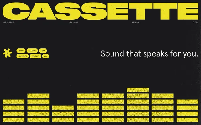
Preview image. Unlock full-res
Granular sonic texture
Color palette
Brand accent, active states, button fills, primary text on dark backgrounds. A vivid, almost neon yellow that defines the brand's energetic feel
Decorative block background, illustration accent. A vibrant, moderate pink
Decorative block background, illustration accent. A vivid orange
Decorative block background, illustration accent. A vivid blue
Decorative block background, illustration accent. A vivid green
Primary surface background, text on brand yellow accents. Black with a subtle warmth for depth
Subtle text, secondary border outlines, muted links. A desaturated light gray
Primary text on light backgrounds, strong borders, graphic elements. Pure black for maximum contrast
Component backgrounds, badge fills, text on dark backgrounds. An off-white resembling aged paper
Hairline separators, subtle borders on dark surfaces
Typography
- Weights
- 400
- Sizes
- 15px, 37px, 56px, 60px
- Line height
- 1.08, 1.2
- Fallback
- system-ui
Major headings and key marketing statements. The standard sans serif for primary expression.
- Weights
- 400
- Sizes
- 13px, 14px
- Line height
- 1, 1.16, 1.3
- Fallback
- Menlo, Monaco, 'Courier New', monospace
Body text, metadata, labels, and all detailed information. Its monospaced nature contributes to the structured, technical feel.
Spacing & shape
Components
Boldly rounded button with Cassette Yellow fill and Midnight Oil text. Padding is 10px vertically and 13px horizontally. Radius 900px.
Outline button with Cassette Yellow text and a 1px Cassette Yellow border on a transparent background. Padding is 10px vertically and 13px horizontally. Radius 900px.
Paper White background with True Black text. Square 0px radius. Padding 4px vertically and 4.8px horizontally.
Transparent background with Midnight Oil text. Square 0px radius. Often used as a heading for client lists. Top padding 24px, no horizontal padding.
Guidelines
- Use Midnight Oil (#19181a) as the primary background for content areas.
- Apply a 900px border radius to all interactive elements like buttons and any card-like groupings.
- Utilize Cassette Yellow (#f0e226) for all primary calls to action, highlights, and functional icons.
- Set all body text and detailed information in Apercu Mono Pro at 13px or 14px, weight 400 for a consistent technical feel.
- Employ True Black (#000000) for primary text on light backgrounds and for high-contrast borders.
- Maintain an element gap of 8px for tight groupings and apply 13px for internal card padding.
- Use Paper White (#f5f4f0) for component backgrounds and badges that require a lighter surface.
- Avoid generic rectangular shapes; always use the extreme 900px border radius for interactive and contained elements.
- Do not introduce additional sans-serif fonts beyond Apercu Pro or mono fonts beyond Apercu Mono Pro.
- Never use Cassette Yellow (#f0e226) for non-interactive text or mere decoration; reserve its impact for active states and brand accents.
- Avoid soft, ambiguous color palettes; maintain the stark contrast between Midnight Oil/True Black and Cassette Yellow.
- Do not use subtle shadows for elevation; rely on strong color blocking and outline borders instead.
- Do not deviate from the grain texture on backgrounds; it's a signature visual element.
- Avoid decorative elements that feel 'modern' or 'clean'; embrace purposeful retro-futuristic graphics and sharp angles.
About this system
ShowHide
Cassette employs a retro-futuristic, bold aesthetic centered on high-contrast black and yellow. Textures are a key visual element, with a CRT-like grain applied to background surfaces. Typography is compact and functional, balancing a monospaced font for details with a humanist sans-serif for impact. Components are lightweight with distinctive extreme corner rounding, contrasting with the sharp, graphic angles of the overall layout.
The page primarily uses a full-bleed dark background with content centered vertically and horizontally. The hero section features a large, centered headline over the textured dark background, with navigation elements positioned at the top. Sections exhibit consistent vertical spacing, often breaking into alternating full-width blocks or multi-column layouts. A prominent grid is used for client logos (4-column). Text and image content often form L-shaped or Z-shaped arrangements rather than strict symmetrical columns, creating dynamic visual flow. Navigation is a simple top bar with distinct button-like links, sometimes accompanied by a dynamic, 'rotating' graphic.
This site features a mix of abstract and product imagery with a distinct texture overlay. Photography includes tight crops of cassette tapes and hands, often against vibrant, contrasting backgrounds. Illustrations are geometric and outlined, sometimes with a distressed or grainy effect, using the brand's accent colors as fillers. Iconography is primarily outlined, featuring an asterisk-like brand mark with a medium stroke weight. Imagery serves both decorative atmosphere and explicit product showcase, with a medium density, balancing text-heavy sections with bold visual statements.
Reminiscent of Offf Festival, Future Publishing, Adult Swim, Superdeluxe.
# Cassette — Style Reference
> Granular sonic texture

**Theme:** dark

**Site:** https://cassettemusic.com

Cassette employs a retro-futuristic, bold aesthetic centered on high-contrast black and yellow. Textures are a key visual element, with a CRT-like grain applied to background surfaces. Typography is compact and functional, balancing a monospaced font for details with a humanist sans-serif for impact. Components are lightweight with distinctive extreme corner rounding, contrasting with the sharp, graphic angles of the overall layout.

## Tokens — Colors

| Name | Value | Token | Role |
|------|------|------|------|
| Cassette Yellow | `#f0e226` | `--color-cassette-yellow` | Brand accent, active states, button fills, primary text on dark backgrounds. A vivid, almost neon yellow that defines the brand's energetic feel |
| Pop Pink | `#fac4f0` | `--color-pop-pink` | Decorative block background, illustration accent. A vibrant, moderate pink |
| Tangelo Dream | `#ff8461` | `--color-tangelo-dream` | Decorative block background, illustration accent. A vivid orange |
| Sky Blue | `#2896f3` | `--color-sky-blue` | Decorative block background, illustration accent. A vivid blue |
| Evergreen | `#0db55b` | `--color-evergreen` | Decorative block background, illustration accent. A vivid green |
| Midnight Oil | `#19181a` | `--color-midnight-oil` | Primary surface background, text on brand yellow accents. Black with a subtle warmth for depth |
| Ghostly Gray | `#d9d7ce` | `--color-ghostly-gray` | Subtle text, secondary border outlines, muted links. A desaturated light gray |
| True Black | `#000000` | `--color-true-black` | Primary text on light backgrounds, strong borders, graphic elements. Pure black for maximum contrast |
| Paper White | `#f5f4f0` | `--color-paper-white` | Component backgrounds, badge fills, text on dark backgrounds. An off-white resembling aged paper |
| Subtle Line | `#272727` | `--color-subtle-line` | Hairline separators, subtle borders on dark surfaces |

## Tokens — Typography

### Apercu Pro
- **Substitute:** system-ui
- **Weights:** 400
- **Sizes:** 15px, 37px, 56px, 60px
- **Line height:** 1.08, 1.2
- **Role:** Major headings and key marketing statements. The standard sans serif for primary expression.

### Apercu Mono Pro
- **Substitute:** Menlo, Monaco, 'Courier New', monospace
- **Weights:** 400
- **Sizes:** 13px, 14px
- **Line height:** 1, 1.16, 1.3
- **Role:** Body text, metadata, labels, and all detailed information. Its monospaced nature contributes to the structured, technical feel.

## Tokens — Type Scale

Golden Ratio (1.618) from 56px base.

| Role | Size | Line height | Letter spacing |
|------|------|------|------|
| caption | 15px | 1.2 | — |
| body-sm | 37px | 1.2 | — |
| body | 56px | 1.2 | — |
| body-lg | 60px | 1.2 | — |

## Tokens — Spacing

- **Section gap:** 48px
- **Card padding:** 13px
- **Element gap:** 8px

## Tokens — Radius

- **Buttons:** 900px
- **other:** 900px

## Layout

The page primarily uses a full-bleed dark background with content centered vertically and horizontally. The hero section features a large, centered headline over the textured dark background, with navigation elements positioned at the top. Sections exhibit consistent vertical spacing, often breaking into alternating full-width blocks or multi-column layouts. A prominent grid is used for client logos (4-column). Text and image content often form L-shaped or Z-shaped arrangements rather than strict symmetrical columns, creating dynamic visual flow. Navigation is a simple top bar with distinct button-like links, sometimes accompanied by a dynamic, 'rotating' graphic.

## Imagery

This site features a mix of abstract and product imagery with a distinct texture overlay. Photography includes tight crops of cassette tapes and hands, often against vibrant, contrasting backgrounds. Illustrations are geometric and outlined, sometimes with a distressed or grainy effect, using the brand's accent colors as fillers. Iconography is primarily outlined, featuring an asterisk-like brand mark with a medium stroke weight. Imagery serves both decorative atmosphere and explicit product showcase, with a medium density, balancing text-heavy sections with bold visual statements.

## Components

### Primary Filled Button
*Main call to action*

Boldly rounded button with Cassette Yellow fill and Midnight Oil text. Padding is 10px vertically and 13px horizontally. Radius 900px.

### Ghost Button
*Secondary call to action, navigation items*

Outline button with Cassette Yellow text and a 1px Cassette Yellow border on a transparent background. Padding is 10px vertically and 13px horizontally. Radius 900px.

### Info Badge
*Informational labels, status indicators*

Paper White background with True Black text. Square 0px radius. Padding 4px vertically and 4.8px horizontally.

### Outline Badge
*Subtle categories or labels*

Transparent background with Midnight Oil text. Square 0px radius. Often used as a heading for client lists. Top padding 24px, no horizontal padding.

## Guidelines

### Do

- Use Midnight Oil (#19181a) as the primary background for content areas.
- Apply a 900px border radius to all interactive elements like buttons and any card-like groupings.
- Utilize Cassette Yellow (#f0e226) for all primary calls to action, highlights, and functional icons.
- Set all body text and detailed information in Apercu Mono Pro at 13px or 14px, weight 400 for a consistent technical feel.
- Employ True Black (#000000) for primary text on light backgrounds and for high-contrast borders.
- Maintain an element gap of 8px for tight groupings and apply 13px for internal card padding.
- Use Paper White (#f5f4f0) for component backgrounds and badges that require a lighter surface.

### Don't

- Avoid generic rectangular shapes; always use the extreme 900px border radius for interactive and contained elements.
- Do not introduce additional sans-serif fonts beyond Apercu Pro or mono fonts beyond Apercu Mono Pro.
- Never use Cassette Yellow (#f0e226) for non-interactive text or mere decoration; reserve its impact for active states and brand accents.
- Avoid soft, ambiguous color palettes; maintain the stark contrast between Midnight Oil/True Black and Cassette Yellow.
- Do not use subtle shadows for elevation; rely on strong color blocking and outline borders instead.
- Do not deviate from the grain texture on backgrounds; it's a signature visual element.
- Avoid decorative elements that feel 'modern' or 'clean'; embrace purposeful retro-futuristic graphics and sharp angles.

## Agent Prompt Guide

Quick Color Reference:
- text: #000000 (on light), #f5f4f0 (on dark)
- background: #19181a
- border: #000000 (strong), #f0e226 (accent)
- accent: #f0e226
- primary action: #f0e226 (filled action)

Example Component Prompts:
- Create a Primary Action Button: #f0e226 background, #000000 text, 9999px radius, compact pill padding. Use this filled treatment for the main CTA.
- Create a ghost button labeled 'LEARN MORE' on the dark background.
- Create an info badge that reads 'NEW'.
- Create a section divider: 1px solid Subtle Line (#272727) spanning the content width.
More like this







Keep what you find
A free account saves references to boards and can send you a weekly email of picks based on what you save.
To see every result, go Pro.