Preview image. Unlock full-res
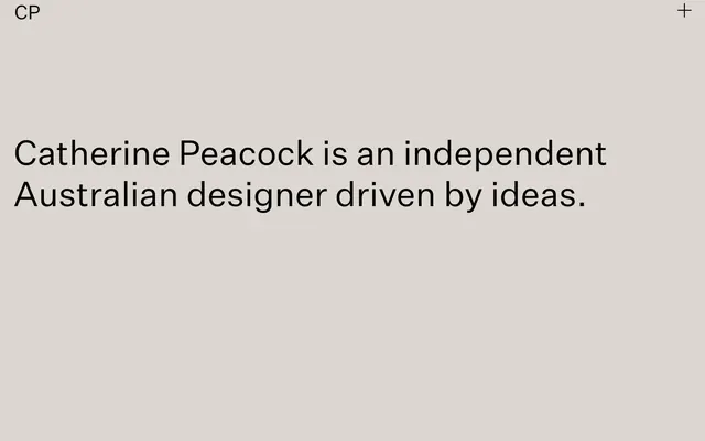
Minimalist gallery canvas
Color palette
Hairline borders, dividers, input outlines, and card edges on light surfaces. Do not promote it to the primary CTA color
Primary text, prominent headings, and functional icons — provides stark contrast against light backgrounds
Secondary text, subtle borders, and background elements that require less intensity than pure black
Subtle background panels or sections, creating a slight visual separation from the pure white canvas without high contrast
Decorative borders and dividers, providing minimal visual interruption
Typography
- Weights
- 400
- Sizes
- 28px, 50px
- Line height
- 1.2, 1.25
- Letter spacing
- 0.0040em
- Fallback
- system-ui
Display and prominent headings — its generous letter spacing and size command attention.
- Weights
- 400
- Sizes
- 16px
- Line height
- 1, 1.25
- Letter spacing
- -0.0020em
- Fallback
- system-ui
Body text and navigation elements — tight letter spacing ensures compact readability for functional text.
Spacing & shape
Components
A frameless, borderless content area with 0px radius, using Canvas White (#ffffff) as its background. Provides a clean, flat surface that blends seamlessly with the page background.
Text link styled with Text Black (#000000) for high contrast against light backgrounds. Appears as a distinct interactive element without relying on visual chrome.
Headline text, typically in 'custom_35137' font at 50px-1.25lh or 28px-1.2lh with 0.0040em letter-spacing, using Text Black (#000000). Commands immediate attention through size and stark contrast.
Interactive button presented as a simple '+' icon. This is achieved through an outline in Text Black (#000000) on a Canvas White (#ffffff) background, with text and icon color of Text Black. It foregrounds simplicity and functionality. All elements have a 0px radius.
Guidelines
- Prioritize Canvas White (#ffffff) for all main backgrounds to maintain a clean, expansive aesthetic.
- Use Text Black (#000000) for all primary text elements to ensure high contrast and legibility.
- Apply 0px border-radius to all cards and significant UI containers to preserve a sharp, architectural feel.
- Employ `custom_35137` font with a generous 0.0040em letter-spacing for large headlines to enhance their commanding presence.
- Keep components visually minimal, relying on typography and stark color contrast rather than shadows or elaborate borders.
- Use Text Graphite (#282828) for secondary text or subtle UI details where a softer presence is desired compared to pure black.
- Maintain the density at 'comfortable' for all major sections and element grouping.
- Do not introduce highly saturated colors unless specifically for functional interaction states not present in the current system.
- Avoid using any drop shadows or complex elevation schemes; the design relies on flat, layered surfaces.
- Do not use heavily rounded corners; 0px radius is preferred for all elements.
- Do not vary line heights excessively; stick to the specified 1.0 or 1.25 for system text and 1.2 or 1.25 for display text.
- Do not add decorative gradients or textures; maintain a flat, achromatic visual presentation.
- Avoid tight element spacing for large type; always allow generous white space around display text.
About this system
ShowHide
Catherine Peacock's visual system evokes a minimal gallery aesthetic, presenting content on an expansive, light canvas with strong typographic presence. The design relies on a restricted achromatic palette, where shades of gray define structure and depth. Typography is central, using generous letter-spacing for large text and precise spacing for smaller details, creating a sense of considered calm and focus.
The page adheres to a full-bleed model without a constrained max-width, allowing content to span the entire viewport. The hero section is characterized by a large, centered headline against a light background. Sectional rhythm is implicitly created through the generous white space around text blocks. Content appears to be presented in centered stacks or simple linear flows, prioritizing readability and directness. Navigation is minimal, limited to a simple top-right icon. The overall density is spacious, with considerable breathing room around elements.
This system primarily uses text as its visual focus, with no explicit imagery or illustrations present. The UI itself serves as the visual language, emphasizing typographic arrangements and stark contrast.
Reminiscent of Framer, Basic Agency, Stripe.
# Catherine Peacock — Style Reference
> Minimalist gallery canvas

**Theme:** light

**Site:** https://catherinepeacock.com

Catherine Peacock's visual system evokes a minimal gallery aesthetic, presenting content on an expansive, light canvas with strong typographic presence. The design relies on a restricted achromatic palette, where shades of gray define structure and depth. Typography is central, using generous letter-spacing for large text and precise spacing for smaller details, creating a sense of considered calm and focus.

## Tokens — Colors

| Name | Value | Token | Role |
|------|------|------|------|
| Canvas White | `#ffffff` | `--color-canvas-white` | Hairline borders, dividers, input outlines, and card edges on light surfaces. Do not promote it to the primary CTA color |
| Text Black | `#000000` | `--color-text-black` | Primary text, prominent headings, and functional icons — provides stark contrast against light backgrounds |
| Text Graphite | `#282828` | `--color-text-graphite` | Secondary text, subtle borders, and background elements that require less intensity than pure black |
| Background Taupe | `#dcd7d0` | `--color-background-taupe` | Subtle background panels or sections, creating a slight visual separation from the pure white canvas without high contrast |
| Border Silver | `#bababa` | `--color-border-silver` | Decorative borders and dividers, providing minimal visual interruption |

## Tokens — Typography

### custom_35137
- **Substitute:** system-ui
- **Weights:** 400
- **Sizes:** 28px, 50px
- **Line height:** 1.2, 1.25
- **Letter spacing:** 0.0040em
- **Role:** Display and prominent headings — its generous letter spacing and size command attention.

### -apple-system
- **Substitute:** system-ui
- **Weights:** 400
- **Sizes:** 16px
- **Line height:** 1, 1.25
- **Letter spacing:** -0.0020em
- **Role:** Body text and navigation elements — tight letter spacing ensures compact readability for functional text.

## Tokens — Spacing

- **Card padding:** 0px

## Tokens — Radius

- **Cards:** 0px

## Layout

The page adheres to a full-bleed model without a constrained max-width, allowing content to span the entire viewport. The hero section is characterized by a large, centered headline against a light background. Sectional rhythm is implicitly created through the generous white space around text blocks. Content appears to be presented in centered stacks or simple linear flows, prioritizing readability and directness. Navigation is minimal, limited to a simple top-right icon. The overall density is spacious, with considerable breathing room around elements.

## Imagery

This system primarily uses text as its visual focus, with no explicit imagery or illustrations present. The UI itself serves as the visual language, emphasizing typographic arrangements and stark contrast.

## Components

### Minimal Card
*Content container*

A frameless, borderless content area with 0px radius, using Canvas White (#ffffff) as its background. Provides a clean, flat surface that blends seamlessly with the page background.

### Navigation Link
*Interactive text*

Text link styled with Text Black (#000000) for high contrast against light backgrounds. Appears as a distinct interactive element without relying on visual chrome.

### Branded Heading
*Primary identifier*

Headline text, typically in 'custom_35137' font at 50px-1.25lh or 28px-1.2lh with 0.0040em letter-spacing, using Text Black (#000000). Commands immediate attention through size and stark contrast.

### Nav Button
*Call to action*

Interactive button presented as a simple '+' icon. This is achieved through an outline in Text Black (#000000) on a Canvas White (#ffffff) background, with text and icon color of Text Black. It foregrounds simplicity and functionality. All elements have a 0px radius.

## Guidelines

### Do

- Prioritize Canvas White (#ffffff) for all main backgrounds to maintain a clean, expansive aesthetic.
- Use Text Black (#000000) for all primary text elements to ensure high contrast and legibility.
- Apply 0px border-radius to all cards and significant UI containers to preserve a sharp, architectural feel.
- Employ `custom_35137` font with a generous 0.0040em letter-spacing for large headlines to enhance their commanding presence.
- Keep components visually minimal, relying on typography and stark color contrast rather than shadows or elaborate borders.
- Use Text Graphite (#282828) for secondary text or subtle UI details where a softer presence is desired compared to pure black.
- Maintain the density at 'comfortable' for all major sections and element grouping.

### Don't

- Do not introduce highly saturated colors unless specifically for functional interaction states not present in the current system.
- Avoid using any drop shadows or complex elevation schemes; the design relies on flat, layered surfaces.
- Do not use heavily rounded corners; 0px radius is preferred for all elements.
- Do not vary line heights excessively; stick to the specified 1.0 or 1.25 for system text and 1.2 or 1.25 for display text.
- Do not add decorative gradients or textures; maintain a flat, achromatic visual presentation.
- Avoid tight element spacing for large type; always allow generous white space around display text.

## Agent Prompt Guide

**Quick Color Reference:**
text: #000000
background: #ffffff
border: #282828
accent: no distinct accent color
primary action: no distinct CTA color

**3-5 Example Component Prompts:**
1. Create a page header with 'CP' in Text Black (#000000), 'custom_35137' font at 16px, 1.25 line height, 0.0040em letter spacing. Include a '+' icon button (Text Black, 0px radius, 0px padding) aligned to the right.
2. Design a hero section background in Background Taupe (#dcd7d0). Place a large headline, "Catherine Peacock is an independent Australian designer driven by ideas.", using Text Black (#000000), 'custom_35137' font at 50px, 1.25 line height, 0.0040em letter spacing, centered on the page.
3. Implement a text link for navigation, utilizing Text Black (#000000), -apple-system font at 16px, 1.25 line height, -0.0020em letter spacing. Ensure it has no background or border.
More like this









Keep what you find
A free account saves references to boards and can send you a weekly email of picks based on what you save.
To see every result, go Pro.