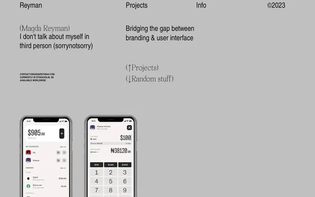
Preview image. Unlock full-res
High-contrast digital notebook.
Color palette
Primary page background, neutral base
Card backgrounds, elevated surface treatments within the UI
Primary body text, link text, strong headings. Creates strong contrast against light backgrounds
Secondary text, subtle details, and borders
Bold text and high-emphasis elements, typically used sparingly for maximum impact
Typography
- Weights
- 400, 700
- Sizes
- 8px, 24px, 40px
- Line height
- 1, 1.25, 1.58
- Letter spacing
- 0.0250em
Headings, body text, and links. The consistent tracking across sizes is a signature choice creating a technical, precise feel. Exact substitute unknown without brand guidance.
- Weights
- 400
- Sizes
- 16px
- Line height
- 1
- Letter spacing
- normal
- Fallback
- System Font
Secondary short text and utility information.
- Weights
- 400
- Sizes
- 18px
- Line height
- 1.67
- Letter spacing
- normal
- Fallback
- Inter
Paragraph text for readability on longer blocks.
- Weights
- 400
- Sizes
- 24px
- Line height
- 1.25
- Letter spacing
- normal
Specific heading elements. Exact substitute unknown without brand guidance.
Spacing & shape
Components
Background is Surface Frost (#ffffff) with 0px border-radius and no shadow. No intrinsic padding, content defines internal spacing.
Uses a 162px border-radius, often with transparent background (rgba(9, 9, 9, 0)) and no shadow, allowing elements to appear as if 'ghosted' or purely textual.
Guidelines
- Prioritize text as the primary visual communication tool, using Text Charcoal (#090909) on Surface Frost (#ffffff) or Canvas Fog (#c0c0c0) for high contrast.
- Use a 0px border-radius for main content cards and containers to maintain a sharp, angular aesthetic.
- Apply 162px border-radius to create distinctly circular or pill-shaped decorative elements for contrast.
- Maintain a compact density, allowing typography to breathe without excessive white space around text blocks; use 1px or 16px vertical padding where defined.
- Utilize 'custom_30190' with its precise 0.0250em letter-spacing for all headings and emphasis to establish a consistent, technical tone.
- Keep backgrounds and surfaces in the achromatic neutral palette (Canvas Fog, Surface Frost) to keep the focus on content and typography.
- Ensure all text, especially links, is in Text Charcoal (#090909) for optimal readability and a consistent dark-on-light appearance.
- Do not introduce color into primary UI elements such as backgrounds, buttons, or navigation; reserve color strictly for content if at all.
- Avoid decorative shadows or complex gradients on UI components; elevation is achieved through distinct color surfaces or sharp typographic hierarchy.
- Do not use generic system fonts for prominent headings or body text where a custom font is specified; the precise letter-spacing of 'custom_30190' is key.
- Refrain from varying border-radius widely; stick to 0px for main containers and 162px for specialty circular elements.
- Do not embed imagery haphazardly; product screenshots should be tightly contained and presented cleanly, as seen in the iPhone mockups.
- Avoid large, sparse sections; content should feel intentional and dense, with tight vertical rhythm.
- Do not use multiple font families for similar purposes; the typographic system is minimal and direct.
About this system
ShowHide
Magda Reyman's design system evokes a minimalist, high-contrast digital notebook. Typography is the primary visual element, eschewing colorful branding for stark black and white text against a soft, light gray canvas. Layout prioritizes clarity and directness, with a strong emphasis on content over decorative elements. Visual weight comes from precise typographic choices and close-cropped product imagery within iPhone mockups, suggesting a focus on functional, UI-centric design.
The page uses a full-bleed model without a defined `pageMaxWidth`, creating expansive, content-first sections. The hero section features centered, strong typographic statements on the light gray background. Content often arranges in alternating text and visual blocks, with text-dominant areas and specific product displays embedded within the flow. Vertical spacing is consistent but compact, focusing on direct communication rather than spacious visual breaks. Navigation is a minimal top bar.
Imagery consists primarily of clean, contained product screenshots (specifically, app interfaces within iPhone mockups) without external context or lifestyle elements. They are used as illustrative content, not decorative atmosphere, and are tightly integrated into the UI. Icons are typically solid and monochromatic, used functionally.
Reminiscent of Awwwards-featured portfolio sites, Linear, Stripe (early branding).
# Magda Reyman — Style Reference
> High-contrast digital notebook.

**Theme:** light

**Site:** https://magdareyman.com

Magda Reyman's design system evokes a minimalist, high-contrast digital notebook. Typography is the primary visual element, eschewing colorful branding for stark black and white text against a soft, light gray canvas. Layout prioritizes clarity and directness, with a strong emphasis on content over decorative elements. Visual weight comes from precise typographic choices and close-cropped product imagery within iPhone mockups, suggesting a focus on functional, UI-centric design.

## Tokens — Colors

| Name | Value | Token | Role |
|------|------|------|------|
| Canvas Fog | `#c0c0c0` | `--color-canvas-fog` | Primary page background, neutral base |
| Surface Frost | `#ffffff` | `--color-surface-frost` | Card backgrounds, elevated surface treatments within the UI |
| Text Charcoal | `#090909` | `--color-text-charcoal` | Primary body text, link text, strong headings. Creates strong contrast against light backgrounds |
| Text Graphite | `#282828` | `--color-text-graphite` | Secondary text, subtle details, and borders |
| Text Ink | `#000000` | `--color-text-ink` | Bold text and high-emphasis elements, typically used sparingly for maximum impact |

## Tokens — Typography

### custom_30190
- **Weights:** 400, 700
- **Sizes:** 8px, 24px, 40px
- **Line height:** 1, 1.25, 1.58
- **Letter spacing:** 0.0250em
- **Role:** Headings, body text, and links. The consistent tracking across sizes is a signature choice creating a technical, precise feel. Exact substitute unknown without brand guidance.

### -apple-system
- **Substitute:** System Font
- **Weights:** 400
- **Sizes:** 16px
- **Line height:** 1
- **Letter spacing:** normal
- **Role:** Secondary short text and utility information.

### Inter
- **Substitute:** Inter
- **Weights:** 400
- **Sizes:** 18px
- **Line height:** 1.67
- **Letter spacing:** normal
- **Role:** Paragraph text for readability on longer blocks.

### custom_351
- **Weights:** 400
- **Sizes:** 24px
- **Line height:** 1.25
- **Letter spacing:** normal
- **Role:** Specific heading elements. Exact substitute unknown without brand guidance.

## Tokens — Spacing

- **Card padding:** 0px

## Tokens — Radius

- **Cards:** 0px
- **elements_circular:** 162px
- **other_elements:** 32px

## Layout

The page uses a full-bleed model without a defined `pageMaxWidth`, creating expansive, content-first sections. The hero section features centered, strong typographic statements on the light gray background. Content often arranges in alternating text and visual blocks, with text-dominant areas and specific product displays embedded within the flow. Vertical spacing is consistent but compact, focusing on direct communication rather than spacious visual breaks. Navigation is a minimal top bar.

## Imagery

Imagery consists primarily of clean, contained product screenshots (specifically, app interfaces within iPhone mockups) without external context or lifestyle elements. They are used as illustrative content, not decorative atmosphere, and are tightly integrated into the UI. Icons are typically solid and monochromatic, used functionally.

## Components

### Rectangular Card
*Content container.*

Background is Surface Frost (#ffffff) with 0px border-radius and no shadow. No intrinsic padding, content defines internal spacing.

### Circular Element
*Decorative or functional elements with extreme curvature.*

Uses a 162px border-radius, often with transparent background (rgba(9, 9, 9, 0)) and no shadow, allowing elements to appear as if 'ghosted' or purely textual.

## Guidelines

### Do

- Prioritize text as the primary visual communication tool, using Text Charcoal (#090909) on Surface Frost (#ffffff) or Canvas Fog (#c0c0c0) for high contrast.
- Use a 0px border-radius for main content cards and containers to maintain a sharp, angular aesthetic.
- Apply 162px border-radius to create distinctly circular or pill-shaped decorative elements for contrast.
- Maintain a compact density, allowing typography to breathe without excessive white space around text blocks; use 1px or 16px vertical padding where defined.
- Utilize 'custom_30190' with its precise 0.0250em letter-spacing for all headings and emphasis to establish a consistent, technical tone.
- Keep backgrounds and surfaces in the achromatic neutral palette (Canvas Fog, Surface Frost) to keep the focus on content and typography.
- Ensure all text, especially links, is in Text Charcoal (#090909) for optimal readability and a consistent dark-on-light appearance.

### Don't

- Do not introduce color into primary UI elements such as backgrounds, buttons, or navigation; reserve color strictly for content if at all.
- Avoid decorative shadows or complex gradients on UI components; elevation is achieved through distinct color surfaces or sharp typographic hierarchy.
- Do not use generic system fonts for prominent headings or body text where a custom font is specified; the precise letter-spacing of 'custom_30190' is key.
- Refrain from varying border-radius widely; stick to 0px for main containers and 162px for specialty circular elements.
- Do not embed imagery haphazardly; product screenshots should be tightly contained and presented cleanly, as seen in the iPhone mockups.
- Avoid large, sparse sections; content should feel intentional and dense, with tight vertical rhythm.
- Do not use multiple font families for similar purposes; the typographic system is minimal and direct.

## Agent Prompt Guide

Quick Color Reference:
text: #090909
background: #c0c0c0
border: #282828
accent: no distinct accent color
primary action: no distinct CTA color

Example Component Prompts:
Create a section with a main heading 'Projects' using custom_30190 weight 400 at 40px, Text Charcoal (#090909), letter-spacing 0.0250em. Below it, add a body text '(↑Projects)' using custom_30190 weight 400 at 24px, Text Graphite (#282828), letter-spacing 0.0250em.

Create a card component: background Surface Frost (#ffffff), 0px border-radius, no shadow. Inside, add a text element 'Bridging the gap between branding & user interface' using custom_30190 weight 400 at 24px, Text Charcoal (#090909), letter-spacing 0.0250em.

Design a footer navigation link 'CONTACT@MAGDAREYMAN.COM': text in -apple-system weight 400 at 16px, Text Graphite (#282828), normal letter-spacing, with a 1px bottom padding.
More like this









Keep what you find
A free account saves references to boards and can send you a weekly email of picks based on what you save.
To see every result, go Pro.