Preview image. Unlock full-res
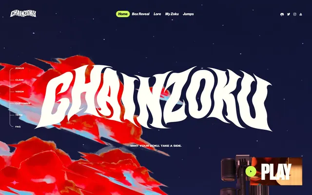
Neon Cyberpunk Nightscape – A high-contrast world of dark urban realism punctuated by electric neon accents.
Color palette
Primary interactive elements, navigation active states, accent borders, highlights. A vivid, almost radioactive green that signifies action and attention
Hero background accents, informational highlights. A moderately saturated blue used for atmospheric background elements
Illustrative accents, decorative fills – creates a high-energy contrast with the primary green
Container backgrounds, contextual elements. A muted green providing a grounded, earthy counterpoint
Illustrative accents. A moderate green providing visual richness in graphical elements
Container backgrounds, accent borders for high visual impact. A vivid red used sparingly for emphasis
Subtle container backgrounds, contextual elements. A muted pink providing a soft, atmospheric background
Illustrative accents. A vivid pink for graphical flair
Background gradient for atmospheric depth
Primary text, borders, dark backgrounds, decorative fills. Creates stark definition against lighter surfaces
Primary background, inverse text, active states. Provides a bright, slightly warm canvas for content
Card backgrounds, secondary text on light surfaces. A nuanced dark gray providing subtle depth
Footer backgrounds, subtle contextual surfaces. A cool off-white for low-contrast backgrounds
Typography
- Weights
- 400, 500, 900
- Sizes
- 16px, 18px, 23px, 26px, 40px, 57px, 90px, 100px
- Line height
- 1, 1.19, 1.2, 1.39
- Letter spacing
- -0.0200em
- Fallback
- Helvetica Neue
Versatile workhorse font for body text, navigation, and many headings. Its slightly condensed forms give a modern, efficient feel, even at lighter weights. The negative letter-spacing maintains a tight, compact readability.
- Weights
- 400, 700
- Sizes
- 26px, 30px
- Line height
- 0.78
- Letter spacing
- normal
Used for specific callouts and contextual text where a classic, highly readable sans-serif is needed, often with extremely tight line heights for a stacked, graphic effect.
- Weights
- 400
- Sizes
- 100px, 177px, 301px
- Line height
- 0.8
- Letter spacing
- -0.0200em
- Fallback
- Bebas Neue
Signature display font for large, impactful headlines. Its heavy weight and expansive width, combined with tight letter spacing and line height, create a powerful, almost monumental presence.
Spacing & shape
Components
Text in Ghost White (#fffff7) on a transparent background, no borders or padding; used for primary navigation and sidebar on dark backgrounds. Inherits parent typography.
Text in Midnight Ink (#000000) on a transparent background, no borders or padding; used for primary navigation and sidebar on light backgrounds. Inherits parent typography.
A circular button with Electric Lime (#cdfb52) background and Midnight Ink (#000000) text. Border radius 9999px. Minimal padding on text. Often used for 'Play' or 'Mint' actions.
Transparent background with Ghost White (#fffff7) text and a Ghost White (#fffff7) border. No border radius. Minimum content padding, but the visual separation is created by the border.
Transparent background, 0px border radius, no box shadow, 0px padding. Serves as a flexible, borderless content wrapper.
Transparent background, 10px border radius, no box shadow, 0px bottom padding, 0px left/right/top padding for tight content grouping.
Deep Shadow (#1c1616) background, 10px border radius, no box shadow, 0px padding. Used for visually distinct blocks on the page.
Deep Shadow (#1c1616) background, 0px border radius, no box shadow, 50px top/bottom padding, 40px left/right padding. Used for clear content separation.
Guidelines
- Use Midnight Ink (#000000) for all primary text on light backgrounds and Ghost White (#fffff7) for primary text on dark backgrounds to maintain high contrast.
- Implement Electric Lime (#cdfb52) as the primary accent color for active states, small interactive elements, and key calls to action like the 'Play' button.
- Apply Druk Heavy for all large display headlines at sizes 100px or larger, using a letterSpacing of -0.0200em and a lineHeight of 0.8em to create a compressed, impactful header.
- Structure primary navigation links using Ghost Navigation Link components, ensuring no background or padding to keep a lightweight, unobtrusive feel.
- Maintain a comfortable density by utilizing an elementGap of 8px for internal spacing between components.
- Round corners of cards and interactive background elements with a 10px border radius, except for header navigation which uses 15px.
- Use 1px borders of either Midnight Ink (#000000) or Ghost White (#fffff7) for subtle separation, particularly in list items or form elements, avoiding overt shadows where possible.
- Avoid using soft shadows or complex elevation; the design relies on stark color contrast and clear borders for visual hierarchy.
- Do not use generic system fonts for branding headlines; Druk Heavy is crucial for the strong brand voice.
- Refrain from saturating the interface with multiple vibrant colors; reserve vivid hues like Electric Lime (#cdfb52) and Cyber Pink (#f24ac7) for accents and interactive states.
- Do not introduce gradients unless they are the specific 'Gradient Sky' (#a2b6cf) linear gradient, or directly for background atmosphere.
- Do not apply large internal padding to navigation links or simple buttons; they should feel lightweight and text-focused.
- Avoid arbitrary border radii; adhere strictly to 10px for cards and 15px for navigation to maintain visual consistency.
About this system
ShowHide
Chainzoku's visual system evokes a dark, gritty cyberpunk aesthetic set against an urban nightscape. It uses stark black and off-white as primary textual and surface colors, punched up by vivid, almost neon, greens and hot pinks for interactive elements and accents. Typography is oversized and angular, featuring a custom variable font with high contrast and tight-tracked display text, giving the brand a distinct, almost aggressive, voice. Surfaces are generally flat and unshadowed, opting for strong borders and high-contrast color shifts to delineate elements.
The page primarily uses a full-bleed layout, allowing atmospheric illustrations to extend to the viewport edges, especially in the hero and section backgrounds. Content sections below the hero often alternate with strong background visuals. The main branding (Chainzoku logo) and primary navigation are confined to a top bar, with an additional sticky left-hand sidebar for section navigation. Text is frequently presented as centered headlines or in distinct, visually separated blocks, often with a unique, cut-out container shape rather than a standard rectangular box, creating an angular, dynamic rhythm. The site features a mix of two-column layouts juxtaposed with large, immersive single-column visual elements. There's a comfortable density with ample breathing room, ensuring large visuals can dominate.
The site's imagery is characterized by highly stylized, detailed illustrations and concept art, often depicting characters and urban environments. These visuals are typically full-bleed or large contained elements, integrated into the page with masked or irregular edges. The art style is dimensional but not photorealistic, with a strong emphasis on vivid, almost neon, colors against a dark, nocturnal backdrop. Icons are primarily solid or filled, echoing the game-like aesthetic, and serve both decorative and explanatory roles. The imagery is central to content delivery, giving the site a visual-heavy, immersive feel.
Reminiscent of Cyberpunk 2077 game franchise, Akira (manga/film), Arcane (Netflix series).
# Chainzoku — Style Reference
> Neon Cyberpunk Nightscape – A high-contrast world of dark urban realism punctuated by electric neon accents.

**Theme:** light

**Site:** https://chainzoku.io

Chainzoku's visual system evokes a dark, gritty cyberpunk aesthetic set against an urban nightscape. It uses stark black and off-white as primary textual and surface colors, punched up by vivid, almost neon, greens and hot pinks for interactive elements and accents. Typography is oversized and angular, featuring a custom variable font with high contrast and tight-tracked display text, giving the brand a distinct, almost aggressive, voice. Surfaces are generally flat and unshadowed, opting for strong borders and high-contrast color shifts to delineate elements.

## Tokens — Colors

| Name | Value | Token | Role |
|------|------|------|------|
| Electric Lime | `#cdfb52` | `--color-electric-lime` | Primary interactive elements, navigation active states, accent borders, highlights. A vivid, almost radioactive green that signifies action and attention |
| Sky Blue | `#5c97ce` | `--color-sky-blue` | Hero background accents, informational highlights. A moderately saturated blue used for atmospheric background elements |
| Cyber Pink | `#f24ac7` | `--color-cyber-pink` | Illustrative accents, decorative fills – creates a high-energy contrast with the primary green |
| Olive Drab | `#485229` | `--color-olive-drab` | Container backgrounds, contextual elements. A muted green providing a grounded, earthy counterpoint |
| Forest Fern | `#8c9b57` | `--color-forest-fern` | Illustrative accents. A moderate green providing visual richness in graphical elements |
| Crimson Glare | `#ab0000` | `--color-crimson-glare` | Container backgrounds, accent borders for high visual impact. A vivid red used sparingly for emphasis |
| Lavender Ash | `#deafd2` | `--color-lavender-ash` | Subtle container backgrounds, contextual elements. A muted pink providing a soft, atmospheric background |
| Vibrant Magenta | `#f756a3` | `--color-vibrant-magenta` | Illustrative accents. A vivid pink for graphical flair |
| Gradient Sky | `#a2b6cf` | `--color-gradient-sky` | Background gradient for atmospheric depth |
| Midnight Ink | `#000000` | `--color-midnight-ink` | Primary text, borders, dark backgrounds, decorative fills. Creates stark definition against lighter surfaces |
| Ghost White | `#fffff7` | `--color-ghost-white` | Primary background, inverse text, active states. Provides a bright, slightly warm canvas for content |
| Deep Shadow | `#1c1616` | `--color-deep-shadow` | Card backgrounds, secondary text on light surfaces. A nuanced dark gray providing subtle depth |
| Faded Concrete | `#c4c1c6` | `--color-faded-concrete` | Footer backgrounds, subtle contextual surfaces. A cool off-white for low-contrast backgrounds |

## Tokens — Typography

### NeueHaasGrotDisp
- **Substitute:** Helvetica Neue
- **Weights:** 400, 500, 900
- **Sizes:** 16px, 18px, 23px, 26px, 40px, 57px, 90px, 100px
- **Line height:** 1, 1.19, 1.2, 1.39
- **Letter spacing:** -0.0200em
- **Role:** Versatile workhorse font for body text, navigation, and many headings. Its slightly condensed forms give a modern, efficient feel, even at lighter weights. The negative letter-spacing maintains a tight, compact readability.

### Helvetica Neue
- **Weights:** 400, 700
- **Sizes:** 26px, 30px
- **Line height:** 0.78
- **Letter spacing:** normal
- **Role:** Used for specific callouts and contextual text where a classic, highly readable sans-serif is needed, often with extremely tight line heights for a stacked, graphic effect.

### Druk Heavy
- **Substitute:** Bebas Neue
- **Weights:** 400
- **Sizes:** 100px, 177px, 301px
- **Line height:** 0.8
- **Letter spacing:** -0.0200em
- **Role:** Signature display font for large, impactful headlines. Its heavy weight and expansive width, combined with tight letter spacing and line height, create a powerful, almost monumental presence.

## Tokens — Type Scale

Golden Ratio (1.618) from 16px base.

| Role | Size | Line height | Letter spacing |
|------|------|------|------|
| body | 16px | 1.39 | — |
| subheading | 23px | 1.2 | — |
| heading | 40px | 1.19 | -0.8px |
| heading-lg | 57px | 1 | -1.14px |
| display-md | 100px | 0.8 | -2px |
| display-lg | 177px | 0.8 | -3.54px |
| display | 301px | 0.8 | -6.02px |

## Tokens — Spacing

- **Section gap:** 50px
- **Card padding:** 40px
- **Element gap:** 8px

## Tokens — Radius

- **Cards:** 10px
- **navigation:** 15px

## Layout

The page primarily uses a full-bleed layout, allowing atmospheric illustrations to extend to the viewport edges, especially in the hero and section backgrounds. Content sections below the hero often alternate with strong background visuals. The main branding (Chainzoku logo) and primary navigation are confined to a top bar, with an additional sticky left-hand sidebar for section navigation. Text is frequently presented as centered headlines or in distinct, visually separated blocks, often with a unique, cut-out container shape rather than a standard rectangular box, creating an angular, dynamic rhythm. The site features a mix of two-column layouts juxtaposed with large, immersive single-column visual elements. There's a comfortable density with ample breathing room, ensuring large visuals can dominate.

## Imagery

The site's imagery is characterized by highly stylized, detailed illustrations and concept art, often depicting characters and urban environments. These visuals are typically full-bleed or large contained elements, integrated into the page with masked or irregular edges. The art style is dimensional but not photorealistic, with a strong emphasis on vivid, almost neon, colors against a dark, nocturnal backdrop. Icons are primarily solid or filled, echoing the game-like aesthetic, and serve both decorative and explanatory roles. The imagery is central to content delivery, giving the site a visual-heavy, immersive feel.

## Components

### Ghost Navigation Link: Dark
*Primary header navigation and sidebar links.*

Text in Ghost White (#fffff7) on a transparent background, no borders or padding; used for primary navigation and sidebar on dark backgrounds. Inherits parent typography.

### Ghost Navigation Link: Light
*Primary header navigation and sidebar links.*

Text in Midnight Ink (#000000) on a transparent background, no borders or padding; used for primary navigation and sidebar on light backgrounds. Inherits parent typography.

### Pill Accent Button
*Primary calls to action for key interactions.*

A circular button with Electric Lime (#cdfb52) background and Midnight Ink (#000000) text. Border radius 9999px. Minimal padding on text. Often used for 'Play' or 'Mint' actions.

### Outline Sidebar Button
*Interactive elements within the left sidebar navigation.*

Transparent background with Ghost White (#fffff7) text and a Ghost White (#fffff7) border. No border radius. Minimum content padding, but the visual separation is created by the border.

### Base Card
*Structural container for content sections.*

Transparent background, 0px border radius, no box shadow, 0px padding. Serves as a flexible, borderless content wrapper.

### Content Card Narrow
*Containers for specific content blocks with subtle visual separation.*

Transparent background, 10px border radius, no box shadow, 0px bottom padding, 0px left/right/top padding for tight content grouping.

### Content Card Dark
*Containers for specific content blocks requiring a darker background.*

Deep Shadow (#1c1616) background, 10px border radius, no box shadow, 0px padding. Used for visually distinct blocks on the page.

### Padded Content Block
*Sections requiring significant internal padding for content.*

Deep Shadow (#1c1616) background, 0px border radius, no box shadow, 50px top/bottom padding, 40px left/right padding. Used for clear content separation.

## Guidelines

### Do

- Use Midnight Ink (#000000) for all primary text on light backgrounds and Ghost White (#fffff7) for primary text on dark backgrounds to maintain high contrast.
- Implement Electric Lime (#cdfb52) as the primary accent color for active states, small interactive elements, and key calls to action like the 'Play' button.
- Apply Druk Heavy for all large display headlines at sizes 100px or larger, using a letterSpacing of -0.0200em and a lineHeight of 0.8em to create a compressed, impactful header.
- Structure primary navigation links using Ghost Navigation Link components, ensuring no background or padding to keep a lightweight, unobtrusive feel.
- Maintain a comfortable density by utilizing an elementGap of 8px for internal spacing between components.
- Round corners of cards and interactive background elements with a 10px border radius, except for header navigation which uses 15px.
- Use 1px borders of either Midnight Ink (#000000) or Ghost White (#fffff7) for subtle separation, particularly in list items or form elements, avoiding overt shadows where possible.

### Don't

- Avoid using soft shadows or complex elevation; the design relies on stark color contrast and clear borders for visual hierarchy.
- Do not use generic system fonts for branding headlines; Druk Heavy is crucial for the strong brand voice.
- Refrain from saturating the interface with multiple vibrant colors; reserve vivid hues like Electric Lime (#cdfb52) and Cyber Pink (#f24ac7) for accents and interactive states.
- Do not introduce gradients unless they are the specific 'Gradient Sky' (#a2b6cf) linear gradient, or directly for background atmosphere.
- Do not apply large internal padding to navigation links or simple buttons; they should feel lightweight and text-focused.
- Avoid arbitrary border radii; adhere strictly to 10px for cards and 15px for navigation to maintain visual consistency.

## Agent Prompt Guide

### Quick Color Reference
text: #000000
background: #fffff7
border: #000000
accent: #cdfb52
primary action: #cdfb52 (filled action)

### 3-5 Example Component Prompts
1. Create a Hero section: full-bleed background using Gradient Sky (#a2b6cf) with subtle atmospheric elements. Centered headline 'Chainzoku Saga' in Druk Heavy, size 301px, Midnight Ink (#000000) text, letter-spacing -6.02px, line-height 0.8em. Subtext 'Mint your Zoku. Take a side.' in NeueHaasGrotDisp, size 26px, Midnight Ink (#000000) text, letter-spacing -0.52px, line-height 1.2em.
2. Design a 'Play' Pill Accent Button: Electric Lime (#cdfb52) background, Midnight Ink (#000000) text (NeueHaasGrotDisp, size 16px), 9999px border radius, with minimal padding. Include a small, solid play icon next to the text.
3. Build a 'Clans' Content Card Dark: Deep Shadow (#1c1616) background, 10px border radius, 0px padding. Content includes a subheading 'The Onizoku' from NeueHaasGrotDisp, size 23px, Ghost White (#fffff7) text, and body text in Ghost White (#fffff7) at 16px, line-height 1.39em. Ensure text blocks maintain 8px element spacing.
4. Construct a Sidebar Navigation System: uses Ghost Navigation Link: Dark components in a vertical list. Links should be Ghost White (#fffff7), 16px NeueHaasGrotDisp text. The entire list should sit within a container that uses 'Outline Sidebar Button' styling for interactive elements like 'Zokus', with Ghost White (#fffff7) border and text.
More like this







Keep what you find
A free account saves references to boards and can send you a weekly email of picks based on what you save.
To see every result, go Pro.