Preview image. Unlock full-res
Neon accent on white canvas
Color palette
Primary calls to action, active navigation indicators, link highlights — a vibrant, eye-catching color against the neutral backdrop
Primary page canvas and white card surfaces. Do not promote it to the primary CTA color
Decorative icons and occasional branded accent text, used sparingly for specific feature highlights
Decorative icons and occasional branded accent text, used sparingly for specific feature highlights
Decorative icons and occasional branded accent text, used sparingly for specific feature highlights
Decorative icons and occasional branded accent text, used sparingly for specific feature highlights
Green decorative accent for icons, marks, and small graphic details. Use as a supporting accent, not as a status color
Red decorative accent for icons, marks, and small graphic details. Use as a supporting accent, not as a status color
Page backgrounds, elevated card surfaces, default button fills
Subtle background for card-like elements, indicating a slight elevation from the base canvas
Dominant text color for headings and essential body copy, providing strong contrast
Secondary text, button text on ghost buttons, and subtle interface details
Helper text, captions, and deactivated navigation items — a softer grey for less emphasis
Placeholder text in input fields and other non-essential text
Subtle borders for input fields and ghost buttons
Typography
- Weights
- 400, 485, 500, 535
- Sizes
- 11px, 12px, 13px, 14px, 16px, 18px, 24px, 36px, 52px, 64px
- Line height
- 0.75, 0.96, 1, 1.11, 1.15, 1.19, 1.2, 1.25, 1.3, 1.33, 1.49, 3
- Letter spacing
- -0.020em
- Fallback
- system-ui
The primary typeface for all UI elements and content, providing a consistent, compact, and confident tone. Its slight letter-spacing reduction across sizes makes it feel more purposeful and less generic.
Spacing & shape
Elevation
Components
Background: Action Pink (#ff37c7). Text: Canvas White (#ffffff). Radius: 999999px (pill). Padding: 4px. Font: Basel, weight 485.
Background: transparent. Border: 1px solid Text Primary (#131313). Text: Text Primary (#131313). Radius: 12px. Padding: 8px 12px.
Background: rgba(19, 19, 19, 0.08). Text: Text Secondary (#222222). Radius: 999999px (pill). Padding: 4px. Font: Basel, weight 485.
Background: Surface Frost (#f9f9f9). Radius: 20px. Padding: 0. Shadows: none. Internally may contain elements with Canvas White backgrounds.
Background: Canvas White (#ffffff). Radius: 24px. Padding: 8px. Shadows: none.
Background: transparent (often on a Surface Frost card). Text: Text Primary (#131313). Placeholder Text: Text Placeholder (#acacac). Border: transparent. Focus state not explicit but likely a subtle border or glow.
Text: Text Primary (#131313) for inactive, Action Pink (#ff37c7) for active. Underline: 1px Action Pink (#ff37c7) for active state. Radius: 20px for the hover container. Padding: variable. Font: Basel, weight 400.
Guidelines
- Use Basel typeface at varying weights (400, 485, 500, 535) with a -0.020em letter-spacing for all text elements.
- Prioritize Canvas White (#ffffff) for the primary page background and Surface Frost (#f9f9f9) for card elements to establish surface hierarchy.
- Apply Action Pink (#ff37c7) exclusively for primary calls to action, clear active states, and critical interactive elements.
- Utilize 999999px (pill) radius for all primary action buttons and small interactive elements, and 20px-24px for cards.
- Maintain comfortable spacing with 8px as the primary element gap and 24px for section separation.
- Layer text colors from Text Primary (#131313) to Text Muted (#6a6a6a) to convey information hierarchy clearly.
- Incorporate highly rounded, almost pill-shaped corners (999999px) for buttons and similar interactive elements for a distinct friendly feel.
- Do not introduce new saturated colors for interactive elements; rely on the established brand and accent colors.
- Avoid heavy drop shadows or strong elevation effects; a minimal or absent shadow approach is preferred.
- Do not deviate from the Basel typeface or its specified letter-spacing for any UI text.
- Do not use generic square or slightly rounded components; ensure cards have at least a 20px radius.
- Refrain from using deep, dark backgrounds for main content areas, as the system is built on a light canvas.
- Avoid cluttering layouts; always prioritize generous negative space and comfortable density.
- Do not use transparent backgrounds for action buttons when Action Pink (#ff37c7) is available for a filled state.
About this system
ShowHide
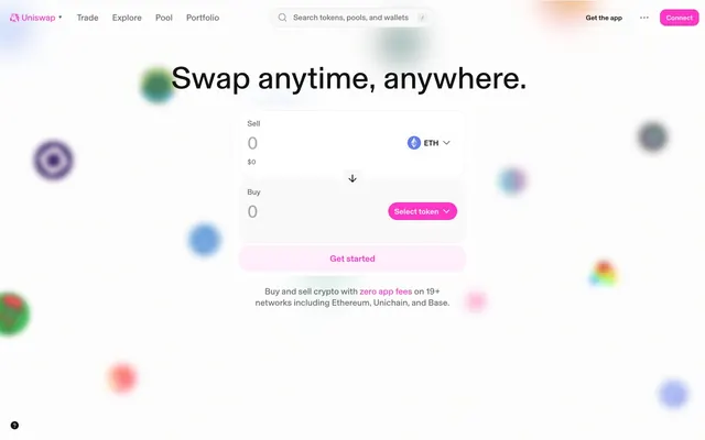
Uniswap's design system embraces a 'soft tech' aesthetic, balancing a vibrant, almost playful color palette with clean, functional UI elements. The layout features generous negative space and a light canvas, punctuated by rounded cards and ghost buttons. A single vivid pink serves as the primary accent, creating clear calls to action amidst a mostly achromatic interface. Typography is compact and precise, contributing to a feeling of efficiency and modern reliability.
The page primarily uses a full-bleed layout, allowing background elements to extend to the edges. Content, however, is contained within an implicit maximum width, centered on the screen, creating clear reading paths. The hero section often features a prominent, centered headline over a diffused graphical background. Sections generally follow a consistent vertical rhythm with minimal visual dividers, flowing seamlessly. Content is frequently arranged in balanced two-column text-left/image-right or text-over-card blocks, with some sections utilizing a three-column card grid for features. The overall density is comfortable, with ample whitespace surrounding content blocks. Navigation is a sticky top bar with clear, compact links and a prominent 'Connect' action button.
The visual language for imagery leans heavily into abstract, blurred, organic shapes used as background decoration, often with a pastel color palette. These elements are atmospheric rather than informative, adding a soft, playful energy. Icons are typically single-color, clean, and functional, frequently adopting one of the accent colors (#8251fb, #ff4d00, #f50db4, #2abdff, #00c3a0). Photography and screenshots are product-focused and often presented within rounded containers, maintaining the overall soft aesthetic. The density is moderate; imagery serves to break up text and add visual interest without overpowering the UI.
Reminiscent of Framer, Rive, Superhuman, Linear.
# Uniswap — Style Reference
> Neon accent on white canvas

**Theme:** light

**Site:** https://app.uniswap.org

Uniswap's design system embraces a 'soft tech' aesthetic, balancing a vibrant, almost playful color palette with clean, functional UI elements. The layout features generous negative space and a light canvas, punctuated by rounded cards and ghost buttons. A single vivid pink serves as the primary accent, creating clear calls to action amidst a mostly achromatic interface. Typography is compact and precise, contributing to a feeling of efficiency and modern reliability.

## Tokens — Colors

| Name | Value | Token | Role |
|------|------|------|------|
| Action Pink | `#ff37c7` | `--color-action-pink` | Primary calls to action, active navigation indicators, link highlights — a vibrant, eye-catching color against the neutral backdrop |
| Action Pink Light | `#fef4ff` | `--color-action-pink-light` | Primary page canvas and white card surfaces. Do not promote it to the primary CTA color |
| Icon Violet | `#8251fb` | `--color-icon-violet` | Decorative icons and occasional branded accent text, used sparingly for specific feature highlights |
| Icon Orange | `#ff4d00` | `--color-icon-orange` | Decorative icons and occasional branded accent text, used sparingly for specific feature highlights |
| Icon Teal | `#00c3a0` | `--color-icon-teal` | Decorative icons and occasional branded accent text, used sparingly for specific feature highlights |
| Icon Blue | `#2abdff` | `--color-icon-blue` | Decorative icons and occasional branded accent text, used sparingly for specific feature highlights |
| Semantic Success Green | `#0c8911` | `--color-semantic-success-green` | Green decorative accent for icons, marks, and small graphic details. Use as a supporting accent, not as a status color |
| Semantic Error Red | `#e01a2b` | `--color-semantic-error-red` | Red decorative accent for icons, marks, and small graphic details. Use as a supporting accent, not as a status color |
| Canvas White | `#ffffff` | `--color-canvas-white` | Page backgrounds, elevated card surfaces, default button fills |
| Surface Frost | `#f9f9f9` | `--color-surface-frost` | Subtle background for card-like elements, indicating a slight elevation from the base canvas |
| Text Primary | `#131313` | `--color-text-primary` | Dominant text color for headings and essential body copy, providing strong contrast |
| Text Secondary | `#222222` | `--color-text-secondary` | Secondary text, button text on ghost buttons, and subtle interface details |
| Text Muted | `#6a6a6a` | `--color-text-muted` | Helper text, captions, and deactivated navigation items — a softer grey for less emphasis |
| Text Placeholder | `#acacac` | `--color-text-placeholder` | Placeholder text in input fields and other non-essential text |
| Border Grey | `#f2f2f2` | `--color-border-grey` | Subtle borders for input fields and ghost buttons |

## Tokens — Typography

### Basel
- **Substitute:** system-ui
- **Weights:** 400, 485, 500, 535
- **Sizes:** 11px, 12px, 13px, 14px, 16px, 18px, 24px, 36px, 52px, 64px
- **Line height:** 0.75, 0.96, 1, 1.11, 1.15, 1.19, 1.2, 1.25, 1.3, 1.33, 1.49, 3
- **Letter spacing:** -0.020em
- **Role:** The primary typeface for all UI elements and content, providing a consistent, compact, and confident tone. Its slight letter-spacing reduction across sizes makes it feel more purposeful and less generic.

## Tokens — Type Scale

Augmented Fourth (1.414) from 14px base.

| Role | Size | Line height | Letter spacing |
|------|------|------|------|
| caption | 11px | 1.49 | -0.22px |
| body | 14px | 1.19 | -0.28px |
| subheading | 18px | 1.15 | -0.36px |
| heading | 24px | 1.25 | -0.48px |
| heading-lg | 36px | 1.2 | -0.72px |
| display | 64px | 0.96 | -1.28px |

## Tokens — Spacing

- **Section gap:** 24px
- **Card padding:** 8px
- **Element gap:** 8px

## Tokens — Radius

- **circle:** 50%
- **lg:** 20px
- **md:** 12px
- **none:** 0px
- **pill:** 999999px
- **sm:** 8px
- **xl:** 24px

## Tokens — Elevation

- **button:** `color(srgb 0.0745098 0.0745098 0.0745098 / 0.00313726) 0px 0px 10px 0px`

## Layout

The page primarily uses a full-bleed layout, allowing background elements to extend to the edges. Content, however, is contained within an implicit maximum width, centered on the screen, creating clear reading paths. The hero section often features a prominent, centered headline over a diffused graphical background. Sections generally follow a consistent vertical rhythm with minimal visual dividers, flowing seamlessly. Content is frequently arranged in balanced two-column text-left/image-right or text-over-card blocks, with some sections utilizing a three-column card grid for features. The overall density is comfortable, with ample whitespace surrounding content blocks. Navigation is a sticky top bar with clear, compact links and a prominent 'Connect' action button.

## Imagery

The visual language for imagery leans heavily into abstract, blurred, organic shapes used as background decoration, often with a pastel color palette. These elements are atmospheric rather than informative, adding a soft, playful energy. Icons are typically single-color, clean, and functional, frequently adopting one of the accent colors (#8251fb, #ff4d00, #f50db4, #2abdff, #00c3a0). Photography and screenshots are product-focused and often presented within rounded containers, maintaining the overall soft aesthetic. The density is moderate; imagery serves to break up text and add visual interest without overpowering the UI.

## Components

### Primary Action Button
*Filled button for main calls to action*

Background: Action Pink (#ff37c7). Text: Canvas White (#ffffff). Radius: 999999px (pill). Padding: 4px. Font: Basel, weight 485.

### Ghost Button
*Secondary and tertiary actions that need less emphasis*

Background: transparent. Border: 1px solid Text Primary (#131313). Text: Text Primary (#131313). Radius: 12px. Padding: 8px 12px.

### Filled Secondary Button
*Secondary action button with a subtle fill*

Background: rgba(19, 19, 19, 0.08). Text: Text Secondary (#222222). Radius: 999999px (pill). Padding: 4px. Font: Basel, weight 485.

### Input Card
*Container for user inputs and content blocks*

Background: Surface Frost (#f9f9f9). Radius: 20px. Padding: 0. Shadows: none. Internally may contain elements with Canvas White backgrounds.

### Elevated Content Card
*Prominent content card, often used for interactive tools or feature showcases*

Background: Canvas White (#ffffff). Radius: 24px. Padding: 8px. Shadows: none.

### Minimal Input Field
*Standard text input field*

Background: transparent (often on a Surface Frost card). Text: Text Primary (#131313). Placeholder Text: Text Placeholder (#acacac). Border: transparent. Focus state not explicit but likely a subtle border or glow.

### Navigation Link
*Top-level navigation items*

Text: Text Primary (#131313) for inactive, Action Pink (#ff37c7) for active. Underline: 1px Action Pink (#ff37c7) for active state. Radius: 20px for the hover container. Padding: variable. Font: Basel, weight 400.

## Guidelines

### Do

- Use Basel typeface at varying weights (400, 485, 500, 535) with a -0.020em letter-spacing for all text elements.
- Prioritize Canvas White (#ffffff) for the primary page background and Surface Frost (#f9f9f9) for card elements to establish surface hierarchy.
- Apply Action Pink (#ff37c7) exclusively for primary calls to action, clear active states, and critical interactive elements.
- Utilize 999999px (pill) radius for all primary action buttons and small interactive elements, and 20px-24px for cards.
- Maintain comfortable spacing with 8px as the primary element gap and 24px for section separation.
- Layer text colors from Text Primary (#131313) to Text Muted (#6a6a6a) to convey information hierarchy clearly.
- Incorporate highly rounded, almost pill-shaped corners (999999px) for buttons and similar interactive elements for a distinct friendly feel.

### Don't

- Do not introduce new saturated colors for interactive elements; rely on the established brand and accent colors.
- Avoid heavy drop shadows or strong elevation effects; a minimal or absent shadow approach is preferred.
- Do not deviate from the Basel typeface or its specified letter-spacing for any UI text.
- Do not use generic square or slightly rounded components; ensure cards have at least a 20px radius.
- Refrain from using deep, dark backgrounds for main content areas, as the system is built on a light canvas.
- Avoid cluttering layouts; always prioritize generous negative space and comfortable density.
- Do not use transparent backgrounds for action buttons when Action Pink (#ff37c7) is available for a filled state.

## Agent Prompt Guide

Quick Color Reference:
text: #131313
background: #ffffff
border: #f2f2f2
accent: #ff37c7
primary action: #ff37c7 (filled action)

Example Component Prompts:
1. Create a Primary Action Button: #ff37c7 background, #000000 text, 9999px radius, compact pill padding. Use this filled treatment for the main CTA.
2. Design an input card: background Surface Frost (#f9f9f9), radius 20px, no shadows, internal padding 8px for contents, surrounded by 8px element gap from other components.
3. Build a prominent page heading: text Text Primary (#131313), font Basel weight 535, size 64px, lineHeight 0.96, letterSpacing -1.28px.
More like this






Keep what you find
A free account saves references to boards and can send you a weekly email of picks based on what you save.
To see every result, go Pro.