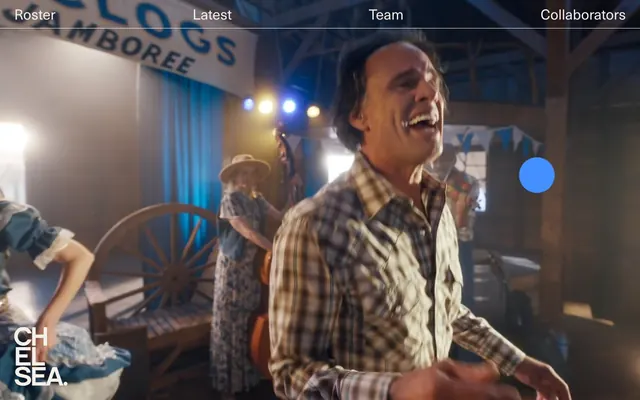
Preview image. Unlock full-res
Cinematic Night Canvas — light through shadow.
Color palette
Primary actionable elements like links, buttons, and selected states — the only vivid color that draws the eye
Page backgrounds, significant content blocks, footer; establishes the dark theme
Muted text, subtle borders, secondary labels – provides depth without visual noise
Primary text on dark backgrounds, high-contrast labels
Pure white for occasional high-contrast accents or specific text elements
Very light borders; provides a subtle division on dark surfaces
Typography
- Weights
- 400, 700
- Sizes
- 12px, 14px, 16px, 32px, 48px
- Line height
- 1, 1.1, 1.12, 1.15, 1.43, 1.5
- Letter spacing
- normal
- Fallback
- Helvetica Neue
Primary typeface for all text content including headings, body, and navigation. Its clean, condensed nature provides a modern, impactful presence while maintaining readability on a dark canvas.
Spacing & shape
Components
Ghost White text (#f4efe9) at 14px (body), 16px (heading) with variable line height. Interactive states turn Electric Blue (#4490ff). Focus states may show a hairline Pavement Gray (#e5e7eb) border.
Filled with Electric Blue (#4490ff), with Electric Blue text (#4490ff) which is likely overridden to white in practice to be legible against the blue fill. Has a 9999px border radius for a distinct pill shape. Padding is minimal or zero indicating a tight fit around content.
Transparent background with a Pavement Gray (#e5e7eb) border, likely 1px. No padding or radius specified, suggesting a minimalist, outline-only presentation for elements like 'US'/'UK' selectors. Text is Ash Gray (#1f2937).
Ghost White text (#f4efe9) with potential bold weight for names or categories. Uses 8px for element spacing and 16px as internal padding for containers.
Guidelines
- Always use Midnight Ink (#000000) as the canvas background for new pages to maintain the dark theme.
- Reserve Electric Blue (#4490ff) exclusively for interactive elements and state indicators, never for decorative purposes.
- Prioritize Neue Haas Unica Pro for all text, varying weight (400, 700) and size (12-48px) to establish hierarchy.
- Apply a 9999px border radius for all pill-shaped buttons and interactive elements requiring a soft, rounded aesthetic.
- Utilize Ash Gray (#1f2937) for subtle borders and secondary information, maintaining visual quietness.
- Implement a compact density with 8px as the default element spacing in components and layouts.
- Ensure primary text is Ghost White (#f4efe9) against the dark background for optimal contrast.
- Do not introduce new vibrant colors outside of the defined Electric Blue; maintain a monochrome palette with strategic accents.
- Avoid heavy shadows or gradients; components should remain flat and minimalist to align with the stark aesthetic.
- Do not use generic system fonts; Neue Haas Unica Pro is critical for brand identity.
- Do not apply large, decorative border radii to elements other than specific buttons/links with the 9999px radius.
- Avoid overly dense layouts; use 96px for section gaps to ensure generous breathing room horizontally and vertically.
- Do not use Electric Blue for non-interactive text or static elements.
- Avoid changing the default 1px border thickness for dividers unless explicitly specified for a unique component.
About this system
ShowHide
Chelsea evokes a stark, filmic mood with a dark canvas and luminous text-based navigation. Typography is the primary visual element, given weight and presence through color and generous spacing. A single vivid blue accent color is reserved for interactive elements, creating points of distinct focus against the monochromatic backdrop. Components are minimal and flat, emphasizing content over decorative chrome, with an overall impression of focused elegance.
The page primarily employs a full-bleed layout, particularly for the hero section, embedding video or photography as the dominant visual. Content sections maintain a contained, centered structure with text blocks. The header is a minimal, top-bar navigation that remains sticky, featuring text links that highlight subtly. Section rhythm is often seamless, blending content over continuous dark backgrounds rather than distinct bands, punctuated by generous vertical spacing (96px). Content arrangement is text-dominant with clear, left-aligned typography.
The site uses video and photography prominently, treated with a cinematic, high-contrast, and often low-key aesthetic that suits the film production context. Product shots, when present, are full-bleed capturing an immersive experience. There is no usage of abstract graphics or highly stylized illustrations; the focus is on realistic, high-quality visual content. Icons are minimal, likely grayscale or the accent blue, and purely functional. Imagery is dominant, often replacing the background, creating an image-rich experience.
Reminiscent of A24 FILMS, Squarespace, Artemis (financial platform), Wieden+Kennedy.
# CHELSEA — Style Reference
> Cinematic Night Canvas — light through shadow.

**Theme:** dark

**Site:** https://www.chelsea.com

Chelsea evokes a stark, filmic mood with a dark canvas and luminous text-based navigation. Typography is the primary visual element, given weight and presence through color and generous spacing. A single vivid blue accent color is reserved for interactive elements, creating points of distinct focus against the monochromatic backdrop. Components are minimal and flat, emphasizing content over decorative chrome, with an overall impression of focused elegance.

## Tokens — Colors

| Name | Value | Token | Role |
|------|------|------|------|
| Electric Blue | `#4490ff` | `--color-electric-blue` | Primary actionable elements like links, buttons, and selected states — the only vivid color that draws the eye |
| Midnight Ink | `#000000` | `--color-midnight-ink` | Page backgrounds, significant content blocks, footer; establishes the dark theme |
| Ash Gray | `#1f2937` | `--color-ash-gray` | Muted text, subtle borders, secondary labels – provides depth without visual noise |
| Ghost White | `#f4efe9` | `--color-ghost-white` | Primary text on dark backgrounds, high-contrast labels |
| Polar White | `#ffffff` | `--color-polar-white` | Pure white for occasional high-contrast accents or specific text elements |
| Pavement Gray | `#e5e7eb` | `--color-pavement-gray` | Very light borders; provides a subtle division on dark surfaces |

## Tokens — Typography

### Neue Haas Unica Pro
- **Substitute:** Helvetica Neue
- **Weights:** 400, 700
- **Sizes:** 12px, 14px, 16px, 32px, 48px
- **Line height:** 1, 1.1, 1.12, 1.15, 1.43, 1.5
- **Letter spacing:** normal
- **Role:** Primary typeface for all text content including headings, body, and navigation. Its clean, condensed nature provides a modern, impactful presence while maintaining readability on a dark canvas.

## Tokens — Type Scale

Augmented Fourth (1.414) from 16px base.

| Role | Size | Line height | Letter spacing |
|------|------|------|------|
| caption | 12px | 1.15 | — |
| body-sm | 14px | 1.15 | — |
| body | 16px | 1.15 | — |
| body-lg | 32px | 1.15 | — |
| heading-sm | 48px | 1.15 | — |

## Tokens — Spacing

- **Section gap:** 96px
- **Card padding:** 16px
- **Element gap:** 8px

## Tokens — Radius

- **Buttons:** 9999px
- **links:** 9999px

## Layout

The page primarily employs a full-bleed layout, particularly for the hero section, embedding video or photography as the dominant visual. Content sections maintain a contained, centered structure with text blocks. The header is a minimal, top-bar navigation that remains sticky, featuring text links that highlight subtly. Section rhythm is often seamless, blending content over continuous dark backgrounds rather than distinct bands, punctuated by generous vertical spacing (96px). Content arrangement is text-dominant with clear, left-aligned typography.

## Imagery

The site uses video and photography prominently, treated with a cinematic, high-contrast, and often low-key aesthetic that suits the film production context. Product shots, when present, are full-bleed capturing an immersive experience. There is no usage of abstract graphics or highly stylized illustrations; the focus is on realistic, high-quality visual content. Icons are minimal, likely grayscale or the accent blue, and purely functional. Imagery is dominant, often replacing the background, creating an image-rich experience.

## Components

### Navigation Link
*Main navigation items and sub-navigation lists.*

Ghost White text (#f4efe9) at 14px (body), 16px (heading) with variable line height. Interactive states turn Electric Blue (#4490ff). Focus states may show a hairline Pavement Gray (#e5e7eb) border.

### Pill Accent Button
*Primary action button that stands out.*

Filled with Electric Blue (#4490ff), with Electric Blue text (#4490ff) which is likely overridden to white in practice to be legible against the blue fill. Has a 9999px border radius for a distinct pill shape. Padding is minimal or zero indicating a tight fit around content.

### Ghost Border Button
*Secondary action or categorized filters.*

Transparent background with a Pavement Gray (#e5e7eb) border, likely 1px. No padding or radius specified, suggesting a minimalist, outline-only presentation for elements like 'US'/'UK' selectors. Text is Ash Gray (#1f2937).

### Text List Item
*Displaying team members or project names in a list.*

Ghost White text (#f4efe9) with potential bold weight for names or categories. Uses 8px for element spacing and 16px as internal padding for containers.

## Guidelines

### Do

- Always use Midnight Ink (#000000) as the canvas background for new pages to maintain the dark theme.
- Reserve Electric Blue (#4490ff) exclusively for interactive elements and state indicators, never for decorative purposes.
- Prioritize Neue Haas Unica Pro for all text, varying weight (400, 700) and size (12-48px) to establish hierarchy.
- Apply a 9999px border radius for all pill-shaped buttons and interactive elements requiring a soft, rounded aesthetic.
- Utilize Ash Gray (#1f2937) for subtle borders and secondary information, maintaining visual quietness.
- Implement a compact density with 8px as the default element spacing in components and layouts.
- Ensure primary text is Ghost White (#f4efe9) against the dark background for optimal contrast.

### Don't

- Do not introduce new vibrant colors outside of the defined Electric Blue; maintain a monochrome palette with strategic accents.
- Avoid heavy shadows or gradients; components should remain flat and minimalist to align with the stark aesthetic.
- Do not use generic system fonts; Neue Haas Unica Pro is critical for brand identity.
- Do not apply large, decorative border radii to elements other than specific buttons/links with the 9999px radius.
- Avoid overly dense layouts; use 96px for section gaps to ensure generous breathing room horizontally and vertically.
- Do not use Electric Blue for non-interactive text or static elements.
- Avoid changing the default 1px border thickness for dividers unless explicitly specified for a unique component.

## Agent Prompt Guide

Quick Color Reference:
text: #f4efe9
background: #000000
border: #e5e7eb
accent: #4490ff
primary action: #4490ff (filled action)

Example Component Prompts:
1. Create a primary navigation link: Neue Haas Unica Pro, 14px, weight 400, text color Ghost White (#f4efe9). On hover, change text color to Electric Blue (#4490ff).
2. Design a Pill Accent Button: Filled with Electric Blue (#4490ff), text color Polar White (#ffffff), Neue Haas Unica Pro, 16px, weight 700. Border radius 9999px.
3. Create a Team Roster List Item: Neue Haas Unica Pro, 16px, weight 400, text color Ghost White (#f4efe9). Each item should have 8px vertical element gap and an Ash Gray (#1f2937) border on the bottom of 1px.
4. Design a Ghost Border Filter Button: Transparent background, 1px Pavement Gray (#e5e7eb) border, Ash Gray (#1f2937) text, Neue Haas Unica Pro, 12px, weight 400. No border radius.
More like this







Keep what you find
A free account saves references to boards and can send you a weekly email of picks based on what you save.
To see every result, go Pro.