Preview image. Unlock full-res
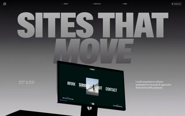
Brutalism meets engineered minimalism.
Color palette
Highly vivid accent for decorative elements, images, and brand highlights. Used for its pop against the largely monochromatic UI
Orange state accent for badges, validation surfaces, and short status labels. Do not promote it to the primary CTA color
Neutral form states, badge text, and quiet UI feedback where color should stay understated. Do not promote it to the primary CTA color
Secondary text, navigation items, borders, and subtle graphical elements. It provides a softer contrast against darker backgrounds or for less prominent text
Page backgrounds, card backgrounds, and a high-contrast text color against dark elements. Used extensively to create spacious, light areas
Subtle text variations, borders, and light background elements. It offers a very soft contrast against white or for divider lines
Backgrounds for alternating sections, subtle card backgrounds, and minor border elements. Contributes to the layered, almost monochrome background structure
Muted text or decorative borders on light surfaces. Provides a medium-dark neutral for various UI elements
Darkest background for sections, text, and elements requiring strong contrast, particularly against bright white. Nearly black, used sparingly for emphasis
Backgrounds, especially for hero sections, creating a dramatic, deep to light transition that influences content visibility
Overlays and atmospheric backgrounds where elements need to stand out against a dark, dramatic backdrop
Typography
- Weights
- 500
- Sizes
- 12px, 17px, 18px, 21px, 36px, 54px, 60px
- Line height
- 1, 1.1, 1.25, 1.3
- Letter spacing
- -0.0300em (at 60px), -0.0200em (at 54px), -0.0100em (at 12-36px)
- Fallback
- Arial, Helvetica, sans-serif
Primary headings, navigation, and key informational text. Its singular 500 weight emphasizes uniformity and industrial clarity, despite variations in size and tracking.
- Weights
- 500, 600
- Sizes
- 12px, 14px
- Line height
- 1, 1.2, 1.3
- Letter spacing
- -0.0200em (at 14px), -0.0100em (at 12px)
- Fallback
- Consolas, Monaco, monospace
Utility text, timestamps, code snippets, and minor labels. Its monospace nature provides a technical, data-driven feel in smaller contexts.
- Weights
- 400, 500
- Sizes
- 12px, 24px, 96px, 274px, 288px
- Line height
- 0.74, 1, 1.3
- Letter spacing
- -0.0200em (at 288px), -0.0100em (at 274px), -0.0050em (at 96px)
- Fallback
- Arial, Helvetica, sans-serif
Display typography, primarily for hero headlines and impactful, oversized visual statements. Its variable nature allows extreme scale and tight tracking, creating monumental text as a visual centerpiece.
Spacing & shape
Components
Transparent background, 'Ink Slate' #3c3a3 text, no explicit border on first inspection. Relies on text color for visibility and interaction.
Completely transparent background, 'Ghost Gray' #a2a2a2 text. No border or shadow. Padding 0px on all sides. Used for minimal presentation of content.
Background set to `rgba(255, 255, 255, 0.5)` for a frosted glass effect. No border or shadow. Padding 12px top/right/left, 18px bottom.
Transparent background, 'Ink Slate' #3c3a3 text. No border or radius. Padding 0px on all sides. Highly integrated with surrounding text.
Background 'Action Orange' #ff6436, 'Ink Slate' #3c3a3 text. Fully rounded with 50% border radius. Padding 0px. Used for compact, urgent cues.
Background `rgba(255, 255, 255, 0.05)`, 'Canvas White' #ffffff with 70% opacity for text. No border or radius. Horizontal padding 6px. Offers a subtle, elevated label effect.
Background 'Deep Space' #161616, 'Silver Dust' #f1f1f1 text. No border or radius. Horizontal padding 6px. Achieves high contrast for important labels.
Guidelines
- Use 'Die Grotesk B' 500 for all primary headings, adjusting letter spacing specific to each size to maintain visual tension.
- Apply 'ABC Gravity Variable' for large display typography, ensuring tight letterSpacing to maximize impact and solidity.
- Maintain a monochromatic base with 'Ink Slate' #3c3a3, 'Ghost Gray' #a2a2a2, and 'Canvas White' #ffffff for 95% of UI elements and backgrounds.
- Introduce 'Sunrise Orange' #ff4c24 or 'Action Orange' #ff6436 only as a distinct, vivid accent for functional cues or compelling highlights.
- Utilize a 14.4px border radius for all corner rounding, contributing to the distinct, subtle softness in an otherwise sharp design.
- Prioritize transparent or semi-transparent backgrounds for cards and overlays, using `rgba(255, 255, 255, 0.5)` for a frosted effect or full transparency.
- Implement the base unit of 6px for all spacing, with element gaps at 6px and card padding at 12px, to reinforce the compact density.
- Avoid introducing additional saturated colors beyond the established orange accents, as it dilutes the brand's sharp monochromatic identity.
- Do not use heavy shadows or significant elevation, as the system prefers transparent layering and subtle background shifts over pronounced depth.
- Refrain from altering the prescribed letter-spacing values for 'Die Grotesk B' and 'ABC Gravity Variable'; these are critical to the typographic personality.
- Do not break the compact density by introducing large, inconsistent spacing between elements or sections.
- Avoid decorative imagery that isn't either tightly cropped product shots or abstract, monochromatic visuals, to maintain focus on the UI.
- Do not use generic system fonts without explicit reasoning; prioritize 'Die Grotesk B' and 'IBM Plex Mono' for their specific roles.
- Resist using heavily decorated or outlined buttons; the system favors ghost buttons or solid, color-neutral badges.
About this system
ShowHide
The Dylanbrouwer design system projects a bold, industrial aesthetic through a highly constrained greyscale palette, sharp edges, and oversized, tightly tracked typography. A single vibrant orange hue serves as a sharp, functional accent. Component surfaces are mostly transparent or subtle, emphasizing a layered, almost architectural feel rather than solid blocks. Interactions are minimal and precise, with an underlying sense of restrained power.
The page primarily uses a full-bleed structure for its dramatic hero section, transitioning into a contained max-width layout for subsequent content. The hero features monumental, centered typography over a dark-to-light gradient background, with key interactive elements positioned strategically. Sections below often alternate between 'Canvas White' and 'Silver Dust' backgrounds, featuring a strong vertical rhythm. Content arrangement frequently pairs text with visual elements, sometimes in alternating left/right configurations or stacked for impact. Navigation is a minimal, top-aligned bar with ghost links, emphasizing the content's dominance. A 3-column card grid is observed for features, maintaining visual density.
This system primarily uses product-focused imagery, often displayed within mock-up screens or as tightly cropped, editorial-style photography. Visuals are typically contained, not full-bleed, and integrated into the layout rather than used as large decorative blocks. There's a preference for abstract, geometric compositions or monochromatic palettes within images, mirroring the UI's own restraint. Icons are minimal, likely outlined or solid, with a consistent stroke weight to match the precise typography. Imagery functions to showcase specific work or provide functional context, maintaining a high density of information without feeling cluttered.
Reminiscent of Basic agency sites, Brutalism-inspired portfolios, Webflow agency sites, Developer portfolios.
# Dylanbrouwer — Style Reference
> Brutalism meets engineered minimalism.

**Theme:** light

**Site:** https://www.dylanbrouwer.design

The Dylanbrouwer design system projects a bold, industrial aesthetic through a highly constrained greyscale palette, sharp edges, and oversized, tightly tracked typography. A single vibrant orange hue serves as a sharp, functional accent. Component surfaces are mostly transparent or subtle, emphasizing a layered, almost architectural feel rather than solid blocks. Interactions are minimal and precise, with an underlying sense of restrained power.

## Tokens — Colors

| Name | Value | Token | Role |
|------|------|------|------|
| Sunrise Orange | `#ff4c24` | `--color-sunrise-orange` | Highly vivid accent for decorative elements, images, and brand highlights. Used for its pop against the largely monochromatic UI |
| Action Orange | `#ff6436` | `--color-action-orange` | Orange state accent for badges, validation surfaces, and short status labels. Do not promote it to the primary CTA color |
| Ink Slate | `#3c3a3e` | `--color-ink-slate` | Neutral form states, badge text, and quiet UI feedback where color should stay understated. Do not promote it to the primary CTA color |
| Ghost Gray | `#a2a2a2` | `--color-ghost-gray` | Secondary text, navigation items, borders, and subtle graphical elements. It provides a softer contrast against darker backgrounds or for less prominent text |
| Canvas White | `#ffffff` | `--color-canvas-white` | Page backgrounds, card backgrounds, and a high-contrast text color against dark elements. Used extensively to create spacious, light areas |
| Platinum Mist | `#c9c7cc` | `--color-platinum-mist` | Subtle text variations, borders, and light background elements. It offers a very soft contrast against white or for divider lines |
| Silver Dust | `#f1f1f1` | `--color-silver-dust` | Backgrounds for alternating sections, subtle card backgrounds, and minor border elements. Contributes to the layered, almost monochrome background structure |
| Cool Stone | `#7b7a7c` | `--color-cool-stone` | Muted text or decorative borders on light surfaces. Provides a medium-dark neutral for various UI elements |
| Deep Space | `#161616` | `--color-deep-space` | Darkest background for sections, text, and elements requiring strong contrast, particularly against bright white. Nearly black, used sparingly for emphasis |
| Grey Scale Gradient | `#000000` | `--color-grey-scale-gradient` | Backgrounds, especially for hero sections, creating a dramatic, deep to light transition that influences content visibility |
| Dark Overlay Gradient | `#040305` | `--color-dark-overlay-gradient` | Overlays and atmospheric backgrounds where elements need to stand out against a dark, dramatic backdrop |

## Tokens — Typography

### Die Grotesk B
- **Substitute:** Arial, Helvetica, sans-serif
- **Weights:** 500
- **Sizes:** 12px, 17px, 18px, 21px, 36px, 54px, 60px
- **Line height:** 1, 1.1, 1.25, 1.3
- **Letter spacing:** -0.0300em (at 60px), -0.0200em (at 54px), -0.0100em (at 12-36px)
- **Role:** Primary headings, navigation, and key informational text. Its singular 500 weight emphasizes uniformity and industrial clarity, despite variations in size and tracking.

### IBM Plex Mono
- **Substitute:** Consolas, Monaco, monospace
- **Weights:** 500, 600
- **Sizes:** 12px, 14px
- **Line height:** 1, 1.2, 1.3
- **Letter spacing:** -0.0200em (at 14px), -0.0100em (at 12px)
- **Role:** Utility text, timestamps, code snippets, and minor labels. Its monospace nature provides a technical, data-driven feel in smaller contexts.

### ABC Gravity Variable
- **Substitute:** Arial, Helvetica, sans-serif
- **Weights:** 400, 500
- **Sizes:** 12px, 24px, 96px, 274px, 288px
- **Line height:** 0.74, 1, 1.3
- **Letter spacing:** -0.0200em (at 288px), -0.0100em (at 274px), -0.0050em (at 96px)
- **Role:** Display typography, primarily for hero headlines and impactful, oversized visual statements. Its variable nature allows extreme scale and tight tracking, creating monumental text as a visual centerpiece.

## Tokens — Type Scale

| Role | Size | Line height | Letter spacing |
|------|------|------|------|
| caption | 12px | 1.3 | -0.12px |
| body-sm | 14px | 1.2 | -0.28px |
| subheading | 18px | 1.25 | -0.18px |
| heading-sm | 21px | 1.1 | -0.21px |
| heading | 36px | 1.1 | -0.36px |
| heading-lg | 54px | 1 | -1.08px |
| display | 288px | 0.74 | -5.76px |

## Tokens — Spacing

- **Section gap:** 24px
- **Card padding:** 12px
- **Element gap:** 6px

## Tokens — Radius

- **all:** 14.4px

## Layout

The page primarily uses a full-bleed structure for its dramatic hero section, transitioning into a contained max-width layout for subsequent content. The hero features monumental, centered typography over a dark-to-light gradient background, with key interactive elements positioned strategically. Sections below often alternate between 'Canvas White' and 'Silver Dust' backgrounds, featuring a strong vertical rhythm. Content arrangement frequently pairs text with visual elements, sometimes in alternating left/right configurations or stacked for impact. Navigation is a minimal, top-aligned bar with ghost links, emphasizing the content's dominance. A 3-column card grid is observed for features, maintaining visual density.

## Imagery

This system primarily uses product-focused imagery, often displayed within mock-up screens or as tightly cropped, editorial-style photography. Visuals are typically contained, not full-bleed, and integrated into the layout rather than used as large decorative blocks. There's a preference for abstract, geometric compositions or monochromatic palettes within images, mirroring the UI's own restraint. Icons are minimal, likely outlined or solid, with a consistent stroke weight to match the precise typography. Imagery functions to showcase specific work or provide functional context, maintaining a high density of information without feeling cluttered.

## Components

### Ghost Button
*Text-based navigation or secondary actions*

Transparent background, 'Ink Slate' #3c3a3 text, no explicit border on first inspection. Relies on text color for visibility and interaction.

### Card (Transparent)
*Informational grouping, background for labels*

Completely transparent background, 'Ghost Gray' #a2a2a2 text. No border or shadow. Padding 0px on all sides. Used for minimal presentation of content.

### Card (White Subtle)
*Content container with slight prominence*

Background set to `rgba(255, 255, 255, 0.5)` for a frosted glass effect. No border or shadow. Padding 12px top/right/left, 18px bottom.

### Badge (Transparent)
*Categorization or decorative text labels*

Transparent background, 'Ink Slate' #3c3a3 text. No border or radius. Padding 0px on all sides. Highly integrated with surrounding text.

### Badge (Vivid Accent)
*Small, high-visibility status indicators*

Background 'Action Orange' #ff6436, 'Ink Slate' #3c3a3 text. Fully rounded with 50% border radius. Padding 0px. Used for compact, urgent cues.

### Badge (Dark Subtle)
*Muted labels against dark backgrounds*

Background `rgba(255, 255, 255, 0.05)`, 'Canvas White' #ffffff with 70% opacity for text. No border or radius. Horizontal padding 6px. Offers a subtle, elevated label effect.

### Badge (Solid Dark)
*Prominent tags or status on very light backgrounds*

Background 'Deep Space' #161616, 'Silver Dust' #f1f1f1 text. No border or radius. Horizontal padding 6px. Achieves high contrast for important labels.

## Guidelines

### Do

- Use 'Die Grotesk B' 500 for all primary headings, adjusting letter spacing specific to each size to maintain visual tension.
- Apply 'ABC Gravity Variable' for large display typography, ensuring tight letterSpacing to maximize impact and solidity.
- Maintain a monochromatic base with 'Ink Slate' #3c3a3, 'Ghost Gray' #a2a2a2, and 'Canvas White' #ffffff for 95% of UI elements and backgrounds.
- Introduce 'Sunrise Orange' #ff4c24 or 'Action Orange' #ff6436 only as a distinct, vivid accent for functional cues or compelling highlights.
- Utilize a 14.4px border radius for all corner rounding, contributing to the distinct, subtle softness in an otherwise sharp design.
- Prioritize transparent or semi-transparent backgrounds for cards and overlays, using `rgba(255, 255, 255, 0.5)` for a frosted effect or full transparency.
- Implement the base unit of 6px for all spacing, with element gaps at 6px and card padding at 12px, to reinforce the compact density.

### Don't

- Avoid introducing additional saturated colors beyond the established orange accents, as it dilutes the brand's sharp monochromatic identity.
- Do not use heavy shadows or significant elevation, as the system prefers transparent layering and subtle background shifts over pronounced depth.
- Refrain from altering the prescribed letter-spacing values for 'Die Grotesk B' and 'ABC Gravity Variable'; these are critical to the typographic personality.
- Do not break the compact density by introducing large, inconsistent spacing between elements or sections.
- Avoid decorative imagery that isn't either tightly cropped product shots or abstract, monochromatic visuals, to maintain focus on the UI.
- Do not use generic system fonts without explicit reasoning; prioritize 'Die Grotesk B' and 'IBM Plex Mono' for their specific roles.
- Resist using heavily decorated or outlined buttons; the system favors ghost buttons or solid, color-neutral badges.

## Agent Prompt Guide

Quick Color Reference:
text: #3c3a3e
background: #ffffff
border: #a2a2a2
accent: #ff4c24
primary action: no distinct CTA color

Example Component Prompts:
1. Create a Hero Section: Background 'Grey Scale Gradient' linear-gradient(rgb(0, 0, 0), rgb(110, 108, 112) 25%, rgb(185, 183, 187) 50%, rgb(220, 214, 214) 75%, rgb(241, 241, 241)). Centered headline 'Branding That Moves' using 'ABC Gravity Variable' 288px, weight 500, #c9c7cc, letter-spacing -5.76px. Beneath it, 'Ghost Button' with text 'Discover Our Work' using 'Die Grotesk B' 17px, weight 500, #3c3a3e.
2. Design a Feature Card: Background `rgba(255, 255, 255, 0.5)`, 14.4px radius, 12px top/right/left padding, 18px bottom padding. Title 'Strategic Design' using 'Die Grotesk B' 21px, weight 500, #3c3a3e, letter-spacing -0.21px. Body text 'We craft visually striking experiences that convert.' using 'Ghost Gray' #a2a2a2 at 17px, weight 500.
3. Implement a Navigation Item: Text 'Services' using 'Die Grotesk B' 17px, weight 500, #3c3a3e. Transparent background. On hover, apply a subtle text color change to 'Platinum Mist' #c9c7cc.
4. Create a Status Badge: Background 'Action Orange' #ff6436, 50% border-radius. Text 'New' using 'Ink Slate' #3c3a3e at 12px, weight 500. No padding.
5. Build a Footer Link: Text 'Legal' using 'IBM Plex Mono' 12px, weight 500, #a2a2a2, letter-spacing -0.12px. Transparent background.
More like this









Keep what you find
A free account saves references to boards and can send you a weekly email of picks based on what you save.
To see every result, go Pro.