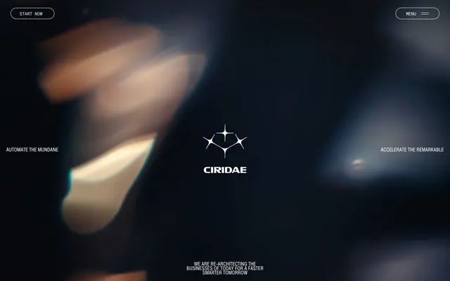
Preview image. Unlock full-res
Monochrome Grid, Abstract Glow. Precision-engineered UI on a dark, almost black canvas, with typography as the primary visual texture and light playing like reflections off dark metal.
Color palette
Rare accent color for specific information hints or subtle emphasis. Its limited use makes any appearance notable.
Backgrounds, prominent text, icon fills.
Secondary backgrounds, subtle elevated surfaces.
Tertiary backgrounds, deeper surface layers.
Primary text, button labels, interactive elements, prominent iconography. Creates high contrast against dark backgrounds.
Subtle borders, inactive text, secondary iconography.
Placeholder text, minor borders, tertiary text.
Used for a subtle linear fade, providing a soft transition effect.
Typography
- Weights
- 400
- Sizes
- 14px, 16px, 20px, 32px, 62px
- Line height
- 0.9, 1, 1.05, 1.1, 1.43
- Letter spacing
- -0.02em
- Fallback
- Open Sans Condensed
Primary headings, navigation, prominent statements, and general UI labels. Its condensed form and tight letter-spacing create a sharp, efficient aesthetic.
- Weights
- 400
- Sizes
- 15px, 24px
- Line height
- 1.1, 1.2
- Letter spacing
- -0.02em, -0.01em
- Fallback
- Open Sans
Secondary headings and larger body text blocks where slightly more breath is needed compared to Pragmatica Cond.
- Weights
- 400
- Sizes
- 11px, 14px
- Line height
- 0.9, 1, 1.1, 1.2
- Letter spacing
- -0.02em
- Fallback
- Roboto Mono
Body copy and informational text. The monospaced nature subtly reinforces a technical, code-adjacent brand identity.
Spacing & shape
Components
Transparent background, Pure White text, Pure White 1px border. Extremely large 1440px border-radius for a pill shape. Padding 10px vertical, 18px horizontal. Uses Pragmatica Cond 400.
Transparent background, Pure White text. Extremely large 1440px border-radius. Padding 5px vertical, 11px horizontal. Uses Pragmatica Cond 400.
Steel Gray background, Deep Charcoal text. Extremely large 1440px border-radius. Padding 7px vertical, 10px horizontal. Uses Pragmatica Cond 400.
Pure White text. Uses Pragmatica Cond 400 at 14px with -0.02em letter-spacing. Minimal padding around text.
Guidelines
- Prioritize high contrast text-on-dark backgrounds using Pure White (#FFFFFF) text on Deep Charcoal (#0B0B0B) or Absolute Black (#000000).
- Use pill-shaped radii (1440px) for all buttons and badges to create a distinct, modern form.
- Apply -0.02em letter-spacing to all text elements using Pragmatica Cond for a uniform, crisp typographic texture.
- Maintain generous internal padding of 10px vertical and 18px horizontal for buttons, and 5-7px vertical, 10-11px horizontal for badges.
- Reserve Subtle Orange (#CC6437) for extremely limited, high-impact accent moments, such as subtle borders or interactive states, to maximize its effect.
- Do not introduce additional chromatic colors; the palette is strictly monochrome with a single, subtle orange accent.
- Avoid using box-shadows or drop-shadows for elevation; rely on background color changes from Deep Charcoal to Warm Graphite.
- Do not vary letter-spacing for Pragmatica Cond; it rigidly adheres to -0.02em.
- Do not use conventional square or slightly rounded corners; elements should either be perfectly sharp or pill-shaped (1440px radius).
- Avoid decorative imagery or large photography; rely on abstract graphics and a minimal UI approach.
About this system
ShowHide
This AI transformation firm's design identity is a stark, high-contrast monochrome world, like a precision instrument in a dark laboratory. The design consistently avoids color beyond white and black, using the absence of color to convey seriousness and focus. The only chromatic hint is a subtle, almost unnoticeable orange, creating an atmosphere of contained power. This system focuses on sharp typography and generous padding around interactive elements, suggesting careful deliberation in every interaction.
The page primarily uses a full-bleed dark background, creating an expansive, borderless feel. The hero section is full-screen, featuring the brand logo centrally over the abstract, atmospheric background, with minimal surrounding text. Content sections are primarily centered, with a strong emphasis on large, singular text blocks or simple two-column arrangements that alternate textual explanations with subtle graphic elements. There's no immediately apparent grid for complex content, favoring a stacked, spacious approach. Navigation is minimal, consisting of top-left and top-right ghost buttons. Vertical spacing between content blocks is generous, providing significant breathing room and contributing to the overall sense of minimalist luxury.
The visual language is abstract and conceptual. It predominantly features blurred, out-of-focus light flares and bokeh effects against a dark background, evoking a sense of depth, atmosphere, and advanced technology without being explicit. There are no conventional photographs or detailed illustrations. Product representation is limited to minimalist, iconic renderings of the brand's star-shaped logo, often with glossy or reflective finishes. Icons are outlines, leveraging the Pure White on dark contrast. The density is extremely low, with imagery serving as decorative atmosphere rather than explanatory content, enhancing the perception of a sophisticated, almost mysterious, high-tech entity.
Reminiscent of Anthropic, Linear, Supabase, Vercel.
# Ciridae — Style Reference
> Monochrome Grid, Abstract Glow. Precision-engineered UI on a dark, almost black canvas, with typography as the primary visual texture and light playing like reflections off dark metal.

**Theme:** dark

**Site:** https://www.ciridae.com

This AI transformation firm's design identity is a stark, high-contrast monochrome world, like a precision instrument in a dark laboratory. The design consistently avoids color beyond white and black, using the absence of color to convey seriousness and focus. The only chromatic hint is a subtle, almost unnoticeable orange, creating an atmosphere of contained power. This system focuses on sharp typography and generous padding around interactive elements, suggesting careful deliberation in every interaction.

## Tokens — Colors

| Name | Value | Token | Role |
|------|------|------|------|
| Subtle Orange | `#CC6437` | `--color-subtle-orange` | Rare accent color for specific information hints or subtle emphasis. Its limited use makes any appearance notable. |
| Absolute Black | `#000000` | `--color-absolute-black` | Backgrounds, prominent text, icon fills. |
| Deep Charcoal | `#0B0B0B` | `--color-deep-charcoal` | Secondary backgrounds, subtle elevated surfaces. |
| Warm Graphite | `#272A2A` | `--color-warm-graphite` | Tertiary backgrounds, deeper surface layers. |
| Pure White | `#FFFFFF` | `--color-pure-white` | Primary text, button labels, interactive elements, prominent iconography. Creates high contrast against dark backgrounds. |
| Ash Gray | `#CECECE` | `--color-ash-gray` | Subtle borders, inactive text, secondary iconography. |
| Steel Gray | `#858585` | `--color-steel-gray` | Placeholder text, minor borders, tertiary text. |
| White to Ash Gradient | `#FFFFFF` | `--color-white-to-ash-gradient` | Used for a subtle linear fade, providing a soft transition effect. |

## Tokens — Typography

### Pragmatica Cond
- **Substitute:** Open Sans Condensed
- **Weights:** 400
- **Sizes:** 14px, 16px, 20px, 32px, 62px
- **Line height:** 0.9, 1, 1.05, 1.1, 1.43
- **Letter spacing:** -0.02em
- **Role:** Primary headings, navigation, prominent statements, and general UI labels. Its condensed form and tight letter-spacing create a sharp, efficient aesthetic.

### Pragmatica
- **Substitute:** Open Sans
- **Weights:** 400
- **Sizes:** 15px, 24px
- **Line height:** 1.1, 1.2
- **Letter spacing:** -0.02em, -0.01em
- **Role:** Secondary headings and larger body text blocks where slightly more breath is needed compared to Pragmatica Cond.

### Roboto Mono
- **Substitute:** Roboto Mono
- **Weights:** 400
- **Sizes:** 11px, 14px
- **Line height:** 0.9, 1, 1.1, 1.2
- **Letter spacing:** -0.02em
- **Role:** Body copy and informational text. The monospaced nature subtly reinforces a technical, code-adjacent brand identity.

## Tokens — Type Scale

Augmented Fourth (1.414) from 11px base.

| Role | Size | Line height | Letter spacing |
|------|------|------|------|
| caption | 11px | 1.1 | -0.22px |
| body-sm | 14px | 1 | -0.28px |
| heading | 20px | 1.05 | -0.4px |
| heading-lg | 24px | 1.2 | -0.24px |
| display | 32px | 1.1 | -0.64px |
| display-lg | 62px | 1.43 | -1.24px |

## Tokens — Spacing

- **Section gap:** 48px
- **Element gap:** 4px

## Tokens — Radius

- **General:** 10px
- **Buttons:** 1440px
- **badges:** 1440px
- **subtle:** 4px

## Layout

The page primarily uses a full-bleed dark background, creating an expansive, borderless feel. The hero section is full-screen, featuring the brand logo centrally over the abstract, atmospheric background, with minimal surrounding text. Content sections are primarily centered, with a strong emphasis on large, singular text blocks or simple two-column arrangements that alternate textual explanations with subtle graphic elements. There's no immediately apparent grid for complex content, favoring a stacked, spacious approach. Navigation is minimal, consisting of top-left and top-right ghost buttons. Vertical spacing between content blocks is generous, providing significant breathing room and contributing to the overall sense of minimalist luxury.

## Imagery

The visual language is abstract and conceptual. It predominantly features blurred, out-of-focus light flares and bokeh effects against a dark background, evoking a sense of depth, atmosphere, and advanced technology without being explicit. There are no conventional photographs or detailed illustrations. Product representation is limited to minimalist, iconic renderings of the brand's star-shaped logo, often with glossy or reflective finishes. Icons are outlines, leveraging the Pure White on dark contrast. The density is extremely low, with imagery serving as decorative atmosphere rather than explanatory content, enhancing the perception of a sophisticated, almost mysterious, high-tech entity.

## Components

### Ghost Button Group

### Mission Statement Block

### Team & Backers Block

### Ghost Button
*Primary Action*

Transparent background, Pure White text, Pure White 1px border. Extremely large 1440px border-radius for a pill shape. Padding 10px vertical, 18px horizontal. Uses Pragmatica Cond 400.

### Circular Badge
*Informational Tag*

Transparent background, Pure White text. Extremely large 1440px border-radius. Padding 5px vertical, 11px horizontal. Uses Pragmatica Cond 400.

### Monochrome Badge
*Neutral Tag*

Steel Gray background, Deep Charcoal text. Extremely large 1440px border-radius. Padding 7px vertical, 10px horizontal. Uses Pragmatica Cond 400.

### Navigation Link
*Primary Navigation*

Pure White text. Uses Pragmatica Cond 400 at 14px with -0.02em letter-spacing. Minimal padding around text.

## Guidelines

### Do

- Prioritize high contrast text-on-dark backgrounds using Pure White (#FFFFFF) text on Deep Charcoal (#0B0B0B) or Absolute Black (#000000).
- Use pill-shaped radii (1440px) for all buttons and badges to create a distinct, modern form.
- Apply -0.02em letter-spacing to all text elements using Pragmatica Cond for a uniform, crisp typographic texture.
- Maintain generous internal padding of 10px vertical and 18px horizontal for buttons, and 5-7px vertical, 10-11px horizontal for badges.
- Reserve Subtle Orange (#CC6437) for extremely limited, high-impact accent moments, such as subtle borders or interactive states, to maximize its effect.

### Don't

- Do not introduce additional chromatic colors; the palette is strictly monochrome with a single, subtle orange accent.
- Avoid using box-shadows or drop-shadows for elevation; rely on background color changes from Deep Charcoal to Warm Graphite.
- Do not vary letter-spacing for Pragmatica Cond; it rigidly adheres to -0.02em.
- Do not use conventional square or slightly rounded corners; elements should either be perfectly sharp or pill-shaped (1440px radius).
- Avoid decorative imagery or large photography; rely on abstract graphics and a minimal UI approach.

## Agent Prompt Guide

### Quick Color Reference
- Text: #FFFFFF
- Background: #0B0B0B
- CTA: #FFFFFF (border/text on transparent background)
- Border: #FFFFFF
- Accent: #CC6437

### 3-5 Example Component Prompts
1. Create a Hero Section: Full-bleed background with abstract blurred light effect. Center the main brand logo (white outline). Below it, display the `display-lg` headline 'CIRIDAE' in Pure White (#FFFFFF), Pragmatica Cond 400, 62px, 1.43 lineHeight, -1.24px letterSpacing. Add a 'START NOW' ghost button (Pure White border and text, 1440px radius, 10px vertical 18px horizontal padding) in the top left, and a 'MENU' ghost button (Pure White border and text, 1440px radius, 10px vertical 18px horizontal padding) in the top right.
2. Create a feature block: Warm Graphite (#272A2A) background with 48px vertical sectionGap. Display a `heading` 'WORKFLOW REDESIGN' in Pure White (#FFFFFF), Pragmatica Cond 400, 20px, 1.05 lineHeight, -0.4px letterSpacing. Below it, add body text 'We map how work... end-to-end.' in Pure White (#FFFFFF), Roboto Mono 400, 14px, 1.0 lineHeight, -0.28px letterSpacing. Ensure ample 20px horizontal padding.
3. Design a Call-to-Action button: 'EXPLORE ALL' text in Pure White (#FFFFFF), Pragmatica Cond 400, 14px, 0.90 lineHeight, -0.28px letterSpacing. Transparent background, 1px Pure White (#FFFFFF) border, 1440px border-radius, 10px vertical and 18px horizontal padding. The element gap around it should be 4px.
4. Create a small informational badge: 'NEW' text in Pure White (#FFFFFF), Pragmatica Cond 400, 14px, 0.9 lineHeight, -0.28px letterSpacing. Transparent background, 1440px border-radius, 5px vertical and 11px horizontal padding.
More like this









Keep what you find
A free account saves references to boards and can send you a weekly email of picks based on what you save.
To see every result, go Pro.