Preview image. Unlock full-res
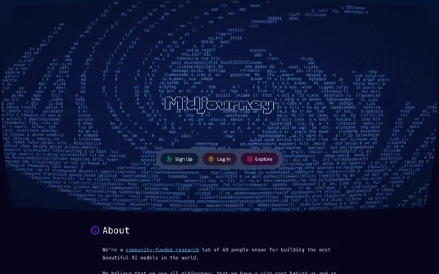
Deep-ocean bioluminescent terminal. A pressurized darkness where intelligence visibly generates itself in ASCII streams, and controls appear as faintly glowing specimens.
Color palette
Primary page background and hero fill — the violet undertone separates it from neutral black, making darkness feel galactic rather than empty
Secondary surface backgrounds, button background variant — a step lighter than Cosmic Void for subtle depth layering
Hyperlinks, inline text links — the single fully saturated accent visible in body content, connecting to Midjourney's Discord/community ecosystem
Sign Up pill button background (20% opacity tint) — deep green specimen glow against void
Explore pill button background (20% opacity tint) — amber specimen variant
Log In pill button background (20% opacity tint) — deep red specimen variant
Card surfaces, nav background, interactive container backgrounds
Elevated card or hover state backgrounds
Primary body text, general UI text — slightly blue-gray rather than pure white, reducing harshness against the dark void backgrounds
Borders, dividers, icon strokes throughout the UI
Secondary text, subdued labels
Heading text at maximum contrast
High-brightness text on dark surfaces, link contrast text
Icon strokes and decorative SVG fills — vivid but used sparingly in iconography only
Icon and UI accent strokes — section heading icons (Projects ⚙, About ℹ)
Icon strokes, error-adjacent SVG fills
Typography
- Weights
- 400
- Sizes
- 14px, 16px, 30px
- Line height
- 1.25
- Letter spacing
- normal
- Fallback
- Fira Code, Source Code Pro
Every typographic role on this site — navigation labels, body copy, headings, buttons, links. Using a monospace font as the universal typeface (not just for code) makes the entire interface read as an active terminal output. 30px at lineHeight 1.25 serves section headings; 16px at 1.50 serves body and UI labels; 14px at 1.63 serves captions and metadata.
- Weights
- 400, 500
- Sizes
- 16px
- Line height
- 1.5
- Letter spacing
- normal
- Fallback
- Inter, Outfit
Secondary UI copy and body text in prose sections — appears at 16px only. Weight 500 for emphasis within body blocks. Provides a subtle humanist contrast against the monospace primary, used sparingly so the terminal character of JetBrains Mono dominates.
Spacing & shape
Components
9999px border-radius pill. Background: oklch green tint at 20% opacity (#004f3b equivalent). Text: #00bc7d bright green (oklch 0.979 0.021 166.113). Border: white at 10% opacity. Padding: 8px 20px. Font: JetBrains Mono 14px. Shadow: rgba(0,0,0,0.1) 0px 4px 6px -1px, rgba(0,0,0,0.1) 0px 2px 4px -2px. The translucent jewel-tint approach makes it read as a specimen label rather than a traditional CTA button.
9999px border-radius. Background: dark red tint (~#8b0836 at 20% opacity). Text: near-white #fff1f2. Border: white 10% opacity. Padding: 8px 20px. JetBrains Mono 14px. Double soft shadow.
9999px border-radius pill. Background: amber/orange tint at 20% opacity (#733e0a base). Text: #fefce8 warm cream (oklch 0.987 0.026 102.212). Border: white at 10% opacity. Padding: 8px 20px. Font: JetBrains Mono 14px. Third specimen-color variant completing the red/green/amber triad in navigation.
Flat tab style: background transparent (rgba 0,0,0,0), no border-radius (0px), no padding (0px all sides). Text: #63b3ed Portal Blue at 16px JetBrains Mono. Acts as a plain text link styled to match the terminal aesthetic — no affordance chrome, relies entirely on color for identification.
JetBrains Mono 30px weight 400, #ffffff text. Preceded by a small colored icon (⚙ in amber #f0b100 for Projects, ℹ in amber for About) at 16px. Icon and label sit on the same horizontal baseline with ~8px gap. No text-transform, no letter-spacing override. The monospace weight-400 at 30px is deliberately un-bold — headings do not shout.
Square-aspect image tiles arranged in a 4-column grid with 8px gap. 8px border-radius on each image. Images are monochromatic blue-violet renders of anatomical/symbolic subjects (eye, brain, heart, hand) — no text overlay, no hover badge. Border: #e5e7eb Fog at low opacity as a subtle stroke. Cards function as pure image containers without any UI chrome.
Full-width bar with #1d293d Steel Navy background. Left side: Documentation (flat text link, #63b3ed) and Explore (amber pill) tabs. Right side: Sign Up (green pill) and Log In (red pill). All items use JetBrains Mono 14px. Vertical padding: 8px. Horizontal padding: ~48px on outer edges. Pill buttons float with translucent tinted backgrounds creating a specimen-tray organization.
Fills the entire first viewport with dense ASCII/generative text rendered in #cad5e2 Mist at very low opacity against the #06051d Cosmic Void background. The text forms a spherical/elliptical visual mass centered in the frame. Logo 'Midjourney' overlaid at center in a stylized typeface at approximately 36-40px. Three navigation pill buttons overlay the bottom of the hero. No image or photograph — the generative text IS the hero visual.
Inline text at 16px JetBrains Mono weight 400. Color: #63b3ed Portal Blue — the only chromatic accent color used in body text. No underline by default (transparent borderTopColor in the raw data). Sits at zero padding/margin within the text flow. 'community-funded research' example demonstrates usage.
CSS gradient: linear-gradient(0deg, #06051d 30%, #061434). Transitions from pure Cosmic Void at the bottom to a slightly lighter deep navy at the top, creating a sense of depth in a dark environment. Applied as the base layer beneath all content — not visible as a discrete element but sets the atmospheric depth of the entire page.
Guidelines
- Use JetBrains Mono as the primary typeface for all UI elements — navigation, headings, buttons, body copy — treating monospace as the visual identity, not a code-context exception.
- Apply the three-color pill button system (green/amber/red tints at ~20% opacity) only for the Sign Up / Explore / Log In triad — do not extend the specimen-color scheme to other button types.
- Set all page backgrounds to #06051d or the gradient variant linear-gradient(0deg, #06051d 30%, #061434) — never use pure #000000, which would flatten the violet cosmic depth.
- Use 9999px border-radius for all pill buttons and 8px for all card/image containers — no intermediate values; the contrast between fully rounded and gently rounded is the shape system.
- Render section headings at 30px JetBrains Mono weight 400 with a small amber #f0b100 icon prefix — never increase to bold weights, the whisper-weight at large sizes is the signature.
- Use #63b3ed Portal Blue exclusively for inline hyperlinks and flat navigation text links — it is the only fully visible chromatic color in body content.
- Maintain 64px vertical gap between page sections to preserve the spacious, pressurized-void atmosphere between content blocks.
- Do not use any sans-serif or serif font as a heading font — DM Sans is for body prose only; JetBrains Mono must dominate the typographic hierarchy.
- Do not create solid-fill opaque buttons — the translucent 20% opacity tinted backgrounds on pills are the system; solid fills break the bioluminescent specimen aesthetic.
- Do not introduce light backgrounds (#ffffff, light grays) into page sections — the design has no light mode; all surfaces must remain within the #06051d to #314062 dark range.
- Do not use more than three accent tint colors for buttons — the red/green/amber specimen triad is a closed system; adding new button colors dilutes the precision.
- Do not bold section headings or use font-weight above 500 anywhere in the UI — weight 400 at display sizes is the deliberate anti-convention choice that defines the visual voice.
- Do not add decorative imagery or photography — the only permitted visuals are AI-generated monochromatic renders and the ASCII/generative text hero.
- Do not apply colored backgrounds to body text sections — prose content must sit directly on #06051d Cosmic Void with #cad5e2 Mist text, no content cards with contrasting backgrounds.
About this system
ShowHide
Midjourney's interface feels like peering through a deep-ocean porthole into a bioluminescent void — vast, pressurized darkness with faint light sources. The #06051d near-black with violet undertone is not simply dark but dimensionally deep, distinguished from pure black by that violet warmth that reads as cosmic rather than void. A sprawling ASCII/generative text animation fills the hero against this background, making the interface itself feel like it's generating intelligence in real time. Section headings and nav use JetBrains Mono exclusively — monospace as aesthetic choice, not technical necessity, giving every label the weight of a terminal command. The three pill buttons (Sign Up, Log In, Explore) float as translucent jewels — each tinted a different hue (green, yellow, red-orange) at 20% opacity against their dark backgrounds, with matching text colors, making them feel less like CTAs and more like categorized data packets.
Narrow centered column layout with a max-width of approximately 800px — deliberately constrained for a research lab publishing cadence rather than a marketing site. The hero is full-viewport dark with centered ASCII text animation and overlaid logo, creating an immersive first screen before content begins. Below the hero, content flows as a single column of prose sections separated by 64px vertical gaps. Section headings use a left-aligned icon + label pattern. The Projects section breaks into a 4-column image grid with 8px gaps. Navigation is a full-width sticky bar at the top with left-aligned text links and right-aligned pill button cluster — no hamburger menu, no mega-menu, no sidebar. The layout is deliberately text-document-like: a long scrolling page of research notes with visual inserts, not a feature-driven marketing layout.
All imagery on this site is AI-generated — square-format monochromatic renders in blue-violet tones depicting anatomical and symbolic subjects: an eye with radiating iris lines, a stylized brain, a heart, a human hand, a profile of a head, lips, an arched passage, and a needle. Each image is contained in an 8px-radius tile with no text overlay. The color treatment is consistent: desaturated blue-violet with slight 3D relief texturing, making them feel like scientific specimens under ultraviolet light. No photography, no lifestyle imagery, no illustrations in the traditional sense. The hero visual is a generative ASCII sphere — thousands of characters forming a 3D ellipsoid — which is the primary 'image' of the page. Icon usage is minimal: small colored glyphs (gear, info circle) in amber preceding section headings. The visual content IS the product demonstration, not a metaphor for it.
Reminiscent of OpenAI, Anthropic, Perplexity AI, Stability AI, Replicate.
# Midjourney — Style Reference
> Deep-ocean bioluminescent terminal. A pressurized darkness where intelligence visibly generates itself in ASCII streams, and controls appear as faintly glowing specimens.

**Theme:** dark

**Site:** https://midjourney.com

Midjourney's interface feels like peering through a deep-ocean porthole into a bioluminescent void — vast, pressurized darkness with faint light sources. The #06051d near-black with violet undertone is not simply dark but dimensionally deep, distinguished from pure black by that violet warmth that reads as cosmic rather than void. A sprawling ASCII/generative text animation fills the hero against this background, making the interface itself feel like it's generating intelligence in real time. Section headings and nav use JetBrains Mono exclusively — monospace as aesthetic choice, not technical necessity, giving every label the weight of a terminal command. The three pill buttons (Sign Up, Log In, Explore) float as translucent jewels — each tinted a different hue (green, yellow, red-orange) at 20% opacity against their dark backgrounds, with matching text colors, making them feel less like CTAs and more like categorized data packets.

## Tokens — Colors

| Name | Value | Token | Role |
|------|------|------|------|
| Cosmic Void | `#06051d` | `--color-cosmic-void` | Primary page background and hero fill — the violet undertone separates it from neutral black, making darkness feel galactic rather than empty |
| Abyssal Blue | `#0f1c36` | `--color-abyssal-blue` | Secondary surface backgrounds, button background variant — a step lighter than Cosmic Void for subtle depth layering |
| Portal Blue | `#63b3ed` | `--color-portal-blue` | Hyperlinks, inline text links — the single fully saturated accent visible in body content, connecting to Midjourney's Discord/community ecosystem |
| Bioluminescent Green | `#004f3b` | `--color-bioluminescent-green` | Sign Up pill button background (20% opacity tint) — deep green specimen glow against void |
| Terminal Amber | `#733e0a` | `--color-terminal-amber` | Explore pill button background (20% opacity tint) — amber specimen variant |
| Crimson Depth | `#8b0836` | `--color-crimson-depth` | Log In pill button background (20% opacity tint) — deep red specimen variant |
| Steel Navy | `#1d293d` | `--color-steel-navy` | Card surfaces, nav background, interactive container backgrounds |
| Deep Slate | `#314062` | `--color-deep-slate` | Elevated card or hover state backgrounds |
| Mist | `#cad5e2` | `--color-mist` | Primary body text, general UI text — slightly blue-gray rather than pure white, reducing harshness against the dark void backgrounds |
| Fog | `#e5e7eb` | `--color-fog` | Borders, dividers, icon strokes throughout the UI |
| Ash | `#2e3038` | `--color-ash` | Secondary text, subdued labels |
| Ghost White | `#ffffff` | `--color-ghost-white` | Heading text at maximum contrast |
| Ice Blue | `#ebf8ff` | `--color-ice-blue` | High-brightness text on dark surfaces, link contrast text |
| Specimen Green | `#00bc7d` | `--color-specimen-green` | Icon strokes and decorative SVG fills — vivid but used sparingly in iconography only |
| Warning Amber | `#f0b100` | `--color-warning-amber` | Icon and UI accent strokes — section heading icons (Projects ⚙, About ℹ) |
| Fault Red | `#ff2056` | `--color-fault-red` | Icon strokes, error-adjacent SVG fills |

## Tokens — Typography

### JetBrains Mono
- **Substitute:** Fira Code, Source Code Pro
- **Weights:** 400
- **Sizes:** 14px, 16px, 30px
- **Line height:** 1.25
- **Letter spacing:** normal
- **Role:** Every typographic role on this site — navigation labels, body copy, headings, buttons, links. Using a monospace font as the universal typeface (not just for code) makes the entire interface read as an active terminal output. 30px at lineHeight 1.25 serves section headings; 16px at 1.50 serves body and UI labels; 14px at 1.63 serves captions and metadata.

### DM Sans
- **Substitute:** Inter, Outfit
- **Weights:** 400, 500
- **Sizes:** 16px
- **Line height:** 1.5
- **Letter spacing:** normal
- **Role:** Secondary UI copy and body text in prose sections — appears at 16px only. Weight 500 for emphasis within body blocks. Provides a subtle humanist contrast against the monospace primary, used sparingly so the terminal character of JetBrains Mono dominates.

## Tokens — Type Scale

Perfect Fifth (1.5) from 16px base.

| Role | Size | Line height | Letter spacing |
|------|------|------|------|
| caption | 14px | 1.63 | — |
| body | 16px | 1.5 | — |
| heading | 30px | 1.25 | — |

## Tokens — Spacing

- **Max width:** 800px
- **Section gap:** 64px
- **Card padding:** 32px
- **Element gap:** 8-16px

## Tokens — Radius

- **Buttons:** 9999px
- **Inputs:** 8px
- **Cards:** 8px
- **Images:** 8px

## Layout

Narrow centered column layout with a max-width of approximately 800px — deliberately constrained for a research lab publishing cadence rather than a marketing site. The hero is full-viewport dark with centered ASCII text animation and overlaid logo, creating an immersive first screen before content begins. Below the hero, content flows as a single column of prose sections separated by 64px vertical gaps. Section headings use a left-aligned icon + label pattern. The Projects section breaks into a 4-column image grid with 8px gaps. Navigation is a full-width sticky bar at the top with left-aligned text links and right-aligned pill button cluster — no hamburger menu, no mega-menu, no sidebar. The layout is deliberately text-document-like: a long scrolling page of research notes with visual inserts, not a feature-driven marketing layout.

## Imagery

All imagery on this site is AI-generated — square-format monochromatic renders in blue-violet tones depicting anatomical and symbolic subjects: an eye with radiating iris lines, a stylized brain, a heart, a human hand, a profile of a head, lips, an arched passage, and a needle. Each image is contained in an 8px-radius tile with no text overlay. The color treatment is consistent: desaturated blue-violet with slight 3D relief texturing, making them feel like scientific specimens under ultraviolet light. No photography, no lifestyle imagery, no illustrations in the traditional sense. The hero visual is a generative ASCII sphere — thousands of characters forming a 3D ellipsoid — which is the primary 'image' of the page. Icon usage is minimal: small colored glyphs (gear, info circle) in amber preceding section headings. The visual content IS the product demonstration, not a metaphor for it.

## Components

### Pill Button Group

### Section Heading with Body — About

### Projects Section with Image Grid

### Sign Up Pill Button
*Primary registration CTA in navigation*

9999px border-radius pill. Background: oklch green tint at 20% opacity (#004f3b equivalent). Text: #00bc7d bright green (oklch 0.979 0.021 166.113). Border: white at 10% opacity. Padding: 8px 20px. Font: JetBrains Mono 14px. Shadow: rgba(0,0,0,0.1) 0px 4px 6px -1px, rgba(0,0,0,0.1) 0px 2px 4px -2px. The translucent jewel-tint approach makes it read as a specimen label rather than a traditional CTA button.

### Log In Pill Button
*Secondary auth action in navigation*

9999px border-radius. Background: dark red tint (~#8b0836 at 20% opacity). Text: near-white #fff1f2. Border: white 10% opacity. Padding: 8px 20px. JetBrains Mono 14px. Double soft shadow.

### Explore Pill Button
*Navigation action for main product discovery*

9999px border-radius pill. Background: amber/orange tint at 20% opacity (#733e0a base). Text: #fefce8 warm cream (oklch 0.987 0.026 102.212). Border: white at 10% opacity. Padding: 8px 20px. Font: JetBrains Mono 14px. Third specimen-color variant completing the red/green/amber triad in navigation.

### Documentation Tab
*Navigation label for technical docs section*

Flat tab style: background transparent (rgba 0,0,0,0), no border-radius (0px), no padding (0px all sides). Text: #63b3ed Portal Blue at 16px JetBrains Mono. Acts as a plain text link styled to match the terminal aesthetic — no affordance chrome, relies entirely on color for identification.

### Section Heading with Icon
*Page section titles (About, Projects, Careers)*

JetBrains Mono 30px weight 400, #ffffff text. Preceded by a small colored icon (⚙ in amber #f0b100 for Projects, ℹ in amber for About) at 16px. Icon and label sit on the same horizontal baseline with ~8px gap. No text-transform, no letter-spacing override. The monospace weight-400 at 30px is deliberately un-bold — headings do not shout.

### Project Image Card
*Visual showcase grid for AI-generated imagery*

Square-aspect image tiles arranged in a 4-column grid with 8px gap. 8px border-radius on each image. Images are monochromatic blue-violet renders of anatomical/symbolic subjects (eye, brain, heart, hand) — no text overlay, no hover badge. Border: #e5e7eb Fog at low opacity as a subtle stroke. Cards function as pure image containers without any UI chrome.

### Sticky Navigation Bar
*Primary site navigation across all pages*

Full-width bar with #1d293d Steel Navy background. Left side: Documentation (flat text link, #63b3ed) and Explore (amber pill) tabs. Right side: Sign Up (green pill) and Log In (red pill). All items use JetBrains Mono 14px. Vertical padding: 8px. Horizontal padding: ~48px on outer edges. Pill buttons float with translucent tinted backgrounds creating a specimen-tray organization.

### Hero ASCII Animation Background
*Full-viewport hero visual*

Fills the entire first viewport with dense ASCII/generative text rendered in #cad5e2 Mist at very low opacity against the #06051d Cosmic Void background. The text forms a spherical/elliptical visual mass centered in the frame. Logo 'Midjourney' overlaid at center in a stylized typeface at approximately 36-40px. Three navigation pill buttons overlay the bottom of the hero. No image or photograph — the generative text IS the hero visual.

### Inline Body Link
*Hyperlinks within prose content*

Inline text at 16px JetBrains Mono weight 400. Color: #63b3ed Portal Blue — the only chromatic accent color used in body text. No underline by default (transparent borderTopColor in the raw data). Sits at zero padding/margin within the text flow. 'community-funded research' example demonstrates usage.

### Background Gradient Surface
*Full-page atmospheric depth layer*

CSS gradient: linear-gradient(0deg, #06051d 30%, #061434). Transitions from pure Cosmic Void at the bottom to a slightly lighter deep navy at the top, creating a sense of depth in a dark environment. Applied as the base layer beneath all content — not visible as a discrete element but sets the atmospheric depth of the entire page.

## Guidelines

### Do

- Use JetBrains Mono as the primary typeface for all UI elements — navigation, headings, buttons, body copy — treating monospace as the visual identity, not a code-context exception.
- Apply the three-color pill button system (green/amber/red tints at ~20% opacity) only for the Sign Up / Explore / Log In triad — do not extend the specimen-color scheme to other button types.
- Set all page backgrounds to #06051d or the gradient variant linear-gradient(0deg, #06051d 30%, #061434) — never use pure #000000, which would flatten the violet cosmic depth.
- Use 9999px border-radius for all pill buttons and 8px for all card/image containers — no intermediate values; the contrast between fully rounded and gently rounded is the shape system.
- Render section headings at 30px JetBrains Mono weight 400 with a small amber #f0b100 icon prefix — never increase to bold weights, the whisper-weight at large sizes is the signature.
- Use #63b3ed Portal Blue exclusively for inline hyperlinks and flat navigation text links — it is the only fully visible chromatic color in body content.
- Maintain 64px vertical gap between page sections to preserve the spacious, pressurized-void atmosphere between content blocks.

### Don't

- Do not use any sans-serif or serif font as a heading font — DM Sans is for body prose only; JetBrains Mono must dominate the typographic hierarchy.
- Do not create solid-fill opaque buttons — the translucent 20% opacity tinted backgrounds on pills are the system; solid fills break the bioluminescent specimen aesthetic.
- Do not introduce light backgrounds (#ffffff, light grays) into page sections — the design has no light mode; all surfaces must remain within the #06051d to #314062 dark range.
- Do not use more than three accent tint colors for buttons — the red/green/amber specimen triad is a closed system; adding new button colors dilutes the precision.
- Do not bold section headings or use font-weight above 500 anywhere in the UI — weight 400 at display sizes is the deliberate anti-convention choice that defines the visual voice.
- Do not add decorative imagery or photography — the only permitted visuals are AI-generated monochromatic renders and the ASCII/generative text hero.
- Do not apply colored backgrounds to body text sections — prose content must sit directly on #06051d Cosmic Void with #cad5e2 Mist text, no content cards with contrasting backgrounds.

## Agent Prompt Guide

**Quick Color Reference**
- Page background: #06051d (with gradient to #061434)
- Primary text: #cad5e2
- Headings: #ffffff
- Inline links: #63b3ed
- Borders/dividers: #e5e7eb
- Nav surface: #1d293d
- Sign Up button bg: #004f3b at 20% opacity, text: #00bc7d
- Log In button bg: #8b0836 at 20% opacity, text: #fff1f2
- Explore button bg: #733e0a at 20% opacity, text: #fefce8

**Example Component Prompts**

1. **Hero section**: Full-viewport background using linear-gradient(0deg, #06051d 30%, #061434). Center a dense ASCII text animation in #cad5e2 at ~5% opacity forming a sphere shape. Overlay the text 'Midjourney' at 36px JetBrains Mono weight 400 #ffffff centered. Place three pill buttons (Sign Up green, Log In red, Explore amber) horizontally centered at bottom of hero with 16px gaps.

2. **Navigation bar**: Full-width #1d293d background, 8px vertical padding, 48px horizontal padding. Left: 'Documentation' (JetBrains Mono 14px #63b3ed, no padding, 0px radius) and 'Explore' pill (amber tint). Right: 'Sign Up' (green pill) and 'Log In' (red pill). Pills use 9999px radius, 8px 20px padding, white border at 10% opacity.

3. **Section heading**: Left-aligned amber icon (16px #f0b100) + text label 'Projects' at 30px JetBrains Mono weight 400 #ffffff with 8px gap between icon and text. No bold, no uppercase, no letter-spacing modification.

4. **Project image grid**: 4-column grid, 8px column and row gap. Each cell: square-aspect image with 8px border-radius, monochromatic blue-violet AI-generated content, #e5e7eb border at 15% opacity. No hover text, no captions below images.

5. **Body prose block**: Max-width 640px within the 800px page column. JetBrains Mono 16px weight 400, #cad5e2, lineHeight 1.5. Inline links in #63b3ed with no underline. Paragraph gap: 16px. Sits directly on #06051d background with no card container.

## Specimen Button Color System

The three navigation pill buttons operate as a closed specimen-tray system where each button has its own hue tint at ~20% opacity, text color matched to that hue at high brightness, and a shared white 10% border. The triad is: Green (Sign Up) — bg #004f3b@20%, text #00bc7d; Red (Log In) — bg #8b0836@20%, text #fff1f2; Amber (Explore/Documentation) — bg #733e0a@20%, text #fefce8. This is not a priority hierarchy (primary/secondary/tertiary) — it is a categorical taxonomy where each action belongs to a different domain. Do not add a fourth color. Do not make one of the three visually dominant over the others.
More like this









Keep what you find
A free account saves references to boards and can send you a weekly email of picks based on what you save.
To see every result, go Pro.