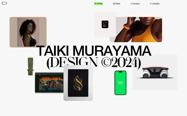
Preview image. Unlock full-res
High-contrast digital brutalism.
Color palette
Primary interactive element highlight, button backgrounds, and strong accent borders. This is the singular chromatic element signaling action
Translucent background for active navigation states, giving a hint of energy without being fully opaque
Page backgrounds, base surface for card elements, subtle borders
Primary text color, bold accent borders, and background for high-contrast elements
Dominant color for headlines and strong decorative borders, achieving maximum contrast
Subtle secondary text, hairline borders, and decorative accents
Secondary background surfaces, providing a slight visual separation from Canvas White
Typography
- Weights
- 400
- Sizes
- 16px, 28px
- Line height
- 1, 1.2
- Letter spacing
- -0.56, -0.32
- Fallback
- Arial
Universal sans-serif for body text, navigation items, links, and various UI elements. Its clean, functional aesthetic underpins the minimal design.
- Weights
- 400
- Sizes
- 87px, 109px
- Line height
- 0.78
- Letter spacing
- -3.48, -4.36
- Fallback
- IBM Plex Sans
Custom, expansive sans-serif for display-level headlines, creating an authoritative and bold visual statement. The tight line height and negative letter spacing add to its impact.
- Weights
- 400
- Sizes
- 109px
- Line height
- 0.78
- Letter spacing
- -4.36
- Fallback
- Oswald Bold
A decorative custom bold font used for specific, high-impact headings, often layered or used subtly. Creates distinct brand identity through its exaggerated forms.
- Weights
- 500
- Sizes
- 14px
- Line height
- 1.2
- Letter spacing
- 0.28
- Fallback
- Inter
A secondary sans-serif primarily used for button text, offering a slightly more rounded and distinct voice for calls to action.
Spacing & shape
Components
Transparent background, Deep Graphite text (16px Helvetica Neue, 400 weight), with a 1px Deep Graphite bottom border. Padding of 40px top, 0px right, 15px bottom, 0px left.
Filled with Cyber Green, text is Deep Graphite (14px Poppins, 500 weight). Features a full pill shape with 300px border-radius and 14.4px top/bottom, 25.6px left/right padding.
Transparent background, 0px border-radius, no box-shadow, and 0px padding. This acts as a container for images and text that rely on adjacent elements for visual grouping.
Pale Ash background with 15px border-radius, no box-shadow, and 0px padding. Provides a faint surface distinction from the Canvas White page background.
Background is Ghost Green with 4px border radius. This subtle, translucent green visually indicates the currently active page.
Guidelines
- Prioritize Canvas White for page backgrounds with Deep Graphite/Pure Black for primary text to maintain high contrast.
- Use Cyber Green exclusively for primary interactive elements like buttons and active states to signal action and create visual punctuation.
- Apply 15px border-radius for cards and content blocks, and a tight 300px for pill-shaped buttons and tags.
- Utilize Helvetica Neue weights 400 for body text and navigation, ensuring -0.035em letter-spacing for 16px text and -0.020em for 28px text.
- Employ custom HelveticaNeue.tcc or FHPhemister-Bold.woff2 for large display headings (87px-109px) with negative letter-spacing (-40em relative to size) for maximal impact.
- Maintain a clear visual hierarchy by employing 1px Deep Graphite or Pure Black bottom borders on text-only buttons and interactive elements.
- Ensure generous negative space; the elementGap of 11px should be a minimum baseline for tight internal elements, with sectionGap of 79px for major content divisions.
- Do not introduce additional saturated colors; Cyber Green should be the only vivid chromatic element for interaction.
- Avoid using box-shadows or significant elevation; prefer subtle background color changes or strong borders for visual hierarchy.
- Do not apply standard positive letter-spacing to large headlines; tight tracking (e.g., -4.36px for 109px text) is key to the aesthetic.
- Do not deviate from the specified border-radii; 15px for cards and 300px for buttons are signature elements.
- Do not clutter content areas; maintain the ample negative space and minimal information density.
- Avoid using Helvetica Neue for button text; use Poppins at 14px, weight 500 with letter-spacing 0.02em for these elements.
About this system
ShowHide
Taiki Murayama's portfolio design evokes a tactile, high-contrast, 'digital-brutalism-meets-luxe' aesthetic. Sharp, often square visual elements are juxtaposed with a single, highly saturated 'cyber green' accent that signals interaction and focus. Typography leans towards expansive, confident sans-serifs, with some oversized headings creating an editorial, high-fashion feel. The overall presentation is sparse, leaving ample negative space, and prioritizing strong visual statements over dense information.
The page uses a maximum-width contained layout with heavy emphasis on vertical stacking and generous white space. The hero section features a centered headline over a collection of floating portfolio images and product shots, creating a dynamic, almost scattered presentation. Content sections typically follow a consistent vertical rhythm with minimal visual dividers. Text-dominant sections are often left-aligned, showcasing large typography, while image sections employ an asymmetric, somewhat scattered grid approach where elements are positioned with intentional whitespace. Navigation is a minimalist top bar, anchored in place, providing clear but understated access to sections.
This site features a clean, product-focused imagery style. Primarily product crops and lifestyle shots are tightly contained within ghost cards, floating cleanly on the Canvas White background. Images are not full-bleed and often have raw, unmasked edges, contributing to a digital collage or 'moodboard' aesthetic. The treatment is direct and unadorned, allowing the content of the image to speak for itself without heavy styling. Icons, if present, are minimal outlined styles. The density is image-heavy in portfolio sections, using visuals as primary content showcases, balanced by text-dominant sections.
Reminiscent of Huge Inc., Active Theory, B&R Design, Basic. Space.
# Taiki Murayama — Style Reference
> High-contrast digital brutalism.

**Theme:** light

**Site:** https://www.taiki-murayama.com

Taiki Murayama's portfolio design evokes a tactile, high-contrast, 'digital-brutalism-meets-luxe' aesthetic. Sharp, often square visual elements are juxtaposed with a single, highly saturated 'cyber green' accent that signals interaction and focus. Typography leans towards expansive, confident sans-serifs, with some oversized headings creating an editorial, high-fashion feel. The overall presentation is sparse, leaving ample negative space, and prioritizing strong visual statements over dense information.

## Tokens — Colors

| Name | Value | Token | Role |
|------|------|------|------|
| Cyber Green | `#42ff00` | `--color-cyber-green` | Primary interactive element highlight, button backgrounds, and strong accent borders. This is the singular chromatic element signaling action |
| Ghost Green | `#a1ff81` | `--color-ghost-green` | Translucent background for active navigation states, giving a hint of energy without being fully opaque |
| Canvas White | `#ffffff` | `--color-canvas-white` | Page backgrounds, base surface for card elements, subtle borders |
| Deep Graphite | `#0b0b0f` | `--color-deep-graphite` | Primary text color, bold accent borders, and background for high-contrast elements |
| Pure Black | `#000000` | `--color-pure-black` | Dominant color for headlines and strong decorative borders, achieving maximum contrast |
| Muted Silver | `#c6c5c2` | `--color-muted-silver` | Subtle secondary text, hairline borders, and decorative accents |
| Pale Ash | `#efefef` | `--color-pale-ash` | Secondary background surfaces, providing a slight visual separation from Canvas White |

## Tokens — Typography

### Helvetica Neue
- **Substitute:** Arial
- **Weights:** 400
- **Sizes:** 16px, 28px
- **Line height:** 1, 1.2
- **Letter spacing:** -0.56, -0.32
- **Role:** Universal sans-serif for body text, navigation items, links, and various UI elements. Its clean, functional aesthetic underpins the minimal design.

### HelveticaNeue.tcc
- **Substitute:** IBM Plex Sans
- **Weights:** 400
- **Sizes:** 87px, 109px
- **Line height:** 0.78
- **Letter spacing:** -3.48, -4.36
- **Role:** Custom, expansive sans-serif for display-level headlines, creating an authoritative and bold visual statement. The tight line height and negative letter spacing add to its impact.

### FHPhemister-Bold.woff2
- **Substitute:** Oswald Bold
- **Weights:** 400
- **Sizes:** 109px
- **Line height:** 0.78
- **Letter spacing:** -4.36
- **Role:** A decorative custom bold font used for specific, high-impact headings, often layered or used subtly. Creates distinct brand identity through its exaggerated forms.

### Poppins
- **Substitute:** Inter
- **Weights:** 500
- **Sizes:** 14px
- **Line height:** 1.2
- **Letter spacing:** 0.28
- **Role:** A secondary sans-serif primarily used for button text, offering a slightly more rounded and distinct voice for calls to action.

## Tokens — Spacing

- **Section gap:** 79px
- **Card padding:** 40px
- **Element gap:** 11px

## Tokens — Radius

- **General:** 15px
- **Buttons:** 300px
- **Cards:** 15px
- **navigation:** 4px

## Layout

The page uses a maximum-width contained layout with heavy emphasis on vertical stacking and generous white space. The hero section features a centered headline over a collection of floating portfolio images and product shots, creating a dynamic, almost scattered presentation. Content sections typically follow a consistent vertical rhythm with minimal visual dividers. Text-dominant sections are often left-aligned, showcasing large typography, while image sections employ an asymmetric, somewhat scattered grid approach where elements are positioned with intentional whitespace. Navigation is a minimalist top bar, anchored in place, providing clear but understated access to sections.

## Imagery

This site features a clean, product-focused imagery style. Primarily product crops and lifestyle shots are tightly contained within ghost cards, floating cleanly on the Canvas White background. Images are not full-bleed and often have raw, unmasked edges, contributing to a digital collage or 'moodboard' aesthetic. The treatment is direct and unadorned, allowing the content of the image to speak for itself without heavy styling. Icons, if present, are minimal outlined styles. The density is image-heavy in portfolio sections, using visuals as primary content showcases, balanced by text-dominant sections.

## Components

### Text-Only Button
*Navigational or secondary action button with a bottom border.*

Transparent background, Deep Graphite text (16px Helvetica Neue, 400 weight), with a 1px Deep Graphite bottom border. Padding of 40px top, 0px right, 15px bottom, 0px left.

### Pill Cyber Green Button
*Primary call to action.*

Filled with Cyber Green, text is Deep Graphite (14px Poppins, 500 weight). Features a full pill shape with 300px border-radius and 14.4px top/bottom, 25.6px left/right padding.

### Ghost Portfolio Card
*Showcasing individual portfolio pieces or larger content blocks without visual framing.*

Transparent background, 0px border-radius, no box-shadow, and 0px padding. This acts as a container for images and text that rely on adjacent elements for visual grouping.

### Elevated Portfolio Card
*Used for specific content blocks that require a subtle background separation.*

Pale Ash background with 15px border-radius, no box-shadow, and 0px padding. Provides a faint surface distinction from the Canvas White page background.

### Navigation Link Highlight
*Active state for navigation items.*

Background is Ghost Green with 4px border radius. This subtle, translucent green visually indicates the currently active page.

## Guidelines

### Do

- Prioritize Canvas White for page backgrounds with Deep Graphite/Pure Black for primary text to maintain high contrast.
- Use Cyber Green exclusively for primary interactive elements like buttons and active states to signal action and create visual punctuation.
- Apply 15px border-radius for cards and content blocks, and a tight 300px for pill-shaped buttons and tags.
- Utilize Helvetica Neue weights 400 for body text and navigation, ensuring -0.035em letter-spacing for 16px text and -0.020em for 28px text.
- Employ custom HelveticaNeue.tcc or FHPhemister-Bold.woff2 for large display headings (87px-109px) with negative letter-spacing (-40em relative to size) for maximal impact.
- Maintain a clear visual hierarchy by employing 1px Deep Graphite or Pure Black bottom borders on text-only buttons and interactive elements.
- Ensure generous negative space; the elementGap of 11px should be a minimum baseline for tight internal elements, with sectionGap of 79px for major content divisions.

### Don't

- Do not introduce additional saturated colors; Cyber Green should be the only vivid chromatic element for interaction.
- Avoid using box-shadows or significant elevation; prefer subtle background color changes or strong borders for visual hierarchy.
- Do not apply standard positive letter-spacing to large headlines; tight tracking (e.g., -4.36px for 109px text) is key to the aesthetic.
- Do not deviate from the specified border-radii; 15px for cards and 300px for buttons are signature elements.
- Do not clutter content areas; maintain the ample negative space and minimal information density.
- Avoid using Helvetica Neue for button text; use Poppins at 14px, weight 500 with letter-spacing 0.02em for these elements.

## Agent Prompt Guide

### Quick Color Reference
text: #0b0b0f
background: #ffffff
border: #0b0b0f
accent: #a1ff81
primary action: #42ff00 (filled action)

### 3-5 Example Component Prompts
1. Create a primary call-to-action button: Cyber Green background (#42ff00), Deep Graphite text (#0b0b0f) at 14px Poppins 500, 300px border-radius, with 14.4px top/bottom and 25.6px left/right padding.
2. Build a navigation link: Deep Graphite text (#0b0b0f) at 16px Helvetica Neue 400, 1px Deep Graphite (#0b0b0f) bottom border, 0px left/right padding, 40px top padding, 15px bottom padding. On hover, apply a Ghost Green background (#a1ff81) with 4px border-radius.
3. Create a large display heading: Pure Black text (#000000) at 109px HelveticaNeue.tcc 400, with a calculated letter-spacing of -4.36px and a line-height of 0.78.
4. Design a portfolio item card: Pale Ash background (#efefef), 15px border-radius, no shadow, with 0px padding. Content inside should respect elementGap of 11px.
5. Construct a body text block: Deep Graphite text (#0b0b0f) at 16px Helvetica Neue 400, with a letter-spacing of -0.56px.
More like this









Keep what you find
A free account saves references to boards and can send you a weekly email of picks based on what you save.
To see every result, go Pro.