Preview image. Unlock full-res
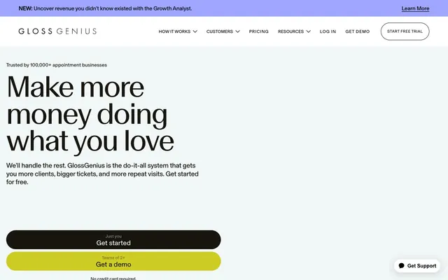
Crisp digital ledger, with neon highlights guiding the way.
Color palette
Calls to Action, active state indicators. This vibrant yellow gives an immediate energetic and positive feel.
Decorative backgrounds and possibly interactive elements, offering a subtle shift in luminescence for visual interest.
Promotional banners, card backgrounds, accent areas. This vivid violet provides a playful, modern contrast to the muted neutrals.
Backgrounds for features or promotional blocks, adding depth and visual softness.
Main page background, card backgrounds, text on dark backgrounds. Dominates the canvas for a bright, open feel.
Secondary background color for sections, card hover states, badge backgrounds. Offers a subtle variation from pure white for content differentiation.
Navigation text, icons, button outlines. Used for the sharpest contrast elements, often interactive.
Subtle borders and dividers for section separation.
Typography
- Weights
- 400, 500, 600
- Sizes
- 13px, 14px, 16px, 18px, 22px, 32px, 40px, 48px, 72px
- Line height
- 0.97, 1.02, 1.05, 1.1, 1.13, 1.2, 1.4
- Letter spacing
- 0.056, 0.031, 0.071, -0.01, -0.015, -0.02, -0.03, -0.03, -0.04
- Fallback
- Inter
Primary typeface for all UI elements, body text, subheadings, and smaller headlines. Its clean sans-serif form ensures high readability and a contemporary feel across all weights and sizes, from small navigation links to substantial section titles.
- Weights
- 400
- Sizes
- 96px, 144px
- Line height
- 0.8, 0.9
- Letter spacing
- -0.03, -0.03
- Fallback
- Playfair Display
Used exclusively for large, impactful display text. The significantly tighter line-height and letter-spacing, combined with its high contrast to Basel Grotesk Book, give it a distinctive, elegant, and editorial presence for hero headlines.
Spacing & shape
Components
Background: rgb(255, 255, 255). Text: #000000. Border: rgba(0, 0, 0, 0.05). Radius: 42px. Padding: 0px 13px. Used for main actions like 'Start Free Trial'.
Background: rgba(0, 0, 0, 0). Text: #17150e. No border radius. Padding: 0px. Used for secondary navigation or subtle links within content, like 'Learn More'.
Background: rgba(0, 0, 0, 0). Text: #000000. Border: rgb(0, 0, 0). No radius. Padding: 38px 15px. Used for prominent navigation items requiring an underline effect on hover/active.
Background: rgba(1, 1, 1, 0.5). Text: #f0f7f6. Border: #f0f7f6. Radius: 1440px. Padding: 0px. Used for internal navigation or filtering tags, like a 'Get Support' button.
Background: rgba(0, 0, 0, 0). Radius: 8px. No box shadow. Padding: 0px. Used for displaying specific features or testimonials, often part of a grid.
Background: #f0f7f6 (Porcelain Gray). Text: #17150 (Inkwell Black). Radius: 8px. Padding: 0px. Used for labels like 'Featured'.
Background: rgba(0, 0, 0, 0). Text: #17150 (Inkwell Black). No radius. Padding: 12px. Used for more prominent tags or categories.
Background: Genius Yellow Gradient. Text: #17150 (Inkwell Black). Radius: 1440px. Padding: 22px 40px (inferred from common button padding + spacing unit). Used for prominent 'Get Started' or 'Get a Demo' actions in the hero.
Background: #17150 (Inkwell Black). Text: #f0f7f6 (Porcelain Gray). Radius: 1440px. Padding: 22px 40px (inferred). Used for calls to action within dark-themed sections.
Guidelines
- Prioritize Basel Grotesk Book for all functional text: 400 weight for body, 500 for subheadings and buttons, 600 for important UI labels.
- Utilize 1440px border-radius for interactive elements like buttons and tags, creating a soft, inviting touch across the UI.
- Use Porcelain Gray (#f0f7f6) as a subtle background differentiator for content blocks or badges to break up Cloud White sections.
- Reserve GlossGenius Yellow (#cccc25 or its gradient) almost exclusively for primary Calls to Action and active states to command attention.
- Employ Basel Classic Book only for large impact headlines (96px, 144px) with tight letter-spacing (-0.03em) and line-height (0.90, 0.80) to maintain an exclusive, editorial feel.
- Maintain an element gap of 8px for consistent spacing between related items and navigation links.
- Do not use Basel Classic Book at smaller sizes or for body copy; its narrow kerning and tight leading are not suitable for readability at scale.
- Avoid using multiple accent colors; stick to Genius Yellow and Sky Violet for deliberate emphasis.
- Do not introduce hard, sharp corners; all significant interactive or content elements should use 8px or 1440px radii.
- Do not use box shadows for elevation; rely on color shifts (Inkwell Black for backgrounds, Porcelain Gray for elevated sections) to create depth instead.
- Do not add unnecessary borders to cards or main content sections; use background color changes to define boundaries.
About this system
ShowHide
GlossGenius feels like a sophisticated, yet approachable digital assistant for beauty professionals. Ultra-clean typography and a largely monochromatic palette create an immediate sense of clarity and organization. Unexpected pops of vivid yellow-green and pastel violet-blue provide energetic accents, reflecting the vibrancy of the beauty industry without being overwhelming. The soft, rounded elements contrast with the sharp Basel Grotesk text, balancing professionalism with user-friendliness.
The site uses a max-width contained layout, typically centered, creating clear content boundaries. The hero section features large, centered headlines over a clean white background, often paired with a subtle illustrative element or a call to action. Content sections alternate between Cloud White and Porcelain Gray backgrounds, or sometimes Inkwell Black for contrast, providing a clear visual rhythm. Content is arranged in flexible patterns: large single columns for headlines, often paired with body text, and then grids of features or testimonials. Navigation is a prominent sticky top bar, featuring both text links and a 'Start Free Trial' button. The layout feels spacious and deliberate, with comfortable breathing room between sections.
Imagery predominantly features crisp product screenshots showcasing the software interface, often presented on screens held by people in a professional, clean environment (e.g., a salon or spa setting). Photography is high-key, bright, and often tightly cropped, focusing on expressions of success, ease, and efficiency. Visuals are contained within defined areas, not full-bleed, and sometimes subtly integrate brand accent colors as background elements. Icons are filled, monochrome, and used functionally.
Reminiscent of Calendly, Doodle, Square Appointments.
# All-In-One Salon — Style Reference
> Crisp digital ledger, with neon highlights guiding the way.

**Theme:** light

**Site:** https://glossgenius.com

GlossGenius feels like a sophisticated, yet approachable digital assistant for beauty professionals. Ultra-clean typography and a largely monochromatic palette create an immediate sense of clarity and organization. Unexpected pops of vivid yellow-green and pastel violet-blue provide energetic accents, reflecting the vibrancy of the beauty industry without being overwhelming. The soft, rounded elements contrast with the sharp Basel Grotesk text, balancing professionalism with user-friendliness.

## Tokens — Colors

| Name | Value | Token | Role |
|------|------|------|------|
| Genius Yellow | `#cccc25` | `--color-genius-yellow` | Calls to Action, active state indicators. This vibrant yellow gives an immediate energetic and positive feel. |
| Genius Yellow Gradient | `#cccc25` | `--color-genius-yellow-gradient` | Decorative backgrounds and possibly interactive elements, offering a subtle shift in luminescence for visual interest. |
| Sky Violet | `#9fa6ff` | `--color-sky-violet` | Promotional banners, card backgrounds, accent areas. This vivid violet provides a playful, modern contrast to the muted neutrals. |
| Sky Violet Gradient | `#9fa6ff` | `--color-sky-violet-gradient` | Backgrounds for features or promotional blocks, adding depth and visual softness. |
| Cloud White | `#ffffff` | `--color-cloud-white` | Main page background, card backgrounds, text on dark backgrounds. Dominates the canvas for a bright, open feel. |
| Porcelain Gray | `#f0f7f6` | `--color-porcelain-gray` | Secondary background color for sections, card hover states, badge backgrounds. Offers a subtle variation from pure white for content differentiation. |
| Obsidian Black | `#000000` | `--color-obsidian-black` | Navigation text, icons, button outlines. Used for the sharpest contrast elements, often interactive. |
| Silver Mist | `#e2e2e2` | `--color-silver-mist` | Subtle borders and dividers for section separation. |

## Tokens — Typography

### Basel Grotesk Book
- **Substitute:** Inter
- **Weights:** 400, 500, 600
- **Sizes:** 13px, 14px, 16px, 18px, 22px, 32px, 40px, 48px, 72px
- **Line height:** 0.97, 1.02, 1.05, 1.1, 1.13, 1.2, 1.4
- **Letter spacing:** 0.056, 0.031, 0.071, -0.01, -0.015, -0.02, -0.03, -0.03, -0.04
- **Role:** Primary typeface for all UI elements, body text, subheadings, and smaller headlines. Its clean sans-serif form ensures high readability and a contemporary feel across all weights and sizes, from small navigation links to substantial section titles.

### Basel Classic Book
- **Substitute:** Playfair Display
- **Weights:** 400
- **Sizes:** 96px, 144px
- **Line height:** 0.8, 0.9
- **Letter spacing:** -0.03, -0.03
- **Role:** Used exclusively for large, impactful display text. The significantly tighter line-height and letter-spacing, combined with its high contrast to Basel Grotesk Book, give it a distinctive, elegant, and editorial presence for hero headlines.

## Tokens — Spacing

- **Section gap:** 72-96px
- **Card padding:** 20px
- **Element gap:** 8px

## Tokens — Radius

- **Buttons:** 1440px
- **Cards:** 8px
- **badges:** 8px
- **interactiveElements:** 1440px
- **nav:** 40px

## Layout

The site uses a max-width contained layout, typically centered, creating clear content boundaries. The hero section features large, centered headlines over a clean white background, often paired with a subtle illustrative element or a call to action. Content sections alternate between Cloud White and Porcelain Gray backgrounds, or sometimes Inkwell Black for contrast, providing a clear visual rhythm. Content is arranged in flexible patterns: large single columns for headlines, often paired with body text, and then grids of features or testimonials. Navigation is a prominent sticky top bar, featuring both text links and a 'Start Free Trial' button. The layout feels spacious and deliberate, with comfortable breathing room between sections.

## Imagery

Imagery predominantly features crisp product screenshots showcasing the software interface, often presented on screens held by people in a professional, clean environment (e.g., a salon or spa setting). Photography is high-key, bright, and often tightly cropped, focusing on expressions of success, ease, and efficiency. Visuals are contained within defined areas, not full-bleed, and sometimes subtly integrate brand accent colors as background elements. Icons are filled, monochrome, and used functionally.

## Components

### Hero CTA Button Group

### Feature Card — Boost Online Traffic

### FAQ Accordion

### Primary Call to Action Button
*Interactive element*

Background: rgb(255, 255, 255). Text: #000000. Border: rgba(0, 0, 0, 0.05). Radius: 42px. Padding: 0px 13px. Used for main actions like 'Start Free Trial'.

### Secondary Ghost Button
*Interactive element*

Background: rgba(0, 0, 0, 0). Text: #17150e. No border radius. Padding: 0px. Used for secondary navigation or subtle links within content, like 'Learn More'.

### Pill Accent Button
*Interactive element*

Background: rgba(0, 0, 0, 0). Text: #000000. Border: rgb(0, 0, 0). No radius. Padding: 38px 15px. Used for prominent navigation items requiring an underline effect on hover/active.

### Rounded White Button
*Interactive element*

Background: rgba(1, 1, 1, 0.5). Text: #f0f7f6. Border: #f0f7f6. Radius: 1440px. Padding: 0px. Used for internal navigation or filtering tags, like a 'Get Support' button.

### Feature Card with 8px Radius
*Content container*

Background: rgba(0, 0, 0, 0). Radius: 8px. No box shadow. Padding: 0px. Used for displaying specific features or testimonials, often part of a grid.

### Informational Badge
*Categorization/Label*

Background: #f0f7f6 (Porcelain Gray). Text: #17150 (Inkwell Black). Radius: 8px. Padding: 0px. Used for labels like 'Featured'.

### Outline Badge
*Categorization/Label*

Background: rgba(0, 0, 0, 0). Text: #17150 (Inkwell Black). No radius. Padding: 12px. Used for more prominent tags or categories.

### Hero CTA Button
*Primary user action*

Background: Genius Yellow Gradient. Text: #17150 (Inkwell Black). Radius: 1440px. Padding: 22px 40px (inferred from common button padding + spacing unit). Used for prominent 'Get Started' or 'Get a Demo' actions in the hero.

### Dark Section CTA Button
*Secondary action in dark sections*

Background: #17150 (Inkwell Black). Text: #f0f7f6 (Porcelain Gray). Radius: 1440px. Padding: 22px 40px (inferred). Used for calls to action within dark-themed sections.

## Guidelines

### Do

- Prioritize Basel Grotesk Book for all functional text: 400 weight for body, 500 for subheadings and buttons, 600 for important UI labels.
- Utilize 1440px border-radius for interactive elements like buttons and tags, creating a soft, inviting touch across the UI.
- Use Porcelain Gray (#f0f7f6) as a subtle background differentiator for content blocks or badges to break up Cloud White sections.
- Reserve GlossGenius Yellow (#cccc25 or its gradient) almost exclusively for primary Calls to Action and active states to command attention.
- Employ Basel Classic Book only for large impact headlines (96px, 144px) with tight letter-spacing (-0.03em) and line-height (0.90, 0.80) to maintain an exclusive, editorial feel.
- Maintain an element gap of 8px for consistent spacing between related items and navigation links.

### Don't

- Do not use Basel Classic Book at smaller sizes or for body copy; its narrow kerning and tight leading are not suitable for readability at scale.
- Avoid using multiple accent colors; stick to Genius Yellow and Sky Violet for deliberate emphasis.
- Do not introduce hard, sharp corners; all significant interactive or content elements should use 8px or 1440px radii.
- Do not use box shadows for elevation; rely on color shifts (Inkwell Black for backgrounds, Porcelain Gray for elevated sections) to create depth instead.
- Do not add unnecessary borders to cards or main content sections; use background color changes to define boundaries.

## Type Scale

caption: 13px/1.05 (Basel Grotesk Book 400, ls=0.056px)
body-sm: 14px/1.05 (Basel Grotesk Book 400, ls=0.031px)
body: 16px/1.05 (Basel Grotesk Book 400, ls=0.071px)
subheading: 18px/1.13 (Basel Grotesk Book 500, ls=-0.01px)
heading-sm: 22px/1.13 (Basel Grotesk Book 500, ls=-0.015px)
heading: 32px/1.13 (Basel Grotesk Book 600, ls=-0.02px)
heading-lg: 40px/1.10 (Basel Grotesk Book 600, ls=-0.03px)
display: 48px/1.02 (Basel Grotesk Book 600, ls=-0.03px)
display-xl: 72px/0.97 (Basel Grotesk Book 600, ls=-0.04px)
display-hero: 96px/0.90 (Basel Classic Book 400, ls=-0.03px)
display-hero-xl: 144px/0.80 (Basel Classic Book 400, ls=-0.03px)

## Agent Prompt Guide

Quick Color Reference:
- Text: #17150 (Inkwell Black)
- Background: #ffffff (Cloud White)
- CTA: #cccc25 (Genius Yellow)
- Border: #e2e2e2 (Silver Mist)
- Accent: #9fa6ff (Sky Violet)

Example Component Prompts:
1. Create a Primary Call to Action Button: background #ffffff, text #000000, border rgba(0, 0, 0, 0.05), border-radius 42px, padding 0px 13px. Text 'Start Free Trial' using Basel Grotesk Book, weight 500.
2. Design a Feature Card with text: background #f0f7f6, border-radius 8px, no shadow, with 20px padding. Inside, use a subheading 'Boost online traffic' at 18px Basel Grotesk Book 500, #17150, and body text 'Rank higher for client searches and get more reviews.' at 16px Basel Grotesk Book 400, #17150e.
3. Implement a Hero Banner: full-width background #9fa6ff (Sky Violet). Overlay a headline 'One system that earns you more' at 96px Basel Classic Book 400, #17150, line-height 0.90, letter-spacing -0.03em. Include a link 'Learn More' in #17150, using Basel Grotesk Book 400 at 16px.
More like this






Keep what you find
A free account saves references to boards and can send you a weekly email of picks based on what you save.
To see every result, go Pro.