Preview image. Unlock full-res
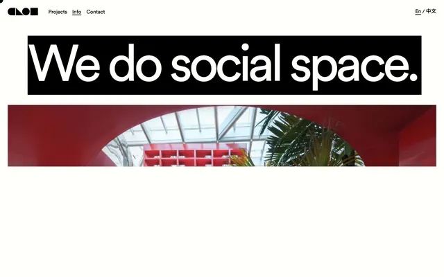
Architectural blueprint on stark white canvas.
Color palette
Used as an almost sculptural accent in large photographic elements, defining architectural features and sections. Not used for UI elements
Page backgrounds, button backgrounds, primary surface for text and imagery
Primary text, borders, headers, and backgrounds for high-contrast sections
Typography
- Weights
- 400, 700
- Sizes
- 13px, 17px, 20px, 25px, 32px, 34px, 50px, 109px, 134px, 166px, 201px
- Line height
- 0.8, 1, 1.06, 1.1, 1.15, 1.5
- Letter spacing
- -0.0700em at 201px, -0.0500em at 166px, -0.0300em at 134px, -0.0120em at 109px, -0.0100em at 50px
- Fallback
- System UI, Montserrat
Primary typeface for all headings, body text, navigation, and interactive elements. Its geometric simplicity reinforces the brand's direct and architectural aesthetic.
Spacing & shape
Components
Text-only button with Ink Black text on Canvas White background, 0px border-radius, with an Ink Black bottom border on hover. Padding is effectively 0px.
Ink Black text on Canvas White background, 0px border-radius. No explicit padding or borders visible, appearing integrated with body text.
Oversized Ink Black text on a Canvas White background, or reversed as Canvas White text on an Ink Black background. Uses font size 109px-201px, line-height 0.8-1.1, and negative letter-spacing for tight, impactful typography.
Ink Black text at 17-20px, medium weight, usually with no background or border, sometimes with an underline on hover/active state.
Guidelines
- Prioritize Canvas White (#fffffc) for backgrounds and Ink Black (#000000) for text to maintain a high-contrast, minimalist aesthetic.
- Use Circular Std exclusively for all typography across the site, leveraging its varied weights and sizes to establish hierarchy.
- Apply negative letter-spacing for all large headlines (size 50px and above) to create a tight, commanding visual presence.
- Maintain a uniform border-radius of 0px across all UI elements to reinforce a sharp, architectural aesthetic.
- Incorporate the Arched Red (#ff0000) color sparingly and primarily within large photographic or graphic sections, not for functional UI elements.
- Ensure all interactive elements, even if ghosted, have a clear Ink Black (#000000) border or text for discoverability.
- Utilize large, bold typography as a primary design element and content divider, making text itself a graphic component.
- Avoid using any drop shadows or complex elevation techniques; the design relies on flat, high-contrast surfaces and explicit borders.
- Do not introduce rounded corners; all UI elements should adhere to sharp, 0px radii.
- Refrain from using gradients on UI elements or backgrounds; the system is built on solid, flat colors.
- Do not introduce additional accent colors beyond Arched Red; color accents are extremely minimal and specific.
- Avoid complex, multi-layered components; favor simple, direct elements with clear boundaries and minimal styling.
- Do not use generic system fonts; always specify Circular Std across all text to maintain brand consistency.
- Unless part of a photographic element, avoid using Arched Red (#ff0000) as a background or primary interaction color.
About this system
ShowHide
CLOU architects employs a stark, high-contrast visual language that is simultaneously bold and minimalist. It features an expansive white canvas frequently punctuated by solid black sections or oversized black typography. The absence of traditional component containers and a singular dramatic red accent color, primarily for large architectural photography, create a direct and impactful aesthetic focused on content. Typography is large, unapologetic, and used as a major graphic element, defining distinct areas and conveying information with a sense of modern, unadorned authority.
The page uses a full-bleed layout, filling the entire viewport width, but with content sections that imply a centered, almost grid-like structure within the fluid container. The hero showcases an oversized, commanding headline, often on a solid black background, directly followed by large-scale architectural photography. Sections alternate between expansive white canvases and solid black blocks, creating a distinct visual rhythm without explicit dividers. Content arrangement is often singular, with large imagery or text dominating the screen, or simple two-column text-and-image layouts where text acts as a label. Navigation is a minimal top bar, featuring ghosted text links, and a functional footer.
Imagery primarily consists of high-quality architectural photography, often featuring interior or exterior shots of completed projects. These images are frequently full-bleed or large, contained within the stark white or black sections of the layout. The treatment is raw, with no apparent masking or rounded corners, allowing the sharp lines of the architecture to dominate. Color in photography can be vibrant, especially when showcasing red elements, serving to make architectural details pop. Illustrations are absent. Icons are minimal, utilizing simple outline styles in Ink Black or Canvas White.
Reminiscent of OMA, Bauhaus, Snøhetta.
# CLOU architects — Style Reference
> Architectural blueprint on stark white canvas.

**Theme:** light

**Site:** https://www.clouarchitects.com

CLOU architects employs a stark, high-contrast visual language that is simultaneously bold and minimalist. It features an expansive white canvas frequently punctuated by solid black sections or oversized black typography. The absence of traditional component containers and a singular dramatic red accent color, primarily for large architectural photography, create a direct and impactful aesthetic focused on content. Typography is large, unapologetic, and used as a major graphic element, defining distinct areas and conveying information with a sense of modern, unadorned authority.

## Tokens — Colors

| Name | Value | Token | Role |
|------|------|------|------|
| Arched Red | `#ff0000` | `--color-arched-red` | Used as an almost sculptural accent in large photographic elements, defining architectural features and sections. Not used for UI elements |
| Canvas White | `#fffffc` | `--color-canvas-white` | Page backgrounds, button backgrounds, primary surface for text and imagery |
| Ink Black | `#000000` | `--color-ink-black` | Primary text, borders, headers, and backgrounds for high-contrast sections |

## Tokens — Typography

### Circular Std
- **Substitute:** System UI, Montserrat
- **Weights:** 400, 700
- **Sizes:** 13px, 17px, 20px, 25px, 32px, 34px, 50px, 109px, 134px, 166px, 201px
- **Line height:** 0.8, 1, 1.06, 1.1, 1.15, 1.5
- **Letter spacing:** -0.0700em at 201px, -0.0500em at 166px, -0.0300em at 134px, -0.0120em at 109px, -0.0100em at 50px
- **Role:** Primary typeface for all headings, body text, navigation, and interactive elements. Its geometric simplicity reinforces the brand's direct and architectural aesthetic.

## Tokens — Type Scale

Perfect Fourth (1.333) from 17px base.

| Role | Size | Line height | Letter spacing |
|------|------|------|------|
| caption | 13px | 1.5 | — |
| body | 17px | 1.5 | — |
| subheading | 20px | 1.5 | — |
| heading-sm | 25px | 1.5 | — |
| heading | 32px | 1.15 | — |
| heading-lg | 50px | 1.1 | -0.01em |
| display | 109px | 1.06 | -0.012em |
| display-xl | 134px | 1 | -0.03em |
| display-xxl | 166px | 0.8 | -0.05em |
| display-xxxl | 201px | 0.8 | -0.07em |

## Tokens — Spacing

- **Section gap:** 25px
- **Card padding:** 17px
- **Element gap:** 17px

## Tokens — Radius

- **none:** 0px

## Layout

The page uses a full-bleed layout, filling the entire viewport width, but with content sections that imply a centered, almost grid-like structure within the fluid container. The hero showcases an oversized, commanding headline, often on a solid black background, directly followed by large-scale architectural photography. Sections alternate between expansive white canvases and solid black blocks, creating a distinct visual rhythm without explicit dividers. Content arrangement is often singular, with large imagery or text dominating the screen, or simple two-column text-and-image layouts where text acts as a label. Navigation is a minimal top bar, featuring ghosted text links, and a functional footer.

## Imagery

Imagery primarily consists of high-quality architectural photography, often featuring interior or exterior shots of completed projects. These images are frequently full-bleed or large, contained within the stark white or black sections of the layout. The treatment is raw, with no apparent masking or rounded corners, allowing the sharp lines of the architecture to dominate. Color in photography can be vibrant, especially when showcasing red elements, serving to make architectural details pop. Illustrations are absent. Icons are minimal, utilizing simple outline styles in Ink Black or Canvas White.

## Components

### Ghost Link Button
*Navigational or secondary action button for text-based links.*

Text-only button with Ink Black text on Canvas White background, 0px border-radius, with an Ink Black bottom border on hover. Padding is effectively 0px.

### Inline Text Button
*Simple text-based button, often used for content within sections like 'View projects +'.*

Ink Black text on Canvas White background, 0px border-radius. No explicit padding or borders visible, appearing integrated with body text.

### Hero Headline Block
*Dominant textual display for key messages, designed for maximum impact.*

Oversized Ink Black text on a Canvas White background, or reversed as Canvas White text on an Ink Black background. Uses font size 109px-201px, line-height 0.8-1.1, and negative letter-spacing for tight, impactful typography.

### Navigation Link
*Header and footer navigation menu items.*

Ink Black text at 17-20px, medium weight, usually with no background or border, sometimes with an underline on hover/active state.

## Guidelines

### Do

- Prioritize Canvas White (#fffffc) for backgrounds and Ink Black (#000000) for text to maintain a high-contrast, minimalist aesthetic.
- Use Circular Std exclusively for all typography across the site, leveraging its varied weights and sizes to establish hierarchy.
- Apply negative letter-spacing for all large headlines (size 50px and above) to create a tight, commanding visual presence.
- Maintain a uniform border-radius of 0px across all UI elements to reinforce a sharp, architectural aesthetic.
- Incorporate the Arched Red (#ff0000) color sparingly and primarily within large photographic or graphic sections, not for functional UI elements.
- Ensure all interactive elements, even if ghosted, have a clear Ink Black (#000000) border or text for discoverability.
- Utilize large, bold typography as a primary design element and content divider, making text itself a graphic component.

### Don't

- Avoid using any drop shadows or complex elevation techniques; the design relies on flat, high-contrast surfaces and explicit borders.
- Do not introduce rounded corners; all UI elements should adhere to sharp, 0px radii.
- Refrain from using gradients on UI elements or backgrounds; the system is built on solid, flat colors.
- Do not introduce additional accent colors beyond Arched Red; color accents are extremely minimal and specific.
- Avoid complex, multi-layered components; favor simple, direct elements with clear boundaries and minimal styling.
- Do not use generic system fonts; always specify Circular Std across all text to maintain brand consistency.
- Unless part of a photographic element, avoid using Arched Red (#ff0000) as a background or primary interaction color.

## Agent Prompt Guide

Quick Color Reference: text: #000000, background: #fffffc, border: #000000, accent: #ff0000, primary action: no distinct CTA color

Example Component Prompts:
Create a hero section: Canvas White background, large Ink Black headline 'We do social space.' in Circular Std weight 700 at 166px, line-height 0.8, letter-spacing -0.05em. No padding, full width.
Create a navigation link: 'Projects' in Ink Black text, Circular Std weight 400 at 17px, line-height 1.5, on a Canvas White background. No visible borders or padding, interactive underline on hover.
Create a text button within content: 'View projects +' in Ink Black text, Circular Std weight 400 at 17px, line-height 1.5, on Canvas White background. No borders, 0px radius, 0px padding.
Create a full-width black section: Ink Black background, with Canvas White text 'Our work' in Circular Std weight 700 at 50px, line-height 1.1, letter-spacing -0.01em. Add 50px vertical padding.
More like this









Keep what you find
A free account saves references to boards and can send you a weekly email of picks based on what you save.
To see every result, go Pro.