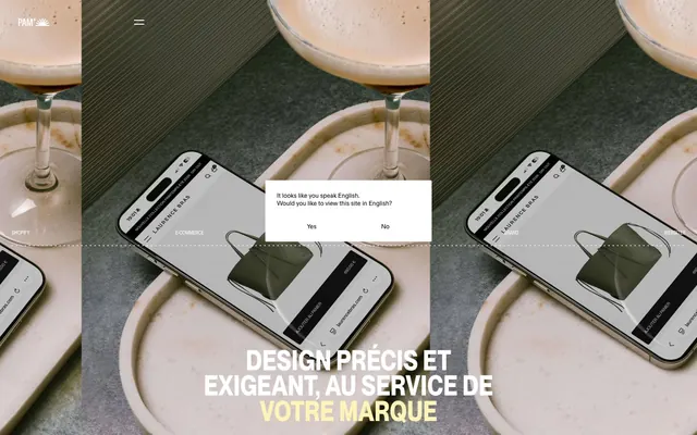
Preview image. Unlock full-res
Graphic Blueprint on Muted Yellow Canvas
Color palette
Page backgrounds, card backgrounds, primary interactive accents – a muted sun-drenched yellow that forms the site's primary atmospheric color
Minimal punctuation for navigation and decorative dot elements – a vivid, singular color used sparingly for emphasis
Primary text, headers, icon fills, dominant borders, footer background – provides high contrast against the Canvas Yellow and Paper White
Secondary backgrounds, modal surfaces, some reversed text, and outlines against dark sections
Input field backgrounds – a slightly deeper, more saturated yellow than Canvas Yellow, providing subtle differentiation
Typography
- Weights
- 500, 700
- Sizes
- 11px, 16px, 32px, 58px
- Line height
- 0.9, 1, 1.2, 1.43, 2.55
- Letter spacing
- normal
- Fallback
- Montserrat
Primary headings, navigation, and prominent body text – characterized by its sharp, technical feel and tight leading, especially for larger sizes.
- Weights
- 400, 700
- Sizes
- 13px, 14px
- Line height
- 1.2, 1.43, 2.15
- Letter spacing
- normal
- Fallback
- Inter
Body text, links, and secondary interface elements – provides a clear, legible counterpoint to Neue Montreal for functional details.
Spacing & shape
Components
Transparent background, Midnight Black text, 0px border radius, 0px padding. Uses OT Neue Montreal weight 500.
Canvas Yellow background, Midnight Black text, 0px border radius, 8px vertical padding, 16px horizontal padding. Uses ABC Diatype weight 400.
Transparent background, Paper White text, Paper White 1px border, 0px border radius, 14px padding. Uses OT Neue Montreal.
Input Pale Yellow background, Midnight Black text, 1px Midnight Black border, 0px border radius, 16px padding. Uses ABC Diatype weight 400.
Transparent background, 0px border radius, no box shadow, 0px padding. Content typically relies on image and typography for definition.
Guidelines
- Use Midnight Black (#000000) for all primary body text and headings for maximum contrast.
- Implement Canvas Yellow (#fff3b8) as the dominant background color for most page sections, establishing the brand's unique atmosphere.
- Apply a 0px border-radius to almost all elements, reinforcing the design's sharp and unadorned aesthetic.
- Ensure generous vertical spacing between sections, primarily '24px', to provide breathing room and modularity to the layout.
- Utilize OT Neue Montreal for all headlines and navigation, leveraging its tight line height (0.9 to 1.2) for a compact and assertive appearance.
- Reserve Accent Red (#ff0000) for hyper-minimal decorative elements or specific active states, never for large blocks of color.
- Use ABC Diatype for all body copy and secondary text elements, maintaining clear legibility at smaller sizes with its default line heights.
- Avoid using rounded corners; the system's identity is built on sharp, angular forms.
- Do not introduce gradients unless explicitly defined; surfaces are flat and monochrome.
- Refrain from using shadows or elevation; elements should live on a single plane or delineate through hard borders and color changes.
- Do not use overly decorative illustrations or imagery; visuals should be clean, product-focused, or abstract.
- Avoid mixing saturated colors; the palette is tightly controlled to Canvas Yellow, Midnight Black, Paper White, and a single Red accent.
- Do not use wide letter-spacing; typography is always compact and often normal or slightly negative.
- Do not vary line-height extensively; the established values for OT Neue Montreal and ABC Diatype are crucial for the system's precise feel.
About this system
ShowHide
Thisispam uses a high-contrast, minimalist visual style featuring stark black and white elements set against a dominant, muted yellow canvas. Typography is compact and precise, often acting as a key visual element with its sharp weight and tightly tracked presentation. The design leverages strong lines and flat surfaces, with color appearing primarily as this signature background hue or as a hyper-minimal accent point, creating a sense of understated assertiveness and directness rather than decorative flourish.
The page primarily uses a max-width contained layout, though some hero sections, notably the initial brand video, can be full-bleed. The hero pattern features large, centered, stark typography over a dynamic background. Sections alternate between Canvas Yellow and Midnight Black backgrounds, creating strong visual segmentation. Content arrangement frequently uses a centered stacked approach for headlines and calls to action, or a two-column grid for showcasing projects (image/mockup on one side, text/label on the other). Vertical rhythm is established through consistent '24px' section gaps. Navigation is a minimal top bar with discreet links and a hamburger icon, suggesting content focus over complex routing.
Imagery primarily consists of high-fidelity product mockups (phones/laptops showing websites) and carefully composed, often abstract or aesthetic, still-life photography. The treatment is direct and unadorned, often with raw edges and minimal masking, usually against a clean white or dark background. If photography is present, it tends to be crisp, high-contrast, and focused on texture or composition, acting as a backdrop or context rather than a narrative element. Icons are minimal, outlined, and monochromatic, inheriting the Midnight Black or Paper White palette with a medium stroke weight. Imagery acts as a showcase for product or an element of aesthetic atmosphere, rather than purely decorative content, and maintains a high density of visual information balanced with whitespace.
Reminiscent of AIGA, Future Fonts, Cargo Collective, Manual (design studio).
# Thisispam — Style Reference
> Graphic Blueprint on Muted Yellow Canvas

**Theme:** light

**Site:** https://thisispam.com

Thisispam uses a high-contrast, minimalist visual style featuring stark black and white elements set against a dominant, muted yellow canvas. Typography is compact and precise, often acting as a key visual element with its sharp weight and tightly tracked presentation. The design leverages strong lines and flat surfaces, with color appearing primarily as this signature background hue or as a hyper-minimal accent point, creating a sense of understated assertiveness and directness rather than decorative flourish.

## Tokens — Colors

| Name | Value | Token | Role |
|------|------|------|------|
| Canvas Yellow | `#fff3b8` | `--color-canvas-yellow` | Page backgrounds, card backgrounds, primary interactive accents – a muted sun-drenched yellow that forms the site's primary atmospheric color |
| Accent Red | `#ff0000` | `--color-accent-red` | Minimal punctuation for navigation and decorative dot elements – a vivid, singular color used sparingly for emphasis |
| Midnight Black | `#000000` | `--color-midnight-black` | Primary text, headers, icon fills, dominant borders, footer background – provides high contrast against the Canvas Yellow and Paper White |
| Paper White | `#ffffff` | `--color-paper-white` | Secondary backgrounds, modal surfaces, some reversed text, and outlines against dark sections |
| Input Pale Yellow | `#f1e4a4` | `--color-input-pale-yellow` | Input field backgrounds – a slightly deeper, more saturated yellow than Canvas Yellow, providing subtle differentiation |

## Tokens — Typography

### OT Neue Montreal
- **Substitute:** Montserrat
- **Weights:** 500, 700
- **Sizes:** 11px, 16px, 32px, 58px
- **Line height:** 0.9, 1, 1.2, 1.43, 2.55
- **Letter spacing:** normal
- **Role:** Primary headings, navigation, and prominent body text – characterized by its sharp, technical feel and tight leading, especially for larger sizes.

### ABC Diatype
- **Substitute:** Inter
- **Weights:** 400, 700
- **Sizes:** 13px, 14px
- **Line height:** 1.2, 1.43, 2.15
- **Letter spacing:** normal
- **Role:** Body text, links, and secondary interface elements – provides a clear, legible counterpoint to Neue Montreal for functional details.

## Tokens — Type Scale

| Role | Size | Line height | Letter spacing |
|------|------|------|------|
| caption | 11px | 1.43 | — |
| body-lg | 14px | 1.2 | — |
| heading | 32px | 1 | — |
| display | 58px | 0.9 | — |

## Tokens — Spacing

- **Section gap:** 24px
- **Card padding:** 16px
- **Element gap:** 12px

## Tokens — Radius

- **none:** 0px
- **small:** 2px

## Layout

The page primarily uses a max-width contained layout, though some hero sections, notably the initial brand video, can be full-bleed. The hero pattern features large, centered, stark typography over a dynamic background. Sections alternate between Canvas Yellow and Midnight Black backgrounds, creating strong visual segmentation. Content arrangement frequently uses a centered stacked approach for headlines and calls to action, or a two-column grid for showcasing projects (image/mockup on one side, text/label on the other). Vertical rhythm is established through consistent '24px' section gaps. Navigation is a minimal top bar with discreet links and a hamburger icon, suggesting content focus over complex routing.

## Imagery

Imagery primarily consists of high-fidelity product mockups (phones/laptops showing websites) and carefully composed, often abstract or aesthetic, still-life photography. The treatment is direct and unadorned, often with raw edges and minimal masking, usually against a clean white or dark background. If photography is present, it tends to be crisp, high-contrast, and focused on texture or composition, acting as a backdrop or context rather than a narrative element. Icons are minimal, outlined, and monochromatic, inheriting the Midnight Black or Paper White palette with a medium stroke weight. Imagery acts as a showcase for product or an element of aesthetic atmosphere, rather than purely decorative content, and maintains a high density of visual information balanced with whitespace.

## Components

### Ghost Navigation Button
*Primary site navigation and contextual actions where visual weight should be minimal.*

Transparent background, Midnight Black text, 0px border radius, 0px padding. Uses OT Neue Montreal weight 500.

### Primary Canvas Button
*Secondary action buttons, often appearing on the Canvas Yellow background.*

Canvas Yellow background, Midnight Black text, 0px border radius, 8px vertical padding, 16px horizontal padding. Uses ABC Diatype weight 400.

### Inverse Ghost Button
*Buttons on dark backgrounds requiring a reversed text and outline color.*

Transparent background, Paper White text, Paper White 1px border, 0px border radius, 14px padding. Uses OT Neue Montreal.

### Input Field
*Interactive text input fields.*

Input Pale Yellow background, Midnight Black text, 1px Midnight Black border, 0px border radius, 16px padding. Uses ABC Diatype weight 400.

### Feature Card
*Displaying project previews or feature blocks.*

Transparent background, 0px border radius, no box shadow, 0px padding. Content typically relies on image and typography for definition.

## Guidelines

### Do

- Use Midnight Black (#000000) for all primary body text and headings for maximum contrast.
- Implement Canvas Yellow (#fff3b8) as the dominant background color for most page sections, establishing the brand's unique atmosphere.
- Apply a 0px border-radius to almost all elements, reinforcing the design's sharp and unadorned aesthetic.
- Ensure generous vertical spacing between sections, primarily '24px', to provide breathing room and modularity to the layout.
- Utilize OT Neue Montreal for all headlines and navigation, leveraging its tight line height (0.9 to 1.2) for a compact and assertive appearance.
- Reserve Accent Red (#ff0000) for hyper-minimal decorative elements or specific active states, never for large blocks of color.
- Use ABC Diatype for all body copy and secondary text elements, maintaining clear legibility at smaller sizes with its default line heights.

### Don't

- Avoid using rounded corners; the system's identity is built on sharp, angular forms.
- Do not introduce gradients unless explicitly defined; surfaces are flat and monochrome.
- Refrain from using shadows or elevation; elements should live on a single plane or delineate through hard borders and color changes.
- Do not use overly decorative illustrations or imagery; visuals should be clean, product-focused, or abstract.
- Avoid mixing saturated colors; the palette is tightly controlled to Canvas Yellow, Midnight Black, Paper White, and a single Red accent.
- Do not use wide letter-spacing; typography is always compact and often normal or slightly negative.
- Do not vary line-height extensively; the established values for OT Neue Montreal and ABC Diatype are crucial for the system's precise feel.

## Agent Prompt Guide

Quick Color Reference:
text: #000000
background: #fff3b8
border: #000000
accent: #ff0000
primary action: #fff3b8 (filled action)

Example Component Prompts:
Create a hero section: full-bleed background set to a dark, evocative image. Overlay with a centered headline 'DESIGN PRÉCIS ET EXIGEANT' using OT Neue Montreal, weight 700, size 58px, line-height 0.9, color #ffffff. Below it, a subtle ghost navigation button 'Aller au contenu principal' with no background, color #ffffff, 14px padding, 0px radius.

Create a project showcase card: Canvas Yellow background (as page background). Content consists of a left-aligned image mockup and a right-aligned project title 'Laurence Bras' using OT Neue Montreal, weight 500, size 16px, color #000000. Underneath, a link 'Full scope' with ABC Diatype, weight 400, size 13px, color #000000.

Create a contact form input: Input Pale Yellow background, 1px Midnight Black border, 0px radius, 16px padding. Placeholder text should be Midnight Black, 14px, ABC Diatype, weight 400.

Create a footer section: Midnight Black background. Layout with multiple columns for contact info and links. Text like 'BUREAU' should be ABC Diatype, weight 700, size 13px, color #ffffff. Links like 'info@thisispam.com' should be ABC Diatype, weight 400, size 13px, color #ffffff.
More like this









Keep what you find
A free account saves references to boards and can send you a weekly email of picks based on what you save.
To see every result, go Pro.