Preview image. Unlock full-res
Deep charcoal on white, with purple-violet washes. Like a digital slate occasionally illuminated by the aurora borealis.
Color palette
Accent backgrounds, brand highlights, decorative elements — creates a dynamic, evolving visual anchor.
Background for feature sections, large decorative elements. This unique purple hue distinguishes the brand's aesthetic from typical tech blues.
Subtle background tints for navigation elements or micro-components, hinting at the brand's chromatic range.
Highlighting interactive elements, rare icon fills. Used sparingly against the neutral palette to draw immediate attention.
Page backgrounds, card surfaces, primary text on dark backgrounds.
Primary headings and body text on light backgrounds, dark button backgrounds.
Secondary text, hero section body copy, footer background text.
Element borders, subtle dividers, inactive states.
Footer link text, inactive navigation items, secondary body text.
Icon fills, outlines, very rare body text for maximum contrast.
Typography
- Weights
- 400, 700
- Sizes
- 12px, 14px, 16px, 18px, 24px, 32px, 48px
- Line height
- 1.2, 1.3, 1.4, 1.5
- Letter spacing
- -0.01
- Fallback
- Inter
Primary branding sans-serif. Used for body text, navigation, buttons, and most headings up to display size. Its subtle negative letter-spacing contributes to the precise, engineered feel.
- Weights
- 400
- Sizes
- 60px, 72px
- Line height
- 1
- Letter spacing
- -0.02
- Fallback
- Outfit
Signature display font for large headlines. Its extremely tight letter-spacing and substantial size command attention without being visually disruptive, embodying the brand's confident but refined voice.
- Weights
- 400
- Sizes
- 14px
- Line height
- 1.4
- Letter spacing
- 0.02
- Fallback
- Space Mono
Monospaced font for code snippets or specific technical labels in navigation. The slight positive letter-spacing ensures readability of technical terms, contrasting with the tighter Unica77.
Spacing & shape
Components
backgroundColor: rgba(0, 0, 0, 0), color: #212121, border: 1px solid #e5e7eb, borderRadius: 9999px, padding: 12px 24px.
backgroundColor: #17171c, color: #ffffff, borderRadius: 9999px, padding: 12px 24px.
backgroundColor: rgba(0, 0, 0, 0), color: #212121, border-bottom: 2px solid #e5e7eb, borderRadius: 4px, padding-bottom: 0px.
backgroundColor: rgba(0, 0, 0, 0), color: #212121, border-bottom: 2px solid transparent (visual only for active state), borderRadius: 0px, padding-bottom: 36px.
font-family: CohereText, font-weight: 400, font-size: 72px, line-height: 1, letter-spacing: -1.44px, color: #212121.
backgroundColor: transparent, borderRadius: 22px, box-shadow: none, minimal internal padding for images/content to bleed to edges.
backgroundColor: transparent, color: #ffffff, border-bottom: 1px solid #ffffff, borderRadius: 0px, padding-bottom: 0px.
Guidelines
- Use Night Sky (#17171c) for primary headings and body text on light backgrounds to maintain high contrast.
- Apply button border-radius of 9999px for all interactive buttons to establish a consistent soft, approachable shape.
- Ensure large display headings use CohereText weight 400 at 72px, with a precise -0.02em letter-spacing for brand consistency.
- Elevate sections or cards without traditional box-shadows, relying on the #9b60aa and linear gradients for visual distinction.
- Maintain a clear distinction between the tight letter-spacing of Unica77 Web (-0.01em) and the expanded CohereMono (0.02em).
- Use Ash Mist (#e5e7eb) for all neutral borders and dividers to provide subtle structure.
- Do not introduce additional color hues beyond the defined brand and accent palette; maintain a controlled and focused color scheme.
- Avoid generic drop shadows; rely on color contrast and the specified gradients for depth and separation.
- Do not vary border-radius for buttons and input fields; consistently use 9999px for buttons and 0px for inputs.
- Refrain from using Unica77 Web for hero/display-level headings; reserve CohereText for these prominent areas.
- Do not deviate from the defined letter-spacing values for each font family; they are critical to the typographic identity.
- Avoid filling cards with solid background colors; maintain transparency where appropriate for a lightweight aesthetic, and use background gradients only when specified.
About this system
ShowHide
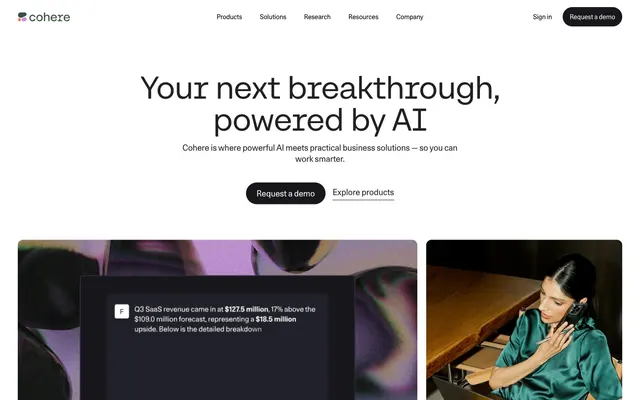
Cohere's visual identity projects a sense of measured, capable AI. It balances the stark minimalism often associated with technology with subtle organic hints of color and rounded forms, suggesting a human-centered approach to complex systems. The predominant white and deep charcoal create a high-contrast, authoritative feel, softened by strategically placed gradients and rounded elements that prevent the design from feeling overly rigid. The absence of strong shadows emphasizes depth through color contrast rather than artificial light, contributing to a modern, almost ethereal aesthetic.
The page primarily uses a max-width contained layout for content sections, set against a predominantly white full-bleed background. The hero section is centered with a large headline, subtext, and call-to-action buttons. Subsequent sections alternate between full-width abstract graphic backgrounds and contained content blocks. Content arrangement frequently features text-left/image-right or symmetrically stacked elements. Spacing between sections is generous, creating a spacious and legible page flow. The footer is a full-width dark section contrasting the light main page, organizing content into distinct columns. The navigation bar is sticky at the top, allowing for continuous access.
Imagery is characterized by a mix of abstract, almost iridescent 3D renders with prominent purple-violet tones, juxtaposed with realistic, muted photography of individuals interacting with technology. The abstract graphics are used as full-bleed backgrounds or contained within feature sections, adding a futuristic, sophisticated atmosphere. Photography often features close-up, focused shots with desaturated or slightly cool-toned filters, avoiding over-vibrancy. Product screenshots appear as insets within the abstract visuals, showcasing actual UI without overwhelming the page. Icons are monochrome, generally filled outlines or simple geometric forms, reinforcing the technical and precise aesthetic.
Reminiscent of Anthropic, OpenAI, Vercel, Linear.
# Cohere — Style Reference
> Deep charcoal on white, with purple-violet washes. Like a digital slate occasionally illuminated by the aurora borealis.

**Theme:** light

**Site:** https://cohere.com

Cohere's visual identity projects a sense of measured, capable AI. It balances the stark minimalism often associated with technology with subtle organic hints of color and rounded forms, suggesting a human-centered approach to complex systems. The predominant white and deep charcoal create a high-contrast, authoritative feel, softened by strategically placed gradients and rounded elements that prevent the design from feeling overly rigid. The absence of strong shadows emphasizes depth through color contrast rather than artificial light, contributing to a modern, almost ethereal aesthetic.

## Tokens — Colors

| Name | Value | Token | Role |
|------|------|------|------|
| Warm Violet Gradient | `#ff7759` | `--color-warm-violet-gradient` | Accent backgrounds, brand highlights, decorative elements — creates a dynamic, evolving visual anchor. |
| Cosmic Violet | `#9b60aa` | `--color-cosmic-violet` | Background for feature sections, large decorative elements. This unique purple hue distinguishes the brand's aesthetic from typical tech blues. |
| Soft Indigo Wash | `#f0dff3` | `--color-soft-indigo-wash` | Subtle background tints for navigation elements or micro-components, hinting at the brand's chromatic range. |
| Azure Glow | `#00a1df` | `--color-azure-glow` | Highlighting interactive elements, rare icon fills. Used sparingly against the neutral palette to draw immediate attention. |
| Absolute Zero | `#ffffff` | `--color-absolute-zero` | Page backgrounds, card surfaces, primary text on dark backgrounds. |
| Night Sky | `#17171c` | `--color-night-sky` | Primary headings and body text on light backgrounds, dark button backgrounds. |
| Charcoal Slate | `#212121` | `--color-charcoal-slate` | Secondary text, hero section body copy, footer background text. |
| Ash Mist | `#e5e7eb` | `--color-ash-mist` | Element borders, subtle dividers, inactive states. |
| Graphite | `#75758a` | `--color-graphite` | Footer link text, inactive navigation items, secondary body text. |
| Deep Space | `#000000` | `--color-deep-space` | Icon fills, outlines, very rare body text for maximum contrast. |

## Tokens — Typography

### Unica77 Cohere Web
- **Substitute:** Inter
- **Weights:** 400, 700
- **Sizes:** 12px, 14px, 16px, 18px, 24px, 32px, 48px
- **Line height:** 1.2, 1.3, 1.4, 1.5
- **Letter spacing:** -0.01
- **Role:** Primary branding sans-serif. Used for body text, navigation, buttons, and most headings up to display size. Its subtle negative letter-spacing contributes to the precise, engineered feel.

### CohereText
- **Substitute:** Outfit
- **Weights:** 400
- **Sizes:** 60px, 72px
- **Line height:** 1
- **Letter spacing:** -0.02
- **Role:** Signature display font for large headlines. Its extremely tight letter-spacing and substantial size command attention without being visually disruptive, embodying the brand's confident but refined voice.

### CohereMono
- **Substitute:** Space Mono
- **Weights:** 400
- **Sizes:** 14px
- **Line height:** 1.4
- **Letter spacing:** 0.02
- **Role:** Monospaced font for code snippets or specific technical labels in navigation. The slight positive letter-spacing ensures readability of technical terms, contrasting with the tighter Unica77.

## Tokens — Type Scale

Major Third (1.25) from 16px base.

| Role | Size | Line height | Letter spacing |
|------|------|------|------|
| caption | 12px | 1.4 | -0.12px |
| body-sm | 14px | 1.4 | -0.14px |
| body | 16px | 1.5 | -0.16px |
| subheading | 18px | 1.4 | -0.18px |
| heading | 24px | 1.3 | -0.24px |
| heading-lg | 32px | 1.2 | -0.32px |
| display | 48px | 1.2 | -0.48px |
| display-xl | 60px | 1 | -1.2px |
| display-xxl | 72px | 1 | -1.44px |

## Tokens — Spacing

- **Section gap:** 64px
- **Card padding:** 32px
- **Element gap:** 16px

## Tokens — Radius

- **Default:** 22px
- **Buttons:** 9999px
- **navigation:** 4px

## Layout

The page primarily uses a max-width contained layout for content sections, set against a predominantly white full-bleed background. The hero section is centered with a large headline, subtext, and call-to-action buttons. Subsequent sections alternate between full-width abstract graphic backgrounds and contained content blocks. Content arrangement frequently features text-left/image-right or symmetrically stacked elements. Spacing between sections is generous, creating a spacious and legible page flow. The footer is a full-width dark section contrasting the light main page, organizing content into distinct columns. The navigation bar is sticky at the top, allowing for continuous access.

## Imagery

Imagery is characterized by a mix of abstract, almost iridescent 3D renders with prominent purple-violet tones, juxtaposed with realistic, muted photography of individuals interacting with technology. The abstract graphics are used as full-bleed backgrounds or contained within feature sections, adding a futuristic, sophisticated atmosphere. Photography often features close-up, focused shots with desaturated or slightly cool-toned filters, avoiding over-vibrancy. Product screenshots appear as insets within the abstract visuals, showcasing actual UI without overwhelming the page. Icons are monochrome, generally filled outlines or simple geometric forms, reinforcing the technical and precise aesthetic.

## Components

### CTA Button Group

### Trusted By Logo Bar

### Feature Pillars — Security, Deployment, Customization

### Primary Ghost Button
*Call to action, secondary actions.*

backgroundColor: rgba(0, 0, 0, 0), color: #212121, border: 1px solid #e5e7eb, borderRadius: 9999px, padding: 12px 24px.

### Primary Filled Button
*Main call to action.*

backgroundColor: #17171c, color: #ffffff, borderRadius: 9999px, padding: 12px 24px.

### Tertiary Bordered Link
*Navigation, subtle calls to action.*

backgroundColor: rgba(0, 0, 0, 0), color: #212121, border-bottom: 2px solid #e5e7eb, borderRadius: 4px, padding-bottom: 0px.

### Navigation Link with Underline
*Primary navigation items.*

backgroundColor: rgba(0, 0, 0, 0), color: #212121, border-bottom: 2px solid transparent (visual only for active state), borderRadius: 0px, padding-bottom: 36px.

### Hero Headline
*Main page title.*

font-family: CohereText, font-weight: 400, font-size: 72px, line-height: 1, letter-spacing: -1.44px, color: #212121.

### Product Feature Card
*Displaying product features or content sections.*

backgroundColor: transparent, borderRadius: 22px, box-shadow: none, minimal internal padding for images/content to bleed to edges.

### Footer Input Field
*Email subscription input.*

backgroundColor: transparent, color: #ffffff, border-bottom: 1px solid #ffffff, borderRadius: 0px, padding-bottom: 0px.

## Guidelines

### Do

- Use Night Sky (#17171c) for primary headings and body text on light backgrounds to maintain high contrast.
- Apply button border-radius of 9999px for all interactive buttons to establish a consistent soft, approachable shape.
- Ensure large display headings use CohereText weight 400 at 72px, with a precise -0.02em letter-spacing for brand consistency.
- Elevate sections or cards without traditional box-shadows, relying on the #9b60aa and linear gradients for visual distinction.
- Maintain a clear distinction between the tight letter-spacing of Unica77 Web (-0.01em) and the expanded CohereMono (0.02em).
- Use Ash Mist (#e5e7eb) for all neutral borders and dividers to provide subtle structure.

### Don't

- Do not introduce additional color hues beyond the defined brand and accent palette; maintain a controlled and focused color scheme.
- Avoid generic drop shadows; rely on color contrast and the specified gradients for depth and separation.
- Do not vary border-radius for buttons and input fields; consistently use 9999px for buttons and 0px for inputs.
- Refrain from using Unica77 Web for hero/display-level headings; reserve CohereText for these prominent areas.
- Do not deviate from the defined letter-spacing values for each font family; they are critical to the typographic identity.
- Avoid filling cards with solid background colors; maintain transparency where appropriate for a lightweight aesthetic, and use background gradients only when specified.

## Agent Prompt Guide

### Quick Color Reference
- Text (Primary): #17171c
- Background (Page): #ffffff
- CTA Button (Filled): #17171c
- Border (Neutral): #e5e7eb
- Accent (Brand Purple): #9b60aa

### 3-5 Example Component Prompts
1. Create a hero section: background #ffffff. Headline 'Your next breakthrough, powered by AI' using CohereText font, weight 400, size 72px, line-height 1, letter-spacing -1.44px, color #212121. Subtext 'Cohere is where powerful AI meets practical business solutions' using Unica77 Cohere Web, weight 400, size 18px, line-height 1.4, color #212121. Two buttons below, left: Filled Button using #17171c background, #ffffff text, 9999px radius, 12px 24px padding. Right: Ghost Button using transparent background, #212121 text, 1px solid #e5e7eb border, 9999px radius, 12px 24px padding.
2. Design a feature card: Transparent background, 22px border radius. Inside, place a 10px tall gradient bar using 'linear-gradient(to right, rgb(255, 119, 89), rgb(118, 112, 197), rgb(76, 110, 230))'. Below the bar, include a heading using Unica77 Cohere Web, weight 700, size 24px, line-height 1.3, color #17171c, and body text using Unica77 Cohere Web, weight 400, size 16px, line-height 1.5, color #212121.
3. Create a footer email input field: background transparent. Placeholder text 'Enter your email' in #ffffff. Input text color #ffffff. Bottom border 1px solid #ffffff. No border radius. Button '->' to the right should be a ghost button with #ffffff text, transparent background, and #ffffff border, 9999px radius.
More like this








Keep what you find
A free account saves references to boards and can send you a weekly email of picks based on what you save.
To see every result, go Pro.