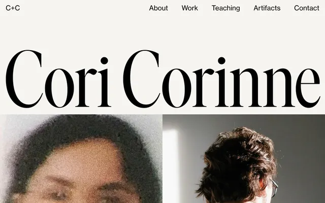
Preview image. Unlock full-res
Editorial grand typography
Color palette
Dominant page background, soft card surfaces
Primary text color for body copy, navigational elements, and subtle borders. Creates strong contrast against the light canvas
Elevated background surfaces for certain sections or content blocks
Dark borders and separators for elevated surfaces and inverted UI. Do not promote it to the primary CTA color
Typography
- Weights
- 400
- Sizes
- 18px, 30px
- Line height
- 1.67, 2.33
- Letter spacing
- normal
- Fallback
- system-ui, sans-serif
Primary text for body content, links, and general informational text. Its clean, readable proportions balance the more expressive display font.
- Weights
- 400
- Sizes
- 18px, 30px
- Line height
- 1, 2.33
- Letter spacing
- normal
- Fallback
- 'EB Garamond', serif
Display font for large, impactful headlines and a signature brand mark. Its high contrast and elegant serif forms establish a sophisticated, editorial tone. The 1.0 line height for smaller sizes contributes to a concise, dense feel.
Spacing & shape
Components
Text: Open Sans, 18px, weight 400, Ink Obsidian (#292a2c). Hover/Active state: Deep Midnight (#000000) with a 1px bottom border of Deep Midnight (#000000).
Font: neue-haas-grotesk-text, 30px (likely much larger based on visual prominence), weight 400. Color: Ink Obsidian (#292a2c). Visually this appears centered on a Canvas Parchment background, setting an immediate tone of grandeur.
Text: Open Sans, 18px, weight 400, Deep Midnight (#000000). Behaves like a standard text link, changing color on interaction.
Guidelines
- Prioritize Canvas Parchment (#f6f5f0) as the primary background for all major content areas.
- Use Open Sans (weight 400) for all body text, ensuring high readability and a neutral base for content.
- Employ neue-haas-grotesk-text (weight 400) exclusively for large, editorial headlines to establish visual drama.
- Maintain a rigid 0px border-radius for all elements, preserving a crisp, angular aesthetic.
- Utilize Ink Obsidian (#292a2c) for most text and secondary interaction elements to create strong contrast without harshness.
- Ensure generous vertical spacing between sections, using a base rhythm of 60px to maintain an open, spacious feel.
- Avoid using saturated or vivid colors; the palette is strictly neutral with high contrast.
- Do not introduce rounded corners or soft shadows; elevation and form should be defined by hard edges and stark contrast.
- Refrain from using thin weights for body text; Open Sans 400 is the minimum for legibility.
- Avoid decorative gradients or background images; rely on the interplay of text, high-contrast imagery, and spacious layout.
- Do not deviate from the established font families; the serif/sans-serif pairing is a core identity element.
- Never use less than 30px for padding or element separation, to prevent a cramped appearance.
About this system
ShowHide
Cori Corinne presents a refined, editorial aesthetic, emphasizing large, high-contrast typography and subtle textural backgrounds over vibrant color. The system relies on a warm, off-white canvas and deep charcoal text, creating a sense of understated elegance. Visual hierarchy is established through dramatic scale shifts in headlines and classic serif fonts, while interaction elements remain minimal and ghost-like.
The page utilizes a full-bleed layout, allowing content and hero sections to span the entire viewport width. The hero pattern is characterized by a centered, oversized headline using the brand's display font, set against the Canvas Parchment background. Section rhythm is driven by distinct vertical blocks, with generous spacing creating an unhurried, gallery-like experience. Content is primarily arranged in simple stacked blocks or large single visual elements, emphasizing individual statements. Navigation is a minimal, top-aligned bar with text links. Density leans towards spaciousness, allowing each element significant breathing room.
Imagery is high-contrast, often black-and-white or desaturated, appearing as full-width or large visual blocks. Photography features textured surfaces or abstract compositions, often with a raw, slightly grainy aesthetic. The images serve as atmospheric elements rather than literal content showcases, providing mood and visual interest without overwhelming the stark typography. Icons, if present, would likely be minimal and outlined in black.
Reminiscent of AIGA Journal, The New York Times, Other portfolio sites with a strong focus on art direction.
# Cori Corinne — Style Reference
> Editorial grand typography

**Theme:** light

**Site:** https://www.coricorinne.com

Cori Corinne presents a refined, editorial aesthetic, emphasizing large, high-contrast typography and subtle textural backgrounds over vibrant color. The system relies on a warm, off-white canvas and deep charcoal text, creating a sense of understated elegance. Visual hierarchy is established through dramatic scale shifts in headlines and classic serif fonts, while interaction elements remain minimal and ghost-like.

## Tokens — Colors

| Name | Value | Token | Role |
|------|------|------|------|
| Canvas Parchment | `#f6f5f0` | `--color-canvas-parchment` | Dominant page background, soft card surfaces |
| Ink Obsidian | `#292a2c` | `--color-ink-obsidian` | Primary text color for body copy, navigational elements, and subtle borders. Creates strong contrast against the light canvas |
| Pure White | `#ffffff` | `--color-pure-white` | Elevated background surfaces for certain sections or content blocks |
| Deep Midnight | `#000000` | `--color-deep-midnight` | Dark borders and separators for elevated surfaces and inverted UI. Do not promote it to the primary CTA color |

## Tokens — Typography

### Open Sans
- **Substitute:** system-ui, sans-serif
- **Weights:** 400
- **Sizes:** 18px, 30px
- **Line height:** 1.67, 2.33
- **Letter spacing:** normal
- **Role:** Primary text for body content, links, and general informational text. Its clean, readable proportions balance the more expressive display font.

### neue-haas-grotesk-text
- **Substitute:** 'EB Garamond', serif
- **Weights:** 400
- **Sizes:** 18px, 30px
- **Line height:** 1, 2.33
- **Letter spacing:** normal
- **Role:** Display font for large, impactful headlines and a signature brand mark. Its high contrast and elegant serif forms establish a sophisticated, editorial tone. The 1.0 line height for smaller sizes contributes to a concise, dense feel.

## Tokens — Spacing

- **Section gap:** 60px
- **Card padding:** 30px
- **Element gap:** 30px

## Tokens — Radius

- **none:** 0px

## Layout

The page utilizes a full-bleed layout, allowing content and hero sections to span the entire viewport width. The hero pattern is characterized by a centered, oversized headline using the brand's display font, set against the Canvas Parchment background. Section rhythm is driven by distinct vertical blocks, with generous spacing creating an unhurried, gallery-like experience. Content is primarily arranged in simple stacked blocks or large single visual elements, emphasizing individual statements. Navigation is a minimal, top-aligned bar with text links. Density leans towards spaciousness, allowing each element significant breathing room.

## Imagery

Imagery is high-contrast, often black-and-white or desaturated, appearing as full-width or large visual blocks. Photography features textured surfaces or abstract compositions, often with a raw, slightly grainy aesthetic. The images serve as atmospheric elements rather than literal content showcases, providing mood and visual interest without overwhelming the stark typography. Icons, if present, would likely be minimal and outlined in black.

## Components

### Header Navigation Link
*Top-level navigation items*

Text: Open Sans, 18px, weight 400, Ink Obsidian (#292a2c). Hover/Active state: Deep Midnight (#000000) with a 1px bottom border of Deep Midnight (#000000).

### Hero Headline
*Dominant page titles and primary visual impact*

Font: neue-haas-grotesk-text, 30px (likely much larger based on visual prominence), weight 400. Color: Ink Obsidian (#292a2c). Visually this appears centered on a Canvas Parchment background, setting an immediate tone of grandeur.

### Social Link
*Footer or section-level links to external platforms*

Text: Open Sans, 18px, weight 400, Deep Midnight (#000000). Behaves like a standard text link, changing color on interaction.

## Guidelines

### Do

- Prioritize Canvas Parchment (#f6f5f0) as the primary background for all major content areas.
- Use Open Sans (weight 400) for all body text, ensuring high readability and a neutral base for content.
- Employ neue-haas-grotesk-text (weight 400) exclusively for large, editorial headlines to establish visual drama.
- Maintain a rigid 0px border-radius for all elements, preserving a crisp, angular aesthetic.
- Utilize Ink Obsidian (#292a2c) for most text and secondary interaction elements to create strong contrast without harshness.
- Ensure generous vertical spacing between sections, using a base rhythm of 60px to maintain an open, spacious feel.

### Don't

- Avoid using saturated or vivid colors; the palette is strictly neutral with high contrast.
- Do not introduce rounded corners or soft shadows; elevation and form should be defined by hard edges and stark contrast.
- Refrain from using thin weights for body text; Open Sans 400 is the minimum for legibility.
- Avoid decorative gradients or background images; rely on the interplay of text, high-contrast imagery, and spacious layout.
- Do not deviate from the established font families; the serif/sans-serif pairing is a core identity element.
- Never use less than 30px for padding or element separation, to prevent a cramped appearance.

## Agent Prompt Guide

Quick Color Reference:
text: #292a2c
background: #f6f5f0
border: #292a2c
accent: no distinct accent color
primary action: no distinct CTA color

Example Component Prompts:
1. Create a primary navigation link: Background transparent, text Ink Obsidian (#292a2c), Open Sans weight 400, 18px. On hover, text becomes Deep Midnight (#000000) and gains a 1px solid Deep Midnight bottom border.
2. Design a hero section, full-width: Canvas Parchment (#f6f5f0) background. Centered headline 'Cori Corinne' using neue-haas-grotesk-text weight 400, text color Ink Obsidian (#292a2c) at a very large size (e.g., 96px).
3. Generate a footer social link: Text 'Instagram' using Open Sans weight 400, 18px, color Deep Midnight (#000000).
More like this









Keep what you find
A free account saves references to boards and can send you a weekly email of picks based on what you save.
To see every result, go Pro.