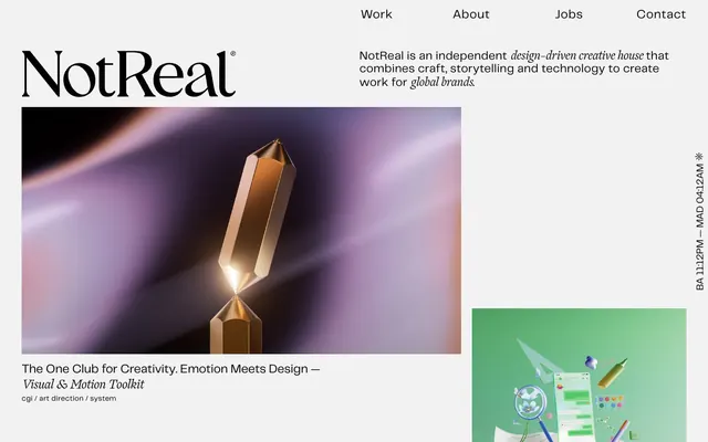
Preview image. Unlock full-res
High-contrast editorial canvas
Color palette
Primary page and surface background
Primary text, navigation links, and element borders
Dark borders and separators for elevated surfaces and inverted UI. Do not promote it to the primary CTA color
Typography
- Weights
- 400
- Sizes
- 15px, 18px, 20px, 24px, 25px, 55px
- Line height
- 0.75, 1, 1.08, 1.1, 1.25, 1.33, 1.67, 2
- Letter spacing
- 0.002em, 0.021em, 0.025em, 0.033em, 0.040em
- Fallback
- Inter
Body copy, navigation, descriptive text, and secondary headings. Its clean, technical feel provides legibility across various scales.
- Weights
- 400
- Sizes
- 24px, 26px, 55px
- Line height
- 1.06, 1.1, 1.5
- Letter spacing
- -0.036em, -0.020em
- Fallback
- Playfair Display
Primary headings and artistic display text. Its high contrast and elegant serifs provide a distinct, editorial brand identity, with tight negative tracking to maintain a compact appearance.
Spacing & shape
Components
Text in Ink Black (telegraf, 400, 18px, 1.33 lh, 0.38px ls), with a bottom border of 1px Deepest Black on hover or active state.
Exclusively uses Ogg, 400 weight, 55px size, with -1.98px letter spacing. Color is Ink Black, positioned prominently in the top left.
Set in Telegraf 400, Ink Black, using 15px text and 1.67 line height for body, and a 25px size with 1.08 line height for key phrases. Utilizes a compact letterSpacing of 0.025em for emphasis.
Consists of an image filling its container, with no visible borders or radius. Text below uses Telegraf 400, 15px, Ink Black for tags and project title in Ogg 400, 26px with -0.52px letter spacing.
Small text in Telegraf 400, 15px, Ink Black, with a tight lineHeight of 1.67. Often rotated or positioned vertically to save space.
Guidelines
- Prioritize high contrast between text (#292a2c, #000000) and background (#f2f2f2).
- Use Ogg font for all prominent headings and brand elements to establish a distinct editorial tone, applying its specific negative letter spacing for a dense effect.
- Employ Telegraf for all body text, navigation, and secondary UI elements, maintaining its default letter spacing for optimal readability.
- Maintain a compact density for typography by using specified line heights such as 1.33 for 18px body text and 0.75 to 1.10 for larger headings.
- Structure layouts with generous Canvas White (#f2f2f2) surrounding content blocks to create breathing room and emphasize core visual elements.
- Apply Deepest Black (#000000) as a 1px border for interactive states or as an accent border for text links and visual separators.
- Ensure all imagery is crisp and occupies significant visual space, acting as the primary splash of color and detail against the monochrome UI.
- Do not introduce new color hues; strictly adhere to the achromatic palette with #f2f2f2, #292a2c, and #000000.
- Avoid decorative elements like shadows, gradients, or complex background patterns; rely on typography and spacing for visual hierarchy.
- Do not use generic system fonts or fallbacks as primary UI text; Telegraf and Ogg are fundamental to the brand's identity.
- Prevent cluttered layouts; prioritize white space, using 44px for section gaps and 18px for internal padding around content.
- Do not round corners on any UI elements; all shapes should be sharp and angular, reflecting a precise, craft-oriented aesthetic.
- Avoid using multiple font families beyond Telegraf and Ogg; maintain typographic simplicity.
- Do not apply excessive padding or margin to small text elements; keep them dense and contained within 11px general element spacing.
About this system
ShowHide
NotReal employs a stark, print-inspired aesthetic characterized by high-contrast typography and a restrained achromatic palette. The design system emphasizes generous white space and precise visual hierarchy through font choices, rather than color or complex layouts. Project showcases act as vibrant focal points within an otherwise minimalist, editorial grid.
The page exhibits a full-bleed layout for its overall structure, embracing the screen edges. The hero section features the logo and navigation prominently at the top, with a centered description block, while project showcases are arranged in an alternating text-left/image-right pattern or stacked vertically. Sections maintain consistent vertical spacing of 44px, creating a rhythmic, clean flow. There is a strong single-column grid for content blocks, with images often spanning full width, and an implicit two-column grid for text-and-image pairings. Navigation is a minimal top-bar, always visible.
Imagery primarily consists of high-quality, product-focused 3D renders and CGI, often showcasing intricate textures and dynamic lighting. The treatment is full-bleed or contained within a sharp, rectangular frame, never overlapping or with rounded corners. Images serve as vibrant, expressive focal points that break the monochromatic UI, acting as a product showcase to explain content and impress. Density is high within the image blocks themselves, but these blocks are surrounded by text-dominant and spacious negative space.
Reminiscent of AIGA Design, Working Not Working, Chermayeff & Geismar & Haviv.
# Not Real — Style Reference
> High-contrast editorial canvas

**Theme:** light

**Site:** https://notreal.tv

NotReal employs a stark, print-inspired aesthetic characterized by high-contrast typography and a restrained achromatic palette. The design system emphasizes generous white space and precise visual hierarchy through font choices, rather than color or complex layouts. Project showcases act as vibrant focal points within an otherwise minimalist, editorial grid.

## Tokens — Colors

| Name | Value | Token | Role |
|------|------|------|------|
| Canvas White | `#f2f2f2` | `--color-canvas-white` | Primary page and surface background |
| Ink Black | `#292a2c` | `--color-ink-black` | Primary text, navigation links, and element borders |
| Deepest Black | `#000000` | `--color-deepest-black` | Dark borders and separators for elevated surfaces and inverted UI. Do not promote it to the primary CTA color |

## Tokens — Typography

### Telegraf
- **Substitute:** Inter
- **Weights:** 400
- **Sizes:** 15px, 18px, 20px, 24px, 25px, 55px
- **Line height:** 0.75, 1, 1.08, 1.1, 1.25, 1.33, 1.67, 2
- **Letter spacing:** 0.002em, 0.021em, 0.025em, 0.033em, 0.040em
- **Role:** Body copy, navigation, descriptive text, and secondary headings. Its clean, technical feel provides legibility across various scales.

### Ogg
- **Substitute:** Playfair Display
- **Weights:** 400
- **Sizes:** 24px, 26px, 55px
- **Line height:** 1.06, 1.1, 1.5
- **Letter spacing:** -0.036em, -0.020em
- **Role:** Primary headings and artistic display text. Its high contrast and elegant serifs provide a distinct, editorial brand identity, with tight negative tracking to maintain a compact appearance.

## Tokens — Type Scale

Augmented Fourth (1.414) from 18px base.

| Role | Size | Line height | Letter spacing |
|------|------|------|------|
| body-sm | 15px | 1.67 | — |
| body | 18px | 1.33 | 0.38px |
| subheading | 20px | 1.25 | — |
| heading-sm | 24px | 1.1 | -0.48px |
| display | 55px | 0.75 | -1.98px |

## Tokens — Spacing

- **Section gap:** 44px
- **Card padding:** 18px
- **Element gap:** 11px

## Tokens — Radius

- **Default:** 0px

## Layout

The page exhibits a full-bleed layout for its overall structure, embracing the screen edges. The hero section features the logo and navigation prominently at the top, with a centered description block, while project showcases are arranged in an alternating text-left/image-right pattern or stacked vertically. Sections maintain consistent vertical spacing of 44px, creating a rhythmic, clean flow. There is a strong single-column grid for content blocks, with images often spanning full width, and an implicit two-column grid for text-and-image pairings. Navigation is a minimal top-bar, always visible.

## Imagery

Imagery primarily consists of high-quality, product-focused 3D renders and CGI, often showcasing intricate textures and dynamic lighting. The treatment is full-bleed or contained within a sharp, rectangular frame, never overlapping or with rounded corners. Images serve as vibrant, expressive focal points that break the monochromatic UI, acting as a product showcase to explain content and impress. Density is high within the image blocks themselves, but these blocks are surrounded by text-dominant and spacious negative space.

## Components

### Primary Navigation Link
*Top-level navigation element*

Text in Ink Black (telegraf, 400, 18px, 1.33 lh, 0.38px ls), with a bottom border of 1px Deepest Black on hover or active state.

### Site Logo
*Brand identifier*

Exclusively uses Ogg, 400 weight, 55px size, with -1.98px letter spacing. Color is Ink Black, positioned prominently in the top left.

### Hero Description Block
*Introductory text for the agency*

Set in Telegraf 400, Ink Black, using 15px text and 1.67 line height for body, and a 25px size with 1.08 line height for key phrases. Utilizes a compact letterSpacing of 0.025em for emphasis.

### Project Thumbnail Card
*Showcase individual projects*

Consists of an image filling its container, with no visible borders or radius. Text below uses Telegraf 400, 15px, Ink Black for tags and project title in Ogg 400, 26px with -0.52px letter spacing.

### Copyright/Status Text
*Informational text in footer or sidebar*

Small text in Telegraf 400, 15px, Ink Black, with a tight lineHeight of 1.67. Often rotated or positioned vertically to save space.

## Guidelines

### Do

- Prioritize high contrast between text (#292a2c, #000000) and background (#f2f2f2).
- Use Ogg font for all prominent headings and brand elements to establish a distinct editorial tone, applying its specific negative letter spacing for a dense effect.
- Employ Telegraf for all body text, navigation, and secondary UI elements, maintaining its default letter spacing for optimal readability.
- Maintain a compact density for typography by using specified line heights such as 1.33 for 18px body text and 0.75 to 1.10 for larger headings.
- Structure layouts with generous Canvas White (#f2f2f2) surrounding content blocks to create breathing room and emphasize core visual elements.
- Apply Deepest Black (#000000) as a 1px border for interactive states or as an accent border for text links and visual separators.
- Ensure all imagery is crisp and occupies significant visual space, acting as the primary splash of color and detail against the monochrome UI.

### Don't

- Do not introduce new color hues; strictly adhere to the achromatic palette with #f2f2f2, #292a2c, and #000000.
- Avoid decorative elements like shadows, gradients, or complex background patterns; rely on typography and spacing for visual hierarchy.
- Do not use generic system fonts or fallbacks as primary UI text; Telegraf and Ogg are fundamental to the brand's identity.
- Prevent cluttered layouts; prioritize white space, using 44px for section gaps and 18px for internal padding around content.
- Do not round corners on any UI elements; all shapes should be sharp and angular, reflecting a precise, craft-oriented aesthetic.
- Avoid using multiple font families beyond Telegraf and Ogg; maintain typographic simplicity.
- Do not apply excessive padding or margin to small text elements; keep them dense and contained within 11px general element spacing.

## Agent Prompt Guide

Quick Color Reference:
text: #292a2c
background: #f2f2f2
border: #000000
accent: no distinct accent color
primary action: no distinct CTA color

3-5 Example Component Prompts:
Create a navigation bar: Background Canvas White (#f2f2f2). Links in Telegraf 400, 18px, #292a2c (0.38px ls), with a 1px Deepest Black (#000000) bottom border on hover. The logo is Ogg 400, 55px, #292a2c, -1.98px ls.

Generate a project entry card: Full-width image. Title below in Ogg 400, 26px, #000000 (-0.52px ls). Project tags below in Telegraf 400, 15px, #292a2c, with default letter spacing. No borders or radius.

Design the agency description block: Use Telegraf 400, #292a2c. Key phrases at 25px (1.08 lh, 0.025em ls), body text at 15px (1.67 lh). Text aligned left, with 44px vertical padding above and below.
More like this









Keep what you find
A free account saves references to boards and can send you a weekly email of picks based on what you save.
To see every result, go Pro.