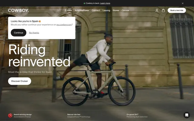
Preview image. Unlock full-res
Minimalist Product Canvas
Color palette
Green wash for highlight backgrounds, decorative bands, and soft emphasis behind content. Use as a supporting accent, not as a status color
Page backgrounds, card surfaces, ghost button backgrounds, default input background
Primary text, filled button backgrounds, prominent headings, dark overlay backgrounds for hero sections
Subtle borders, dividers, subtle background on some page sections, text on dark backgrounds
Muted helper text, secondary button text, less prominent information
Subtle alternative background for card surfaces and alternating sections, providing visual separation
Tertiary text, inactive icons, placeholder text
Input field borders
Violet state accent for badges, validation surfaces, and short status labels. Do not promote it to the primary CTA color
Typography
- Weights
- 400, 500, 600
- Sizes
- 12px, 13px, 14px, 16px, 18px, 20px, 24px, 36px, 42px, 44px, 46px, 52px, 72px, 100px
- Line height
- 0.9, 0.95, 1, 1.05, 1.25, 1.33, 1.47, 1.5
- Letter spacing
- -0.0250em, -0.0250em, -0.0250em, -0.0200em, -0.0200em, -0.0150em, -0.0150em, -0.0150em
- Fallback
- system-ui, sans-serif
Primary brand typeface for all headings, body text, and UI elements. Its strong yet subtle presence defines the textual hierarchy.
- Weights
- 400
- Sizes
- 64px
- Line height
- 1
- Fallback
- monospace
Used for specific large, technical or decorative headings, providing contrast through its monospaced nature.
- Weights
- 400
- Sizes
- 16px
- Line height
- 1.5
- Fallback
- system-ui, sans-serif
Appears in badges and some specific button contexts, providing a concise and functional counterpoint to the primary typeface.
Spacing & shape
Elevation
Components
Background: Ink Black (#1d1d1d), Text: Canvas White (#ffffff), Border Radius: 9999px, Padding: 20px vertical, 24px horizontal. Uses SuisseIntl font.
Background: Canvas White (#ffffff), Text: Ink Black (#1d1d1d), Border: 1px solid Whisper Gray (#e5e7eb) (implied from general border patterns), Border Radius: 9999px, Padding: 12px vertical, 20px horizontal. Uses SuisseIntl font.
Background: transparent (rgba(0, 0, 0, 0)), Text: Canvas White (#ffffff) on dark backgrounds, Ink Black (#1d1d1d) on light backgrounds; Border: none, Border Radius: 0px.
Background: Canvas White (#ffffff), Border Radius: 8px, padding: 48px vertical, 64px horizontal. No visible shadow by default.
Background: Ash Cloud (#f3f4f6), Border Radius: 8px, padding: 0px. Used primarily as a background block rather than a content-carrying card.
Background: transparent (rgba(0, 0, 0, 0)), Border Radius: 0px, padding: 110.4px vertical, 60px horizontal. Designed to integrate fluidly with imagery.
Background: Canvas White (#ffffff) or transparent, Text Color: Action Blue (#2563eb) for input value or Canvas White (#ffffff) for placeholder, Border Color: Slate Border (#6b7280), Border Radius: 0px. Padding: 8px vertical, 12px horizontal.
Background: Canvas White (#ffffff), Text: Ink Black (#1d1d1d), Border Radius: 9999px. Padding implied by content.
Guidelines
- Prioritize SuisseIntl for all text elements, setting it with precise letter-spacing based on size from the typography rules.
- Use Ink Black (#1d1d1d) sparingly for primary headings and call-to-action buttons, creating focal points against lighter backgrounds.
- Apply a border-radius of 8px to all cards and general containers for a consistent soft corner aesthetic.
- Apply a border-radius of 9999px to all buttons and tags to create distinct pill shapes.
- Maintain a clear visual hierarchy by limiting saturated colors to functional states or subtle informational blocks like Forest Whisper (#569d5f) and Action Blue (#2563eb).
- Use Whisper Gray (#e5e7eb) for hairline borders and minimal dividers to separate UI elements without heavy lines.
- Ensure generous vertical spacing between sections, adhering to the 60px section gap for readability and breathability.
- Avoid introducing additional saturated colors unless explicitly assigned a semantic role; maintain the largely achromatic palette.
- Do not use hard, sharp corners; all significant UI elements like cards and buttons should soften with the established radii of 8px or 9999px.
- Refrain from using strong, opaque box shadows; prefer the subtle elevation provided by the detected shadows for interactive elements if needed, or no shadow at all.
- Do not vary line heights or letter-spacing outside the defined SuisseIntl and ui-monospace typography rules.
- Avoid complex gradients; adhere to solid color fills for backgrounds and surfaces.
- Do not rely on color alone to convey crucial information; always pair color with text or iconography.
- Steer clear of dense, cluttered layouts; prioritize ample white space, especially around body copy and calls to action.
About this system
ShowHide
Cowboy presents a functional and understated interface, emphasizing clean typography and a largely monochromatic palette. Visuals are grounded in strong product photography, with UI elements maintaining a soft, rounded aesthetic that feels approachable and human. The design prioritizes clarity and a quiet confidence, allowing product imagery and concise messaging to take center stage.
The page primarily utilizes a full-bleed layout for hero sections, often featuring large product photography or conceptual imagery. Subsequent content sections frequently adopt a max-width contained pattern, with a strong vertical rhythm. Content often alternates between centered stacks of text and visuals, or two-column layouts where text and product imagery are presented side-by-side. Card grids are used for features or selections. The navigation is a persistent top bar, shifting between transparent on dark heroes and solid on lighter sections. Vertical spacing is comfortable, supporting a clean and uncrowded presentation.
The visual language predominantly features high-quality product photography of the e-bikes. These are often tightly cropped on pure white or cream backgrounds to highlight product details, or shown in dynamic lifestyle shots with blurred urban environments. Imagery is frequently full-bleed in hero sections or large content blocks, allowing the product to dominate. Icons are minimal, featuring a clean, outlined style in a single color, primarily for functional annotation rather than decoration. The overall impression is product-focused and sleek, with imagery playing a key role in conveying brand identity and product aspiration.
Reminiscent of VanMoof, Apple, Dyson, Aēsop.
# Cowboy — Style Reference
> Minimalist Product Canvas

**Theme:** light

**Site:** https://cowboy.com

Cowboy presents a functional and understated interface, emphasizing clean typography and a largely monochromatic palette. Visuals are grounded in strong product photography, with UI elements maintaining a soft, rounded aesthetic that feels approachable and human. The design prioritizes clarity and a quiet confidence, allowing product imagery and concise messaging to take center stage.

## Tokens — Colors

| Name | Value | Token | Role |
|------|------|------|------|
| Forest Whisper | `#569d5f` | `--color-forest-whisper` | Green wash for highlight backgrounds, decorative bands, and soft emphasis behind content. Use as a supporting accent, not as a status color |
| Canvas White | `#ffffff` | `--color-canvas-white` | Page backgrounds, card surfaces, ghost button backgrounds, default input background |
| Ink Black | `#1d1d1d` | `--color-ink-black` | Primary text, filled button backgrounds, prominent headings, dark overlay backgrounds for hero sections |
| Whisper Gray | `#e5e7eb` | `--color-whisper-gray` | Subtle borders, dividers, subtle background on some page sections, text on dark backgrounds |
| Dim Gray | `#737373` | `--color-dim-gray` | Muted helper text, secondary button text, less prominent information |
| Ash Cloud | `#f3f4f6` | `--color-ash-cloud` | Subtle alternative background for card surfaces and alternating sections, providing visual separation |
| Stone Gray | `#a3a3a3` | `--color-stone-gray` | Tertiary text, inactive icons, placeholder text |
| Slate Border | `#6b7280` | `--color-slate-border` | Input field borders |
| Action Blue | `#2563eb` | `--color-action-blue` | Violet state accent for badges, validation surfaces, and short status labels. Do not promote it to the primary CTA color |

## Tokens — Typography

### SuisseIntl
- **Substitute:** system-ui, sans-serif
- **Weights:** 400, 500, 600
- **Sizes:** 12px, 13px, 14px, 16px, 18px, 20px, 24px, 36px, 42px, 44px, 46px, 52px, 72px, 100px
- **Line height:** 0.9, 0.95, 1, 1.05, 1.25, 1.33, 1.47, 1.5
- **Letter spacing:** -0.0250em, -0.0250em, -0.0250em, -0.0200em, -0.0200em, -0.0150em, -0.0150em, -0.0150em
- **Role:** Primary brand typeface for all headings, body text, and UI elements. Its strong yet subtle presence defines the textual hierarchy.

### ui-monospace
- **Substitute:** monospace
- **Weights:** 400
- **Sizes:** 64px
- **Line height:** 1
- **Role:** Used for specific large, technical or decorative headings, providing contrast through its monospaced nature.

### intercom-font
- **Substitute:** system-ui, sans-serif
- **Weights:** 400
- **Sizes:** 16px
- **Line height:** 1.5
- **Role:** Appears in badges and some specific button contexts, providing a concise and functional counterpoint to the primary typeface.

## Tokens — Type Scale

Major Third (1.25) from 14px base.

| Role | Size | Line height | Letter spacing |
|------|------|------|------|
| caption | 12px | 1.5 | — |
| body | 14px | 1.5 | — |
| body-lg | 16px | 1.5 | — |
| subheading | 18px | 1.47 | — |
| heading-sm | 20px | 1.33 | -0.3px |
| heading-lg | 36px | 1.05 | -0.54px |
| display-sm | 42px | 1 | -0.84px |
| display | 52px | 0.95 | -1.3px |
| display-lg | 72px | 0.9 | -1.8px |
| display-xl | 100px | 0.9 | -2.5px |

## Tokens — Spacing

- **Section gap:** 60px
- **Card padding:** 48px
- **Element gap:** 8px

## Tokens — Radius

- **Default:** 8px
- **Buttons:** 9999px
- **Cards:** 8px
- **tags:** 9999px

## Tokens — Elevation

- **Button (subtle):** `rgba(0, 0, 0, 0.06) 0px 1px 6px 0px, rgba(0, 0, 0, 0.16) 0px 2px 32px 0px`
- **Card (subtle):** `rgba(0, 0, 0, 0.1) 0px 4px 6px -1px, rgba(0, 0, 0, 0.1) 0px 2px 4px -2px`

## Layout

The page primarily utilizes a full-bleed layout for hero sections, often featuring large product photography or conceptual imagery. Subsequent content sections frequently adopt a max-width contained pattern, with a strong vertical rhythm. Content often alternates between centered stacks of text and visuals, or two-column layouts where text and product imagery are presented side-by-side. Card grids are used for features or selections. The navigation is a persistent top bar, shifting between transparent on dark heroes and solid on lighter sections. Vertical spacing is comfortable, supporting a clean and uncrowded presentation.

## Imagery

The visual language predominantly features high-quality product photography of the e-bikes. These are often tightly cropped on pure white or cream backgrounds to highlight product details, or shown in dynamic lifestyle shots with blurred urban environments. Imagery is frequently full-bleed in hero sections or large content blocks, allowing the product to dominate. Icons are minimal, featuring a clean, outlined style in a single color, primarily for functional annotation rather than decoration. The overall impression is product-focused and sleek, with imagery playing a key role in conveying brand identity and product aspiration.

## Components

### Primary Filled Button
*Main call-to-action button, conveying primary interaction.*

Background: Ink Black (#1d1d1d), Text: Canvas White (#ffffff), Border Radius: 9999px, Padding: 20px vertical, 24px horizontal. Uses SuisseIntl font.

### Secondary Outlined Button
*Secondary calls-to-action, less prominent but still interactive.*

Background: Canvas White (#ffffff), Text: Ink Black (#1d1d1d), Border: 1px solid Whisper Gray (#e5e7eb) (implied from general border patterns), Border Radius: 9999px, Padding: 12px vertical, 20px horizontal. Uses SuisseIntl font.

### Ghost Header Button
*Navigation and utility actions within headers, minimal visual weight.*

Background: transparent (rgba(0, 0, 0, 0)), Text: Canvas White (#ffffff) on dark backgrounds, Ink Black (#1d1d1d) on light backgrounds; Border: none, Border Radius: 0px.

### Feature Card
*Displaying product features or key information blocks.*

Background: Canvas White (#ffffff), Border Radius: 8px, padding: 48px vertical, 64px horizontal. No visible shadow by default.

### Alternating Section Card
*Providing visual distinction between content blocks, often for related features.*

Background: Ash Cloud (#f3f4f6), Border Radius: 8px, padding: 0px. Used primarily as a background block rather than a content-carrying card.

### Product Display Card
*Large, immersive display for product imagery or specific model information.*

Background: transparent (rgba(0, 0, 0, 0)), Border Radius: 0px, padding: 110.4px vertical, 60px horizontal. Designed to integrate fluidly with imagery.

### Input Field
*Standard input for user data entry.*

Background: Canvas White (#ffffff) or transparent, Text Color: Action Blue (#2563eb) for input value or Canvas White (#ffffff) for placeholder, Border Color: Slate Border (#6b7280), Border Radius: 0px. Padding: 8px vertical, 12px horizontal.

### Round Tag Button
*Categorization or small actions, highly rounded.*

Background: Canvas White (#ffffff), Text: Ink Black (#1d1d1d), Border Radius: 9999px. Padding implied by content.

## Guidelines

### Do

- Prioritize SuisseIntl for all text elements, setting it with precise letter-spacing based on size from the typography rules.
- Use Ink Black (#1d1d1d) sparingly for primary headings and call-to-action buttons, creating focal points against lighter backgrounds.
- Apply a border-radius of 8px to all cards and general containers for a consistent soft corner aesthetic.
- Apply a border-radius of 9999px to all buttons and tags to create distinct pill shapes.
- Maintain a clear visual hierarchy by limiting saturated colors to functional states or subtle informational blocks like Forest Whisper (#569d5f) and Action Blue (#2563eb).
- Use Whisper Gray (#e5e7eb) for hairline borders and minimal dividers to separate UI elements without heavy lines.
- Ensure generous vertical spacing between sections, adhering to the 60px section gap for readability and breathability.

### Don't

- Avoid introducing additional saturated colors unless explicitly assigned a semantic role; maintain the largely achromatic palette.
- Do not use hard, sharp corners; all significant UI elements like cards and buttons should soften with the established radii of 8px or 9999px.
- Refrain from using strong, opaque box shadows; prefer the subtle elevation provided by the detected shadows for interactive elements if needed, or no shadow at all.
- Do not vary line heights or letter-spacing outside the defined SuisseIntl and ui-monospace typography rules.
- Avoid complex gradients; adhere to solid color fills for backgrounds and surfaces.
- Do not rely on color alone to convey crucial information; always pair color with text or iconography.
- Steer clear of dense, cluttered layouts; prioritize ample white space, especially around body copy and calls to action.

## Agent Prompt Guide

Quick Color Reference:
text: #1d1d1d
background: #ffffff
border: #e5e7eb
accent: no distinct accent color
primary action: #1d1d1d (filled action)

Example Component Prompts:
Create a hero section: full-bleed dark background, centered headline 'Riding reinvented' in SuisseIntl 72px weight 600, Canvas White (#ffffff), letter-spacing -1.8px. Below it, a ghost button with 'Discover Cruiser' text in Canvas White (#ffffff), no background, 0px border-radius, 20px vertical, 24px horizontal padding, with Ink Black (#1d1d1d) text and background on hover.
Create a Primary Filled Button: text 'Book a test ride' in Canvas White (#ffffff), background Ink Black (#1d1d1d), border-radius 9999px, padding 20px vertical, 24px horizontal, SuisseIntl font.
Create a Feature Card: background Canvas White (#ffffff), border-radius 8px, padding 48px, containing a SuisseIntl 24px weight 600 Ink Black (#1d1d1d) heading and SuisseIntl 16px Ink Black (#1d1d1d) body text.
Create an Input Field: background Canvas White (#ffffff), border 1px solid Slate Border (#6b7280), border-radius 0px, placeholder text 'Email address' in Dim Gray (#737373), SuisseIntl 16px.
More like this








Keep what you find
A free account saves references to boards and can send you a weekly email of picks based on what you save.
To see every result, go Pro.