Preview image. Unlock full-res
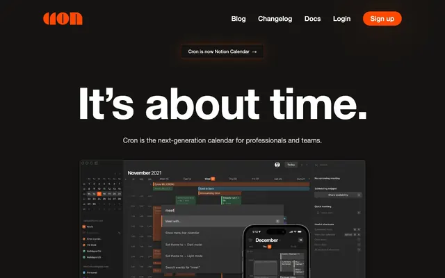
Minimal dark cockpit. Clean contrast of white text on deep gray surfaces, punctuated by a vivid orange accent.
Color palette
Primary call-to-action buttons, prominent interactive elements requiring immediate attention. This is the sole vivid chromatic color used.
More saturated shadow tint for action-oriented elements, creating depth.
Primary page background, footer background.
Button backgrounds for secondary actions.
Primary text color for headlines, body, navigation items, and button text, ensuring high contrast against dark backgrounds.
Secondary text, link underlines, subtle borders and outlines. Provides a softer visual hierarchy than pure white.
Typography
- Weights
- 400, 500, 700
- Sizes
- 13px, 15px, 22px, 140px
- Line height
- 0.9, 1, 1.5, 1.7, 2.88
- Letter spacing
- -0.0210em, 0.0100em
- Fallback
- system-ui, sans-serif
Used universally across all text elements: headlines, body copy, navigation, buttons, and footer links. The wide range of weights and sizes allows for distinct hierarchy within a single, consistent typeface, particularly the oversized weight 700 for display headings.
Spacing & shape
Components
Background: Action Orange (#ff4700). Text: Bright White (#ffffff), Helvetica Neue weight 700. Padding: 0px top, 24px right, 1px bottom, 24px left. Border radius: 4px. No border.
Background: Deep Graphite (#161412). Text: Bright White (#ffffff), Helvetica Neue weight 400. Padding: 0px top, 24px right, 1px bottom, 24px left. Border radius: 4px. Subtle Gray (#cccccc) top border. This button is used for secondary actions or contextual information.
Text: Bright White (#ffffff), Helvetica Neue weight 400, size 15px, line height 1.7. Appears as inline text, not buttonized except for 'Sign up'.
Text: Bright White (#ffffff), Helvetica Neue weight 400, size 13px, line height 1.7. Used for legal and informational links.
Guidelines
- Maintain a clear visual hierarchy by limiting prominent chromatic colors to the Action Orange (#ff4700) for primary CTAs.
- Utilize Bright White (#ffffff) text for primary content and Subtle Gray (#cccccc) for secondary, ensuring high readability on dark backgrounds.
- Apply Helvetica Neue universally, leveraging its differing weights (e.g., 700 for display, 400 for body) to establish content importance.
- Employ `sectionGap` of 80px between main content blocks to maintain a spacious, uncluttered flow.
- Use 4px border radius for all actionable buttons to provide subtle rounding without compromising precision.
- Apply `padding` of 0px top, 24px right, 1px bottom, 24px left for all buttons, maintaining a consistent minimalist vertical spacing.
- Use a 9999px border radius for tags and prominent notifications like 'Cron is now Notion Calendar' to create distinct pill shapes.
- Do not introduce additional vivid chromatic colors beyond the established Action Orange (#ff4700) to maintain focus.
- Avoid using box shadows that introduce strong light colors or blur, as the system relies on flat, high-contrast surfaces augmented by subtle amber tints.
- Do not create extensive text blocks using Helvetica Neue at sizes larger than 22px; large text is reserved for display headlines.
- Avoid generic button styles; every button should either be Primary Call-to-Action (Action Orange) or Secondary (Deep Graphite).
- Do not vary `elementGap` from 16px unless explicitly for full-bleed section alignment or dense content blocks.
- Do not use overly complex or illustrative imagery; prefer UI screenshots or abstract graphics to align with the functional aesthetic.
About this system
ShowHide
This design system evokes a refined, understated dark mode, like a well-crafted instrument panel in a high-end vehicle. Its strength lies in a stark contrast between near-black surfaces and bright white typography, creating immediate clarity. A single, vibrant orange serves as the primary accent, drawing attention only to key interactive elements. The system feels direct and functional, prioritizing information hierarchy and calls to action over decorative flourishes.
The overarching layout is a max-width contained model, centered on the page, providing clear boundaries for content. The hero section is full-bleed dark with a strong centered headline and smaller subtext that guides the eye towards the central product showcase. Section rhythm is primarily established by consistent vertical spacing (80px `sectionGap`) rather than alternating background colors, although subtle variations in surface color (not evident in the main screenshot but common in dark themes) may exist. Content is generally arranged in a stacked, single-column fashion for primary messaging, potentially transitioning to multi-column grids for features or details. Navigation is a simple top bar with left-aligned branding and right-aligned links and a primary CTA button, sticky to the top of the viewport.
The visual language for imagery is predominantly product screenshots, showcasing the cron calendar interface in dark mode. These are presented without ornate treatments, simply as contained, rectangular displays of the application. The primary role of imagery is explanatory and product-showcasing, focusing on functional aspects of the UI rather than decorative or atmospheric elements. There's a notable absence of lifestyle photography or complex illustrations, reinforcing the tool's utilitarian and professional identity.
Reminiscent of Superhuman, Linear, Notion, Figma (dark mode).
# Cron Calendar — Style Reference
> Minimal dark cockpit. Clean contrast of white text on deep gray surfaces, punctuated by a vivid orange accent.

**Theme:** dark

**Site:** https://cron.com

This design system evokes a refined, understated dark mode, like a well-crafted instrument panel in a high-end vehicle. Its strength lies in a stark contrast between near-black surfaces and bright white typography, creating immediate clarity. A single, vibrant orange serves as the primary accent, drawing attention only to key interactive elements. The system feels direct and functional, prioritizing information hierarchy and calls to action over decorative flourishes.

## Tokens — Colors

| Name | Value | Token | Role |
|------|------|------|------|
| Action Orange | `#ff4700` | `--color-action-orange` | Primary call-to-action buttons, prominent interactive elements requiring immediate attention. This is the sole vivid chromatic color used. |
| Deep Ember | `#8b2e09` | `--color-deep-ember` | More saturated shadow tint for action-oriented elements, creating depth. |
| Cron Black | `#0f0d0a` | `--color-cron-black` | Primary page background, footer background. |
| Deep Graphite | `#161412` | `--color-deep-graphite` | Button backgrounds for secondary actions. |
| Bright White | `#ffffff` | `--color-bright-white` | Primary text color for headlines, body, navigation items, and button text, ensuring high contrast against dark backgrounds. |
| Subtle Gray | `#cccccc` | `--color-subtle-gray` | Secondary text, link underlines, subtle borders and outlines. Provides a softer visual hierarchy than pure white. |

## Tokens — Typography

### Helvetica Neue
- **Substitute:** system-ui, sans-serif
- **Weights:** 400, 500, 700
- **Sizes:** 13px, 15px, 22px, 140px
- **Line height:** 0.9, 1, 1.5, 1.7, 2.88
- **Letter spacing:** -0.0210em, 0.0100em
- **Role:** Used universally across all text elements: headlines, body copy, navigation, buttons, and footer links. The wide range of weights and sizes allows for distinct hierarchy within a single, consistent typeface, particularly the oversized weight 700 for display headings.

## Tokens — Type Scale

| Role | Size | Line height | Letter spacing |
|------|------|------|------|
| caption | 13px | 1.7 | — |
| body-sm | 15px | 1.7 | 0.15px |
| body | 22px | 1.5 | — |
| display | 140px | 0.9 | -2.94px |

## Tokens — Spacing

- **Section gap:** 80px
- **Element gap:** 16px

## Tokens — Radius

- **Buttons:** 4px
- **navigationPills:** 9999px

## Layout

The overarching layout is a max-width contained model, centered on the page, providing clear boundaries for content. The hero section is full-bleed dark with a strong centered headline and smaller subtext that guides the eye towards the central product showcase. Section rhythm is primarily established by consistent vertical spacing (80px `sectionGap`) rather than alternating background colors, although subtle variations in surface color (not evident in the main screenshot but common in dark themes) may exist. Content is generally arranged in a stacked, single-column fashion for primary messaging, potentially transitioning to multi-column grids for features or details. Navigation is a simple top bar with left-aligned branding and right-aligned links and a primary CTA button, sticky to the top of the viewport.

## Imagery

The visual language for imagery is predominantly product screenshots, showcasing the cron calendar interface in dark mode. These are presented without ornate treatments, simply as contained, rectangular displays of the application. The primary role of imagery is explanatory and product-showcasing, focusing on functional aspects of the UI rather than decorative or atmospheric elements. There's a notable absence of lifestyle photography or complex illustrations, reinforcing the tool's utilitarian and professional identity.

## Components

### Announcement Pill Banner

### Button Group — Primary & Secondary

### Feature Stat / Metric Cards

### Primary Call-to-Action Button
*Interactive element*

Background: Action Orange (#ff4700). Text: Bright White (#ffffff), Helvetica Neue weight 700. Padding: 0px top, 24px right, 1px bottom, 24px left. Border radius: 4px. No border.

### Secondary Button
*Interactive element*

Background: Deep Graphite (#161412). Text: Bright White (#ffffff), Helvetica Neue weight 400. Padding: 0px top, 24px right, 1px bottom, 24px left. Border radius: 4px. Subtle Gray (#cccccc) top border. This button is used for secondary actions or contextual information.

### Header Navigation Link
*Navigation*

Text: Bright White (#ffffff), Helvetica Neue weight 400, size 15px, line height 1.7. Appears as inline text, not buttonized except for 'Sign up'.

### Footer Link
*Navigation*

Text: Bright White (#ffffff), Helvetica Neue weight 400, size 13px, line height 1.7. Used for legal and informational links.

## Guidelines

### Do

- Maintain a clear visual hierarchy by limiting prominent chromatic colors to the Action Orange (#ff4700) for primary CTAs.
- Utilize Bright White (#ffffff) text for primary content and Subtle Gray (#cccccc) for secondary, ensuring high readability on dark backgrounds.
- Apply Helvetica Neue universally, leveraging its differing weights (e.g., 700 for display, 400 for body) to establish content importance.
- Employ `sectionGap` of 80px between main content blocks to maintain a spacious, uncluttered flow.
- Use 4px border radius for all actionable buttons to provide subtle rounding without compromising precision.
- Apply `padding` of 0px top, 24px right, 1px bottom, 24px left for all buttons, maintaining a consistent minimalist vertical spacing.
- Use a 9999px border radius for tags and prominent notifications like 'Cron is now Notion Calendar' to create distinct pill shapes.

### Don't

- Do not introduce additional vivid chromatic colors beyond the established Action Orange (#ff4700) to maintain focus.
- Avoid using box shadows that introduce strong light colors or blur, as the system relies on flat, high-contrast surfaces augmented by subtle amber tints.
- Do not create extensive text blocks using Helvetica Neue at sizes larger than 22px; large text is reserved for display headlines.
- Avoid generic button styles; every button should either be Primary Call-to-Action (Action Orange) or Secondary (Deep Graphite).
- Do not vary `elementGap` from 16px unless explicitly for full-bleed section alignment or dense content blocks.
- Do not use overly complex or illustrative imagery; prefer UI screenshots or abstract graphics to align with the functional aesthetic.

## Agent Prompt Guide

1. Quick Color Reference:
   - Text: #ffffff
   - Background: #0f0d0a
   - CTA: #ff4700
   - Secondary Text: #cccccc
   - Secondary Background: #161412

2. Example Component Prompts:
   - Create a hero section: 'Cron Black' background. Headline 'It's about time.' in 'Bright White', Helvetica Neue weight 700, size 140px, line height 0.9, letter spacing -2.94px. Subtext 'Cron is the next-generation calendar for professionals and teams.' in 'Bright White', Helvetica Neue weight 400, size 22px, line height 1.5. Center align all text. Ensure a top padding of 80px above the headline.
   - Generate a secondary button: 'Deep Graphite' background. Text 'Cron is now Notion Calendar →' in 'Bright White', Helvetica Neue weight 400, size 15px, letter spacing 0.15px. Padding 0px 24px 1px 24px. Border radius 4px. Top border 1px 'Subtle Gray'.
   - Design a primary navigation bar: 'Cron Black' background. Logo left-aligned. Right-aligned links 'Blog', 'Changelog', 'Docs', 'Login' in 'Bright White', Helvetica Neue weight 400, size 15px, line height 1.7. Followed by a 'Primary Call-to-Action Button' 'Sign up'.
More like this







Keep what you find
A free account saves references to boards and can send you a weekly email of picks based on what you save.
To see every result, go Pro.