Preview image. Unlock full-res
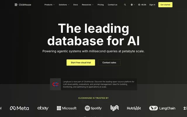
Terminal Console with Chartreuse Zap — a focused dark UI with high-contrast, almost neon, interactive highlights.
Color palette
Primary call-to-action buttons, active navigation indicators, key highlights — commands attention against the dark palette.
Hover states for primary CTAs, subtle interactive borders for focused elements.
Interactive element highlights, subtle glows, accent text.
Decorative element behind focal points, drawing attention with a soft, spreading light.
Primary background, deep sections, text for dark contrast backgrounds.
Secondary background, card surfaces, form fields.
Tertiary background, subtle elevation on dark surfaces.
Divider lines, subtle borders on cards, slight background shifts.
Borders for cards and interactive component outlines.
Navigation backgrounds and elements, subtle interactive states.
Secondary text, inactive states, icons.
Primary text, prominent icons.
Tertiary text, less prominent links and elements.
Navigation text, subtle body text.
Prominent borders, separators; provides a light contrast on dark backgrounds.
Error states, warning indicators; a stark contrast to the primary green.
Typography
- Weights
- 400, 500, 600, 700, 900
- Sizes
- 12px, 14px, 16px, 18px, 20px, 24px, 72px, 96px
- Line height
- 1, 1.33, 1.38, 1.4, 1.43, 1.5, 1.56
- Letter spacing
- -0.01em
- Fallback
- system-ui, sans-serif
Primary typeface for all body text, navigation, buttons, and smaller headings. Its clarity at various sizes supports an information-dense UI. The -0.01em letter-spacing at larger sizes tightens display copy, enhancing its technical feel.
- Weights
- 600
- Sizes
- 20px, 24px, 36px
- Line height
- 1.17, 1.3, 1.4
- Fallback
- system-ui, sans-serif
Captivating typeface for main headings, used sparingly to command attention. Its bold weight and distinct letterforms provide a strong visual anchor against the Inter body. Normal letter-spacing allows the unique character shapes to breathe.
- Weights
- 600
- Sizes
- 16px
- Line height
- 1.5
- Fallback
- monospace
Monospace typeface for code snippets and technical output, ensuring high readability for code-related content. Its fixed-width character design emphasizes precision.
Spacing & shape
Components
backgroundColor: rgba(0, 0, 0, 0), color: #ffffff, borderColor: #faff69, borderRadius: 9999px, padding: 8px 16px. Text uses Inter 400. The roundness combined with the vivid Chartreuse Zap border makes it highly interactive and noticeable.
backgroundColor: rgba(0, 0, 0, 0), color: #ffffff, borderColor: #e5e7eb, borderRadius: 9999px, padding: 8px 16px. Text uses Inter 400. Provides a less intrusive interactive option compared to the primary button due to its neutral border.
backgroundColor: rgba(0, 0, 0, 0), color: #ffffff, borderColor: #faff69, borderRadius: 4px, padding: 0px 32px. Text uses Inter 400. While still Chartreuse-bordered, its rectangular shape signals a more direct, less playful action than the 9999px pill buttons.
backgroundColor: rgba(0, 0, 0, 0), color: #ffffff, borderColor: #e5e7eb, borderRadius: 0px, padding: 0px. Text uses Inter 400. Used for navigational links within content or less emphasized actions.
backgroundColor: rgba(0, 0, 0, 0), color: #1f1f1c, borderColor: #e5e7eb, borderRadius: 9999px, padding: 2px. Text uses Inter 400 (though often icon-only). This is a specialized, smaller button for purely iconic interactions.
backgroundColor: rgba(0, 0, 0, 0), borderRadius: 0px, boxShadow: none, padding: 24px. Primarily used for groupings without a distinct background or elevation, relying on borders or negative space.
backgroundColor: rgba(0,0,0,0), borderBottom: 1px solid #3a3a3a. Uses Inter 18px for question, #ffffff for heading, and #bcbcbb for number indicator. The subtle border and consistent typography maintain content flow within the FAQ section.
color: #bcbcbb for inactive, #faff69 for active/hover. Text uses Inter 500.
Guidelines
- Do use Midnight Oil (#151515) as the default page background to maintain the dark, focused aesthetic.
- Do exclusively use Chartreuse Zap (#faff69) for primary call-to-action buttons and active navigation indicators.
- Do apply a 9999px radius to all interactive buttons and tags for a consistent 'pill' shape, indicating interactivity.
- Do use Inter for all body text and secondary headings, ensuring an -0.01em letter-spacing for large text (72px, 96px).
- Do reserve Basier 600 for prominent headlines (20px, 24px, 36px) to give them visual weight and distinctiveness without overt decoration.
- Do differentiate static content cards with an 8px border-radius and a subtle inset shadow from the background, using Smokey Carbon (#1f1f1c) as their background.
- Do use Inconsolata 600 at 16px for all code snippets and command-line instructions, wrapped in a Smokey Carbon (#1f1f1c) background.
- Don't use any other color besides Chartreuse Zap (#faff69) for primary interactive elements; it dilutes the brand's primary accent.
- Don't use pronounced drop shadows for elevation; rely on subtle inset shadows or shifts in background color (e.g., from Midnight Oil to Smokey Carbon) to indicate depth.
- Don't clutter the layout with excessive imagery; when images are used, ensure they are high-contrast and relevant to the technical context.
- Don't introduce additional font families; restrict typography to Inter, Basier, and Inconsolata to maintain type harmony.
- Don't use large, rounded corners on static content cards; keep them at 8px to distinguish them from the pill-shaped buttons and ensure a structured feel.
- Don't use generic or abstract background patterns; stick to solid dark colors or subtle gradients like Halo Gradient where visual emphasis is needed.
About this system
ShowHide
ClickHouse presents as a high-performance console, leveraging a deep, near-black backdrop and stark white typography for a focused, technical aesthetic. Signature is the 'Chartreuse Zap' yellow-green accent, appearing on interactive elements and key brand highlights, creating a vivid contrast that directs attention without overwhelming the UI. Rounded forms are used sparingly for interactive elements, while container cards maintain sharp corners, building a hierarchy of interaction against static information. The visual atmosphere is one of serious capability and precise feedback, like a terminal display offering critical insights.
The site uses a full-bleed page model with a consistent max-width content container within sections, centered horizontally. The hero section is full-bleed Midnight Oil with a large, centered headline and subtext, followed by two prominent CTA buttons. Section rhythm is primarily defined by consistent vertical spacing (sectionGap '40px') and a subtle alternation of background shades, though the base is always dark. Content arrangement frequently uses 2 to 4-column card grids for features and use cases. Text and visual elements (like icons or code blocks) are often aligned centrally or in clear, symmetrical pairs. The navigation is a sticky top bar with a left-aligned logo and right-aligned links and buttons, all against the dark primary background. The layout prioritizes clear information hierarchy and scannability within a structured, dark environment.
The site uses a mix of icons and occasional abstract graphics. Icons are primarily outlined, thin-stroke, and monocolor (either Cloud White #ffffff or Chartreuse Zap #faff69), reinforcing the technical, precise aesthetic. There's a minimal use of product screenshots, favoring abstract, data-centric visualizations if present, often with a green or yellow glow consistent with the brand accent color. Photography is notably absent. The visual language focuses on UI cleanliness and symbolic representation over literal imagery, making the content and interactive elements the primary visual information. Density is image-light, text-dominant.
Reminiscent of Vercel, Linear, Supabase, Tailwind CSS.
# ClickHouse — Style Reference
> Terminal Console with Chartreuse Zap — a focused dark UI with high-contrast, almost neon, interactive highlights.

**Theme:** dark

**Site:** https://clickhouse.com

ClickHouse presents as a high-performance console, leveraging a deep, near-black backdrop and stark white typography for a focused, technical aesthetic. Signature is the 'Chartreuse Zap' yellow-green accent, appearing on interactive elements and key brand highlights, creating a vivid contrast that directs attention without overwhelming the UI. Rounded forms are used sparingly for interactive elements, while container cards maintain sharp corners, building a hierarchy of interaction against static information. The visual atmosphere is one of serious capability and precise feedback, like a terminal display offering critical insights.

## Tokens — Colors

| Name | Value | Token | Role |
|------|------|------|------|
| Chartreuse Zap | `#faff69` | `--color-chartreuse-zap` | Primary call-to-action buttons, active navigation indicators, key highlights — commands attention against the dark palette. |
| Veridian Stroke | `#4f5100` | `--color-veridian-stroke` | Hover states for primary CTAs, subtle interactive borders for focused elements. |
| Emerald Glint | `#fbff46` | `--color-emerald-glint` | Interactive element highlights, subtle glows, accent text. |
| Halo Gradient | `#faff69` | `--color-halo-gradient` | Decorative element behind focal points, drawing attention with a soft, spreading light. |
| Midnight Oil | `#151515` | `--color-midnight-oil` | Primary background, deep sections, text for dark contrast backgrounds. |
| Smokey Carbon | `#1f1f1c` | `--color-smokey-carbon` | Secondary background, card surfaces, form fields. |
| Deep Graphite | `#282828` | `--color-deep-graphite` | Tertiary background, subtle elevation on dark surfaces. |
| Iron Oxide | `#343434` | `--color-iron-oxide` | Divider lines, subtle borders on cards, slight background shifts. |
| Cool Stone | `#3a3a3a` | `--color-cool-stone` | Borders for cards and interactive component outlines. |
| Muted Ash | `#414141` | `--color-muted-ash` | Navigation backgrounds and elements, subtle interactive states. |
| Shadow White | `#a0a0a0` | `--color-shadow-white` | Secondary text, inactive states, icons. |
| Cloud White | `#ffffff` | `--color-cloud-white` | Primary text, prominent icons. |
| Highlight Silver | `#dfdfdf` | `--color-highlight-silver` | Tertiary text, less prominent links and elements. |
| Silken Whisper | `#bcbcbb` | `--color-silken-whisper` | Navigation text, subtle body text. |
| Border Light | `#e5e7eb` | `--color-border-light` | Prominent borders, separators; provides a light contrast on dark backgrounds. |
| Alert Red | `#ff7575` | `--color-alert-red` | Error states, warning indicators; a stark contrast to the primary green. |

## Tokens — Typography

### Inter
- **Substitute:** system-ui, sans-serif
- **Weights:** 400, 500, 600, 700, 900
- **Sizes:** 12px, 14px, 16px, 18px, 20px, 24px, 72px, 96px
- **Line height:** 1, 1.33, 1.38, 1.4, 1.43, 1.5, 1.56
- **Letter spacing:** -0.01em
- **Role:** Primary typeface for all body text, navigation, buttons, and smaller headings. Its clarity at various sizes supports an information-dense UI. The -0.01em letter-spacing at larger sizes tightens display copy, enhancing its technical feel.

### Basier
- **Substitute:** system-ui, sans-serif
- **Weights:** 600
- **Sizes:** 20px, 24px, 36px
- **Line height:** 1.17, 1.3, 1.4
- **Role:** Captivating typeface for main headings, used sparingly to command attention. Its bold weight and distinct letterforms provide a strong visual anchor against the Inter body. Normal letter-spacing allows the unique character shapes to breathe.

### Inconsolata
- **Substitute:** monospace
- **Weights:** 600
- **Sizes:** 16px
- **Line height:** 1.5
- **Role:** Monospace typeface for code snippets and technical output, ensuring high readability for code-related content. Its fixed-width character design emphasizes precision.

## Tokens — Type Scale

| Role | Size | Line height | Letter spacing |
|------|------|------|------|
| caption | 12px | 1.5 | 0.1px |
| body-sm | 14px | 1.43 | 0.1px |
| body | 16px | 1.5 | 0.1px |
| subheading | 18px | 1.4 | 0.1px |
| heading-sm | 20px | 1.4 | 0.1px |
| heading | 24px | 1.33 | 0.1px |
| heading-lg | 36px | 1.17 | — |
| display | 72px | 1 | 0.1px |
| display-lg | 96px | 1 | 0.1px |

## Tokens — Spacing

- **Section gap:** 40px
- **Card padding:** 24px
- **Element gap:** 8px

## Tokens — Radius

- **Buttons:** 9999px
- **Cards:** 8px
- **inputField:** 4px
- **tags:** 4px

## Layout

The site uses a full-bleed page model with a consistent max-width content container within sections, centered horizontally. The hero section is full-bleed Midnight Oil with a large, centered headline and subtext, followed by two prominent CTA buttons. Section rhythm is primarily defined by consistent vertical spacing (sectionGap '40px') and a subtle alternation of background shades, though the base is always dark. Content arrangement frequently uses 2 to 4-column card grids for features and use cases. Text and visual elements (like icons or code blocks) are often aligned centrally or in clear, symmetrical pairs. The navigation is a sticky top bar with a left-aligned logo and right-aligned links and buttons, all against the dark primary background. The layout prioritizes clear information hierarchy and scannability within a structured, dark environment.

## Imagery

The site uses a mix of icons and occasional abstract graphics. Icons are primarily outlined, thin-stroke, and monocolor (either Cloud White #ffffff or Chartreuse Zap #faff69), reinforcing the technical, precise aesthetic. There's a minimal use of product screenshots, favoring abstract, data-centric visualizations if present, often with a green or yellow glow consistent with the brand accent color. Photography is notably absent. The visual language focuses on UI cleanliness and symbolic representation over literal imagery, making the content and interactive elements the primary visual information. Density is image-light, text-dominant.

## Components

### Use Case Feature Cards

### FAQ Accordion

### Install Code Block & CTA

### Primary Action Button
*Main call to action*

backgroundColor: rgba(0, 0, 0, 0), color: #ffffff, borderColor: #faff69, borderRadius: 9999px, padding: 8px 16px. Text uses Inter 400. The roundness combined with the vivid Chartreuse Zap border makes it highly interactive and noticeable.

### Secondary Outline Button
*Alternative actions*

backgroundColor: rgba(0, 0, 0, 0), color: #ffffff, borderColor: #e5e7eb, borderRadius: 9999px, padding: 8px 16px. Text uses Inter 400. Provides a less intrusive interactive option compared to the primary button due to its neutral border.

### Hero CTA Button
*Prominent hero section action*

backgroundColor: rgba(0, 0, 0, 0), color: #ffffff, borderColor: #faff69, borderRadius: 4px, padding: 0px 32px. Text uses Inter 400. While still Chartreuse-bordered, its rectangular shape signals a more direct, less playful action than the 9999px pill buttons.

### Plain Text Button
*Inline actions or minimal interaction*

backgroundColor: rgba(0, 0, 0, 0), color: #ffffff, borderColor: #e5e7eb, borderRadius: 0px, padding: 0px. Text uses Inter 400. Used for navigational links within content or less emphasized actions.

### Round Icon Button
*Small, interactive icons*

backgroundColor: rgba(0, 0, 0, 0), color: #1f1f1c, borderColor: #e5e7eb, borderRadius: 9999px, padding: 2px. Text uses Inter 400 (though often icon-only). This is a specialized, smaller button for purely iconic interactions.

### Monochrome Card
*Content grouping, less emphasis*

backgroundColor: rgba(0, 0, 0, 0), borderRadius: 0px, boxShadow: none, padding: 24px. Primarily used for groupings without a distinct background or elevation, relying on borders or negative space.

### FAQ Accordion Item
*Expandable content*

backgroundColor: rgba(0,0,0,0), borderBottom: 1px solid #3a3a3a. Uses Inter 18px for question, #ffffff for heading, and #bcbcbb for number indicator. The subtle border and consistent typography maintain content flow within the FAQ section.

### Navigation Link
*Primary navigation elements*

color: #bcbcbb for inactive, #faff69 for active/hover. Text uses Inter 500.

## Guidelines

### Do

- Do use Midnight Oil (#151515) as the default page background to maintain the dark, focused aesthetic.
- Do exclusively use Chartreuse Zap (#faff69) for primary call-to-action buttons and active navigation indicators.
- Do apply a 9999px radius to all interactive buttons and tags for a consistent 'pill' shape, indicating interactivity.
- Do use Inter for all body text and secondary headings, ensuring an -0.01em letter-spacing for large text (72px, 96px).
- Do reserve Basier 600 for prominent headlines (20px, 24px, 36px) to give them visual weight and distinctiveness without overt decoration.
- Do differentiate static content cards with an 8px border-radius and a subtle inset shadow from the background, using Smokey Carbon (#1f1f1c) as their background.
- Do use Inconsolata 600 at 16px for all code snippets and command-line instructions, wrapped in a Smokey Carbon (#1f1f1c) background.

### Don't

- Don't use any other color besides Chartreuse Zap (#faff69) for primary interactive elements; it dilutes the brand's primary accent.
- Don't use pronounced drop shadows for elevation; rely on subtle inset shadows or shifts in background color (e.g., from Midnight Oil to Smokey Carbon) to indicate depth.
- Don't clutter the layout with excessive imagery; when images are used, ensure they are high-contrast and relevant to the technical context.
- Don't introduce additional font families; restrict typography to Inter, Basier, and Inconsolata to maintain type harmony.
- Don't use large, rounded corners on static content cards; keep them at 8px to distinguish them from the pill-shaped buttons and ensure a structured feel.
- Don't use generic or abstract background patterns; stick to solid dark colors or subtle gradients like Halo Gradient where visual emphasis is needed.

## Agent Prompt Guide

### Quick Color Reference
- Text (#ffffff)
- Background (#151515)
- CTA Primary (#faff69)
- Border (#e5e7eb)
- Card Background (#1f1f1c)
- Accent Hover (#4f5100)

### Example Component Prompts
1. Create a Primary Action Button: `backgroundColor: rgba(0, 0, 0, 0), color: #ffffff, borderColor: #faff69, borderRadius: 9999px, padding: 8px 16px`. Text uses Inter 400. Label: 'Get Started'.
2. Create a Feature Card: `backgroundColor: rgba(20, 20, 20, 0.5), borderRadius: 8px, boxShadow: rgba(0, 0, 0, 0.06) 0px 4px 4px 0px, rgba(0, 0, 0, 0.14) 0px 4px 25px 0px inset, padding: 24px`. Headline uses Basier 600 at 24px, color #ffffff. Body text uses Inter 400 at 16px, color #a0a0a0.
3. Create a Code Snippet Block: `backgroundColor: #1f1f1c, color: #e5e7eb, padding: 16px 24px`. Text uses Inconsolata 600 at 16px, lineHeight 1.5. Content: `curl https://clickhouse.com/ | sh`.
4. Create a Hero Headline: `font-family: Basier, font-weight: 600, font-size: 72px, line-height: 1.00, color: #ffffff`. Text: 'The leading database for AI'.
5. Create a Secondary Outline Button: `backgroundColor: rgba(0, 0, 0, 0), color: #ffffff, borderColor: #e5e7eb, borderRadius: 9999px, padding: 8px 16px`. Text uses Inter 400. Label: 'Contact Sales'.
More like this





Keep what you find
A free account saves references to boards and can send you a weekly email of picks based on what you save.
To see every result, go Pro.