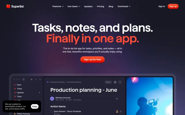
Preview image. Unlock full-res
Dark Nebula with Neon Traces. A cosmic expanse of deep grays and violet, punctuated by sharp, vivid bursts of color that guide the eye.
Color palette
Primary call-to-action button, highlighting urgent or primary interactions against the dark background.
Hover or active state for Rocket Orange, intensifying the call to action.
Accent color for specific iconography or secondary headings, adding a muted chromatic touch.
Decorative highlights, accent text, or specific feature differentiation, adding a vibrant, luminous touch.
Decorative highlights, accent text, or specific feature differentiation, contributing to the vibrant hero section.
Decorative highlights, accent text, or specific feature differentiation, contributing to the vibrant hero section.
Primary background for pages and major sections, setting a dark, immersive tone.
Background for cards, navigation panels, and interactive elements, providing clear differentiation from the main background.
Subtle secondary text, inactive states, and borders, providing high contrast against dark surfaces while maintaining a dark theme.
Navigation links, body text in less prominent areas, and subtle UI accents, a slightly lighter neutral than Nebula Gray.
Primary text color for headlines and key information, ensuring maximum readability.
Prominent text, active navigation items, and icons, a slightly off-white that feels softer than pure white.
Informational highlights or specific link states.
Typography
- Weights
- 400, 600
- Sizes
- 16px, 18px, 24px, 30px, 48px, 70px, 88px
- Line height
- 0.95, 1, 1.1, 1.2, 1.5
- Letter spacing
- -0.48
- Fallback
- Montserrat
Used for smaller headings, navigation items, and input text fields, maintaining a structured, condensed feel.
- Weights
- 400, 600
- Sizes
- 16px, 18px, 24px, 30px, 48px, 70px, 88px
- Line height
- 0.95, 1, 1.1, 1.2, 1.5
- Letter spacing
- -0.02
- Fallback
- Montserrat
Dominant font for all larger headings and display text. Its semi-bold weight at very large sizes (70px, 88px) with tight letter spacing (-2%) creates a powerful, impactful presence that avoids shouting due to its condensed form factor.
- Weights
- 400
- Sizes
- 70px
- Line height
- 0.9
- Letter spacing
- -1.4
- Fallback
- Oswald
Signature display font, often used in combination with Haffer XH SemiBold for hero headlines. Its unusually tight line height and letter spacing give a distinct, almost monospace-like character to large statements.
- Weights
- 400, 500
- Sizes
- 12px, 14px, 16px, 18px
- Line height
- 1.2, 1.3, 1.4
- Letter spacing
- -0.02
- Fallback
- Inter
Used for most body text, links, and supporting details. Its variable weight and spacing ensure legibility across various text densities, providing a comfortable counterpoint to the condensed headlines.
- Weights
- 400, 500
- Sizes
- 12px, 14px, 16px, 18px
- Line height
- 1.2, 1.3, 1.4
- Letter spacing
- -0.02
- Fallback
- Inter
Medium weight for Inter, used for emphasizing phrases within body text or for secondary navigation items, adding moderate emphasis.
- Weights
- 400
- Sizes
- 16px
- Line height
- 1.3
- Letter spacing
- 0
- Fallback
- Roboto Condensed
A distinct custom font blended in for specific body text sections, providing a unique micro-typographic texture compared to Inter.
- Weights
- 500
- Sizes
- 16px
- Line height
- 1.2
- Letter spacing
- 0
- Fallback
- Manrope
Another custom font used for specific body text elements, likely for technical labels or UI elements, offering a clean, modern feel.
- Weights
- 400
- Sizes
- 12px
- Line height
- 1.2
- Letter spacing
- 0
- Fallback
- System UI
Fallback and default for minor UI elements, ensuring basic legibility across all platforms.
Spacing & shape
Elevation
Components
Text link using 'Ghostly Grey' (#8e8da0), weight 400 (Inter) or 600 (Haffer XH SemiBold) at 16px size. No background; simply a text element. Hover state likely uses 'Stardust White' (#f7f7ff) or 'Snow Drift' (#ffffff).
Large text using a combination of 'Haffer XH SemiBold' weight 600 at 88px and 'Jersey 10' weight 400 at 70px. Text color is 'Snow Drift' (#ffffff), with character spacing of -0.02em (-1.4px at 70px, -1.76px at 88px) and a tight line height of 0.90 for Jersey 10 and 0.95 for Haffer XH SemiBold, creating a dense, impactful textual block.
Rectangular card with 'Deep Space' (#181824) background, contrasted from the main page background. Features a generous corner radius of `20px` and likely internal padding of 16px to 24px (inferred from spacing tokens). Testimonial cards are on 'Charcoal Surface' (#26253b) and feature text color 'Snow Drift' (#ffffff).
Guidelines
- Use 'Rocket Orange' (#ff4a36) exclusively for primary calls to action, such as 'Sign up for free' buttons, maintaining its high impact across the site.
- Apply `20px` border-radius to all significant content cards and feature blocks, and `100px` for interactive elements like buttons and input fields, to balance visual softness with system precision.
- Employ the 'Deep Space' (#181824) for page backgrounds and 'Charcoal Surface' (#26253b) for elevated content containers to establish a clear visual hierarchy in the dark theme.
- Pair 'Haffer XH SemiBold' (600 weight) with 'Jersey 10' (400 weight) for large headlines, maintaining a -0.02em letter spacing for a signature condensed and bold statement.
- Utilize Inter font family for all body text in weights 400 and 500, with varying line heights (1.2-1.4) and subtle negative letter spacing (-0.02em, -0.012em, -0.005em) to ensure legibility and a refined feel.
- Maintain a comfortable '10px' as the default element spacing, scaling up to '64px' for section gaps, providing ample breathing room between content blocks.
- Do not introduce new primary accent colors; restrict all vibrant highlights to the established 'Rocket Orange', 'Galaxy Violet', 'Cosmic Pink', 'Neon Pink', and 'Asteroid Yellow' palette.
- Avoid using multiple different font families for body text; stick to Inter, Blender Medium, and Satoshi as designated to prevent visual inconsistency.
- Do not deviate from the established border radii (`20px` for cards, `100px` for buttons/inputs); arbitrary rounding will disrupt the visual consistency.
- Do not use subtle, low-contrast shadows; only apply the `rgba(0, 0, 0, 0.08) 0px 10px 15px 0px` for clear elevation on dark backgrounds, or the `rgba(0,0,0,.1) 0 1px 1px 0, rgba(0,0,0,.05) 0 2px 4px 0, rgba(255,255,255,.45) 0 .5px 0 0 inset` for more complex UI components.
- Never use line heights greater than 1.5 for any text, especially headlines, to maintain the site's condensed and impactful typographic style.
- Do not use pure black (#000000) for text on a dark background; always prioritize the high-contrast 'Snow Drift' (#ffffff) or 'Stardust White' (#f7f7ff) for readability.
- Avoid full-width content; ensure main content areas are logically contained, implicitly aligning to a grid or maximum width, even if no explicit max-width is declared.
About this system
ShowHide
Superlist employs a dark, almost theatrical, aesthetic with intense, contrasting colors to highlight interaction. The deep charcoal and muted violet backgrounds create a sophisticated stage, upon which vibrant pinks and oranges burst forth as calls to action and signifiers of activity. The interplay of strong, condensed headings and softer, spacious body text paired with generous spacing gives the design a comfortable yet decisive presence.
The site uses a full-bleed layout for background elements, but content is generally contained within an implicit maximum width, giving a spacious feel without feeling confined. The hero section is full-viewport, featuring a large, centered headline over a dynamic, dark gradient background. Sections alternate between a dark 'Deep Space' (#181824) background and potentially a slightly lighter variant for feature blocks. Content is often presented in a single, centered stack, or in two-column layouts with text on one side and a product image or screenshot on the other, creating a clear visual flow. Testimonials are arranged in a dynamic, potentially uneven grid of cards. The navigation is a fixed top bar on a dark background, with prominent 'Sign In' and 'Sign up for free' actions.
This site features a blend of product screenshots, abstract gradient backgrounds, and minimal iconography. Product screenshots are typically shown within dark, rounded UI containers, often overlaid on gradient backdrops, emphasizing the application's functionality in context. The abstract graphics are vibrant, evolving gradients (like those in the hero section) that provide a dynamic, futuristic feel without being distracting. Icons are monochrome, often using 'Stardust White' (#f7f7ff) or 'Ghostly Grey' (#8e8da0) on dark surfaces, maintaining a consistent, clean pictogram style. Imagery serves to showcase the product directly or provide decorative atmosphere, sparingly used to balance visual interest with UI focus. Density is moderate, with images playing a primary role in hero sections and feature displays, but giving way to text-dominant layouts in deeper content.
Reminiscent of Linear, Raycast, Notion, Todoist, Craft.do.
# Superlist — Style Reference
> Dark Nebula with Neon Traces. A cosmic expanse of deep grays and violet, punctuated by sharp, vivid bursts of color that guide the eye.

**Theme:** dark

**Site:** https://superlist.com

Superlist employs a dark, almost theatrical, aesthetic with intense, contrasting colors to highlight interaction. The deep charcoal and muted violet backgrounds create a sophisticated stage, upon which vibrant pinks and oranges burst forth as calls to action and signifiers of activity. The interplay of strong, condensed headings and softer, spacious body text paired with generous spacing gives the design a comfortable yet decisive presence.

## Tokens — Colors

| Name | Value | Token | Role |
|------|------|------|------|
| Rocket Orange | `#ff4a36` | `--color-rocket-orange` | Primary call-to-action button, highlighting urgent or primary interactions against the dark background. |
| Flare Orange | `#ff3a26` | `--color-flare-orange` | Hover or active state for Rocket Orange, intensifying the call to action. |
| Comet Tail Violet | `#535676` | `--color-comet-tail-violet` | Accent color for specific iconography or secondary headings, adding a muted chromatic touch. |
| Galaxy Violet | `#9087ff` | `--color-galaxy-violet` | Decorative highlights, accent text, or specific feature differentiation, adding a vibrant, luminous touch. |
| Cosmic Pink | `#f866db` | `--color-cosmic-pink` | Decorative highlights, accent text, or specific feature differentiation, contributing to the vibrant hero section. |
| Neon Pink | `#f739f7` | `--color-neon-pink` | Decorative highlights, accent text, or specific feature differentiation, contributing to the vibrant hero section. |
| Deep Space | `#181824` | `--color-deep-space` | Primary background for pages and major sections, setting a dark, immersive tone. |
| Charcoal Surface | `#26253b` | `--color-charcoal-surface` | Background for cards, navigation panels, and interactive elements, providing clear differentiation from the main background. |
| Nebula Gray | `#696f81` | `--color-nebula-gray` | Subtle secondary text, inactive states, and borders, providing high contrast against dark surfaces while maintaining a dark theme. |
| Ghostly Grey | `#8e8da0` | `--color-ghostly-grey` | Navigation links, body text in less prominent areas, and subtle UI accents, a slightly lighter neutral than Nebula Gray. |
| Snow Drift | `#ffffff` | `--color-snow-drift` | Primary text color for headlines and key information, ensuring maximum readability. |
| Stardust White | `#f7f7ff` | `--color-stardust-white` | Prominent text, active navigation items, and icons, a slightly off-white that feels softer than pure white. |
| Electric Blue | `#2590f1` | `--color-electric-blue` | Informational highlights or specific link states. |

## Tokens — Typography

### Haffer XH SemiBold
- **Substitute:** Montserrat
- **Weights:** 400, 600
- **Sizes:** 16px, 18px, 24px, 30px, 48px, 70px, 88px
- **Line height:** 0.95, 1, 1.1, 1.2, 1.5
- **Letter spacing:** -0.48
- **Role:** Used for smaller headings, navigation items, and input text fields, maintaining a structured, condensed feel.

### Haffer XH SemiBold
- **Substitute:** Montserrat
- **Weights:** 400, 600
- **Sizes:** 16px, 18px, 24px, 30px, 48px, 70px, 88px
- **Line height:** 0.95, 1, 1.1, 1.2, 1.5
- **Letter spacing:** -0.02
- **Role:** Dominant font for all larger headings and display text. Its semi-bold weight at very large sizes (70px, 88px) with tight letter spacing (-2%) creates a powerful, impactful presence that avoids shouting due to its condensed form factor.

### Jersey 10
- **Substitute:** Oswald
- **Weights:** 400
- **Sizes:** 70px
- **Line height:** 0.9
- **Letter spacing:** -1.4
- **Role:** Signature display font, often used in combination with Haffer XH SemiBold for hero headlines. Its unusually tight line height and letter spacing give a distinct, almost monospace-like character to large statements.

### Inter
- **Substitute:** Inter
- **Weights:** 400, 500
- **Sizes:** 12px, 14px, 16px, 18px
- **Line height:** 1.2, 1.3, 1.4
- **Letter spacing:** -0.02
- **Role:** Used for most body text, links, and supporting details. Its variable weight and spacing ensure legibility across various text densities, providing a comfortable counterpoint to the condensed headlines.

### Inter
- **Substitute:** Inter
- **Weights:** 400, 500
- **Sizes:** 12px, 14px, 16px, 18px
- **Line height:** 1.2, 1.3, 1.4
- **Letter spacing:** -0.02
- **Role:** Medium weight for Inter, used for emphasizing phrases within body text or for secondary navigation items, adding moderate emphasis.

### CUSTOM;Blender Medium
- **Substitute:** Roboto Condensed
- **Weights:** 400
- **Sizes:** 16px
- **Line height:** 1.3
- **Letter spacing:** 0
- **Role:** A distinct custom font blended in for specific body text sections, providing a unique micro-typographic texture compared to Inter.

### Satoshi
- **Substitute:** Manrope
- **Weights:** 500
- **Sizes:** 16px
- **Line height:** 1.2
- **Letter spacing:** 0
- **Role:** Another custom font used for specific body text elements, likely for technical labels or UI elements, offering a clean, modern feel.

### sans-serif
- **Substitute:** System UI
- **Weights:** 400
- **Sizes:** 12px
- **Line height:** 1.2
- **Letter spacing:** 0
- **Role:** Fallback and default for minor UI elements, ensuring basic legibility across all platforms.

## Tokens — Type Scale

| Role | Size | Line height | Letter spacing |
|------|------|------|------|
| caption | 12px | 1.2 | — |
| body-sm | 14px | 1.3 | -0.168px |
| body | 16px | 1.4 | -0.08em |
| subheading | 18px | 1.2 | -0.216px |
| heading | 24px | 1.1 | -0.48px |
| heading-lg | 30px | 1.1 | -0.6px |
| display | 48px | 1 | -0.96px |
| display-lg | 70px | 0.9 | -1.4px |
| display-xl | 88px | 0.95 | -1.76px |

## Tokens — Spacing

- **Section gap:** 64px
- **Card padding:** 16px
- **Element gap:** 10px

## Tokens — Radius

- **Buttons:** 100px
- **Inputs:** 100px
- **Cards:** 20px
- **badges:** 8px

## Tokens — Elevation

- **Testimonial Card:** `rgba(0, 0, 0, 0.08) 0px 10px 15px 0px`
- **Navigation Bar:** `rgba(0, 0, 0, 0.1) 0px 1px 1px 0px, rgba(0, 0, 0, 0.05) 0px 2px 4px 0px, rgba(255, 255, 255, 0.45) 0px 0.5px 0px 0px inset`

## Layout

The site uses a full-bleed layout for background elements, but content is generally contained within an implicit maximum width, giving a spacious feel without feeling confined. The hero section is full-viewport, featuring a large, centered headline over a dynamic, dark gradient background. Sections alternate between a dark 'Deep Space' (#181824) background and potentially a slightly lighter variant for feature blocks. Content is often presented in a single, centered stack, or in two-column layouts with text on one side and a product image or screenshot on the other, creating a clear visual flow. Testimonials are arranged in a dynamic, potentially uneven grid of cards. The navigation is a fixed top bar on a dark background, with prominent 'Sign In' and 'Sign up for free' actions.

## Imagery

This site features a blend of product screenshots, abstract gradient backgrounds, and minimal iconography. Product screenshots are typically shown within dark, rounded UI containers, often overlaid on gradient backdrops, emphasizing the application's functionality in context. The abstract graphics are vibrant, evolving gradients (like those in the hero section) that provide a dynamic, futuristic feel without being distracting. Icons are monochrome, often using 'Stardust White' (#f7f7ff) or 'Ghostly Grey' (#8e8da0) on dark surfaces, maintaining a consistent, clean pictogram style. Imagery serves to showcase the product directly or provide decorative atmosphere, sparingly used to balance visual interest with UI focus. Density is moderate, with images playing a primary role in hero sections and feature displays, but giving way to text-dominant layouts in deeper content.

## Components

### CTA Button Group

### Testimonial Cards

### Cookie Consent Banner

### Navigation Link
*Header navigation items*

Text link using 'Ghostly Grey' (#8e8da0), weight 400 (Inter) or 600 (Haffer XH SemiBold) at 16px size. No background; simply a text element. Hover state likely uses 'Stardust White' (#f7f7ff) or 'Snow Drift' (#ffffff).

### Hero Section Headline
*Prominent page titles*

Large text using a combination of 'Haffer XH SemiBold' weight 600 at 88px and 'Jersey 10' weight 400 at 70px. Text color is 'Snow Drift' (#ffffff), with character spacing of -0.02em (-1.4px at 70px, -1.76px at 88px) and a tight line height of 0.90 for Jersey 10 and 0.95 for Haffer XH SemiBold, creating a dense, impactful textual block.

### Feature Card
*Content container for features or testimonials*

Rectangular card with 'Deep Space' (#181824) background, contrasted from the main page background. Features a generous corner radius of `20px` and likely internal padding of 16px to 24px (inferred from spacing tokens). Testimonial cards are on 'Charcoal Surface' (#26253b) and feature text color 'Snow Drift' (#ffffff).

## Guidelines

### Do

- Use 'Rocket Orange' (#ff4a36) exclusively for primary calls to action, such as 'Sign up for free' buttons, maintaining its high impact across the site.
- Apply `20px` border-radius to all significant content cards and feature blocks, and `100px` for interactive elements like buttons and input fields, to balance visual softness with system precision.
- Employ the 'Deep Space' (#181824) for page backgrounds and 'Charcoal Surface' (#26253b) for elevated content containers to establish a clear visual hierarchy in the dark theme.
- Pair 'Haffer XH SemiBold' (600 weight) with 'Jersey 10' (400 weight) for large headlines, maintaining a -0.02em letter spacing for a signature condensed and bold statement.
- Utilize Inter font family for all body text in weights 400 and 500, with varying line heights (1.2-1.4) and subtle negative letter spacing (-0.02em, -0.012em, -0.005em) to ensure legibility and a refined feel.
- Maintain a comfortable '10px' as the default element spacing, scaling up to '64px' for section gaps, providing ample breathing room between content blocks.

### Don't

- Do not introduce new primary accent colors; restrict all vibrant highlights to the established 'Rocket Orange', 'Galaxy Violet', 'Cosmic Pink', 'Neon Pink', and 'Asteroid Yellow' palette.
- Avoid using multiple different font families for body text; stick to Inter, Blender Medium, and Satoshi as designated to prevent visual inconsistency.
- Do not deviate from the established border radii (`20px` for cards, `100px` for buttons/inputs); arbitrary rounding will disrupt the visual consistency.
- Do not use subtle, low-contrast shadows; only apply the `rgba(0, 0, 0, 0.08) 0px 10px 15px 0px` for clear elevation on dark backgrounds, or the `rgba(0,0,0,.1) 0 1px 1px 0, rgba(0,0,0,.05) 0 2px 4px 0, rgba(255,255,255,.45) 0 .5px 0 0 inset` for more complex UI components.
- Never use line heights greater than 1.5 for any text, especially headlines, to maintain the site's condensed and impactful typographic style.
- Do not use pure black (#000000) for text on a dark background; always prioritize the high-contrast 'Snow Drift' (#ffffff) or 'Stardust White' (#f7f7ff) for readability.
- Avoid full-width content; ensure main content areas are logically contained, implicitly aligning to a grid or maximum width, even if no explicit max-width is declared.

## Agent Prompt Guide

### Quick Color Reference
- Text (Primary): #ffffff
- Background (Primary): #181824
- CTA Button: #ff4a36
- Card Background: #26253b
- Neutral Text: #696f81
- Accent Highlight: #f866db

### 3-5 Example Component Prompts
1. Create a Hero Section: Background is a full-bleed dark gradient. Centered Headline 'Tasks, notes, and plans.' uses 'Haffer XH SemiBold' weight 600 at 88px, #ffffff, letter-spacing -1.76px. Subheadline 'Finally in one app.' uses 'Jersey 10' weight 400 at 70px, #ffffff, letter-spacing -1.4px. Body text below uses Inter weight 400 at 18px, #696f81, line-height 1.4, letter-spacing -0.012em. A 'Sign up for free' button is centered below, with #ff4a36 background, #ffffff text, 100px border-radius, padding 10px-20px (inferred to match visual style).
2. Design a Testimonial Card: Background is 'Charcoal Surface' #26253b, with a 20px border-radius. Text uses Inter weight 400 at 16px, line-height 1.4, #ffffff color. Apply shadow `rgba(0, 0, 0, 0.08) 0px 10px 15px 0px` for elevation.
3. Create a Navigation Bar: Background 'Deep Space' #181824. Links use 'Ghostly Grey' #8e8da0, Haffer XH SemiBold weight 400 at 16px. Active links use 'Stardust White' #f7f7ff. Include a 'Sign up for free' button (using 'Rocket Orange' #ff4a36 background, 'Snow Drift' #ffffff text, 100px radius, 10px-20px padding) and a 'Sign In' text link ('Snow Drift' #ffffff). The bar should have a subtle shadow: `rgba(0, 0, 0, 0.1) 0px 1px 1px 0px, rgba(0, 0, 0, 0.05) 0px 2px 4px 0px, rgba(255, 255, 255, 0.45) 0px 0.5px 0px 0px inset`.
More like this





Keep what you find
A free account saves references to boards and can send you a weekly email of picks based on what you save.
To see every result, go Pro.