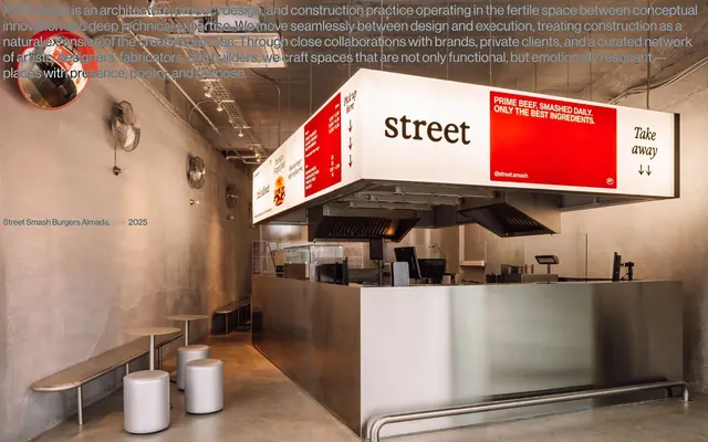
Preview image. Unlock full-res
gallery label on raw concrete
Color palette
Page backgrounds, body text contrast, focal text elements
Most body text, link text, primary heading text
Subtle borders for navigation items, links, and containers — provides a minimal visual separation without strong lines
Typography
- Weights
- 400
- Sizes
- 17px, 28px
- Line height
- 1.14, 1.18
- Fallback
- Helvetica Neue
Primary typeface for all content including headings, body, links, and navigation. Its singular weight and precise letter spacing contribute to the system's unadorned, direct presentation style.
Spacing & shape
Components
Black text (#000000) on Canvas White (#ffffff) background, with a Concrete Gray (#e5e7eb) bottom border on hover/active state to indicate interactivity. Uses Neue Haas Grotesk at 17px, weight 400.
Carbon Black (#000000) text on Canvas White (#ffffff) background. Uses Neue Haas Grotesk at 17px, weight 400, with 6px horizontal padding and 4px vertical padding.
Carbon Black (#000000) text for project titles, with smaller text for auxiliary information like 'year'. Uses Neue Haas Grotesk, 28px for titles and 17px for details, weight 400. Text is presented directly on the Canvas White (#ffffff) background.
Guidelines
- Always use Neue Haas Grotesk (or Helvetica Neue) at weight 400 for all textual elements.
- Prioritize Carbon Black (#000000) for all text on Canvas White (#ffffff) backgrounds.
- Implement a subtle Concrete Gray (#e5e7eb) border for interactive elements to signal state change.
- Maintain a compact density, using 4px and 6px for internal component and element spacing.
- Utilize 225px as a primary vertical margin for significant section breaks or footer separation.
- Keep all corners sharp with a 0px border radius, reinforcing the architectural aesthetic.
- Avoid using any saturated or vivid colors; restrict the palette strictly to the defined monochrome neutrals.
- Do not introduce multiple font weights or styles; maintain the singular weight 400 for consistency.
- Refrain from using shadows or any form of elevation; elements should appear flat and integrated with the surface.
- Do not deviate from the specified spacing units of 4px, 6px, and 225px for elements and sections.
- Never add unnecessary decorative elements or complex backgrounds; the design should remain unembellished.
About this system
ShowHide
XXXI.studio employs a stark, almost architectural aesthetic, reminiscent of an unembellished gallery space. The design system is characterized by a high-contrast monochrome palette, minimal use of visual hierarchy, and precise typographic arrangements that feel more like labels and captions than flowing text. Emphasis is placed on direct content presentation with a sense of restrained utility and a muted, almost industrial background through subtle borders.
The page adheres to a full-bleed layout, effectively using the entire viewport without a defined container width. The hero section features a full-screen image with minimal, centered text overlaid. Sections are demarcated by significant vertical spacing, particularly a 225px margin, rather than explicit dividers or alternating backgrounds. Content arrangement is primarily stacked or presented as direct visual showcases. Navigation appears minimal, typically located at the header and footer, acting more as metadata or project labels than traditional interactive menus.
The site's imagery consists solely of large, full-bleed architectural photography, primarily of interior spaces. These images are functional, acting as background canvases more than distinct content pieces, showcasing the studio's output directly. The treatment of images is raw and unmasked, allowing the photography's natural textures and lighting to define the visual atmosphere. Density is high, with imagery encompassing large portions of the screen, leaving text elements overlaid or adjacent, suggesting the visual documentation is paramount.
Reminiscent of Norm Architects, Studio McGee (pre-eCommerce), The Future Kept, Apartamento Magazine.
# XXXI.studio — Style Reference
> gallery label on raw concrete

**Theme:** light

**Site:** https://xxxi.studio

XXXI.studio employs a stark, almost architectural aesthetic, reminiscent of an unembellished gallery space. The design system is characterized by a high-contrast monochrome palette, minimal use of visual hierarchy, and precise typographic arrangements that feel more like labels and captions than flowing text. Emphasis is placed on direct content presentation with a sense of restrained utility and a muted, almost industrial background through subtle borders.

## Tokens — Colors

| Name | Value | Token | Role |
|------|------|------|------|
| Canvas White | `#ffffff` | `--color-canvas-white` | Page backgrounds, body text contrast, focal text elements |
| Carbon Black | `#000000` | `--color-carbon-black` | Most body text, link text, primary heading text |
| Concrete Gray | `#e5e7eb` | `--color-concrete-gray` | Subtle borders for navigation items, links, and containers — provides a minimal visual separation without strong lines |

## Tokens — Typography

### Neue Haas Grotesk
- **Substitute:** Helvetica Neue
- **Weights:** 400
- **Sizes:** 17px, 28px
- **Line height:** 1.14, 1.18
- **Role:** Primary typeface for all content including headings, body, links, and navigation. Its singular weight and precise letter spacing contribute to the system's unadorned, direct presentation style.

## Tokens — Spacing

- **Card padding:** 4px
- **Element gap:** 4px

## Tokens — Radius

- **Default:** 0px

## Layout

The page adheres to a full-bleed layout, effectively using the entire viewport without a defined container width. The hero section features a full-screen image with minimal, centered text overlaid. Sections are demarcated by significant vertical spacing, particularly a 225px margin, rather than explicit dividers or alternating backgrounds. Content arrangement is primarily stacked or presented as direct visual showcases. Navigation appears minimal, typically located at the header and footer, acting more as metadata or project labels than traditional interactive menus.

## Imagery

The site's imagery consists solely of large, full-bleed architectural photography, primarily of interior spaces. These images are functional, acting as background canvases more than distinct content pieces, showcasing the studio's output directly. The treatment of images is raw and unmasked, allowing the photography's natural textures and lighting to define the visual atmosphere. Density is high, with imagery encompassing large portions of the screen, leaving text elements overlaid or adjacent, suggesting the visual documentation is paramount.

## Components

### Navigation Link
*Interactive text link, primarily in navigation context.*

Black text (#000000) on Canvas White (#ffffff) background, with a Concrete Gray (#e5e7eb) bottom border on hover/active state to indicate interactivity. Uses Neue Haas Grotesk at 17px, weight 400.

### Footer Copyright
*Legal and copyright information.*

Carbon Black (#000000) text on Canvas White (#ffffff) background. Uses Neue Haas Grotesk at 17px, weight 400, with 6px horizontal padding and 4px vertical padding.

### Project Label
*Labeling specific projects or items.*

Carbon Black (#000000) text for project titles, with smaller text for auxiliary information like 'year'. Uses Neue Haas Grotesk, 28px for titles and 17px for details, weight 400. Text is presented directly on the Canvas White (#ffffff) background.

## Guidelines

### Do

- Always use Neue Haas Grotesk (or Helvetica Neue) at weight 400 for all textual elements.
- Prioritize Carbon Black (#000000) for all text on Canvas White (#ffffff) backgrounds.
- Implement a subtle Concrete Gray (#e5e7eb) border for interactive elements to signal state change.
- Maintain a compact density, using 4px and 6px for internal component and element spacing.
- Utilize 225px as a primary vertical margin for significant section breaks or footer separation.
- Keep all corners sharp with a 0px border radius, reinforcing the architectural aesthetic.

### Don't

- Avoid using any saturated or vivid colors; restrict the palette strictly to the defined monochrome neutrals.
- Do not introduce multiple font weights or styles; maintain the singular weight 400 for consistency.
- Refrain from using shadows or any form of elevation; elements should appear flat and integrated with the surface.
- Do not deviate from the specified spacing units of 4px, 6px, and 225px for elements and sections.
- Never add unnecessary decorative elements or complex backgrounds; the design should remain unembellished.

## Agent Prompt Guide

Quick Color Reference:
text: #000000
background: #ffffff
border: #e5e7eb
accent: no distinct accent color
primary action: no distinct CTA color

Example Component Prompts:
1. Create a page hero: Full-bleed architectural image as background. Overlay 'XXXI.studio' as a heading at 28px Neue Haas Grotesk weight 400, #000000, centered at the top.
2. Design a project listing item: 'Street Smash Burgers Almada' as title at 28px Neue Haas Grotesk weight 400, #000000. 'year 2025' as subtitle at 17px Neue Haas Grotesk weight 400, #000000. Each item appears on a Canvas White (#ffffff) background.
3. Implement a primary navigation item: Text 'Info' in Carbon Black (#000000) at 17px Neue Haas Grotesk weight 400. On hover, apply a 1px solid Concrete Gray (#e5e7eb) bottom border, extending the full width of the text with 6px horizontal padding.
More like this









Keep what you find
A free account saves references to boards and can send you a weekly email of picks based on what you save.
To see every result, go Pro.