Preview image. Unlock full-res
Ordered Editorial Ink
Color palette
Page backgrounds, surface base, subtle borders and dividers that define structure without visual weight
Secondary body text, navigation labels, and subdued headings. Do not promote it to the primary CTA color
Secondary text, descriptive paragraphs, list items, and subtle hero text, offering a softer reading experience than primary text
Background for primary call-to-action buttons, providing a deep, solid presence for key interactions
Background for secondary action buttons, providing a slightly lighter alternative to primary button backgrounds
Decorative icons and fills where pure black is used to create sharp, small accents
Specific prominent headings and links, adding a slightly different shade to distinguish certain textual elements
Muted text in links and headings, serving as a lower-contrast visual for less emphasized information
Subtle borders and dividers, providing a slightly darker line than Canvas Porcelain for structural definition
Specific heading elements with a muted, understated tone
Typography
- Weights
- 400, 500, 600, 700
- Sizes
- 14px, 16px, 18px, 22px, 24px, 28px, 32px, 40px
- Line height
- 1.25, 1.5
- Letter spacing
- 0.0250em, 0.1000em
- Fallback
- Inter
Primary grotesque sans-serif for headings, body text, and interactive elements. Its neutral yet confident presence provides the main voice of the content, with moderate tracking at larger sizes to maintain clarity.
- Weights
- 400
- Sizes
- 14px, 20px, 22px, 28px
- Line height
- 1.4, 1.5
- Letter spacing
- normal
- Fallback
- Lora
A serif font used for select headings, links, and specific long-form content. Its classic proportions provide an intellectual counterpoint to the sans-serif, signaling depth and traditional editorial quality.
Spacing & shape
Components
Background: Midnight Ink (#1a202c), Text: Canvas Porcelain (#e5e7eb), Padding: 8px vertical, 12px horizontal. Border radius: 0px. Font: Degular.
Background: Jet Button (#222222), Text: Canvas Porcelain (#ffffff), Padding: 8px vertical, 12px horizontal. Border radius: 4px. Font: Degular.
Background: transparent, Text: Ebony Text (#111827), Padding: 8px square. Border radius: 6px. Font: Degular.
Text: Ebony Text (#111827) for active, Graphite Text (#374151) for inactive. Underline on hover. Border radius: 3px for focused/active states.
Background: Canvas Porcelain (#e5e7eb), Border: 1px solid Canvas Porcelain (#e5e7eb). Text: Ebony Text (#111827). Padding: likely 8-12px.
No explicit card background, assumes Canvas Porcelain (#e5e7eb) as background. Text: Ebony Text (#111827) for roles, Graphite Text (#374151) for descriptions. Defined by vertical spacing.
Border radius: 3px. No explicit border, image is contained directly.
Guidelines
- Prioritize text content: use Ebony Text (#111827) and Graphite Text (#374151) for all primary and secondary text, ensuring AAA contrast against Canvas Porcelain (#e5e7eb).
- Maintain a clear hierarchy with Degular for headings and interactive elements, and Blanco for specific editorial and long-form content.
- Utilize Canvas Porcelain (#e5e7eb) as the dominant background and base for all surfaces and subtly defining structural borders.
- Employ consistent vertical rhythm in content sections, defaulting to 27px for body paragraphs and 40px for list item separation.
- Apply 3px border radius to navigation items, links, and contained images for a subtle softening of edges, contrasting with the sharp 0px radius for primary buttons.
- Use Midnight Ink (#1a202c) exclusively for primary filled button backgrounds to signal key actions.
- Distribute elements with a base element gap of 8px, scaling up for larger section spacing where needed.
- Avoid introducing vibrant or saturated colors; maintain the predominantly monochrome palette with subtle shifts in grey.
- Do not use heavy shadows or excessive elevation; the system relies on subtle borders and spacing for visual separation.
- Refrain from drastically altering font weights or letter spacing beyond the defined Degular and Blanco profiles, especially avoiding tight tracking on body text.
- Do not deviate from the strict 0px radius for primary filled buttons; this is a signature sharp detail.
- Avoid large, ornate, or busy graphical elements; visual communication should remain direct and content-focused.
- Do not use multiple background colors for successive sections; maintain a seamless flow or use Canvas Porcelain with subtle internal borders.
- Do not use generic system fonts; stick to Degular and Blanco to uphold the distinct brand voice.
About this system
ShowHide
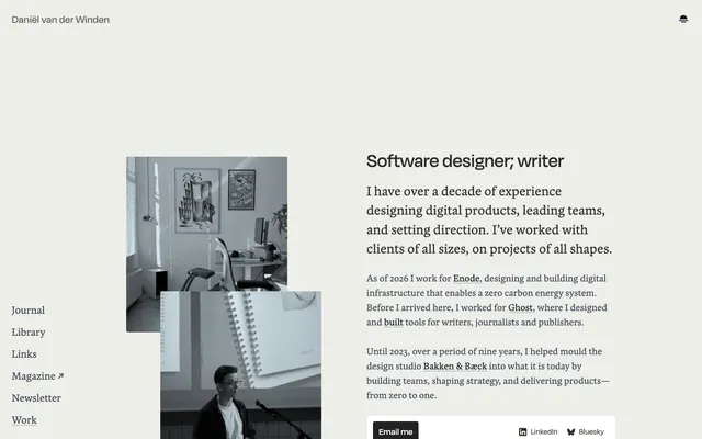
Daniël van der Winden's personal site embodies a focused, editorial aesthetic, reminiscent of a neatly organized journal or academic publication. It prioritizes clarity and directness through a largely monochrome palette, functional typography, and structured content presentation. Visual elements are sparse, with strong emphasis on text, creating an atmosphere of quiet intellectual authority. The design system is characterized by subtle greys, crisp lines, and a deliberate absence of vibrant color, allowing the content to take center stage.
The page primarily uses a contained layout with a maximum width of 1600px, centering content within the Canvas Porcelain background. The hero section presents a combination of text and imagery, arranged as a split screen or with imagery serving as context for the text. Content sections are typically text-dominant, with a clear vertical flow and consistent spacing, avoiding busy or overlapping elements. A prominent left-hand navigation column remains fixed, echoing a desk-bound journal. Features and resume entries are presented in a clean, stacked list-like fashion, defined by strong typographic hierarchy and generous line spacing rather than visual containers. The density is comfortable, with ample breathing room around text blocks and between sections.
Imagery is used sparingly, primarily focusing on candid, slightly desaturated, or monochromatic photography and product shots, often contained within a 3px rounded border. The images serve to provide context or a personal touch rather than being decorative. There are no illustrations or elaborate graphics; the visual language is direct and non-intrusive. Icons are simple, outlined, and monochromatic (Shadow Icon or Ebony Text), acting as functional cues like external link indicators.
Reminiscent of Read.cv, Superlist, Ghost CMS, Linear.
# Daniël van der Winden — Style Reference
> Ordered Editorial Ink

**Theme:** light

**Site:** https://www.daniel.pizza

Daniël van der Winden's personal site embodies a focused, editorial aesthetic, reminiscent of a neatly organized journal or academic publication. It prioritizes clarity and directness through a largely monochrome palette, functional typography, and structured content presentation. Visual elements are sparse, with strong emphasis on text, creating an atmosphere of quiet intellectual authority. The design system is characterized by subtle greys, crisp lines, and a deliberate absence of vibrant color, allowing the content to take center stage.

## Tokens — Colors

| Name | Value | Token | Role |
|------|------|------|------|
| Canvas Porcelain | `#e5e7eb` | `--color-canvas-porcelain` | Page backgrounds, surface base, subtle borders and dividers that define structure without visual weight |
| Ebony Text | `#111827` | `--color-ebony-text` | Secondary body text, navigation labels, and subdued headings. Do not promote it to the primary CTA color |
| Graphite Text | `#374151` | `--color-graphite-text` | Secondary text, descriptive paragraphs, list items, and subtle hero text, offering a softer reading experience than primary text |
| Midnight Ink | `#1a202c` | `--color-midnight-ink` | Background for primary call-to-action buttons, providing a deep, solid presence for key interactions |
| Jet Button | `#222222` | `--color-jet-button` | Background for secondary action buttons, providing a slightly lighter alternative to primary button backgrounds |
| Shadow Icon | `#000000` | `--color-shadow-icon` | Decorative icons and fills where pure black is used to create sharp, small accents |
| Slate Text | `#2a2a28` | `--color-slate-text` | Specific prominent headings and links, adding a slightly different shade to distinguish certain textual elements |
| Ash Text | `#676867` | `--color-ash-text` | Muted text in links and headings, serving as a lower-contrast visual for less emphasized information |
| Fog Border | `#c4c6c8` | `--color-fog-border` | Subtle borders and dividers, providing a slightly darker line than Canvas Porcelain for structural definition |
| Stone Text | `#7b7c7c` | `--color-stone-text` | Specific heading elements with a muted, understated tone |

## Tokens — Typography

### Degular
- **Substitute:** Inter
- **Weights:** 400, 500, 600, 700
- **Sizes:** 14px, 16px, 18px, 22px, 24px, 28px, 32px, 40px
- **Line height:** 1.25, 1.5
- **Letter spacing:** 0.0250em, 0.1000em
- **Role:** Primary grotesque sans-serif for headings, body text, and interactive elements. Its neutral yet confident presence provides the main voice of the content, with moderate tracking at larger sizes to maintain clarity.

### Blanco
- **Substitute:** Lora
- **Weights:** 400
- **Sizes:** 14px, 20px, 22px, 28px
- **Line height:** 1.4, 1.5
- **Letter spacing:** normal
- **Role:** A serif font used for select headings, links, and specific long-form content. Its classic proportions provide an intellectual counterpoint to the sans-serif, signaling depth and traditional editorial quality.

## Tokens — Type Scale

Major Second (1.125) from 16px base.

| Role | Size | Line height | Letter spacing |
|------|------|------|------|
| body-sm | 14px | 1.5 | — |
| body | 16px | 1.5 | — |
| subheading | 18px | 1.5 | — |
| heading | 22px | 1.25 | — |
| heading-lg | 24px | 1.25 | — |
| display-sm | 28px | 1.25 | — |
| display | 32px | 1.25 | — |

## Tokens — Spacing

- **Max width:** 1600px
- **Section gap:** 24px
- **Card padding:** 12px
- **Element gap:** 8px

## Tokens — Radius

- **Buttons:** 0px
- **Cards:** 3px
- **navigation:** 3px
- **other:** 8px

## Layout

The page primarily uses a contained layout with a maximum width of 1600px, centering content within the Canvas Porcelain background. The hero section presents a combination of text and imagery, arranged as a split screen or with imagery serving as context for the text. Content sections are typically text-dominant, with a clear vertical flow and consistent spacing, avoiding busy or overlapping elements. A prominent left-hand navigation column remains fixed, echoing a desk-bound journal. Features and resume entries are presented in a clean, stacked list-like fashion, defined by strong typographic hierarchy and generous line spacing rather than visual containers. The density is comfortable, with ample breathing room around text blocks and between sections.

## Imagery

Imagery is used sparingly, primarily focusing on candid, slightly desaturated, or monochromatic photography and product shots, often contained within a 3px rounded border. The images serve to provide context or a personal touch rather than being decorative. There are no illustrations or elaborate graphics; the visual language is direct and non-intrusive. Icons are simple, outlined, and monochromatic (Shadow Icon or Ebony Text), acting as functional cues like external link indicators.

## Components

### Primary Filled Button
*Main call-to-action button, conveying prominence.*

Background: Midnight Ink (#1a202c), Text: Canvas Porcelain (#e5e7eb), Padding: 8px vertical, 12px horizontal. Border radius: 0px. Font: Degular.

### Email Button
*Secondary action button for personal contacts, slightly softer than primary.*

Background: Jet Button (#222222), Text: Canvas Porcelain (#ffffff), Padding: 8px vertical, 12px horizontal. Border radius: 4px. Font: Degular.

### Ghost Icon Button
*Subtle interactive button, often for icons or secondary actions, maintaining minimal visual footprint.*

Background: transparent, Text: Ebony Text (#111827), Padding: 8px square. Border radius: 6px. Font: Degular.

### Navigation Link
*Interactive elements within the left-hand navigation, indicating selectable items.*

Text: Ebony Text (#111827) for active, Graphite Text (#374151) for inactive. Underline on hover. Border radius: 3px for focused/active states.

### Text Input (Default)
*Standard input field for user data entry.*

Background: Canvas Porcelain (#e5e7eb), Border: 1px solid Canvas Porcelain (#e5e7eb). Text: Ebony Text (#111827). Padding: likely 8-12px.

### Resume Entry Card
*Presenting individual job or project entries in a structured list.*

No explicit card background, assumes Canvas Porcelain (#e5e7eb) as background. Text: Ebony Text (#111827) for roles, Graphite Text (#374151) for descriptions. Defined by vertical spacing.

### Image Wrapper
*Container for imagery, providing subtle shaping.*

Border radius: 3px. No explicit border, image is contained directly.

## Guidelines

### Do

- Prioritize text content: use Ebony Text (#111827) and Graphite Text (#374151) for all primary and secondary text, ensuring AAA contrast against Canvas Porcelain (#e5e7eb).
- Maintain a clear hierarchy with Degular for headings and interactive elements, and Blanco for specific editorial and long-form content.
- Utilize Canvas Porcelain (#e5e7eb) as the dominant background and base for all surfaces and subtly defining structural borders.
- Employ consistent vertical rhythm in content sections, defaulting to 27px for body paragraphs and 40px for list item separation.
- Apply 3px border radius to navigation items, links, and contained images for a subtle softening of edges, contrasting with the sharp 0px radius for primary buttons.
- Use Midnight Ink (#1a202c) exclusively for primary filled button backgrounds to signal key actions.
- Distribute elements with a base element gap of 8px, scaling up for larger section spacing where needed.

### Don't

- Avoid introducing vibrant or saturated colors; maintain the predominantly monochrome palette with subtle shifts in grey.
- Do not use heavy shadows or excessive elevation; the system relies on subtle borders and spacing for visual separation.
- Refrain from drastically altering font weights or letter spacing beyond the defined Degular and Blanco profiles, especially avoiding tight tracking on body text.
- Do not deviate from the strict 0px radius for primary filled buttons; this is a signature sharp detail.
- Avoid large, ornate, or busy graphical elements; visual communication should remain direct and content-focused.
- Do not use multiple background colors for successive sections; maintain a seamless flow or use Canvas Porcelain with subtle internal borders.
- Do not use generic system fonts; stick to Degular and Blanco to uphold the distinct brand voice.

## Agent Prompt Guide

Quick Color Reference:
text: #111827
background: #e5e7eb
border: #e5e7eb
accent: no distinct accent color
primary action: no distinct CTA color

Example Component Prompts:
No distinct primary action color was observed; use the extracted neutral button treatments instead of inventing a filled CTA color.
Create a navigation link for an active state: Text Ebony Text (#111827), Degular font weight 400, 3px border radius, no background.
Create a resume entry heading: Text Ebony Text (#111827), Degular font weight 500, size 22px, line height 1.25. Below it, a description: Text Graphite Text (#374151), Degular font weight 400, size 16px, line height 1.5.
Create a subtle interactive ghost button: Transparent background, Text Ebony Text (#111827), 8px square padding, 6px border radius, Degular font weight 400.
Create a content paragraph: Text Graphite Text (#374151), Degular font weight 400, size 16px, line height 1.5, with 27px bottom margin.
More like this









Keep what you find
A free account saves references to boards and can send you a weekly email of picks based on what you save.
To see every result, go Pro.