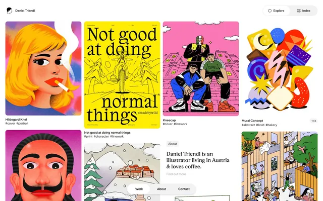
Preview image. Unlock full-res
Gallery wall of stark contrasts
Color palette
Page and primary surface backgrounds
Primary text, headings, icons, borders for UI elements and hover states. Establishes the high-contrast foundation
Subtle background for navigation and secondary sections, distinguishing content blocks with minimal visual impact
Secondary text, muted borders, and disabled link states. Provides a softer visual option while maintaining achromatic consistency
Typography
- Weights
- 400
- Sizes
- 14px
- Line height
- 1.2, 1.21
- Letter spacing
- -0.0100em
- Fallback
- serif
Base text and some navigational elements, providing a classic, structured counterpoint to the custom sans-serifs.
- Weights
- 400
- Sizes
- 14px
- Line height
- 1.2, 1.21
- Letter spacing
- -0.0100em
- Fallback
- Arial, sans-serif
General body text and subheadings, offering a clean, contemporary feel without ornate details.
- Weights
- 500
- Sizes
- 10px, 14px
- Line height
- 1, 1.21
- Letter spacing
- -0.0100em
- Fallback
- Arial, sans-serif
Used for small labels, navigation items, and buttons, its medium weight ensures legibility even at smaller sizes without losing crispness.
- Weights
- 400
- Sizes
- 24px
- Line height
- 1.17
- Letter spacing
- -0.0060em
- Fallback
- Georgia, serif
Signature display font for headings and prominent titles. Its distinct character provides a stylistic flourish within the largely minimalist aesthetic.
Spacing & shape
Components
Transparent background, no border, no padding, no shadow. Content within dictates visual boundaries. Radius is 0px directly on the card, but visual elements within it sometimes have radii of 10px or 16px.
Background 'rgba(0, 0, 0, 0)', text 'rgb(0, 0, 0)', border 'rgb(0, 0, 0)'. No padding, no border radius. These buttons are purely text-based and rely on the active text color for their interactive state on hover.
Text in 'Midnight Black' (#000000). On hover or active, the text color changes or a thin border appears below.
Background 'Midnight Black' (#000000) with 'Canvas White' (#ffffff) text. Features a large border radius (48px) to create a pill or circular shape. Padding is usually implicit around text content.
Guidelines
- Prioritize 'Canvas White' (#ffffff) for all main backgrounds and 'Midnight Black' (#000000) for primary text and interface elements to maintain high contrast.
- Use 'UniversalSans' weights 400 and 500 for most body copy and labels, and ‘Rza’ font for headings, adhering to the specified type scale: 10px (UniversalSans-500) for captions, 14px (UniversalSans-400) for body, and 24px (Rza) for headings.
- Apply precise letter-spacing: -0.0100em for 'Times' and 'UniversalSans' and -0.0060em for 'Rza' to maintain distinct typographic rhythm.
- Implement interactive elements like Ghost Buttons with transparent backgrounds and 'Midnight Black' borders or text for a subtle, print-like interaction.
- Utilize 'Soft Gray' (#f2f2f2) sparingly for secondary background areas or dividers, creating soft visual separation without introducing strong color.
- Use geometric shapes for navigation elements (e.g., circular floating action buttons with 48px radius) to introduce subtle design flair.
- Maintain a compact density with an 'elementGap' of '6px' to keep elements closely related within content blocks.
- Avoid using shadows or excessive elevation; the design system largely relies on flat surfaces and high color contrast for visual depth, with only 'rgba(0,0,0,0.1) 0px 4px 4px 0px' permissible for specific navigation-related elements.
- Do not introduce strong accent colors. Color should be reserved for the artwork itself, maintaining achromaticity in the UI.
- Do not use rounded corners on main content cards; they should maintain a 0px radius for a sharp, gallery-like presentation.
- Avoid large horizontal or vertical padding on interactive elements like buttons; they generally have minimal to zero explicit padding, relying on their text content for sizing.
- Do not use gradient fills for UI elements, as the design system is explicitly flat and high-contrast.
- Do not add superfluous decorative elements; the UI is meant to be a neutral frame for the vibrant illustrations.
- Avoid heavy borders or solid fills for buttons; most interactive elements are ghost buttons with 'Midnight Black' text against a white background.
About this system
ShowHide
The Daniel Triendl portfolio uses a stark, high-contrast aesthetic reminiscent of print media, built on a pure white canvas and almost exclusively black typography. Its visual identity is defined by a bold, unadorned structure where content takes precedence, eschewing soft gradients, rounded corners, or shadows for a direct, impactful presentation. Interactivity is subtle, highlighted by thin borders and text color changes rather than expressive fills. The system prioritizes clear communication, leveraging a precise and minimal set of visual rules to showcase vibrant illustration work with understated elegance.
The page uses a full-bleed, responsive grid system, without a fixed max-width for the main content. The hero section is a variable-height grid of illustrations, interspersed with text blocks. Content is arranged primarily as a dense, masonry-like grid of image cards, which reflows based on viewport width. Text sections (e.g., 'About' or 'Contact') are often centered or left-aligned within their column, maintaining a clean visual hierarchy. Navigation is minimal, consisting of a sticky top bar with text links and a 'Explore' / 'Index' toggle, and floating action buttons for contact/work on scroll.
The site primarily features illustrations. These are often vibrant, full-color, and range in style from bold, graphic art with strong outlines and flat fills to more detailed, whimsical narrative scenes. Illustrations are presented prominently, generally contained within card-like structures but without explicit borders or shadows that would detract from the artwork. They are the content, not decorative background. Icons, if present, are minimal line-art or filled shapes in 'Midnight Black'. There is a high density of imagery relative to text, making the site a visual gallery.
Reminiscent of Italic, Folio Academy, AIGA Design Archives, Are.na.
# Daniel Triendl — Style Reference
> Gallery wall of stark contrasts

**Theme:** light

**Site:** https://www.danieltriendl.com

The Daniel Triendl portfolio uses a stark, high-contrast aesthetic reminiscent of print media, built on a pure white canvas and almost exclusively black typography. Its visual identity is defined by a bold, unadorned structure where content takes precedence, eschewing soft gradients, rounded corners, or shadows for a direct, impactful presentation. Interactivity is subtle, highlighted by thin borders and text color changes rather than expressive fills. The system prioritizes clear communication, leveraging a precise and minimal set of visual rules to showcase vibrant illustration work with understated elegance.

## Tokens — Colors

| Name | Value | Token | Role |
|------|------|------|------|
| Canvas White | `#ffffff` | `--color-canvas-white` | Page and primary surface backgrounds |
| Midnight Black | `#000000` | `--color-midnight-black` | Primary text, headings, icons, borders for UI elements and hover states. Establishes the high-contrast foundation |
| Soft Gray | `#f2f2f2` | `--color-soft-gray` | Subtle background for navigation and secondary sections, distinguishing content blocks with minimal visual impact |
| Muted Ash | `#9b9b9b` | `--color-muted-ash` | Secondary text, muted borders, and disabled link states. Provides a softer visual option while maintaining achromatic consistency |

## Tokens — Typography

### Times
- **Substitute:** serif
- **Weights:** 400
- **Sizes:** 14px
- **Line height:** 1.2, 1.21
- **Letter spacing:** -0.0100em
- **Role:** Base text and some navigational elements, providing a classic, structured counterpoint to the custom sans-serifs.

### UniversalSans
- **Substitute:** Arial, sans-serif
- **Weights:** 400
- **Sizes:** 14px
- **Line height:** 1.2, 1.21
- **Letter spacing:** -0.0100em
- **Role:** General body text and subheadings, offering a clean, contemporary feel without ornate details.

### UniversalSans
- **Substitute:** Arial, sans-serif
- **Weights:** 500
- **Sizes:** 10px, 14px
- **Line height:** 1, 1.21
- **Letter spacing:** -0.0100em
- **Role:** Used for small labels, navigation items, and buttons, its medium weight ensures legibility even at smaller sizes without losing crispness.

### Rza
- **Substitute:** Georgia, serif
- **Weights:** 400
- **Sizes:** 24px
- **Line height:** 1.17
- **Letter spacing:** -0.0060em
- **Role:** Signature display font for headings and prominent titles. Its distinct character provides a stylistic flourish within the largely minimalist aesthetic.

## Tokens — Type Scale

| Role | Size | Line height | Letter spacing |
|------|------|------|------|
| caption | 10px | 1 | -0.1px |
| body | 14px | 1.21 | -0.14px |
| heading | 24px | 1.17 | -0.14px |

## Tokens — Spacing

- **Card padding:** 16px
- **Element gap:** 6px

## Tokens — Radius

- **Default:** 10px
- **large:** 16px
- **navigation:** 48px
- **small:** 4px

## Layout

The page uses a full-bleed, responsive grid system, without a fixed max-width for the main content. The hero section is a variable-height grid of illustrations, interspersed with text blocks. Content is arranged primarily as a dense, masonry-like grid of image cards, which reflows based on viewport width. Text sections (e.g., 'About' or 'Contact') are often centered or left-aligned within their column, maintaining a clean visual hierarchy. Navigation is minimal, consisting of a sticky top bar with text links and a 'Explore' / 'Index' toggle, and floating action buttons for contact/work on scroll.

## Imagery

The site primarily features illustrations. These are often vibrant, full-color, and range in style from bold, graphic art with strong outlines and flat fills to more detailed, whimsical narrative scenes. Illustrations are presented prominently, generally contained within card-like structures but without explicit borders or shadows that would detract from the artwork. They are the content, not decorative background. Icons, if present, are minimal line-art or filled shapes in 'Midnight Black'. There is a high density of imagery relative to text, making the site a visual gallery.

## Components

### Gallery Item Card
*Container for individual artwork previews.*

Transparent background, no border, no padding, no shadow. Content within dictates visual boundaries. Radius is 0px directly on the card, but visual elements within it sometimes have radii of 10px or 16px.

### Ghost Button
*Interactive elements for navigation or secondary actions.*

Background 'rgba(0, 0, 0, 0)', text 'rgb(0, 0, 0)', border 'rgb(0, 0, 0)'. No padding, no border radius. These buttons are purely text-based and rely on the active text color for their interactive state on hover.

### Navigation Link
*Primary navigation items.*

Text in 'Midnight Black' (#000000). On hover or active, the text color changes or a thin border appears below.

### Floating Action Button (FAB)
*Circular button for main actions on an artwork detail page (e.g. 'Work', 'About', 'Contact').*

Background 'Midnight Black' (#000000) with 'Canvas White' (#ffffff) text. Features a large border radius (48px) to create a pill or circular shape. Padding is usually implicit around text content.

## Guidelines

### Do

- Prioritize 'Canvas White' (#ffffff) for all main backgrounds and 'Midnight Black' (#000000) for primary text and interface elements to maintain high contrast.
- Use 'UniversalSans' weights 400 and 500 for most body copy and labels, and ‘Rza’ font for headings, adhering to the specified type scale: 10px (UniversalSans-500) for captions, 14px (UniversalSans-400) for body, and 24px (Rza) for headings.
- Apply precise letter-spacing: -0.0100em for 'Times' and 'UniversalSans' and -0.0060em for 'Rza' to maintain distinct typographic rhythm.
- Implement interactive elements like Ghost Buttons with transparent backgrounds and 'Midnight Black' borders or text for a subtle, print-like interaction.
- Utilize 'Soft Gray' (#f2f2f2) sparingly for secondary background areas or dividers, creating soft visual separation without introducing strong color.
- Use geometric shapes for navigation elements (e.g., circular floating action buttons with 48px radius) to introduce subtle design flair.
- Maintain a compact density with an 'elementGap' of '6px' to keep elements closely related within content blocks.

### Don't

- Avoid using shadows or excessive elevation; the design system largely relies on flat surfaces and high color contrast for visual depth, with only 'rgba(0,0,0,0.1) 0px 4px 4px 0px' permissible for specific navigation-related elements.
- Do not introduce strong accent colors. Color should be reserved for the artwork itself, maintaining achromaticity in the UI.
- Do not use rounded corners on main content cards; they should maintain a 0px radius for a sharp, gallery-like presentation.
- Avoid large horizontal or vertical padding on interactive elements like buttons; they generally have minimal to zero explicit padding, relying on their text content for sizing.
- Do not use gradient fills for UI elements, as the design system is explicitly flat and high-contrast.
- Do not add superfluous decorative elements; the UI is meant to be a neutral frame for the vibrant illustrations.
- Avoid heavy borders or solid fills for buttons; most interactive elements are ghost buttons with 'Midnight Black' text against a white background.

## Agent Prompt Guide

Quick Color Reference: text: #000000, background: #ffffff, border: #000000, accent: no distinct accent color, primary action: no distinct CTA color

Example Component Prompts:
Create a primary navigation link: text 'Index', font 'Times' weight 400 at 14px, color 'Midnight Black' (#000000), letter-spacing -0.1em.
Create a heading: text 'Say Hi!', `Rza` font weight 400 at 24px, color 'Midnight Black' (#000000), letter-spacing -0.006em.
Create a floating action button: text 'Contact', background 'Midnight Black' (#000000), text 'Canvas White' (#ffffff), radius 48px.
Create a subtle background section: background 'Soft Gray' (#f2f2f2).
More like this









Keep what you find
A free account saves references to boards and can send you a weekly email of picks based on what you save.
To see every result, go Pro.