Preview image. Unlock full-res
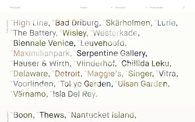
Typographic whisper on textured canvas
Color palette
Page backgrounds, subtle borders, UI elements that recede, primary text on dark accents if any
Medium-contrast borders, control outlines, and structural separators. Do not promote it to the primary CTA color
Footer text, inactive navigation items, and secondary borders, providing a softer contrast than Textured Gray
Thin navigation item borders, offering a slightly darker, more defined boundary than Muted Gray
Decorative icons and SVG fills for maximum contrast against light backgrounds
Typography
- Weights
- 400
- Sizes
- 12px, 15px
- Line height
- 1.6, 1.87, 2.33
- Letter spacing
- normal
- Fallback
- Helvetica Neue Light
Body copy, navigation links, and smaller text elements. Its light weight contributes to the overall delicate and understated aesthetic.
- Weights
- 300
- Sizes
- 60px
- Line height
- 1.25
- Letter spacing
- normal
- Fallback
- Inter Light
Primary headings and large display text. The weight 300 for headlines is anti-convention; most sites use 600-700, this whisper-weight creates authority through restraint, echoing the natural, unobtrusive brand.
Spacing & shape
Components
Uses UniversLTStd-Light, weight 400, 12px size, Textured Gray #808080. When hovered, a 1px solid Outline Gray #999999 bottom border appears after 0.3s ease.
Uses UniversLTStd-Light, weight 400, 60px size, Textured Gray #808080. Features a 6px right margin. Has a subtle textured visual appearance blending with background.
Uses UniversLTStd-Light, weight 400, 12px size, Textured Gray #808080. Features a 22px left margin and 6px right margin.
Uses UniversLTStd-Light, weight 400, 12px size, Muted Gray #b3b3b3.
Guidelines
- Use Canvas White #ffffff as the primary background for all page sections to maintain a bright, airy feel.
- Apply Textured Gray #808080 for all primary text content and interactive borders, leveraging its subtle visual texture.
- Employ Maison Neue Book weight 300 at 60px for all page-level headlines, emphasizing understated authority.
- Incorporate UniversLTStd-Light weight 400 at 12px for body copy and navigational elements, preserving a delicate typographic presentation.
- Maintain the comfortable density by respecting a 40px vertical gap between main page sections.
- Utilize a 6px right margin for horizontal spacing between inline elements like links or keywords.
- For all interactive borders, use a 1px solid stroke with Outline Gray #999999 for clarity and a 0.3s ease transition on hover.
- Avoid using bold or heavy font weights for headlines; the system relies on lighter weights for its distinctive tone.
- Do not introduce strong, saturated colors for backgrounds or primary text; maintain the monochromatic and achromatic palette.
- Refrain from using prominent shadows or elevation effects; the design emphasizes flatness and subtle depth through typography.
- Do not use generic button styles; interactive elements should primarily be text-based with subtle border feedback.
- Avoid tight, condensed line spacing; ensure generous line heights (e.g., 1.6-2.33) for improved readability and visual calm.
- Do not deviate from the specified font families; their unique characteristics are central to the brand's identity.
- Avoid prominent page dividers; section separation is primarily achieved through semantic grouping and vertical spacing, not explicit lines.
About this system
ShowHide
The Piet Oudolf visual system is a minimalist canvas with a typographic core, emphasizing content with subtle interactions. Its primary characteristic is the textured, almost camouflaged typography that appears to blend with its surroundings, creating an organic, almost ethereal display of information. Navigation is understated, relying on delicate borders and a sparse layout to guide the user, hinting at a natural, understated aesthetic where content is paramount and visual clutter is absent.
The page model is full-bleed, with all content expanding to the edges of the viewport horizontally. The hero section features the brand name, a horizontal navigation bar, and is followed by large, text-dominant sections. Content is primarily arranged in centered stacks, with a large, fluid block of text links acting as the main content area. Vertical spacing between sections appears consistent, with no hard visual dividers. The navigation is a minimalist top bar, likely sticky, with subtle interactive states.
The site uses no explicit imagery in its UI outside of what appears to be part of the text rendering, which creates a textured, almost ephemeral effect within the typographic elements themselves. There are no standalone photographs, illustrations, or icons except potentially for very small, functional SVGs rendered in Icon Black. The visual system is entirely dominant by typography, which acts as the primary visual element and source of aesthetic interest.
Reminiscent of AIGA Design Archives, The Browser Company (Arc), Future Fonts, Massimo Vignelli Archive.
# Piet Oudolf — Style Reference
> Typographic whisper on textured canvas

**Theme:** light

**Site:** https://oudolf.com

The Piet Oudolf visual system is a minimalist canvas with a typographic core, emphasizing content with subtle interactions. Its primary characteristic is the textured, almost camouflaged typography that appears to blend with its surroundings, creating an organic, almost ethereal display of information. Navigation is understated, relying on delicate borders and a sparse layout to guide the user, hinting at a natural, understated aesthetic where content is paramount and visual clutter is absent.

## Tokens — Colors

| Name | Value | Token | Role |
|------|------|------|------|
| Canvas White | `#ffffff` | `--color-canvas-white` | Page backgrounds, subtle borders, UI elements that recede, primary text on dark accents if any |
| Textured Gray | `#808080` | `--color-textured-gray` | Medium-contrast borders, control outlines, and structural separators. Do not promote it to the primary CTA color |
| Muted Gray | `#b3b3b3` | `--color-muted-gray` | Footer text, inactive navigation items, and secondary borders, providing a softer contrast than Textured Gray |
| Outline Gray | `#999999` | `--color-outline-gray` | Thin navigation item borders, offering a slightly darker, more defined boundary than Muted Gray |
| Icon Black | `#000000` | `--color-icon-black` | Decorative icons and SVG fills for maximum contrast against light backgrounds |

## Tokens — Typography

### UniversLTStd-Light
- **Substitute:** Helvetica Neue Light
- **Weights:** 400
- **Sizes:** 12px, 15px
- **Line height:** 1.6, 1.87, 2.33
- **Letter spacing:** normal
- **Role:** Body copy, navigation links, and smaller text elements. Its light weight contributes to the overall delicate and understated aesthetic.

### Maison Neue Book
- **Substitute:** Inter Light
- **Weights:** 300
- **Sizes:** 60px
- **Line height:** 1.25
- **Letter spacing:** normal
- **Role:** Primary headings and large display text. The weight 300 for headlines is anti-convention; most sites use 600-700, this whisper-weight creates authority through restraint, echoing the natural, unobtrusive brand.

## Tokens — Type Scale

| Role | Size | Line height | Letter spacing |
|------|------|------|------|
| body | 15px | 1.87 | — |
| display | 60px | 1.25 | — |

## Tokens — Spacing

- **Section gap:** 40px
- **Card padding:** 21px
- **Element gap:** 6px

## Tokens — Radius

- **none:** 0px

## Layout

The page model is full-bleed, with all content expanding to the edges of the viewport horizontally. The hero section features the brand name, a horizontal navigation bar, and is followed by large, text-dominant sections. Content is primarily arranged in centered stacks, with a large, fluid block of text links acting as the main content area. Vertical spacing between sections appears consistent, with no hard visual dividers. The navigation is a minimalist top bar, likely sticky, with subtle interactive states.

## Imagery

The site uses no explicit imagery in its UI outside of what appears to be part of the text rendering, which creates a textured, almost ephemeral effect within the typographic elements themselves. There are no standalone photographs, illustrations, or icons except potentially for very small, functional SVGs rendered in Icon Black. The visual system is entirely dominant by typography, which acts as the primary visual element and source of aesthetic interest.

## Components

### Header Navigation Link
*Interactive text link in the page header.*

Uses UniversLTStd-Light, weight 400, 12px size, Textured Gray #808080. When hovered, a 1px solid Outline Gray #999999 bottom border appears after 0.3s ease.

### Main Project Text Link
*Primary interactive text links for project names.*

Uses UniversLTStd-Light, weight 400, 60px size, Textured Gray #808080. Features a 6px right margin. Has a subtle textured visual appearance blending with background.

### Small Country Code Label
*Contextual label for project locations.*

Uses UniversLTStd-Light, weight 400, 12px size, Textured Gray #808080. Features a 22px left margin and 6px right margin.

### Footer Navigation Link
*Secondary navigation in the page footer.*

Uses UniversLTStd-Light, weight 400, 12px size, Muted Gray #b3b3b3.

## Guidelines

### Do

- Use Canvas White #ffffff as the primary background for all page sections to maintain a bright, airy feel.
- Apply Textured Gray #808080 for all primary text content and interactive borders, leveraging its subtle visual texture.
- Employ Maison Neue Book weight 300 at 60px for all page-level headlines, emphasizing understated authority.
- Incorporate UniversLTStd-Light weight 400 at 12px for body copy and navigational elements, preserving a delicate typographic presentation.
- Maintain the comfortable density by respecting a 40px vertical gap between main page sections.
- Utilize a 6px right margin for horizontal spacing between inline elements like links or keywords.
- For all interactive borders, use a 1px solid stroke with Outline Gray #999999 for clarity and a 0.3s ease transition on hover.

### Don't

- Avoid using bold or heavy font weights for headlines; the system relies on lighter weights for its distinctive tone.
- Do not introduce strong, saturated colors for backgrounds or primary text; maintain the monochromatic and achromatic palette.
- Refrain from using prominent shadows or elevation effects; the design emphasizes flatness and subtle depth through typography.
- Do not use generic button styles; interactive elements should primarily be text-based with subtle border feedback.
- Avoid tight, condensed line spacing; ensure generous line heights (e.g., 1.6-2.33) for improved readability and visual calm.
- Do not deviate from the specified font families; their unique characteristics are central to the brand's identity.
- Avoid prominent page dividers; section separation is primarily achieved through semantic grouping and vertical spacing, not explicit lines.

## Agent Prompt Guide

Quick Color Reference:
- text: #808080
- background: #ffffff
- border: #999999
- accent: no distinct accent color
- primary action: no distinct CTA color

Example Component Prompts:
- Create a header navigation link: UniversLTStd-Light weight 400, 12px size, Textured Gray #808080. On hover, apply a 1px solid Outline Gray #999999 bottom border with a 0.3s ease transition.
- Create a main project text link: Maison Neue Book weight 300, 60px size, Textured Gray #808080. Add a 6px right margin. Ensure the text rendering maintains its unique textured appearance.
- Create a small country code label: UniversLTStd-Light weight 400, 12px size, Textured Gray #808080. Apply a 22px left margin and 6px right margin.
More like this









Keep what you find
A free account saves references to boards and can send you a weekly email of picks based on what you save.
To see every result, go Pro.