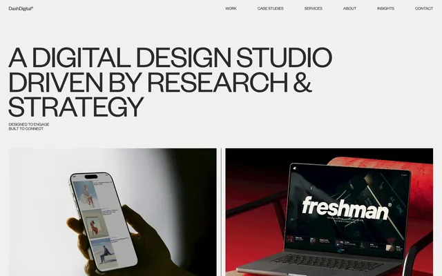
Preview image. Unlock full-res
Architectural blueprints on concrete
Color palette
Page backgrounds, large content sections, subtle surface transitions
General text, secondary headings, link text, hairline borders, inactive navigation items — provides sharp contrast against light surfaces
Primary headings, strong emphasis text, decorative borders for section dividers
Elevated card backgrounds, subtle highlight surfaces
Subtle section dividers, background for less prominent informational blocks
Typography
- Weights
- 300, 400
- Sizes
- 12px, 14px, 16px, 17px, 22px, 40px, 70px, 101px
- Line height
- 0.8, 0.88, 0.9, 1, 1.17, 1.2
- Letter spacing
- -1.4px at 40px, -2.1px at 70px, -3px at 101px
- Fallback
- Inter
Primary typeface for all headings, body text, and UI elements. Its strong presence and precise letter-spacing (-0.03em for display sizes, -0.023em for large headings) establish a confident, almost architectural tone. Weight 300 for large headings creates a sense of gravitas without shouting.
- Weights
- 400
- Sizes
- 16px
- Line height
- 0.9
- Letter spacing
- -0.96px at 16px
- Fallback
- Playfair Display
Used sparingly for subtle decorative text elements, secondary information, and captions. Its very tight letter-spacing (-0.06em) creates a distinctive, almost logotype-like quality for small text blocks.
Spacing & shape
Components
Text in Carbon Text (#2a2a2a) with Founders Grotesk weight 400 at 16px, line-height 1, and no explicit padding, indicating actions inline with text.
Text label in Carbon Text (#2a2a2a) with Founders Grotesk. No background, transparent padding, and typically has a bottom border in Carbon Text (#2a2a2a) at 1px thickness to indicate interactivity.
A minimalist container with no background color, no border radius, and no padding, relying on surrounding layout to define its boundaries. Text is Carbon Text (#2a2a2a) at 14px Founders Grotesk weight 400 for categories, and headings in Midnight Ink (#000000) at 22px Founders Grotesk weight 400.
A transparent card with no border radius or shadow, featuring a strong 1px border in Midnight Ink (#000000) for visual separation. Internal padding is approximately 29px left/right and 20px top/bottom, with content text in Carbon Text (#2a2a2a) using Founders Grotesk font at 16px.
Features a 999px border-radius, creating a pill shape. Background is transparent with text in Carbon Text (#2a2a2a) or Midnight Ink (#000000) using Founders Grotesk at 12px or 14px, with minimal padding (e.g., 4px).
Guidelines
- Prioritize Founders Grotesk for all primary textual content and UI, defaulting to weight 400 for body text and 300 for large headings.
- Use a monochromatic palette concentrating on Storm Canvas (#f0f0f0) for backgrounds, Carbon Text (#2a2a2a) for most text and borders, and Midnight Ink (#000000) for strong headings and dividers.
- Employ consistent 1px hairline borders for clear delineation of sections and content blocks, primarily in Carbon Text (#2a2a2a) or Midnight Ink (#000000).
- Apply specific negative letter-spacing values to Founders Grotesk headings (-0.03em for 40px, -0.023em for 70px, -0.018em for 101px) to maintain visual tightness.
- Structure layouts using a max-width of 1200px centered on the page, with a consistent section gap of 115px.
- Utilize a precise 999px border-radius for pill-shaped elements like badges and tags, maintaining crisp, sharp corners for all other components.
- Integrate subtle transform and opacity transitions with `ease` timing functions over 1s for interactive elements to create a responsive, fluid feel.
- Avoid introducing any new chromatic colors; maintain the gray-scale and black-and-white aesthetic.
- Do not use generic border-radii; adhere strictly to 0px for most elements and 999px for specific pill-like components.
- Refrain from using drop shadows or heavy box-shadows; the design relies on stark contrast and borders for depth.
- Do not use body text larger than 17px or smaller than 12px for primary content; maintain the established type hierarchy.
- Avoid unnecessary padding or excessive white space within components; maintain a comfortable, not overly sparse, density.
- Do not use generic sans-serif system fonts as primary typography; Founders Grotesk is key to the brand's voice.
About this system
ShowHide
Dash Digital Studio employs a stark and confident design language, built on a monochromatic palette of industrial grays and pure black. Typography is sharp and impactful, leveraging precise letter-spacing to create a sense of focused clarity. The layout is disciplined, using robust hairline borders to define content blocks, and relies on subtle motion and confident imagery over color to convey a sense of premium precision.
The site employs a max-width, center-aligned layout of 1200px. The hero section is full-width, utilizing a dark background with a large, centered headline and a subtle subtext. Content sections primarily follow a consistent vertical rhythm with alternating light/gray backgrounds. Most content is presented in a two-column grid, often with text on one side and an image or illustrative graphic on the other, creating a clean left-right visual rhythm. Feature and client sections adapt to multi-column card grids, where each card is visually distinct, often bordered. Navigation is a sticky top bar with a minimal brand logo and a 'Menu +' toggle for expanding a full-screen menu. The overall density is comfortable, with ample whitespace balancing content blocks.
This site features highly stylized, editorial photography and product shots. Images are typically contained within strict rectangular frames (0px radius), either full-width within their columns or slightly off-set. Product shots are often tight, focused crops, sometimes isolated on a neutral background or with dramatic lighting to create visual interest. There is a strong emphasis on showcasing the 'work' itself, without much lifestyle context. Photography is high-contrast, with deep blacks and bright whites, and sometimes a moody or dramatic tone. Icons are generally minimal, outlined, and monochromatic, matching the overall stark aesthetic. Imagery plays a content-dominant and aesthetic role, providing visual richness within a formally structured layout.
Reminiscent of Alinea Invest, Linear, Figma, Supabase, Stripe.
# Dash Digital Studio — Style Reference
> Architectural blueprints on concrete

**Theme:** light

**Site:** https://dashdigital.studio

Dash Digital Studio employs a stark and confident design language, built on a monochromatic palette of industrial grays and pure black. Typography is sharp and impactful, leveraging precise letter-spacing to create a sense of focused clarity. The layout is disciplined, using robust hairline borders to define content blocks, and relies on subtle motion and confident imagery over color to convey a sense of premium precision.

## Tokens — Colors

| Name | Value | Token | Role |
|------|------|------|------|
| Storm Canvas | `#f0f0f0` | `--color-storm-canvas` | Page backgrounds, large content sections, subtle surface transitions |
| Carbon Text | `#2a2a2a` | `--color-carbon-text` | General text, secondary headings, link text, hairline borders, inactive navigation items — provides sharp contrast against light surfaces |
| Midnight Ink | `#000000` | `--color-midnight-ink` | Primary headings, strong emphasis text, decorative borders for section dividers |
| Cloud Gray | `#fafafa` | `--color-cloud-gray` | Elevated card backgrounds, subtle highlight surfaces |
| Slate Divider | `#d6d6d6` | `--color-slate-divider` | Subtle section dividers, background for less prominent informational blocks |

## Tokens — Typography

### Founders Grotesk
- **Substitute:** Inter
- **Weights:** 300, 400
- **Sizes:** 12px, 14px, 16px, 17px, 22px, 40px, 70px, 101px
- **Line height:** 0.8, 0.88, 0.9, 1, 1.17, 1.2
- **Letter spacing:** -1.4px at 40px, -2.1px at 70px, -3px at 101px
- **Role:** Primary typeface for all headings, body text, and UI elements. Its strong presence and precise letter-spacing (-0.03em for display sizes, -0.023em for large headings) establish a confident, almost architectural tone. Weight 300 for large headings creates a sense of gravitas without shouting.

### Editorial Neue
- **Substitute:** Playfair Display
- **Weights:** 400
- **Sizes:** 16px
- **Line height:** 0.9
- **Letter spacing:** -0.96px at 16px
- **Role:** Used sparingly for subtle decorative text elements, secondary information, and captions. Its very tight letter-spacing (-0.06em) creates a distinctive, almost logotype-like quality for small text blocks.

## Tokens — Type Scale

Perfect Fifth (1.5) from 12px base.

| Role | Size | Line height | Letter spacing |
|------|------|------|------|
| caption | 12px | 1 | -0.36px |
| body-sm | 14px | 1.2 | -0.32px |
| heading | 22px | 1 | -0.44px |
| heading-lg | 40px | 0.9 | -1.2px |
| display | 70px | 0.88 | -2.1px |
| display-xl | 101px | 0.8 | -3.03px |

## Tokens — Spacing

- **Max width:** 1200px
- **Section gap:** 115px
- **Card padding:** 14px
- **Element gap:** 4px

## Tokens — Radius

- **Default:** 0px
- **pill:** 999px

## Layout

The site employs a max-width, center-aligned layout of 1200px. The hero section is full-width, utilizing a dark background with a large, centered headline and a subtle subtext. Content sections primarily follow a consistent vertical rhythm with alternating light/gray backgrounds. Most content is presented in a two-column grid, often with text on one side and an image or illustrative graphic on the other, creating a clean left-right visual rhythm. Feature and client sections adapt to multi-column card grids, where each card is visually distinct, often bordered. Navigation is a sticky top bar with a minimal brand logo and a 'Menu +' toggle for expanding a full-screen menu. The overall density is comfortable, with ample whitespace balancing content blocks.

## Imagery

This site features highly stylized, editorial photography and product shots. Images are typically contained within strict rectangular frames (0px radius), either full-width within their columns or slightly off-set. Product shots are often tight, focused crops, sometimes isolated on a neutral background or with dramatic lighting to create visual interest. There is a strong emphasis on showcasing the 'work' itself, without much lifestyle context. Photography is high-contrast, with deep blacks and bright whites, and sometimes a moody or dramatic tone. Icons are generally minimal, outlined, and monochromatic, matching the overall stark aesthetic. Imagery plays a content-dominant and aesthetic role, providing visual richness within a formally structured layout.

## Components

### Ghost Nav Link
*Navigation item and secondary calls to action*

Text in Carbon Text (#2a2a2a) with Founders Grotesk weight 400 at 16px, line-height 1, and no explicit padding, indicating actions inline with text.

### Text Accent Button
*Outlined textual action prompts, typically for 'View Case Study' or 'More +' links*

Text label in Carbon Text (#2a2a2a) with Founders Grotesk. No background, transparent padding, and typically has a bottom border in Carbon Text (#2a2a2a) at 1px thickness to indicate interactivity.

### Project Card
*Displays individual portfolio projects or featured content.*

A minimalist container with no background color, no border radius, and no padding, relying on surrounding layout to define its boundaries. Text is Carbon Text (#2a2a2a) at 14px Founders Grotesk weight 400 for categories, and headings in Midnight Ink (#000000) at 22px Founders Grotesk weight 400.

### Information Block Card
*Structured content blocks, such as client testimonials or service descriptions.*

A transparent card with no border radius or shadow, featuring a strong 1px border in Midnight Ink (#000000) for visual separation. Internal padding is approximately 29px left/right and 20px top/bottom, with content text in Carbon Text (#2a2a2a) using Founders Grotesk font at 16px.

### Pill Badge
*Small, descriptive labels or navigational markers.*

Features a 999px border-radius, creating a pill shape. Background is transparent with text in Carbon Text (#2a2a2a) or Midnight Ink (#000000) using Founders Grotesk at 12px or 14px, with minimal padding (e.g., 4px).

## Guidelines

### Do

- Prioritize Founders Grotesk for all primary textual content and UI, defaulting to weight 400 for body text and 300 for large headings.
- Use a monochromatic palette concentrating on Storm Canvas (#f0f0f0) for backgrounds, Carbon Text (#2a2a2a) for most text and borders, and Midnight Ink (#000000) for strong headings and dividers.
- Employ consistent 1px hairline borders for clear delineation of sections and content blocks, primarily in Carbon Text (#2a2a2a) or Midnight Ink (#000000).
- Apply specific negative letter-spacing values to Founders Grotesk headings (-0.03em for 40px, -0.023em for 70px, -0.018em for 101px) to maintain visual tightness.
- Structure layouts using a max-width of 1200px centered on the page, with a consistent section gap of 115px.
- Utilize a precise 999px border-radius for pill-shaped elements like badges and tags, maintaining crisp, sharp corners for all other components.
- Integrate subtle transform and opacity transitions with `ease` timing functions over 1s for interactive elements to create a responsive, fluid feel.

### Don't

- Avoid introducing any new chromatic colors; maintain the gray-scale and black-and-white aesthetic.
- Do not use generic border-radii; adhere strictly to 0px for most elements and 999px for specific pill-like components.
- Refrain from using drop shadows or heavy box-shadows; the design relies on stark contrast and borders for depth.
- Do not use body text larger than 17px or smaller than 12px for primary content; maintain the established type hierarchy.
- Avoid unnecessary padding or excessive white space within components; maintain a comfortable, not overly sparse, density.
- Do not use generic sans-serif system fonts as primary typography; Founders Grotesk is key to the brand's voice.

## Agent Prompt Guide

Quick Color Reference:
text: #2a2a2a
background: #f0f0f0
border: #2a2a2a
accent: no distinct accent color
primary action: no distinct CTA color

Example Component Prompts:
1. Create a hero section: full-width dark background (no specific hex, inherit from section), centered headline 'A DIGITAL DESIGN STUDIO' using Founders Grotesk weight 300 at 101px, Midnight Ink (#000000) against dark background (text invert for visibility), letter-spacing -3.03px. Sub-headline 'DRIVEN BY RESEARCH & STRATEGY' at 70px Founders Grotesk weight 400, letter-spacing -2.1px.
2. Create a project card showing an image side-by-side with text: A transparent card (no background, no radius). Image is a full-bleed within its column. Below the image, text 'DIGITAL DESIGN - WEB DEVELOPMENT' in Carbon Text (#2a2a2a) with Founders Grotesk weight 400 at 14px. Followed by project title 'GAVIN SCHNEIDER PRODUCTIONS' in Midnight Ink (#000000) with Founders Grotesk weight 400 at 22px.
3. Create an informational block: Cloud Gray (#fafafa) background for the section. A transparent information card with 1px border in Midnight Ink (#000000). Internal padding 29px left/right, 20px top/bottom. Headline 'LEMKUS' at 22px Founders Grotesk weight 400 in Midnight Ink (#000000). Body text in Carbon Text (#2a2a2a) at 16px Founders Grotesk weight 400.
4. Create a pill badge: Text 'More +' in Carbon Text (#2a2a2a), Founders Grotesk weight 400 at 14px, on a transparent background with 999px border-radius and minimal 4px padding.
More like this









Keep what you find
A free account saves references to boards and can send you a weekly email of picks based on what you save.
To see every result, go Pro.