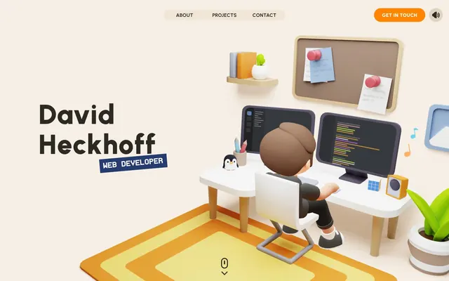
Preview image. Unlock full-res
Warm canvas, playful 3D
Color palette
Primary call-to-action button backgrounds — a bold, energetic accent that immediately draws attention and signifies interactivity
Blue outline accent for tags, dividers, and focused UI edges. Do not promote it to the primary CTA color
Top portion of holographic gradient effects, such as in 3D character bases
Bottom portion of holographic gradient effects, seen in 3D scene elements
Page backgrounds, large structural elements, subtle background for ghost buttons, footer backgrounds — provides a warm, inviting base layer
Card surfaces, subtle button borders, soft elevated elements — works as a secondary surface atop Canvas Beige, maintaining the overall warmth
Primary text, strong borders, prominent text on buttons, main text elements — provides high contrast against the light beige surfaces
Secondary text, descriptive labels, subtle card text — a softer text color for less prominent information, designed to recede slightly
Tertiary card backgrounds, light button fills where a very subtle distinction is needed
Decorative icon accents, subtle highlight effects, supporting visual elements in the 3D illustrations — a near-gray with a cool blue tint
Text on dark backgrounds, small icon details, very subtle button outlines — a clean, bright accent for maximum contrast
Typography
- Weights
- 400, 500, 700, 800, 900
- Sizes
- 14px, 16px, 22px, 72px, 88px
- Line height
- 1.09, 1.11, 1.2, 1.36
- Letter spacing
- 0.21, 0.32, 0.37
- Fallback
- Inter
Primary typeface for all UI text, headings, body, and links. Its humanist sans-serif style contributes to the approachable and friendly tone. Letter spacing is subtly tightened for headlines for a more contained feel.
- Weights
- 400, 700
- Sizes
- 16px, 18px, 22px, 28px
- Line height
- 1.2
- Letter spacing
- 0.18, 0.24, 0.32, 0.36
- Fallback
- Roboto Mono
Used for code snippets and specialized technical text, offering a distinctive mono-spaced character. Its inclusion highlights the developer focus of the brand.
Spacing & shape
Components
Transparent background with Deep Mocha text. `padding: 4px 0px`. No border, relying on text contrast for distinction. `border-radius: 100px` is present but visually unused due to transparent background.
Vibrant Orange background, True White text, `padding: 0px 26px`. Features a full `border-radius: 100px` creating a pill shape.
Light Linen background, Deep Mocha text, `padding: 10px`. Perfectly round with `border-radius: 50%`.
Transparent background, Deep Mocha text, subtle Mid-Tone Beige border. `padding: 0px 16px`. Full `border-radius: 100px` for a pill shape.
Mid-Tone Beige background, `border-radius: 16px`, no visible shadow. Content is typically structured with an `elementGap` of 18px.
Urbanist font, typically weight 800 or 900, Deep Mocha color. Sizes up to 88px, with `letterSpacing` around 0.37px.
Rectangle with Electric Blue border (3px solid), Deep Mocha text, `border-radius: 12px`. Used to categorize or highlight key information like 'WEB DEVELOPER'.
Guidelines
- Prioritize Canvas Beige (#f5efe6) for page backgrounds to maintain the warm, inviting base.
- Use Vibrant Orange (#ff8400) exclusively for primary call-to-action button backgrounds to preserve its impact.
- Apply `border-radius: 100px` to all buttons for a consistent pill-shaped aesthetic.
- Employ the Urbanist font family for all primary UI text, adjusting weights to establish hierarchy rather than relying solely on size.
- Maintain an `elementGap` of 18px between elements within components for comfortable density.
- When introducing new 3D elements, integrate Electric Blue (#34bfff) or the Hologram Gradient to tie into the existing technical visual language.
- Ensure headings use a slightly condensed `letterSpacing` (e.g., 0.37px at 88px) to feel composed.
- Avoid using saturated background colors other than Canvas Beige (#f5efe6), Mid-Tone Beige (#e9ded0), or Light Linen (#dfd2bf) for large surface areas.
- Do not introduce new border radii beyond 100px, 16px, 24px, or 12px to maintain geometric consistency.
- Refrain from using Vibrant Orange (#ff8400) for decorative purposes or secondary text; it must signal primary interaction.
- Do not use highly contrasting or dark backgrounds unless it's for a specific immersive 3D experience with its own contained color scheme.
- Avoid generic icon styles; instead, prefer the 3D illustrative style seen on the site to reinforce brand identity.
- Do not use generic system fonts; always utilize Urbanist or ProFontWindows to maintain typographical distinctiveness.
- Do not make buttons purely square or with sharp corners; always apply significant `border-radius`.
About this system
ShowHide
This system expresses a playful, modern web developer's environment, characterized by soft, warm neutrals as a canvas for bold, single-hue accents. Typographical hierarchy is established through variable font weights and generous line heights, rather than drastic size shifts. Immersive 3D iconography sets a distinct tone, further solidified by a strong orange action color that adds an energetic, 'get-it-done' feel. Components prioritize rounded forms and minimal, subtle outlining, echoing the friendly nature of the primary visuals.
The page primarily uses a contained layout with a maximum width, centered on a Canvas Beige background. The hero section is visually striking, often featuring a large, immersive 3D illustration dominating the upper fold, potentially with a full-bleed effect on transitions. Sections maintain a consistent vertical rhythm, with `sectionGap` of 48px, and often alternate content Left/Right with visuals. Content is frequently arranged in centered stacks for headings and short descriptions, transitioning to multi-column grids (like a 3-column card grid for projects) for feature presentation. The navigation is a classic top bar, often sticky or revealed on scroll, featuring ghost links and a prominent Primary Action Button. The overall density feels comfortable and spaced out, allowing the detailed 3D elements to breathe.
The site heavily features bespoke 3D illustrations, often appearing as hero elements or embedded within sections. These illustrations are volumetric, rendered with soft, diffused lighting and rounded, stylized forms, often depicting work-from-home setups or abstract representations of digital activity. Colors within the illustrations often align with the brand's accent colors (Electric Blue, Hologram gradients) and the warm neutral base. Photography is absent; the visual identity is driven purely by crafted 3D graphics. Icons are also stylized, generally outlined or subtly filled to match the illustrative aesthetic. Imagery is the primary content, often taking full width or large portions of the screen, serving a decorative and explanatory role to set a playful, high-tech atmosphere rather than product showcase.
Reminiscent of Stripe, Framer, Linear, Notion.
# David Heckhoff — Style Reference
> Warm canvas, playful 3D

**Theme:** light

**Site:** https://david-hckh.com

This system expresses a playful, modern web developer's environment, characterized by soft, warm neutrals as a canvas for bold, single-hue accents. Typographical hierarchy is established through variable font weights and generous line heights, rather than drastic size shifts. Immersive 3D iconography sets a distinct tone, further solidified by a strong orange action color that adds an energetic, 'get-it-done' feel. Components prioritize rounded forms and minimal, subtle outlining, echoing the friendly nature of the primary visuals.

## Tokens — Colors

| Name | Value | Token | Role |
|------|------|------|------|
| Vibrant Orange | `#ff8400` | `--color-vibrant-orange` | Primary call-to-action button backgrounds — a bold, energetic accent that immediately draws attention and signifies interactivity |
| Electric Blue | `#34bfff` | `--color-electric-blue` | Blue outline accent for tags, dividers, and focused UI edges. Do not promote it to the primary CTA color |
| Hologram Top | `#003585` | `--color-hologram-top` | Top portion of holographic gradient effects, such as in 3D character bases |
| Hologram Bottom | `#005291` | `--color-hologram-bottom` | Bottom portion of holographic gradient effects, seen in 3D scene elements |
| Canvas Beige | `#f5efe6` | `--color-canvas-beige` | Page backgrounds, large structural elements, subtle background for ghost buttons, footer backgrounds — provides a warm, inviting base layer |
| Mid-Tone Beige | `#e9ded0` | `--color-mid-tone-beige` | Card surfaces, subtle button borders, soft elevated elements — works as a secondary surface atop Canvas Beige, maintaining the overall warmth |
| Deep Mocha | `#2d2a24` | `--color-deep-mocha` | Primary text, strong borders, prominent text on buttons, main text elements — provides high contrast against the light beige surfaces |
| Muted Stone | `#5f5646` | `--color-muted-stone` | Secondary text, descriptive labels, subtle card text — a softer text color for less prominent information, designed to recede slightly |
| Light Linen | `#dfd2bf` | `--color-light-linen` | Tertiary card backgrounds, light button fills where a very subtle distinction is needed |
| Polar Mist | `#e1f5ff` | `--color-polar-mist` | Decorative icon accents, subtle highlight effects, supporting visual elements in the 3D illustrations — a near-gray with a cool blue tint |
| True White | `#ffffff` | `--color-true-white` | Text on dark backgrounds, small icon details, very subtle button outlines — a clean, bright accent for maximum contrast |

## Tokens — Typography

### Urbanist
- **Substitute:** Inter
- **Weights:** 400, 500, 700, 800, 900
- **Sizes:** 14px, 16px, 22px, 72px, 88px
- **Line height:** 1.09, 1.11, 1.2, 1.36
- **Letter spacing:** 0.21, 0.32, 0.37
- **Role:** Primary typeface for all UI text, headings, body, and links. Its humanist sans-serif style contributes to the approachable and friendly tone. Letter spacing is subtly tightened for headlines for a more contained feel.

### ProFontWindows
- **Substitute:** Roboto Mono
- **Weights:** 400, 700
- **Sizes:** 16px, 18px, 22px, 28px
- **Line height:** 1.2
- **Letter spacing:** 0.18, 0.24, 0.32, 0.36
- **Role:** Used for code snippets and specialized technical text, offering a distinctive mono-spaced character. Its inclusion highlights the developer focus of the brand.

## Tokens — Type Scale

Augmented Fourth (1.414) from 14px base.

| Role | Size | Line height | Letter spacing |
|------|------|------|------|
| body | 14px | 1.2 | — |
| body-lg | 16px | 1.2 | 0.24px |
| subheading | 22px | 1.2 | 0.32px |
| heading | 28px | 1.2 | 0.36px |
| display-sm | 72px | 1.11 | 0.32px |
| display | 88px | 1.09 | 0.37px |

## Tokens — Spacing

- **Section gap:** 48px
- **Card padding:** 16px
- **Element gap:** 18px

## Tokens — Radius

- **Buttons:** 100px
- **Cards:** 16px
- **links:** 24px
- **other:** 12px

## Layout

The page primarily uses a contained layout with a maximum width, centered on a Canvas Beige background. The hero section is visually striking, often featuring a large, immersive 3D illustration dominating the upper fold, potentially with a full-bleed effect on transitions. Sections maintain a consistent vertical rhythm, with `sectionGap` of 48px, and often alternate content Left/Right with visuals. Content is frequently arranged in centered stacks for headings and short descriptions, transitioning to multi-column grids (like a 3-column card grid for projects) for feature presentation. The navigation is a classic top bar, often sticky or revealed on scroll, featuring ghost links and a prominent Primary Action Button. The overall density feels comfortable and spaced out, allowing the detailed 3D elements to breathe.

## Imagery

The site heavily features bespoke 3D illustrations, often appearing as hero elements or embedded within sections. These illustrations are volumetric, rendered with soft, diffused lighting and rounded, stylized forms, often depicting work-from-home setups or abstract representations of digital activity. Colors within the illustrations often align with the brand's accent colors (Electric Blue, Hologram gradients) and the warm neutral base. Photography is absent; the visual identity is driven purely by crafted 3D graphics. Icons are also stylized, generally outlined or subtly filled to match the illustrative aesthetic. Imagery is the primary content, often taking full width or large portions of the screen, serving a decorative and explanatory role to set a playful, high-tech atmosphere rather than product showcase.

## Components

### Navigation Link (Ghost)
*Header and footer navigation items.*

Transparent background with Deep Mocha text. `padding: 4px 0px`. No border, relying on text contrast for distinction. `border-radius: 100px` is present but visually unused due to transparent background.

### Primary Action Button
*Key calls to action.*

Vibrant Orange background, True White text, `padding: 0px 26px`. Features a full `border-radius: 100px` creating a pill shape.

### Subtle Round Button
*Small, functional buttons like language selectors.*

Light Linen background, Deep Mocha text, `padding: 10px`. Perfectly round with `border-radius: 50%`.

### Outlined Ghost Button
*Secondary action or navigational buttons.*

Transparent background, Deep Mocha text, subtle Mid-Tone Beige border. `padding: 0px 16px`. Full `border-radius: 100px` for a pill shape.

### Feature Card
*Containers for project listings or information blocs.*

Mid-Tone Beige background, `border-radius: 16px`, no visible shadow. Content is typically structured with an `elementGap` of 18px.

### Section Header
*Large, prominent titles for content sections.*

Urbanist font, typically weight 800 or 900, Deep Mocha color. Sizes up to 88px, with `letterSpacing` around 0.37px.

### Accent Tag
*Small descriptive labels under headings.*

Rectangle with Electric Blue border (3px solid), Deep Mocha text, `border-radius: 12px`. Used to categorize or highlight key information like 'WEB DEVELOPER'.

## Guidelines

### Do

- Prioritize Canvas Beige (#f5efe6) for page backgrounds to maintain the warm, inviting base.
- Use Vibrant Orange (#ff8400) exclusively for primary call-to-action button backgrounds to preserve its impact.
- Apply `border-radius: 100px` to all buttons for a consistent pill-shaped aesthetic.
- Employ the Urbanist font family for all primary UI text, adjusting weights to establish hierarchy rather than relying solely on size.
- Maintain an `elementGap` of 18px between elements within components for comfortable density.
- When introducing new 3D elements, integrate Electric Blue (#34bfff) or the Hologram Gradient to tie into the existing technical visual language.
- Ensure headings use a slightly condensed `letterSpacing` (e.g., 0.37px at 88px) to feel composed.

### Don't

- Avoid using saturated background colors other than Canvas Beige (#f5efe6), Mid-Tone Beige (#e9ded0), or Light Linen (#dfd2bf) for large surface areas.
- Do not introduce new border radii beyond 100px, 16px, 24px, or 12px to maintain geometric consistency.
- Refrain from using Vibrant Orange (#ff8400) for decorative purposes or secondary text; it must signal primary interaction.
- Do not use highly contrasting or dark backgrounds unless it's for a specific immersive 3D experience with its own contained color scheme.
- Avoid generic icon styles; instead, prefer the 3D illustrative style seen on the site to reinforce brand identity.
- Do not use generic system fonts; always utilize Urbanist or ProFontWindows to maintain typographical distinctiveness.
- Do not make buttons purely square or with sharp corners; always apply significant `border-radius`.

## Agent Prompt Guide

Quick Color Reference:
text: #2d2a24
background: #f5efe6
border: #e9ded0
accent: #34bfff
primary action: #ff8400 (filled action)

Example Component Prompts:
Create a hero section headline: 'David Heckhoff' using Urbanist, weight 900, size 88px, Deep Mocha (#2d2a24), letter-spacing 0.37px, line height 1.09. Below it, an Accent Tag: 'WEB DEVELOPER', Deep Mocha text with a 3px solid Electric Blue (#34bfff) border, and 12px radius.

Create a Primary Action Button: #ff8400 background, #2d2a24 text, 9999px radius, compact pill padding. Use this filled treatment for the main CTA.

Design a Feature Card: Mid-Tone Beige (#e9ded0) background, 16px border-radius, with an internal element gap of 18px. Inside, place a title 'CubeWar' using Urbanist weight 700, size 22px, Deep Mocha (#2d2a24), and body text 'Multiplayer strategy game' using Urbanist weight 400, size 16px, Muted Stone (#5f5646).

Create a Navigation Link: 'Projects' with transparent background, Deep Mocha (#2d2a24) text, Urbanist weight 500, size 16px, padding 4px 0px. Ensure it has a 100px border-radius without a visible border to maintain the soft shape from interaction states.
More like this









Keep what you find
A free account saves references to boards and can send you a weekly email of picks based on what you save.
To see every result, go Pro.