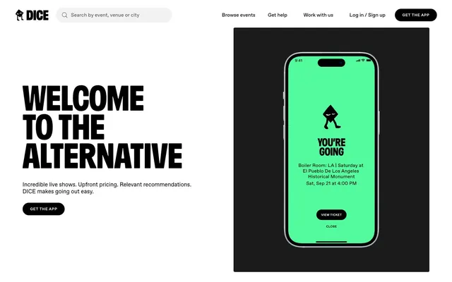
Preview image. Unlock full-res
High-contrast monochrome canvas
Color palette
Informational highlights, occasional link accents (derived from `--blue` token)
Primary text, background for active elements, hero sections at full width, borders, icons. Provides extreme contrast
Soft icon strokes, subtle dividers, and low-emphasis decorative details. Do not promote it to the primary CTA color
Subtle background for UI blocks or dividers, distinct from main canvas but without adding chromaticism
Background for secondary images or distinct button states, a slightly muted white for soft separation
Muted helper text, secondary body copy, less prominent borders. Reduces visual hierarchy subtly
Placeholder text in search inputs, outline borders for ghost buttons, secondary navigation text. Stronger than Medium Gray but not as dominant as Pitch Black
Background for specific interactive buttons (e.g., app store links), providing a soft alternative to Pitch Black
Typography
- Weights
- 350, 400, 700
- Sizes
- 12px, 14px, 16px, 18px, 24px, 28px
- Line height
- 1.15, 1.19, 1.21, 1.22, 1.25, 1.33, 1.4, 1.5
- Letter spacing
- 0.0600em
- Fallback
- Inter
Versatile workhorse typeface for all body text, navigation, and most interactive elements. Its slight monospace character and geometric structure provide a technical yet friendly tone.
- Weights
- 400
- Sizes
- 106px
- Line height
- 0.83
- Letter spacing
- normal
- Fallback
- Impact
The primary display font for oversized headlines. Its compressed, heavy form creates an immediate, impactful statement, giving major headings a declarative, almost poster-like presence. Low line height creates tight stacks.
Spacing & shape
Components
Filled button with Pitch Black background, Arctic White text (Favorit, weight 400), and a large 40px border-radius, giving it a soft, pill-shaped aesthetic. Padding 22px horizontal, implied vertical from inherent height.
Ghost button with a border of Dark Gray (#595959), transparent background, and 20px border-radius. Text in Dark Gray (#595959), Favorit font. Padding 8px vertical, 16px horizontal.
Input field with a Pitch Black text, Dark Gray (#595959) placeholder text, and Arctic White background. Features a soft, rounded 20px border-radius and a full-height appearance.
Cards have a simple 4px border-radius and transparent background, relying on content and imagery for definition. Text (Favorit, multiple weights/sizes) is Pitch Black by default. Image backgrounds can be Cloud White (#eeeeee).
Filled button with Charcoal (#333333) background and Arctic White text (Favorit, weight 400). Features a 20px border-radius and 8px vertical / 16px horizontal padding.
Text link or button with a 20px border-radius, often with Pitch Black text on Arctic White background, or Arctic White text on Pitch Black for active states. Implicit horizontal padding from text content.
Guidelines
- Prioritize high contrast between primary foreground (Pitch Black) and background (Arctic White).
- Use Foggy exclusively for large, impactful headlines (106px at 0.83 line height) to maintain its declarative visual weight.
- Apply Favorit at 0.0600em letter-spacing universally for body, navigation, and interactive text to maintain the characteristic density.
- Utilize 40px border-radius for all primary action buttons, ensuring a consistent pill-shaped interaction target.
- Employ the 8px base unit for consistent element spacing where individual elements require small buffers.
- Introduce accent colors (Neon Green, Electric Blue) sparingly, reserving them for functional states, icons, or crucial brand highlights.
- Keep card and section backgrounds flat and monochrome (Arctic White or Ash Gray) to support the content without distraction.
- Avoid using Foggy for body copy or small text — its legibility is optimized for large display sizes.
- Do not introduce soft shadows or gradients for primary surface elevation; rely on high-contrast color shifts and borders.
- Refrain from using strong chromatic colors for backgrounds or large UI areas; maintain the black-and-white dominance.
- Do not deviate from the specified Favorit font feature settings ("ss02", "ss03", "ss05", "ss06", "ss08") as they are integral to the brand's typographic identity.
- Avoid arbitrary padding or margin values; adhere to the 4px base unit and derived spacing tokens like 8px for element gaps and 24px for section gaps.
- Do not use multiple, distinct border-radius values on elements of the same type; buttons should consistently be 40px radius, cards 4px, etc.
About this system
ShowHide
DICE uses a bold, monochrome aesthetic with a stark black-and-white foundation that provides a high-contrast canvas. Typography is assertive, carrying much of the brand's voice, while subtle hints of energetic accent colors occasionally punctuate the otherwise achromatic interface. Component surfaces are flat and minimal, often relying on high contrast and distinct shapes rather than shadows for visual separation, embodying a robust, no-nonsense utility.
The page structure is primarily max-width contained for content sections, but utilizes full-bleed hero and footer sections that extend edge-to-edge. The hero section often presents a split layout: a dominant, oversized headline and supporting text on one side, paired with a large product visual (e.g., a phone UI) on the other. Content sections typically flow with consistent vertical spacing (24px section gaps), often displaying card grids (e.g., event listings with 3-5 columns) or feature lists. Navigation is a sticky top bar with clear text links and a prominent Primary Action Button.
The visual language predominantly features high-contrast product screenshots (like the phone UI) with clean, sharp edges, often against solid Pitch Black or Arctic White backgrounds. Illustrations are minimalistic and abstract, using thick outlines and primarily black-and-white palettes, occasionally highlighted with a single vivid accent color like Neon Green. Icons are solid, bold, and monoline, conveying clarity and directness. Imagery serves to showcase product functionality or add a distinctive brand personality through abstract, almost 'sticker-like' graphic elements. It's an image-rich but text-dominant system, where images provide visual breaks and emphasis without overwhelming the content.
Reminiscent of Resident Advisor, Boiler Room, Mixmag, Songkick.
# DICE — Style Reference
> High-contrast monochrome canvas

**Theme:** light

**Site:** https://dice.fm

DICE uses a bold, monochrome aesthetic with a stark black-and-white foundation that provides a high-contrast canvas. Typography is assertive, carrying much of the brand's voice, while subtle hints of energetic accent colors occasionally punctuate the otherwise achromatic interface. Component surfaces are flat and minimal, often relying on high contrast and distinct shapes rather than shadows for visual separation, embodying a robust, no-nonsense utility.

## Tokens — Colors

| Name | Value | Token | Role |
|------|------|------|------|
| Electric Blue | `#0000FE` | `--color-electric-blue` | Informational highlights, occasional link accents (derived from `--blue` token) |
| Pitch Black | `#000000` | `--color-pitch-black` | Primary text, background for active elements, hero sections at full width, borders, icons. Provides extreme contrast |
| Arctic White | `#ffffff` | `--color-arctic-white` | Soft icon strokes, subtle dividers, and low-emphasis decorative details. Do not promote it to the primary CTA color |
| Ash Gray | `#d9d9d9` | `--color-ash-gray` | Subtle background for UI blocks or dividers, distinct from main canvas but without adding chromaticism |
| Cloud White | `#eeeeee` | `--color-cloud-white` | Background for secondary images or distinct button states, a slightly muted white for soft separation |
| Medium Gray | `#808080` | `--color-medium-gray` | Muted helper text, secondary body copy, less prominent borders. Reduces visual hierarchy subtly |
| Dark Gray | `#595959` | `--color-dark-gray` | Placeholder text in search inputs, outline borders for ghost buttons, secondary navigation text. Stronger than Medium Gray but not as dominant as Pitch Black |
| Charcoal | `#333333` | `--color-charcoal` | Background for specific interactive buttons (e.g., app store links), providing a soft alternative to Pitch Black |

## Tokens — Typography

### Favorit
- **Substitute:** Inter
- **Weights:** 350, 400, 700
- **Sizes:** 12px, 14px, 16px, 18px, 24px, 28px
- **Line height:** 1.15, 1.19, 1.21, 1.22, 1.25, 1.33, 1.4, 1.5
- **Letter spacing:** 0.0600em
- **Role:** Versatile workhorse typeface for all body text, navigation, and most interactive elements. Its slight monospace character and geometric structure provide a technical yet friendly tone.

### Foggy
- **Substitute:** Impact
- **Weights:** 400
- **Sizes:** 106px
- **Line height:** 0.83
- **Letter spacing:** normal
- **Role:** The primary display font for oversized headlines. Its compressed, heavy form creates an immediate, impactful statement, giving major headings a declarative, almost poster-like presence. Low line height creates tight stacks.

## Tokens — Type Scale

Minor Third (1.2) from 16px base.

| Role | Size | Line height | Letter spacing |
|------|------|------|------|
| caption | 12px | 1.25 | — |
| body-sm | 14px | 1.25 | — |
| body | 16px | 1.25 | — |
| body-lg | 18px | 1.25 | — |
| heading-sm | 24px | 1.25 | — |
| heading | 28px | 1.25 | — |

## Tokens — Spacing

- **Section gap:** 24px
- **Card padding:** 16px
- **Element gap:** 8px

## Tokens — Radius

- **Buttons:** 40px
- **Cards:** 4px
- **Images:** 8px
- **misc:** 20px
- **navigation:** 20px

## Layout

The page structure is primarily max-width contained for content sections, but utilizes full-bleed hero and footer sections that extend edge-to-edge. The hero section often presents a split layout: a dominant, oversized headline and supporting text on one side, paired with a large product visual (e.g., a phone UI) on the other. Content sections typically flow with consistent vertical spacing (24px section gaps), often displaying card grids (e.g., event listings with 3-5 columns) or feature lists. Navigation is a sticky top bar with clear text links and a prominent Primary Action Button.

## Imagery

The visual language predominantly features high-contrast product screenshots (like the phone UI) with clean, sharp edges, often against solid Pitch Black or Arctic White backgrounds. Illustrations are minimalistic and abstract, using thick outlines and primarily black-and-white palettes, occasionally highlighted with a single vivid accent color like Neon Green. Icons are solid, bold, and monoline, conveying clarity and directness. Imagery serves to showcase product functionality or add a distinctive brand personality through abstract, almost 'sticker-like' graphic elements. It's an image-rich but text-dominant system, where images provide visual breaks and emphasis without overwhelming the content.

## Components

### Primary Action Button
*Main call-to-action*

Filled button with Pitch Black background, Arctic White text (Favorit, weight 400), and a large 40px border-radius, giving it a soft, pill-shaped aesthetic. Padding 22px horizontal, implied vertical from inherent height.

### Secondary Ghost Button
*Alternative actions or less prominent calls*

Ghost button with a border of Dark Gray (#595959), transparent background, and 20px border-radius. Text in Dark Gray (#595959), Favorit font. Padding 8px vertical, 16px horizontal.

### SearchBar Input
*Global site search and filtering*

Input field with a Pitch Black text, Dark Gray (#595959) placeholder text, and Arctic White background. Features a soft, rounded 20px border-radius and a full-height appearance.

### Event Card
*Displaying event listings*

Cards have a simple 4px border-radius and transparent background, relying on content and imagery for definition. Text (Favorit, multiple weights/sizes) is Pitch Black by default. Image backgrounds can be Cloud White (#eeeeee).

### App Download Button
*Link to app stores*

Filled button with Charcoal (#333333) background and Arctic White text (Favorit, weight 400). Features a 20px border-radius and 8px vertical / 16px horizontal padding.

### Pill Navigation Item
*Navigation links within headers or footers*

Text link or button with a 20px border-radius, often with Pitch Black text on Arctic White background, or Arctic White text on Pitch Black for active states. Implicit horizontal padding from text content.

## Guidelines

### Do

- Prioritize high contrast between primary foreground (Pitch Black) and background (Arctic White).
- Use Foggy exclusively for large, impactful headlines (106px at 0.83 line height) to maintain its declarative visual weight.
- Apply Favorit at 0.0600em letter-spacing universally for body, navigation, and interactive text to maintain the characteristic density.
- Utilize 40px border-radius for all primary action buttons, ensuring a consistent pill-shaped interaction target.
- Employ the 8px base unit for consistent element spacing where individual elements require small buffers.
- Introduce accent colors (Neon Green, Electric Blue) sparingly, reserving them for functional states, icons, or crucial brand highlights.
- Keep card and section backgrounds flat and monochrome (Arctic White or Ash Gray) to support the content without distraction.

### Don't

- Avoid using Foggy for body copy or small text — its legibility is optimized for large display sizes.
- Do not introduce soft shadows or gradients for primary surface elevation; rely on high-contrast color shifts and borders.
- Refrain from using strong chromatic colors for backgrounds or large UI areas; maintain the black-and-white dominance.
- Do not deviate from the specified Favorit font feature settings ("ss02", "ss03", "ss05", "ss06", "ss08") as they are integral to the brand's typographic identity.
- Avoid arbitrary padding or margin values; adhere to the 4px base unit and derived spacing tokens like 8px for element gaps and 24px for section gaps.
- Do not use multiple, distinct border-radius values on elements of the same type; buttons should consistently be 40px radius, cards 4px, etc.

## Agent Prompt Guide

Quick Color Reference:
text: #000000
background: #ffffff
border: #000000
accent: #4BFA94
primary action: #000000 (filled action)

Example Component Prompts:
Create a hero section: full-bleed Pitch Black (#000000) background. Headline 'WELCOME TO THE ALTERNATIVE' in Foggy, 106px, weight 400, color Arctic White (#ffffff), line-height 0.83. Subtext 'Incredible live shows. Upfront pricing. Relevant recommendations. DICE makes going out easy.' in Favorit, 18px, weight 400, color Arctic White (#ffffff), line-height calc(18px * 1.5). Below, a Primary Action Button labeled 'GET THE APP' (Pitch Black background, Arctic White text, 40px radius).

Create a secondary ghost button for 'Browse events': 2px solid border in Dark Gray (#595959), transparent background. Text 'Browse events' in Favorit, 16px, weight 400, color Dark Gray (#595959). Padding 8px vertical, 16px horizontal, 20px border-radius.

Create an event card: Arctic White (#ffffff) background, 4px border-radius. Image background 'Cloud White' (#eeeeee) with 8px border-radius. Event title in Favorit, 18px, weight 700, color Pitch Black (#000000). Event details in Favorit, 14px, weight 400, color Pitch Black (#000000).
More like this







Keep what you find
A free account saves references to boards and can send you a weekly email of picks based on what you save.
To see every result, go Pro.