Preview image. Unlock full-res
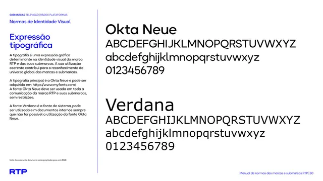
Type specimen page pairing the primary Okta Neue geometric sans with the fallback system font Verdana, each shown as full upper and lowercase alphabets plus numerals.
Summary
A typography reference page showing the two approved typefaces, Okta Neue as primary and Verdana as system fallback, each set as a full alphabet and numeral run.
Visual description
White background split into a narrow left text column and a wide right specimen zone, divided by a thin vertical blue rule. Left column carries the blue "SUBMARCAS" eyebrow with black section labels, a bold blue "Expressão tipográfica" heading, and two short black paragraphs explaining typeface rules. The right side stacks two large type specimens in black: "Okta Neue" as a bold rounded-geometric display word followed by its uppercase alphabet, lowercase alphabet, and numerals 0 to 9, then the same three-line structure for "Verdana" beneath it in a plainer grotesque. Standard footer elements (RGB note, blue RTP wordmark, running page label "80") anchor the bottom of the page.
Key takeaway
Showing a typeface pair as a literal full-alphabet specimen, primary versus fallback, makes the type rule unambiguous for anyone implementing the brand without a font file in hand.
Reuse notes
Useful template for any brand guideline's typography section when a manual needs to communicate both a licensed display font and a safe system substitute. Works best as a plain, high-contrast reference page rather than a hero moment.
From this deck: RTP typographic specimen (Okta Neue and Verdana)
View deck