Preview image. Unlock full-res
White Canvas Productivity
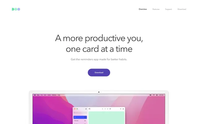
Doo presents a clean, productivity-focused interface with an emphasis on spacious layouts and subtle interactivity. Its visual identity is built on high-contrast typography against a primarily white canvas, accented by soft, rounded cards and a single, deep violet for primary actions. The design minimizes visual clutter, using thin borders and ghost-like elements to define structure, allowing content to take center stage. Maintain a spacious layout, ensuring a minimum sectionGap of 187px between major content blocks. Use Avenir Next, weight 400 for body text and weight 600 for headings, adhering to the defined type scale and letter-spacing values to maintain visual lightness. Apply Canvas White (#ffffff) as the dominant background for body and primary surfaces, creating a bright, uncluttered feel. Round all interactive elements like buttons and input fields with a 39px border-radius. Ensure all cards use a 30px border-radius and either Subtle Gray (#f7f7f7) or Canvas White (#ffffff) backgrounds. Define UI hierarchy using subtle distinctions: Text Primary (#383938) for main content, Text Secondary (#6e6d7a) for supportive details and navigation, and Border Fog (#edeef3) for minimal outlines. Reserve Action Violet (#5e45a2) exclusively for primary calls to action, active states, and elements that require immediate user interaction. Avoid heavy shadows or strong gradients; the interface should remain largely flat and airy. Do not introduce new typefaces; rely solely on Avenir Next for consistency in brand voice. Refrain from using saturated colors other than Action Violet, particularly for backgrounds or large areas. Do not use box-shadow for elevation; rely on background color changes and subtle borders for surface distinction. Avoid dense information blocks; instead, break content into digestible sections with generous padding and clear visual separation. Do not deviate from the defined border-radius values of 39px for buttons and 30px for cards; this is a core aspect of the brand's friendly professional aesthetic. Never use generic system link blue (#0000ee) for text links; use Text Secondary (#6e6d7a).