Preview image. Unlock full-res
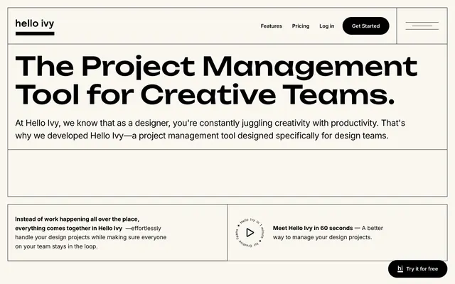
Architectural blueprint on creamy paper. Black lines precisely segment content on a soft background.
Hello Ivy presents as an architectural blueprint rendered on thick, creamy paper, conveying both structure and a subtle warmth. Heavy, bold titles anchor content, while a high-contrast monochromatic palette creates stark visual hierarchy. The signature feature is the strong grid system defined by fine black lines, segmenting content into clear, distinct blocks, as if each piece of information is a precisely cut and placed element within a larger, deliberate composition. Sparse use of color and a focus on sharp edges for everything but interactive elements contributes to a feeling of focused utility and quiet authority. Always define layout sections with subtle 1px Midnight Ink (#000000) borders against Greige Canvas (#faf6f0) to create a structured, architectural feel. Use Unbounded (weight 400-500) for all display headlines, setting letter-spacing to 0.02em for large titles (82px) and 0.01em for smaller section titles (20-34px). Apply Inter (weight 400-700) with a consistent -0.02em letter-spacing for all body text, subheadings, and UI labels. Utilize Greige Canvas (#faf6f0) as the primary background color for all page sections and content blocks. Implement 9999px border-radius for primary action buttons (Solid Pill Buttons) and 8px border-radius for secondary interactive elements (Outline Buttons). Maintain high contrast by using Midnight Ink (#000000) for all primary text and interactive elements on Greige Canvas (#faf6f0) backgrounds. Isolate Pure White (#ffffff) for subtle highlights, such as icon fills or inverse text on dark button backgrounds. Avoid using highly saturated, chromatic colors; the palette is strictly monochromatic with a single warm neutral base. Do not deviate from the established 1px Midnight Ink (#000000) border style for section dividers and containers. Refrain from using drop shadows or complex elevation; depth is created through borders and color contrast. Do not introduce rounded corners on non-interactive content blocks or imagery; maintain sharp, defined edges for structure. Avoid decorative whitespace or intricate patterns; layout should be clean, grid-based, and functional. Do not use generic system fonts for body or heading text where Inter or Unbounded are specified; adhere to the defined typography for brand consistency.