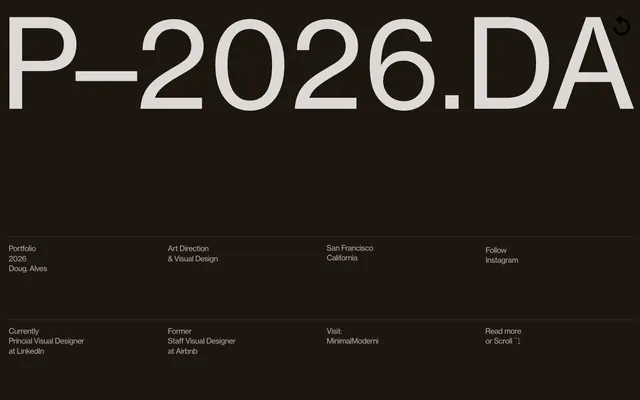
Preview image. Unlock full-res
Type-driven architectural blueprint
Color palette
Primary text, core UI elements, canvas background for information sections
Main page background, content cards, and occasional text against dark backgrounds
Most prominent background for primary text, subtle borders, and fills for certain icons
Secondary text, subheadings, and borders within content areas
Typography
- Weights
- 300, 400
- Sizes
- 12px, 28px, 72px, 197px
- Line height
- 1, 1.04, 1.29, 1.33
- Letter spacing
- -0.0330em at 197px, -0.0210em at 72px, -0.0140em at 28px, -0.0030em at 12px
- Fallback
- Arial, sans-serif
Display headlines and subheadings. The extreme letter-spacing and varied weights create a distinctive, impactful and architectural feel, especially the thin 300 weight for large headings.
- Weights
- 400
- Sizes
- 18px
- Line height
- 0.89, 2
- Letter spacing
- normal
- Fallback
- Helvetica Neue, Arial, sans-serif
Primary body text, used for detailed descriptions and longer content blocks. Its neutral tone supports the minimal aesthetic.
- Weights
- 400
- Sizes
- 16px
- Line height
- 1
- Letter spacing
- normal
- Fallback
- Arial, sans-serif
Utility text, labels, and smaller navigational elements. Provides system-level readability.
- Weights
- 400
- Sizes
- 12px
- Line height
- 1.33
- Letter spacing
- normal
- Fallback
- Arial, sans-serif
Smallest supporting text, captions, and fine print. Used sparingly for compact information.
Spacing & shape
Components
Transparent background, 0px border radius, no box shadow. Content relies on strong typography and layout for separation. Text uses Ink (#282828) or Charcoal (#333333).
wtqc font family, various sizes and weights. Text color is Ink (#282828) or Canvas (#ffffff) depending on background. Underlined on hover.
wtqc font family, weight 300 or 400. Sizes range from 28px to 197px with significant negative letter-spacing for a modern, architectural feel. Color is Ink (#282828) or Canvas (#ffffff).
Guidelines
- Prioritize wtqc font family for all primary headings, leveraging its strong letter-spacing and weight variations for visual impact.
- Maintain a strict color palette of Ink (#282828) for most text and dark backgrounds, and Canvas (#ffffff) for light canvases and contrasting text.
- Use 0px border-radius for informational cards and sections, allowing typography and internal spacing to define boundaries.
- Apply precise letter-spacing values to wtqc typography at all sizes, especially for large headings, to preserve its distinctive crispness.
- Employ the compact Inter font for body text to maintain density and readability within content blocks.
- Avoid decorative gradients or vivid colors; the system relies on high contrast and typographic hierarchy.
- Do not introduce box-shadows on cards or standard interface elements; maintain a flat, architectural surface aesthetic.
- Refrain from using common rounded button styles; interactive elements are primarily text-based or minimal-border outlines.
- Do not deviate from the defined letter-spacing values for wtqc; this is a signature characteristic of the branding.
- Avoid excessive whitespace; the design is compact, leveraging density to present information efficiently.
About this system
ShowHide
Doug–Alves presents a stark, high-contrast digital portfolio. Its design language is driven by highly structured, compact typography that carves out information on a dark plane, occasionally giving way to white canvases. The interaction design emphasizes functional clarity over ornamental flourishes, using subtle transitions and strong typographic scale to create visual rhythm.
The page structure balances full-bleed dark sections with contained, maximal-width light sections. The initial hero pattern features a monumental, centered headline against a dark background. Content sections flow with a consistent vertical rhythm, lacking overt visual dividers between logically grouped information blocks. Content arrangement often appears in a grid-like or tabular structure, particularly for biographical and experience details. There is no rigid max-width for the entire page; some elements stretch edge-to-edge while others are implicitly contained by text width. Navigation is minimal and integrated into the footer-like areas, with links existing as part of information groups rather than a distinct, persistent header.
This design system primarily relies on crisp, functional UI elements rather than prominent imagery. When visuals are present, they are either abstract and minimal (like the image of a binder with text) or highly focused product-like shots. Imagery serves an explanatory or showcase role, not decorative atmosphere. Photography is high-key, product-focused, and tightly cropped. Icons are not explicitly defined in the data but can be inferred as minimal and functional, likely monochromatic to match the system's overall restraint. The density is text-dominant with visuals supporting the content, not dictating the layout.
Reminiscent of Huge Inc., Pentagram, Kikk.be (design conference), Build in Public.
# Doug–Alves — Style Reference
> Type-driven architectural blueprint

**Theme:** light

**Site:** https://dougalves.work

Doug–Alves presents a stark, high-contrast digital portfolio. Its design language is driven by highly structured, compact typography that carves out information on a dark plane, occasionally giving way to white canvases. The interaction design emphasizes functional clarity over ornamental flourishes, using subtle transitions and strong typographic scale to create visual rhythm.

## Tokens — Colors

| Name | Value | Token | Role |
|------|------|------|------|
| Ink | `#282828` | `--color-ink` | Primary text, core UI elements, canvas background for information sections |
| Canvas | `#ffffff` | `--color-canvas` | Main page background, content cards, and occasional text against dark backgrounds |
| Deep Space | `#000000` | `--color-deep-space` | Most prominent background for primary text, subtle borders, and fills for certain icons |
| Charcoal | `#333333` | `--color-charcoal` | Secondary text, subheadings, and borders within content areas |

## Tokens — Typography

### wtqc
- **Substitute:** Arial, sans-serif
- **Weights:** 300, 400
- **Sizes:** 12px, 28px, 72px, 197px
- **Line height:** 1, 1.04, 1.29, 1.33
- **Letter spacing:** -0.0330em at 197px, -0.0210em at 72px, -0.0140em at 28px, -0.0030em at 12px
- **Role:** Display headlines and subheadings. The extreme letter-spacing and varied weights create a distinctive, impactful and architectural feel, especially the thin 300 weight for large headings.

### Inter
- **Substitute:** Helvetica Neue, Arial, sans-serif
- **Weights:** 400
- **Sizes:** 18px
- **Line height:** 0.89, 2
- **Letter spacing:** normal
- **Role:** Primary body text, used for detailed descriptions and longer content blocks. Its neutral tone supports the minimal aesthetic.

### -apple-system
- **Substitute:** Arial, sans-serif
- **Weights:** 400
- **Sizes:** 16px
- **Line height:** 1
- **Letter spacing:** normal
- **Role:** Utility text, labels, and smaller navigational elements. Provides system-level readability.

### Roboto
- **Substitute:** Arial, sans-serif
- **Weights:** 400
- **Sizes:** 12px
- **Line height:** 1.33
- **Letter spacing:** normal
- **Role:** Smallest supporting text, captions, and fine print. Used sparingly for compact information.

## Tokens — Type Scale

| Role | Size | Line height | Letter spacing |
|------|------|------|------|
| caption | 12px | 1.33 | -0.003em |
| body | 18px | 2 | — |
| subheading | 28px | 1.04 | -0.014em |
| heading | 72px | 1.29 | -0.021em |
| display | 197px | 1 | -0.033em |

## Tokens — Spacing

- **Section gap:** 64px
- **Card padding:** 0px
- **Element gap:** 24px

## Tokens — Radius

- **other:** 20px

## Layout

The page structure balances full-bleed dark sections with contained, maximal-width light sections. The initial hero pattern features a monumental, centered headline against a dark background. Content sections flow with a consistent vertical rhythm, lacking overt visual dividers between logically grouped information blocks. Content arrangement often appears in a grid-like or tabular structure, particularly for biographical and experience details. There is no rigid max-width for the entire page; some elements stretch edge-to-edge while others are implicitly contained by text width. Navigation is minimal and integrated into the footer-like areas, with links existing as part of information groups rather than a distinct, persistent header.

## Imagery

This design system primarily relies on crisp, functional UI elements rather than prominent imagery. When visuals are present, they are either abstract and minimal (like the image of a binder with text) or highly focused product-like shots. Imagery serves an explanatory or showcase role, not decorative atmosphere. Photography is high-key, product-focused, and tightly cropped. Icons are not explicitly defined in the data but can be inferred as minimal and functional, likely monochromatic to match the system's overall restraint. The density is text-dominant with visuals supporting the content, not dictating the layout.

## Components

### Information Card Group
*Container for related text and links, often appearing in horizontal grids.*

Transparent background, 0px border radius, no box shadow. Content relies on strong typography and layout for separation. Text uses Ink (#282828) or Charcoal (#333333).

### Text Link
*Interactive text elements.*

wtqc font family, various sizes and weights. Text color is Ink (#282828) or Canvas (#ffffff) depending on background. Underlined on hover.

### Header Title
*Prominent page titles and section headers.*

wtqc font family, weight 300 or 400. Sizes range from 28px to 197px with significant negative letter-spacing for a modern, architectural feel. Color is Ink (#282828) or Canvas (#ffffff).

## Guidelines

### Do

- Prioritize wtqc font family for all primary headings, leveraging its strong letter-spacing and weight variations for visual impact.
- Maintain a strict color palette of Ink (#282828) for most text and dark backgrounds, and Canvas (#ffffff) for light canvases and contrasting text.
- Use 0px border-radius for informational cards and sections, allowing typography and internal spacing to define boundaries.
- Apply precise letter-spacing values to wtqc typography at all sizes, especially for large headings, to preserve its distinctive crispness.
- Employ the compact Inter font for body text to maintain density and readability within content blocks.

### Don't

- Avoid decorative gradients or vivid colors; the system relies on high contrast and typographic hierarchy.
- Do not introduce box-shadows on cards or standard interface elements; maintain a flat, architectural surface aesthetic.
- Refrain from using common rounded button styles; interactive elements are primarily text-based or minimal-border outlines.
- Do not deviate from the defined letter-spacing values for wtqc; this is a signature characteristic of the branding.
- Avoid excessive whitespace; the design is compact, leveraging density to present information efficiently.

## Agent Prompt Guide

Quick Color Reference:
text: #282828
background: #ffffff
border: #282828
accent: no distinct accent color
primary action: no distinct CTA color

Example Component Prompts:
1. Create a hero section: 'DECONSTRUCT' at 197px wtqc weight 300, color Canvas (#ffffff), letter-spacing -0.033em, centered on a Deep Space (#000000) background.
2. Create an information card group: Canvas (#ffffff) background, with three columns. Each column contains a heading 'Portfolio 2026' at 28px wtqc weight 400, color Ink (#282828), letter-spacing -0.014em. Below each heading, include body text 'Doug Alves' at 18px Inter weight 400, color Ink (#282828), line-height 2.
3. Create a navigational link: 'Instagram' text at 12px wtqc weight 400, color Ink (#282828), letter-spacing -0.003em, with a 1px bottom border of Ink (#282828) on hover.
More like this









Keep what you find
A free account saves references to boards and can send you a weekly email of picks based on what you save.
To see every result, go Pro.